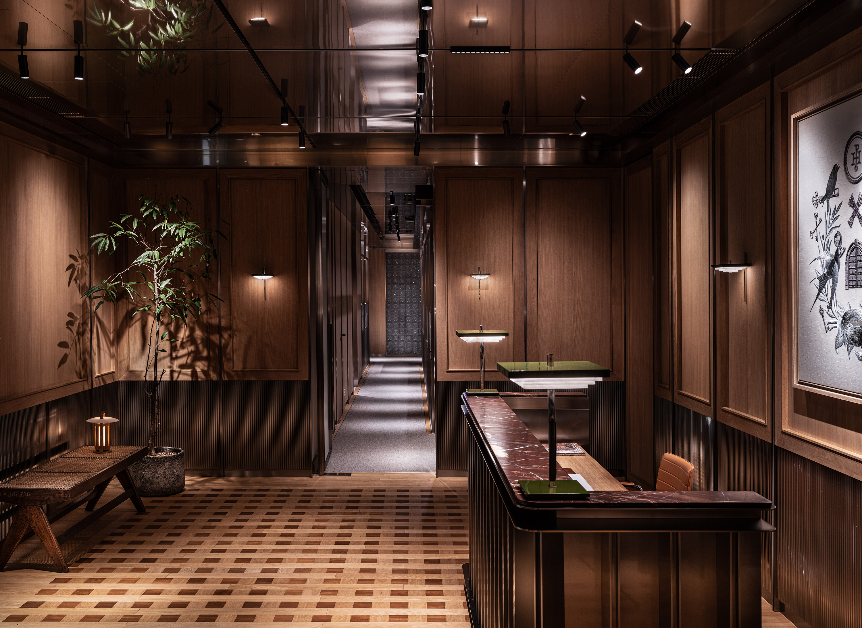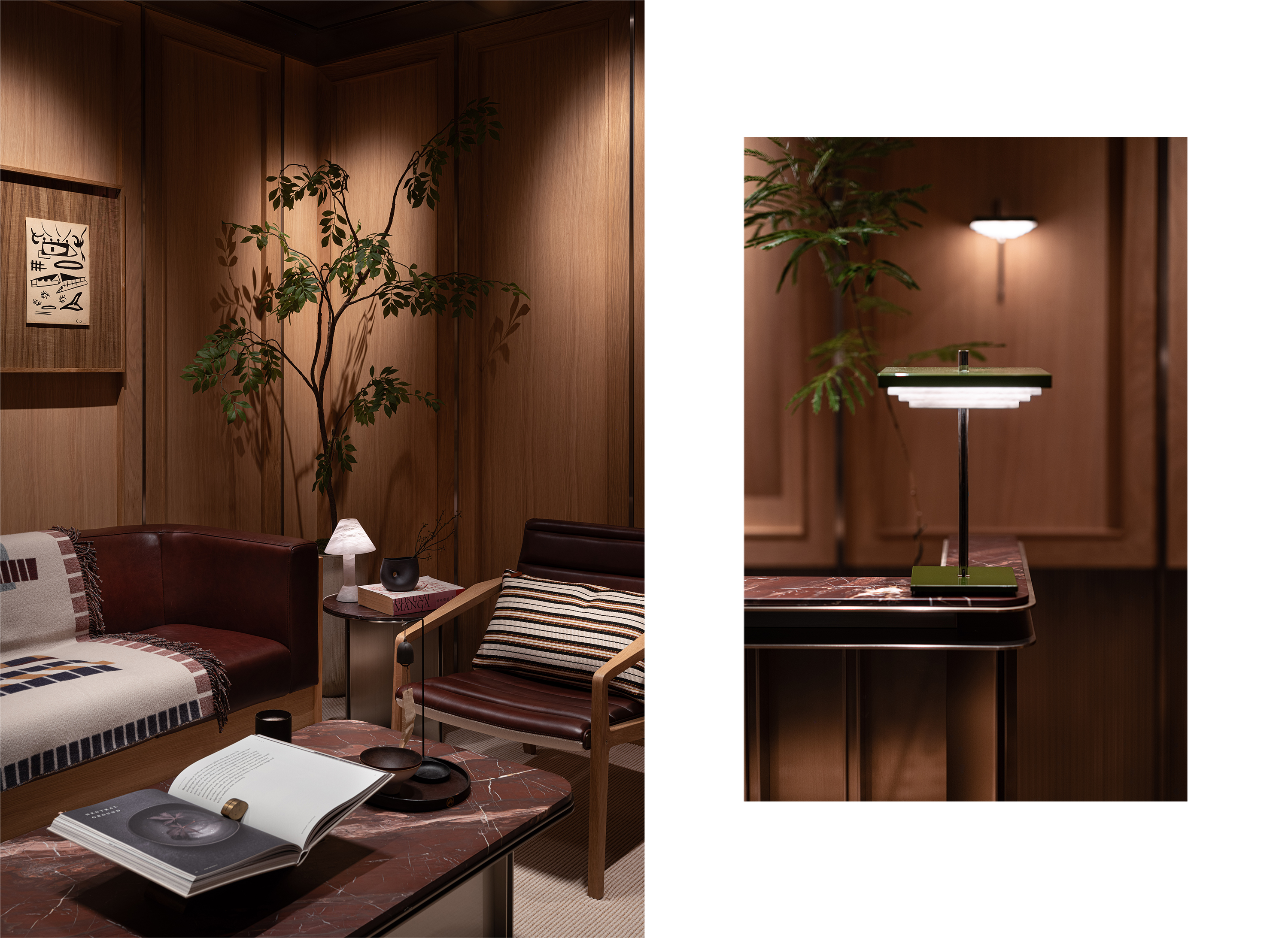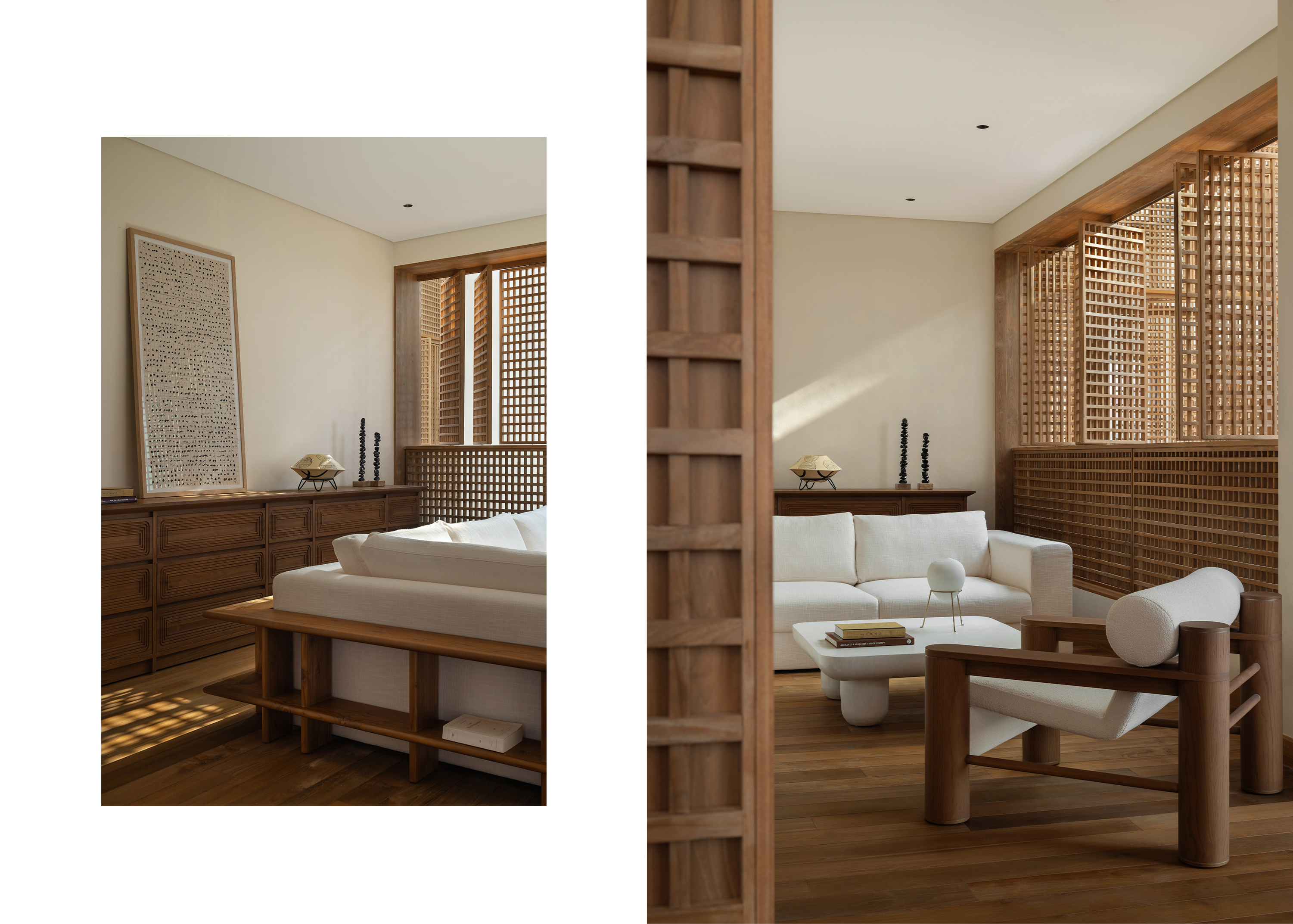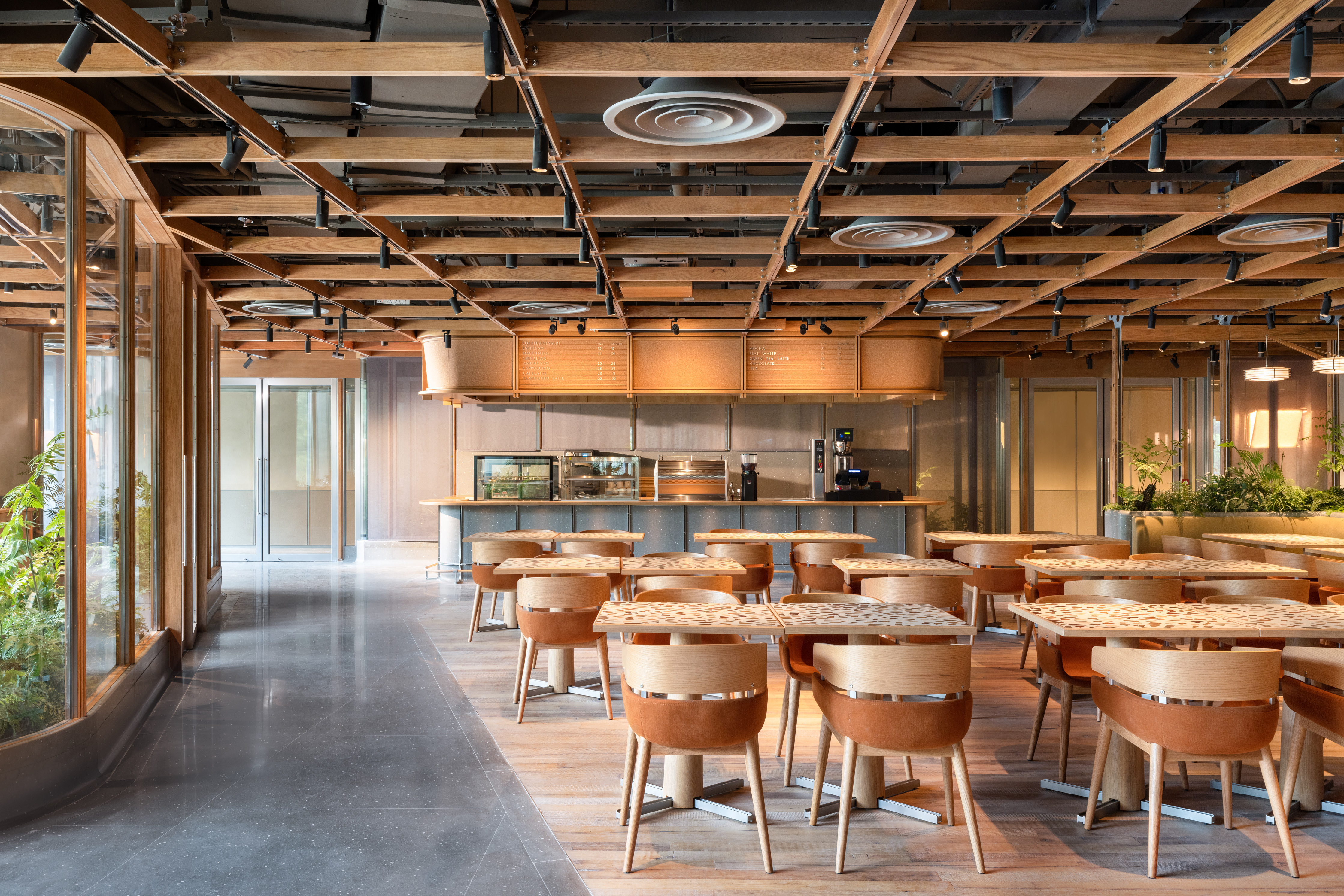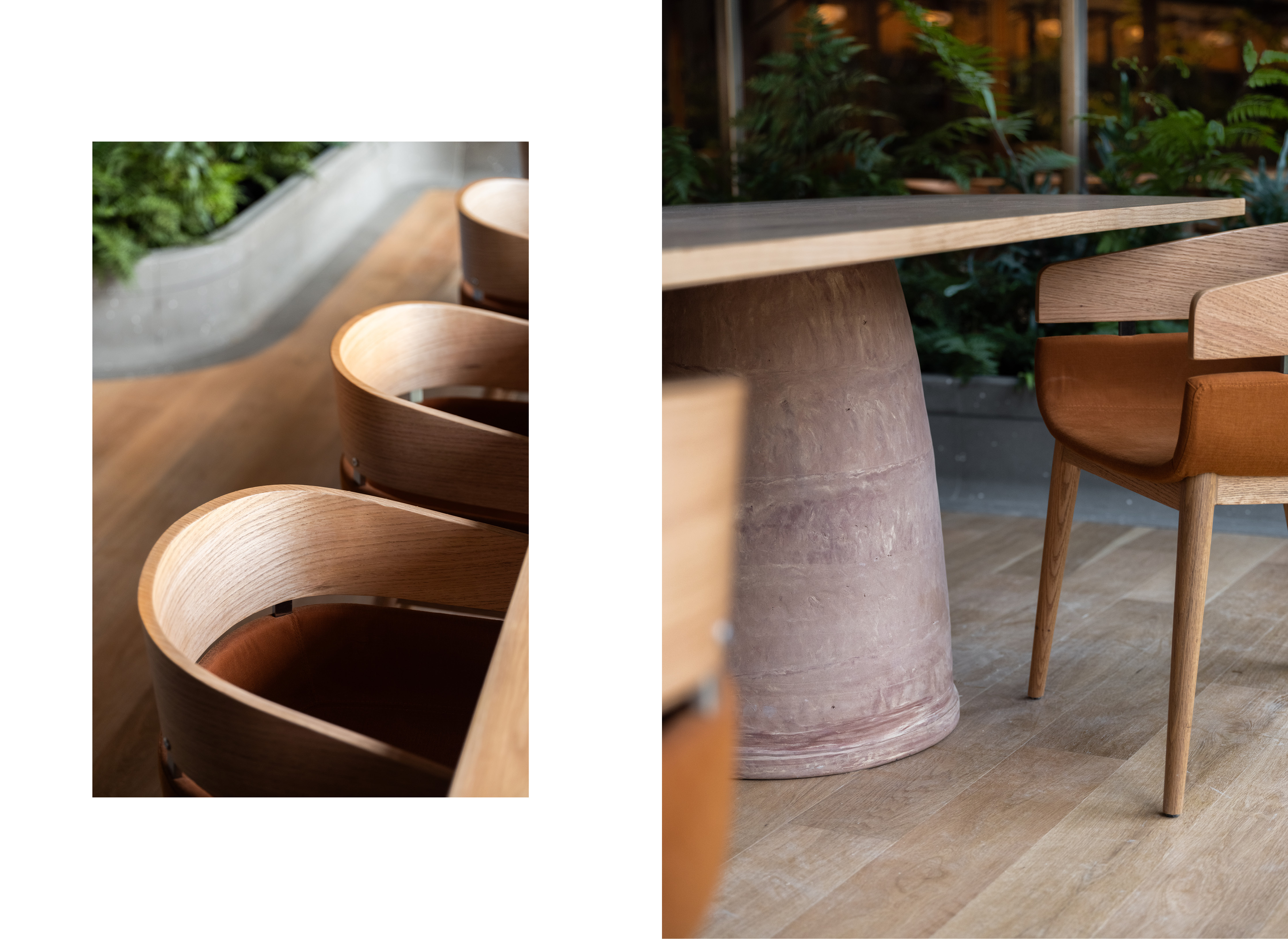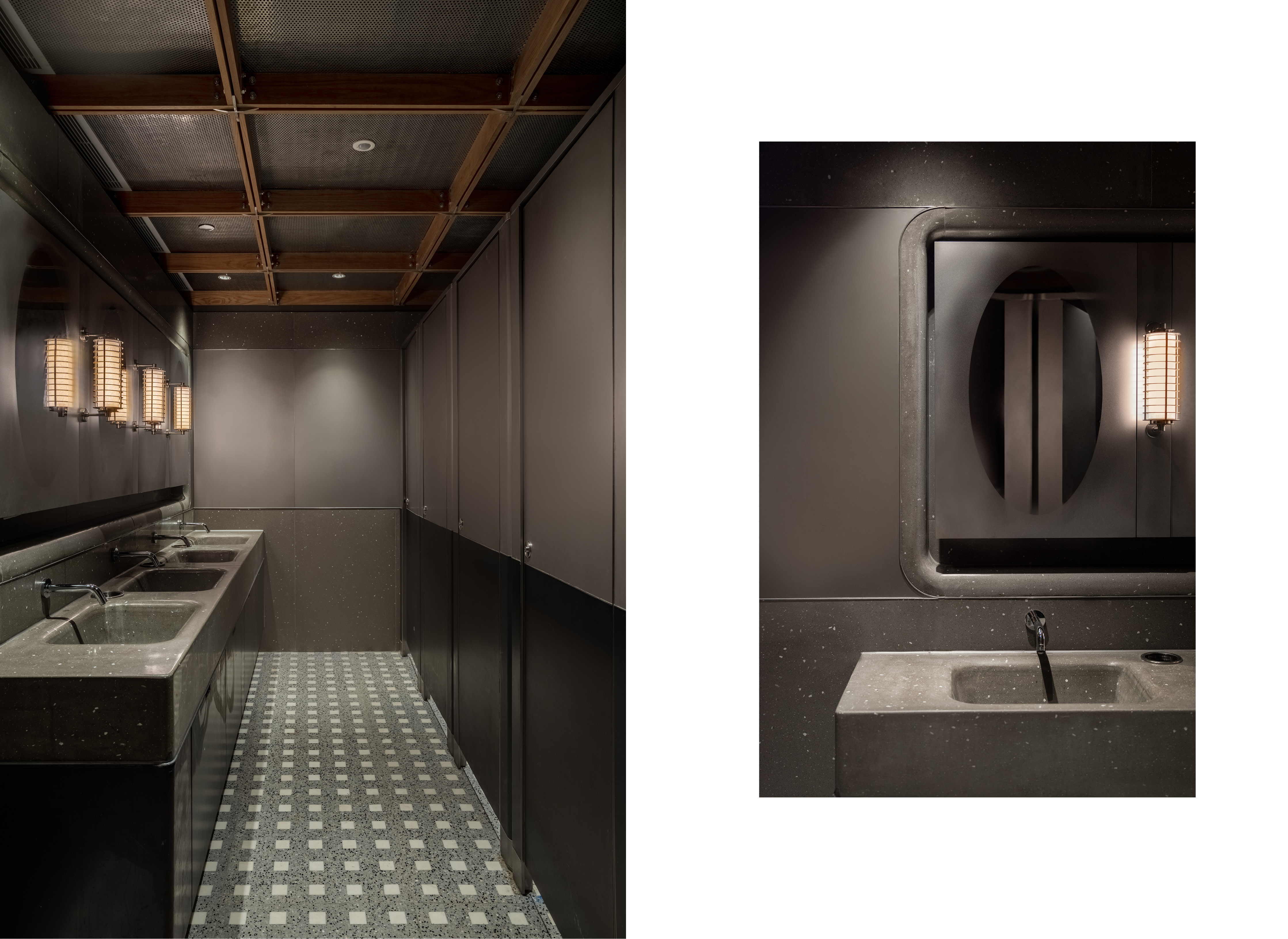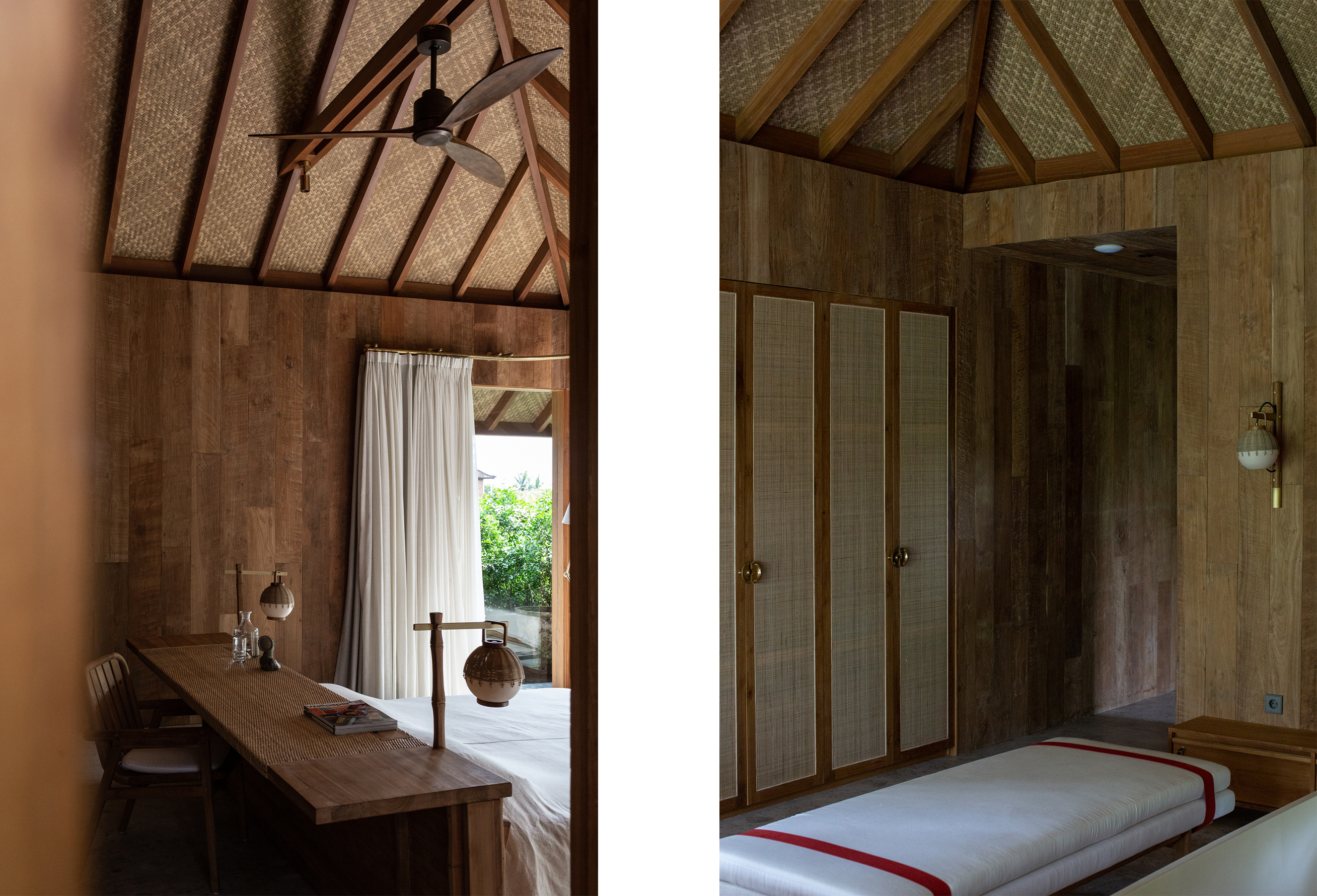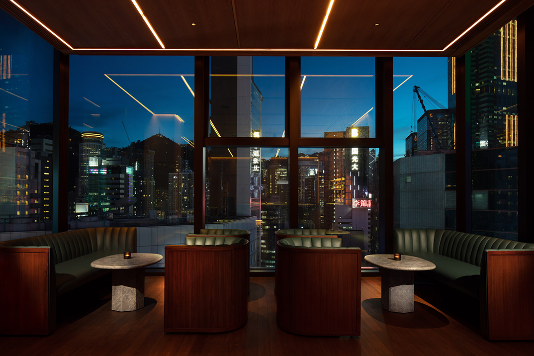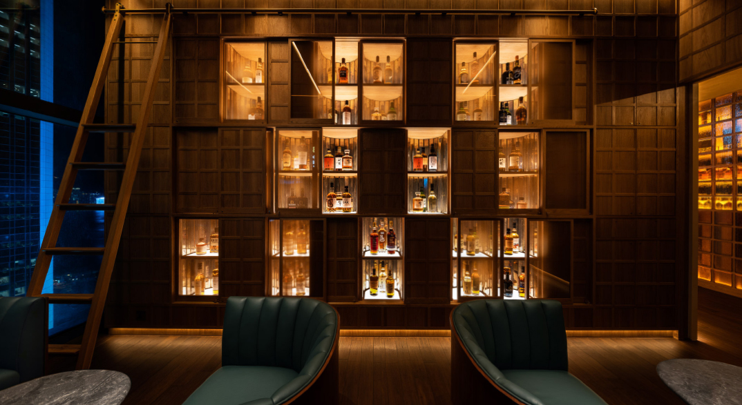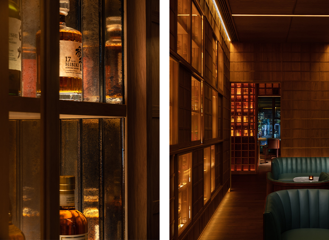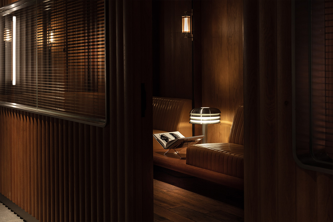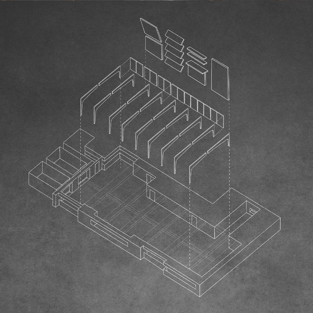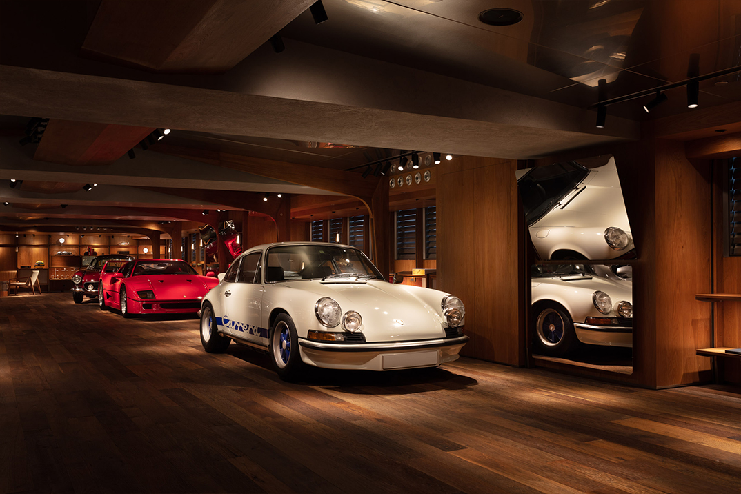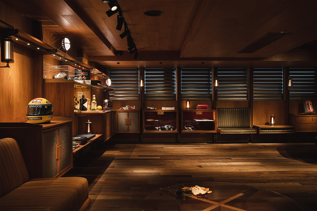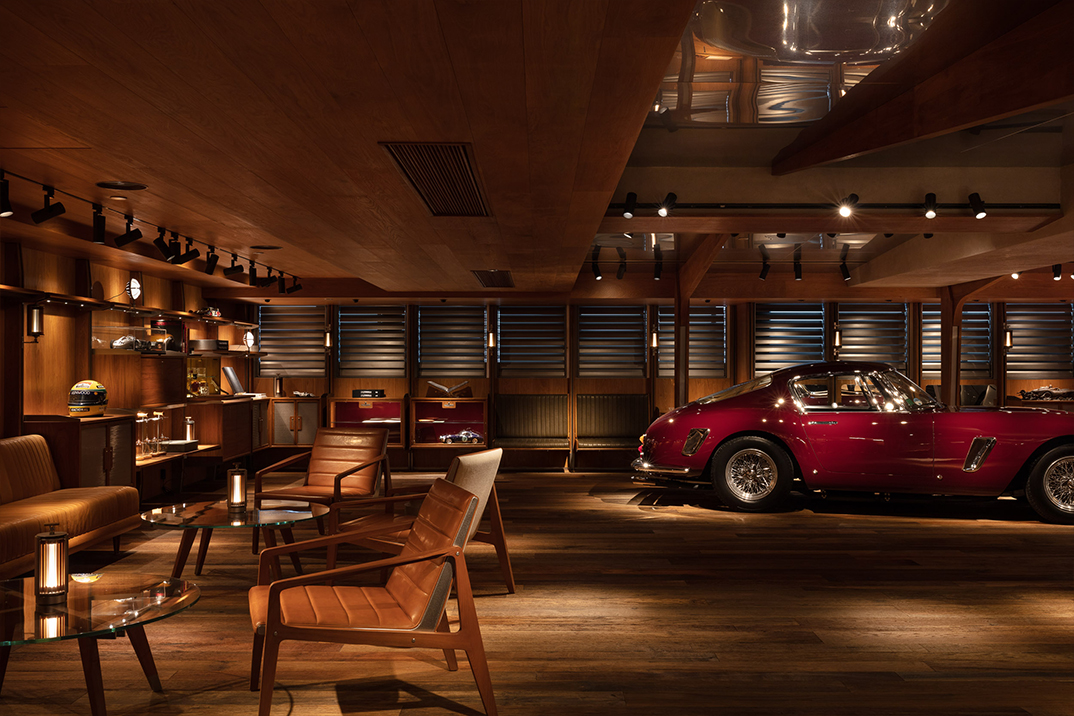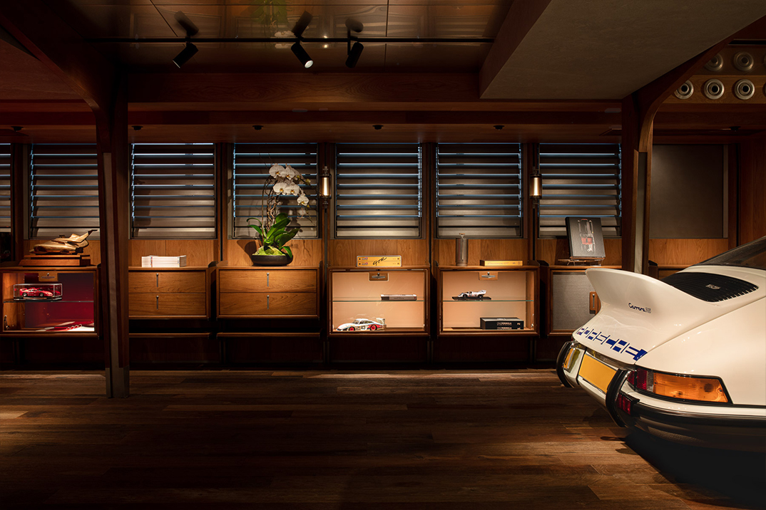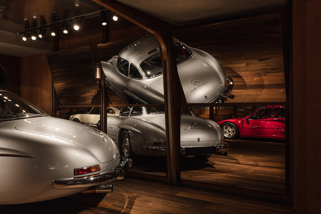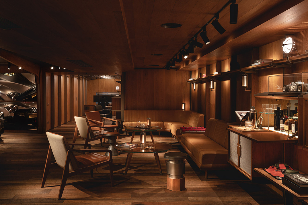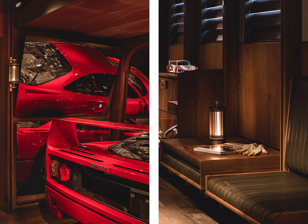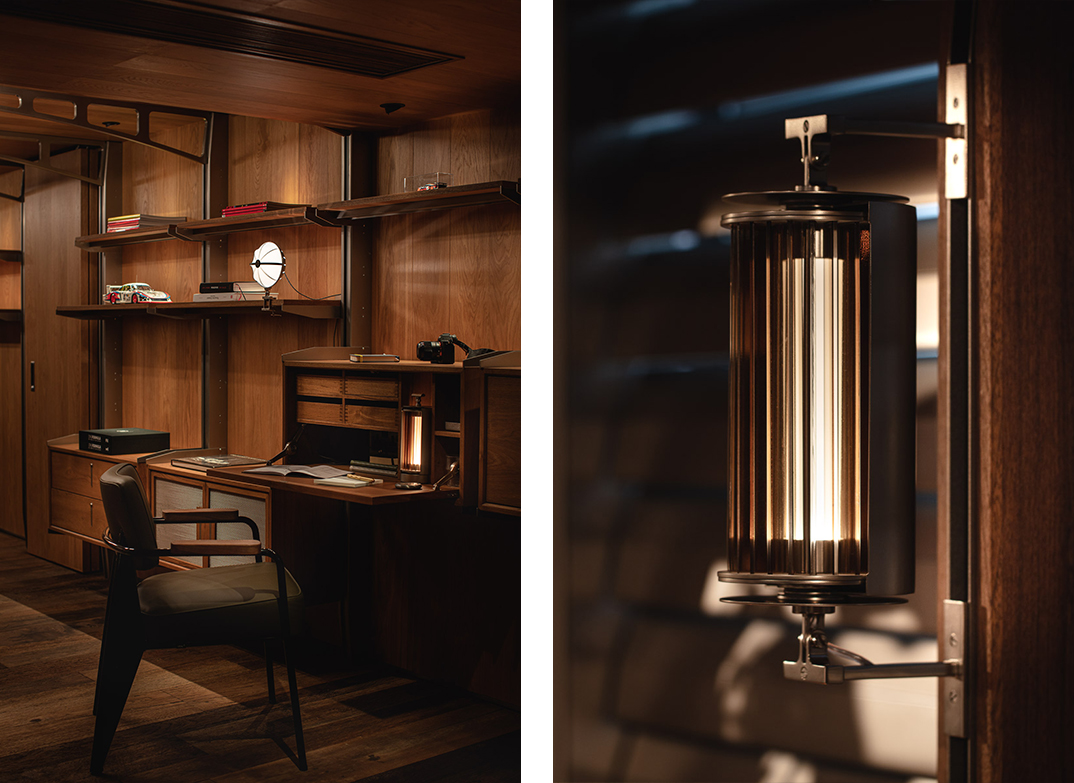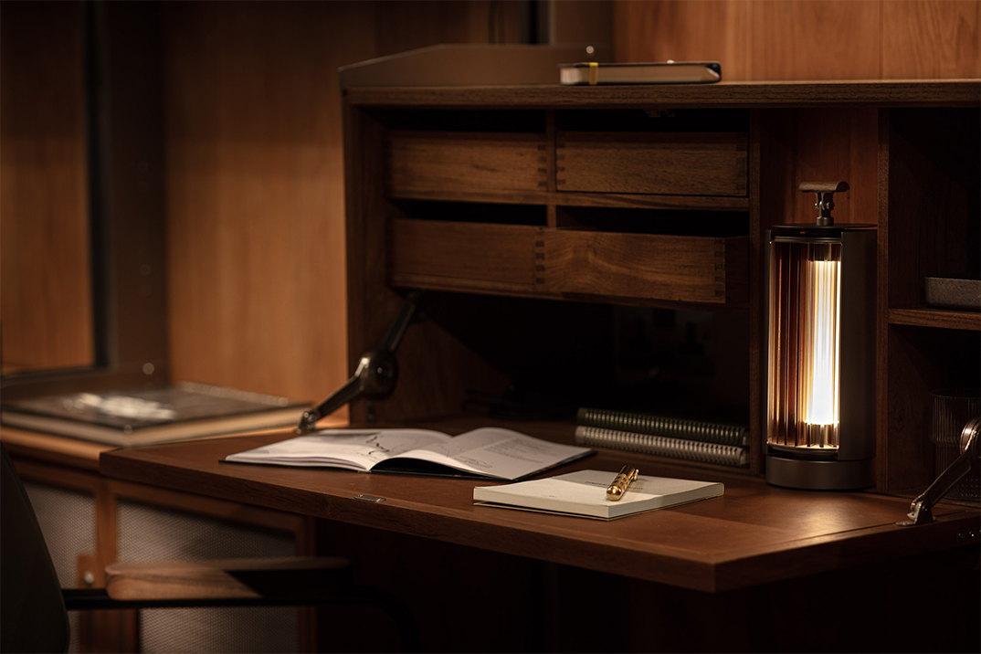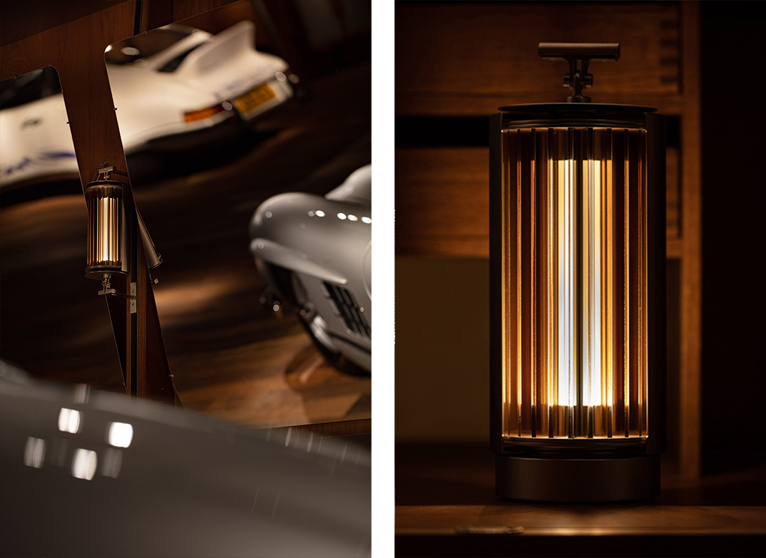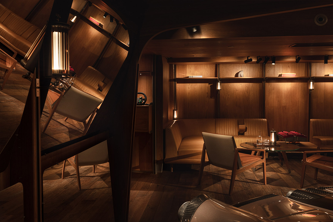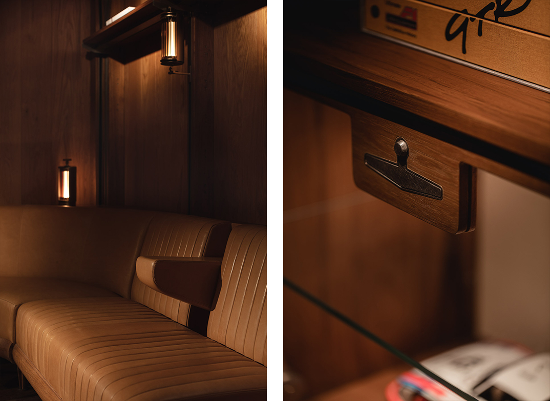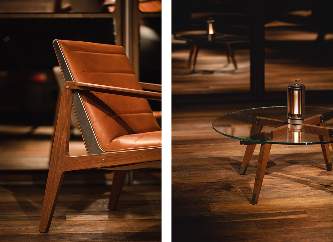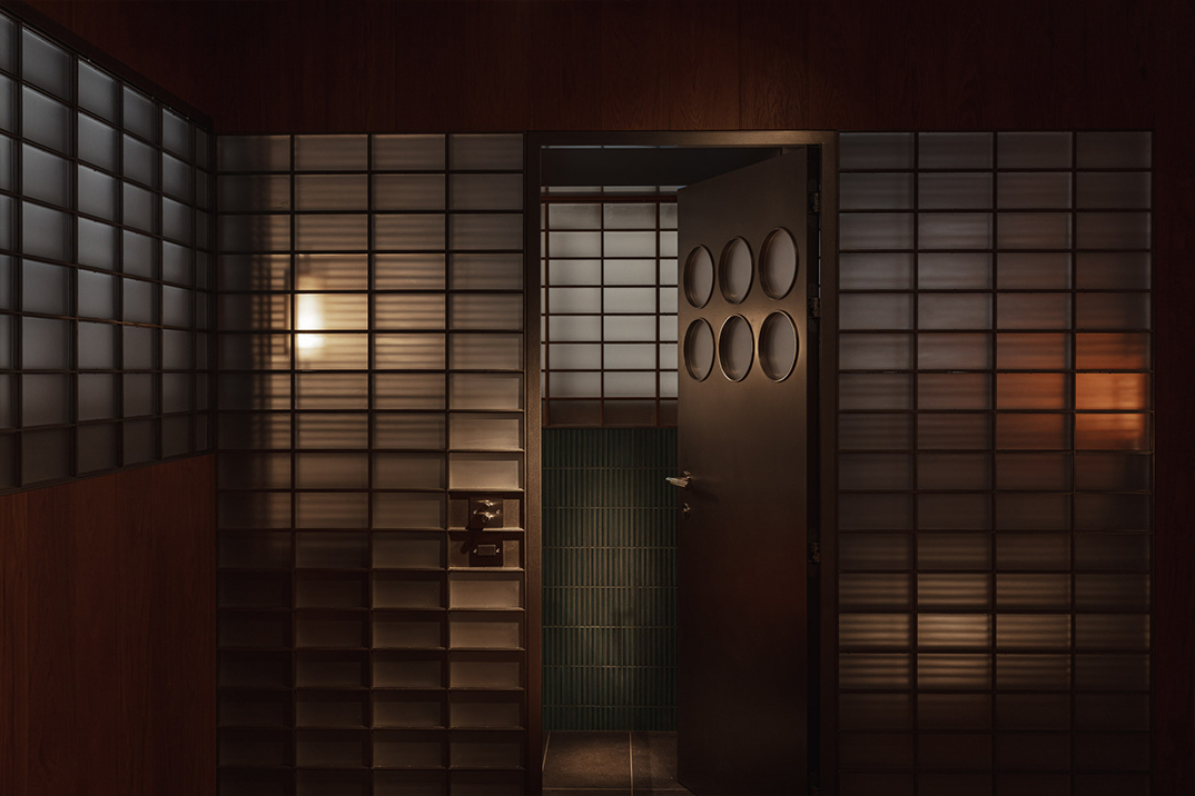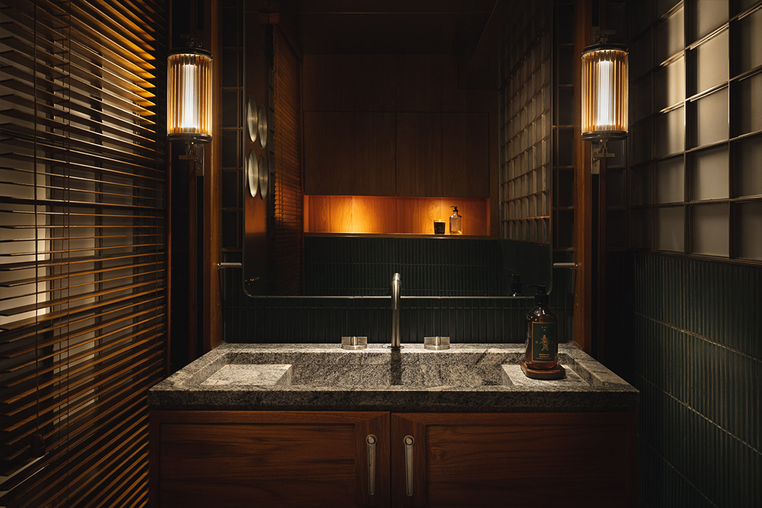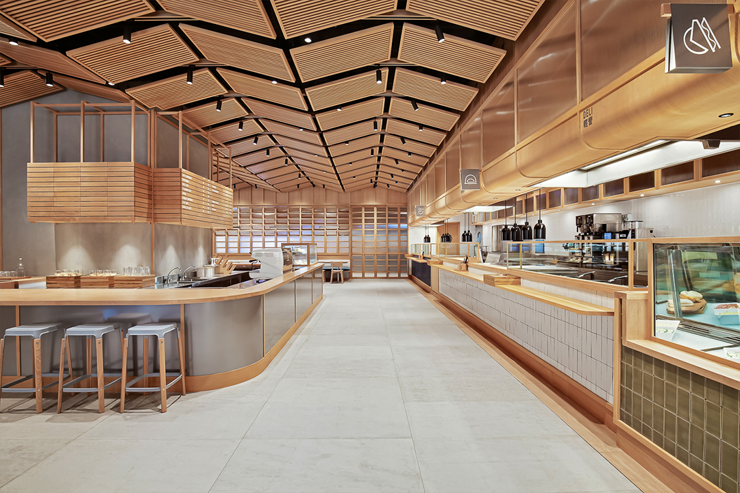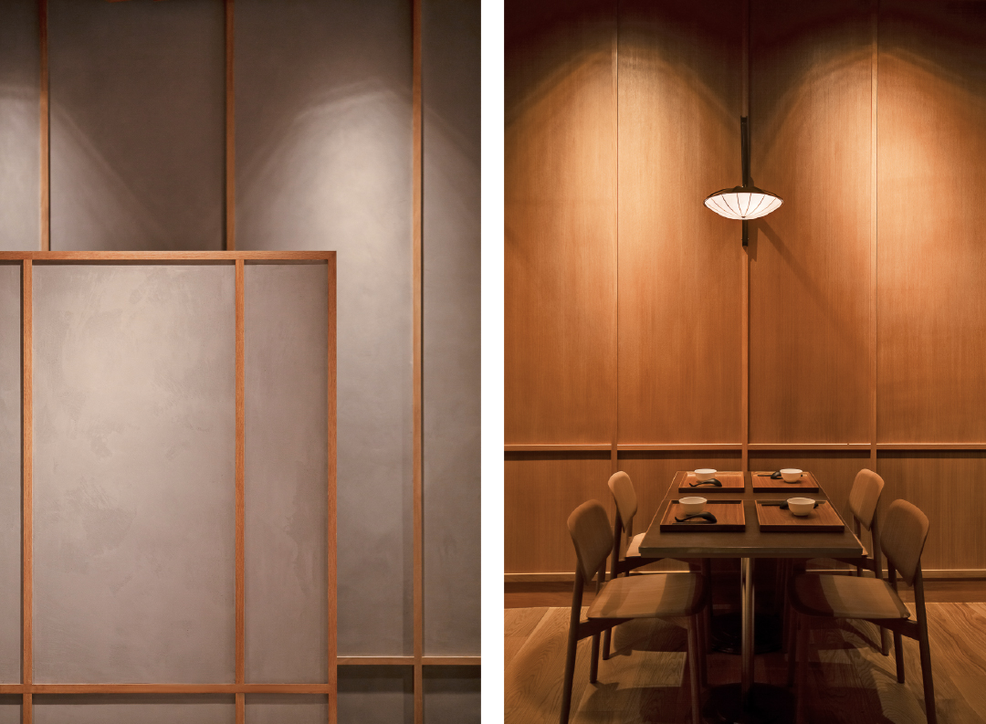
this family office pays tribute to an era when design balanced restraint with indulgence. functionality meets flair, infused with the warmth and intimacy of a private residence.
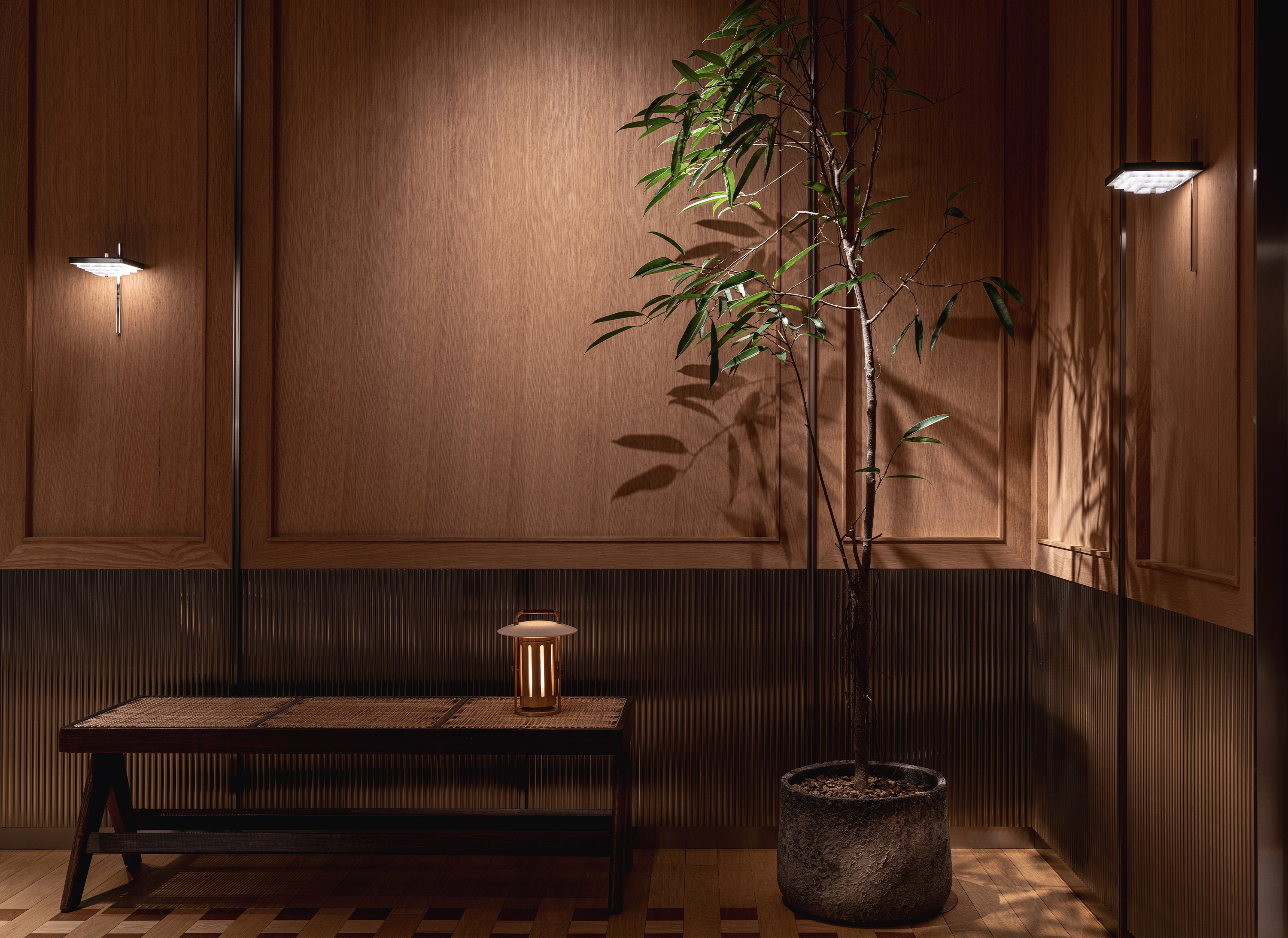
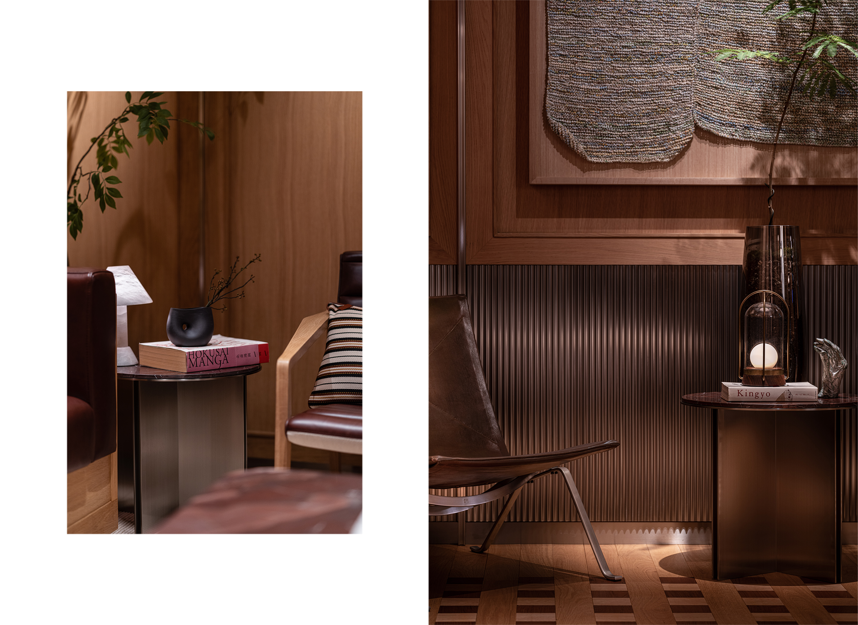
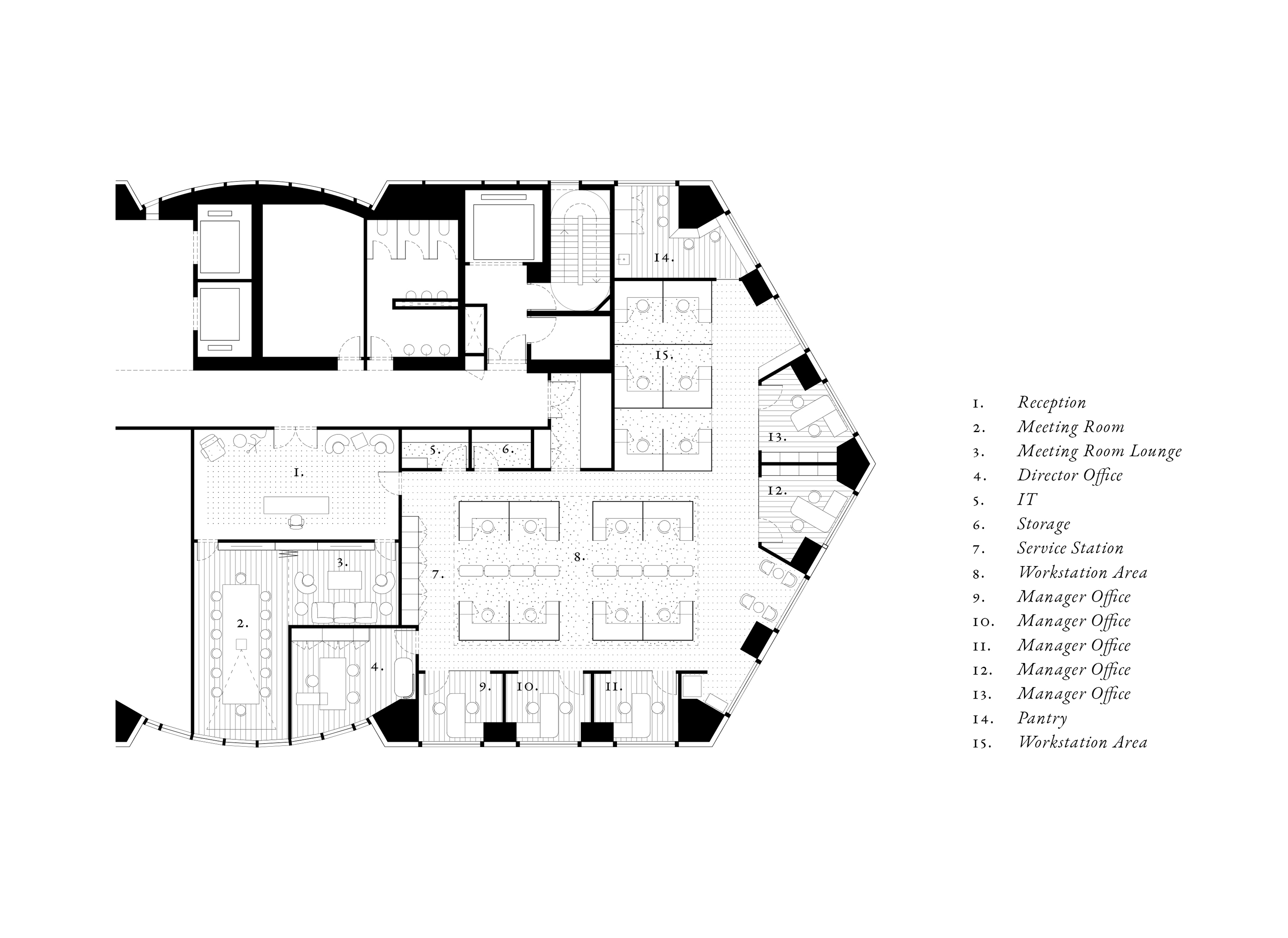
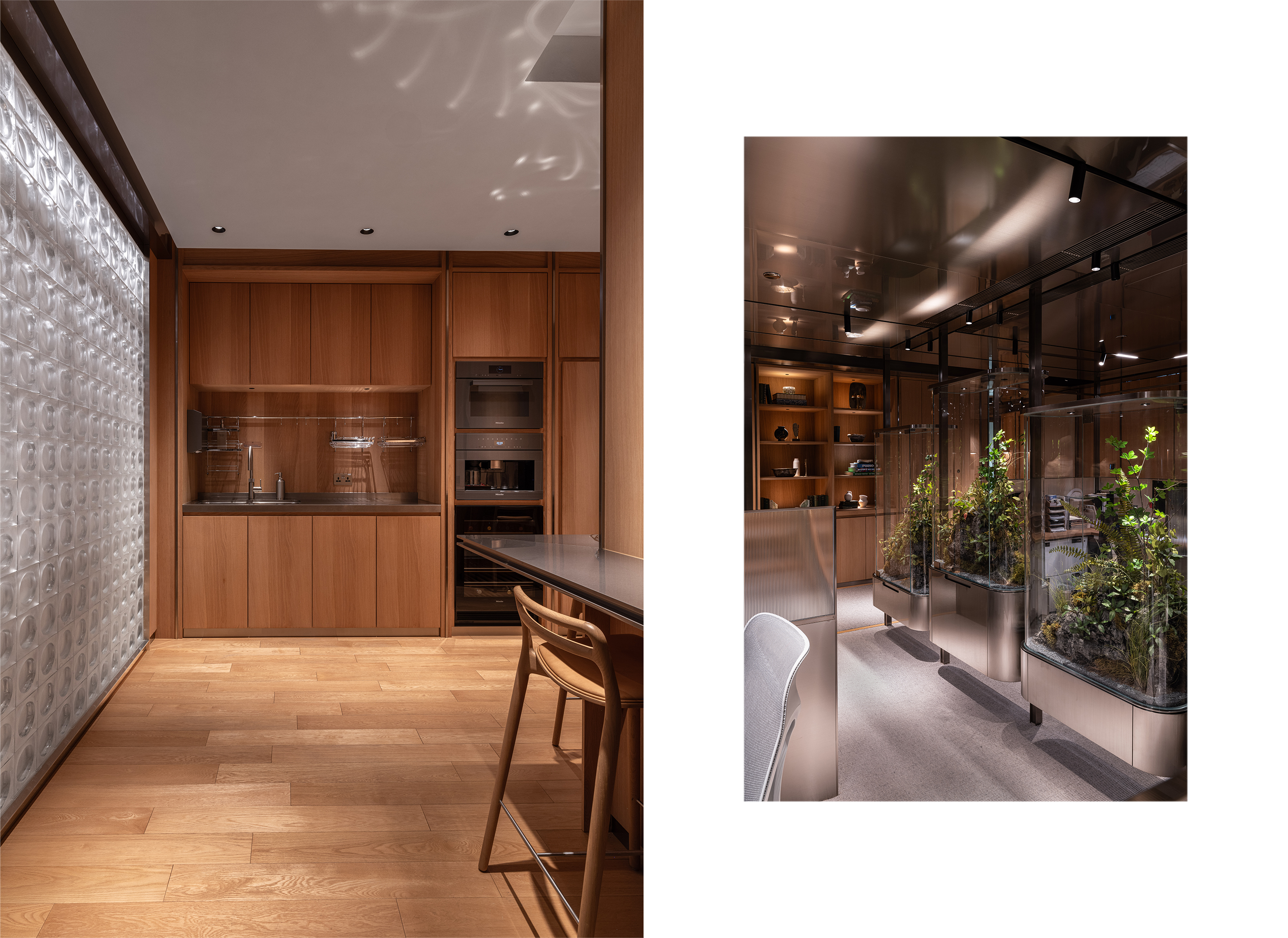
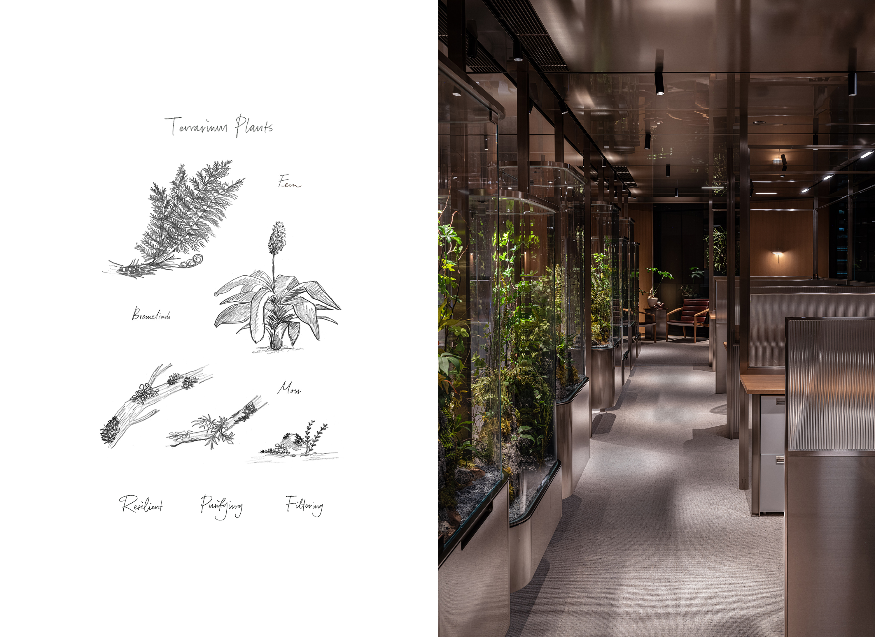
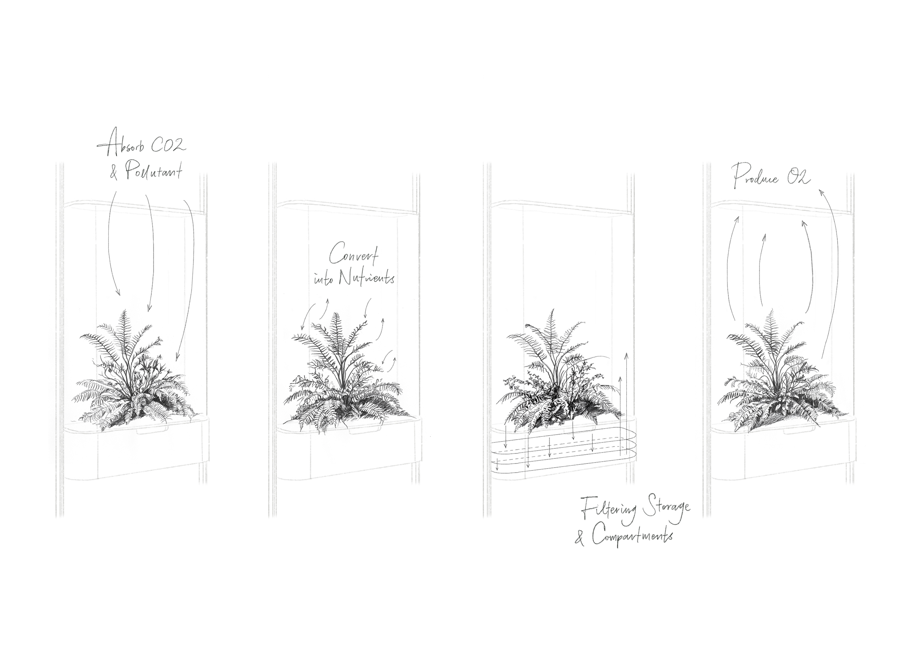
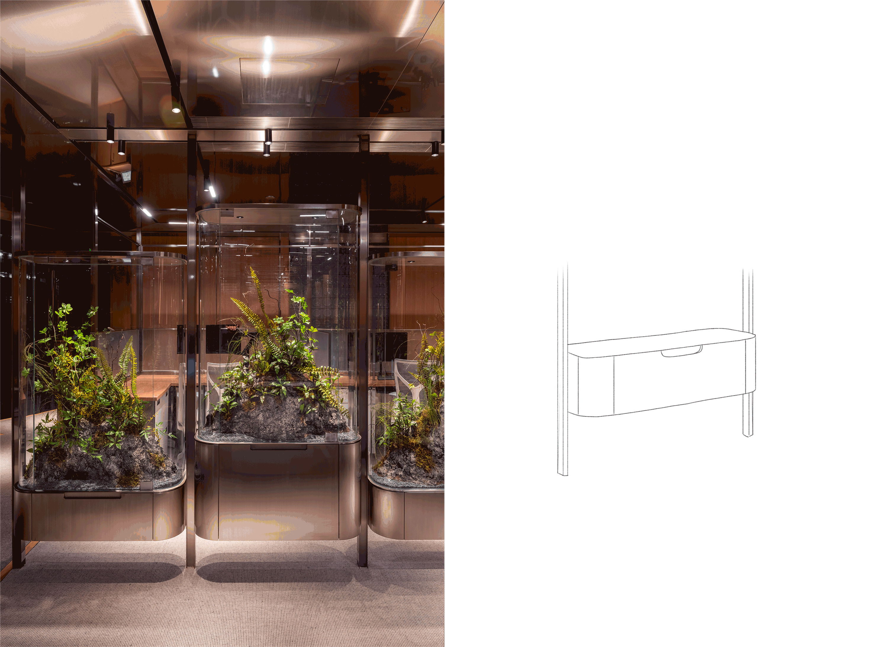
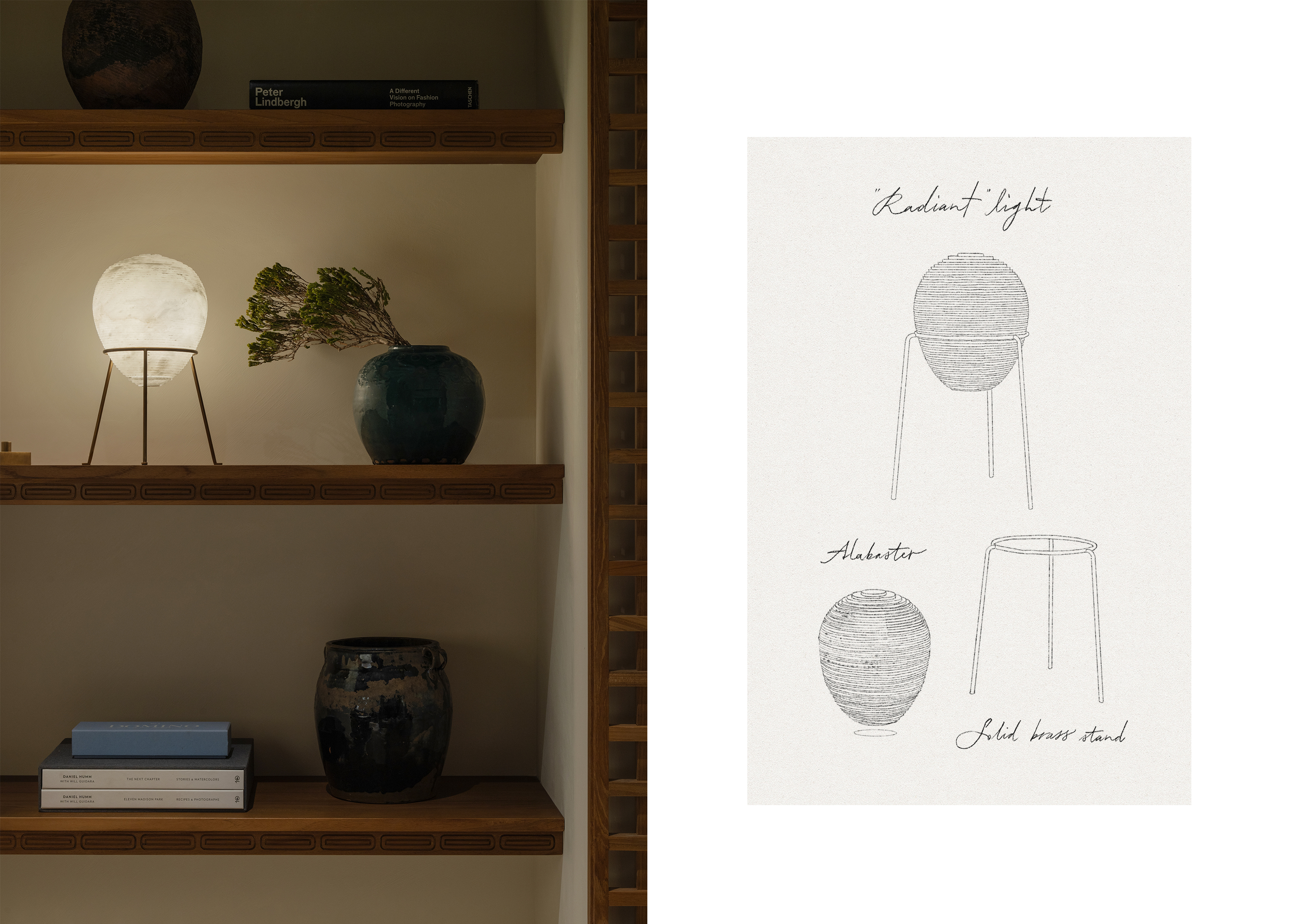
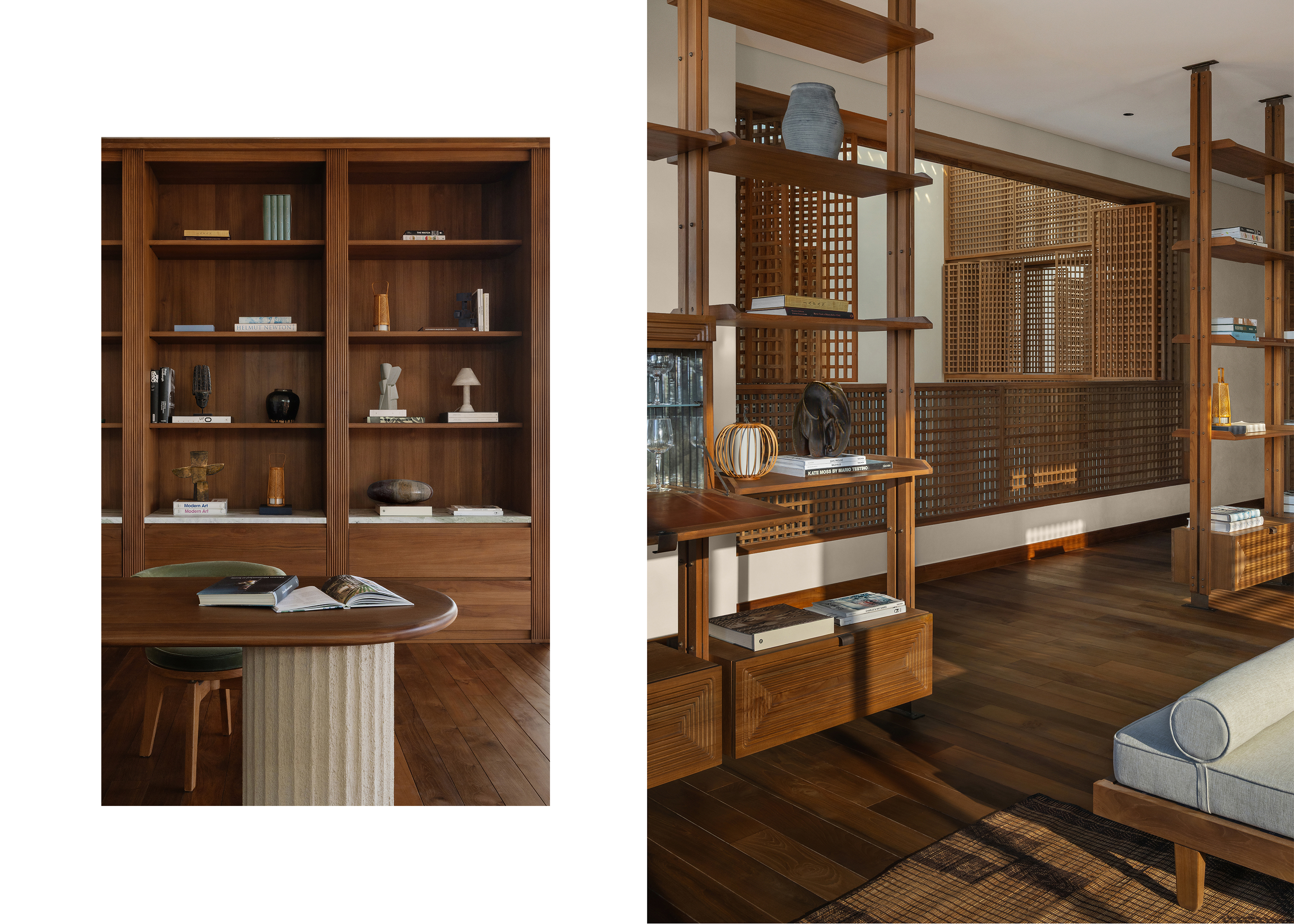
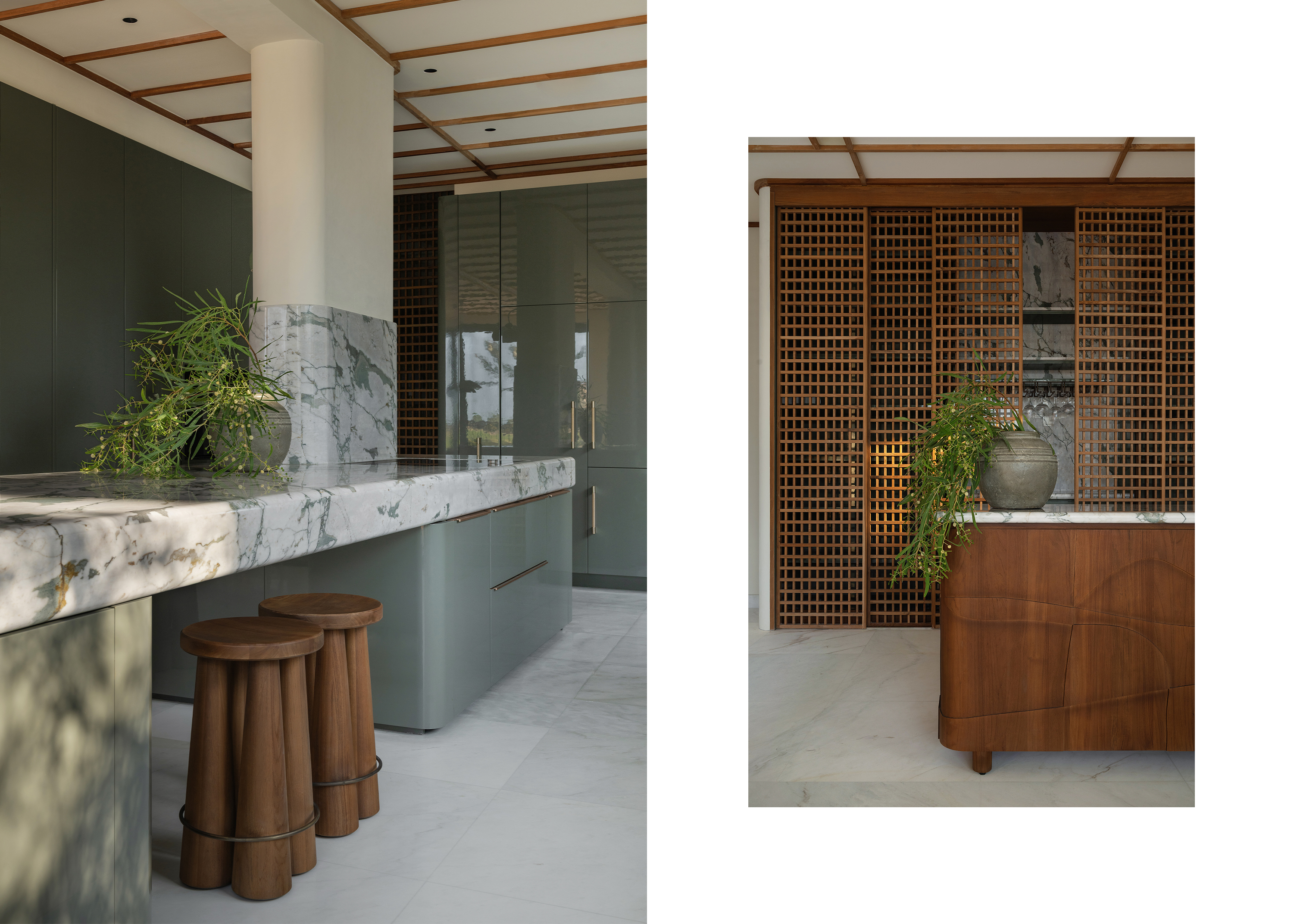
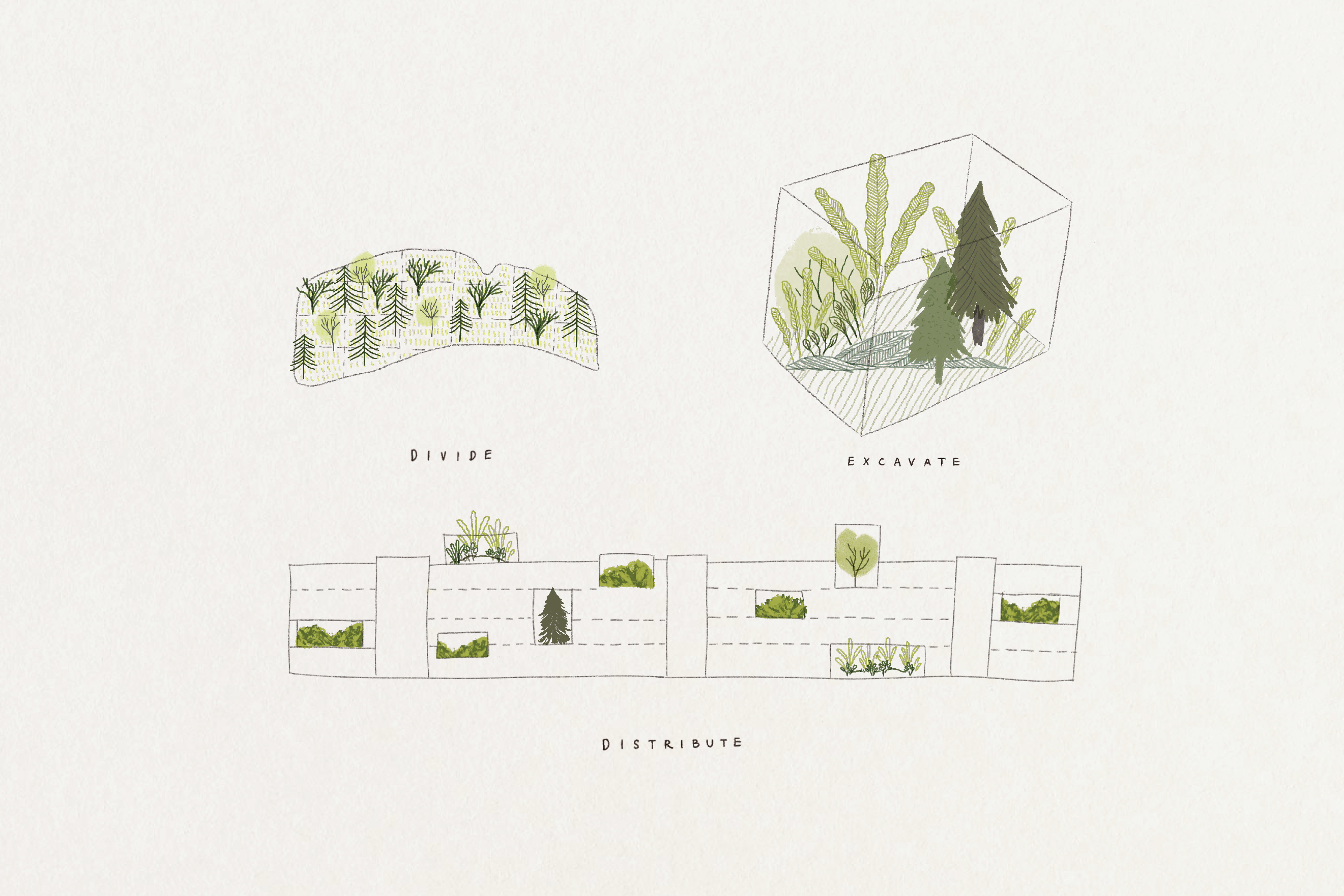
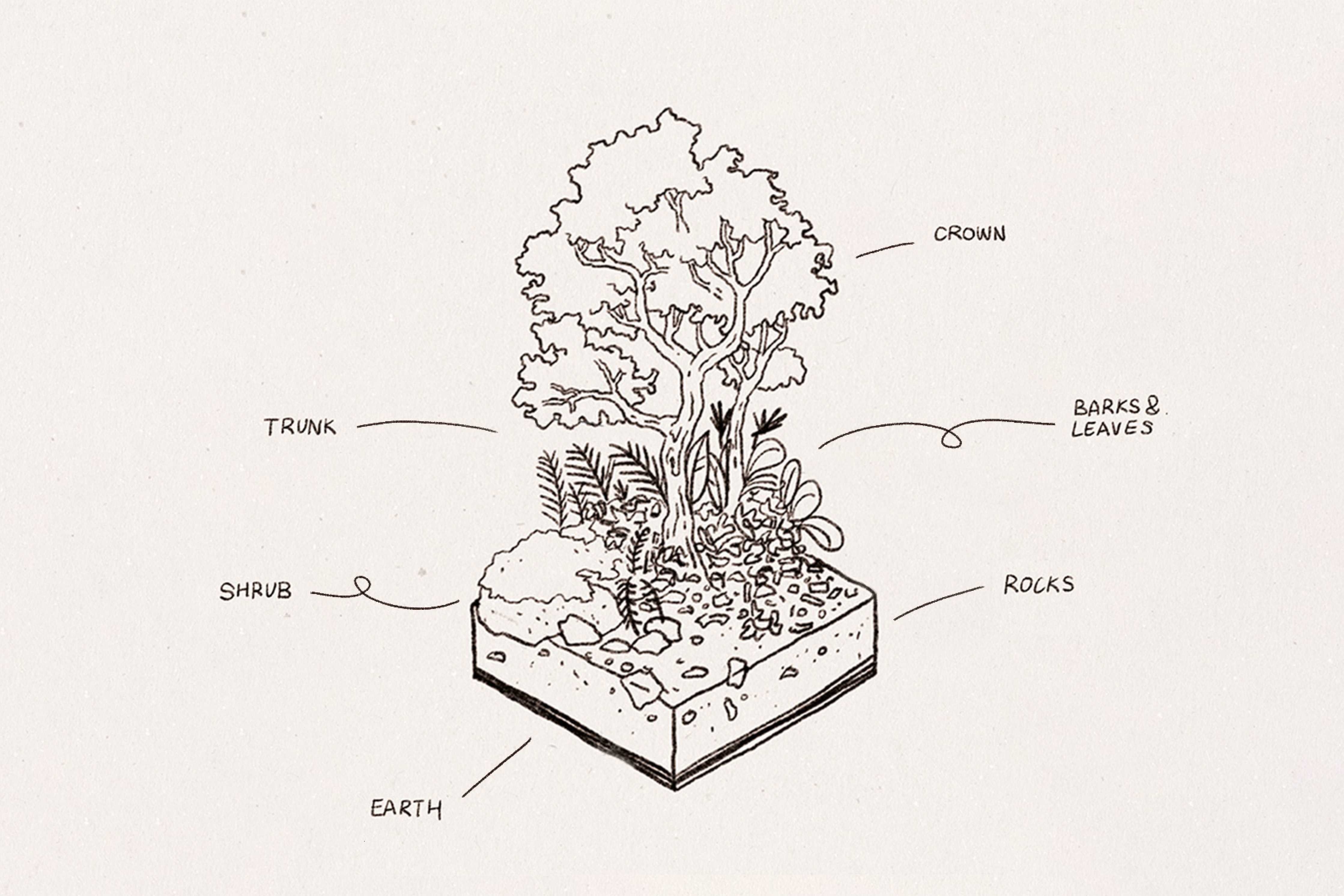
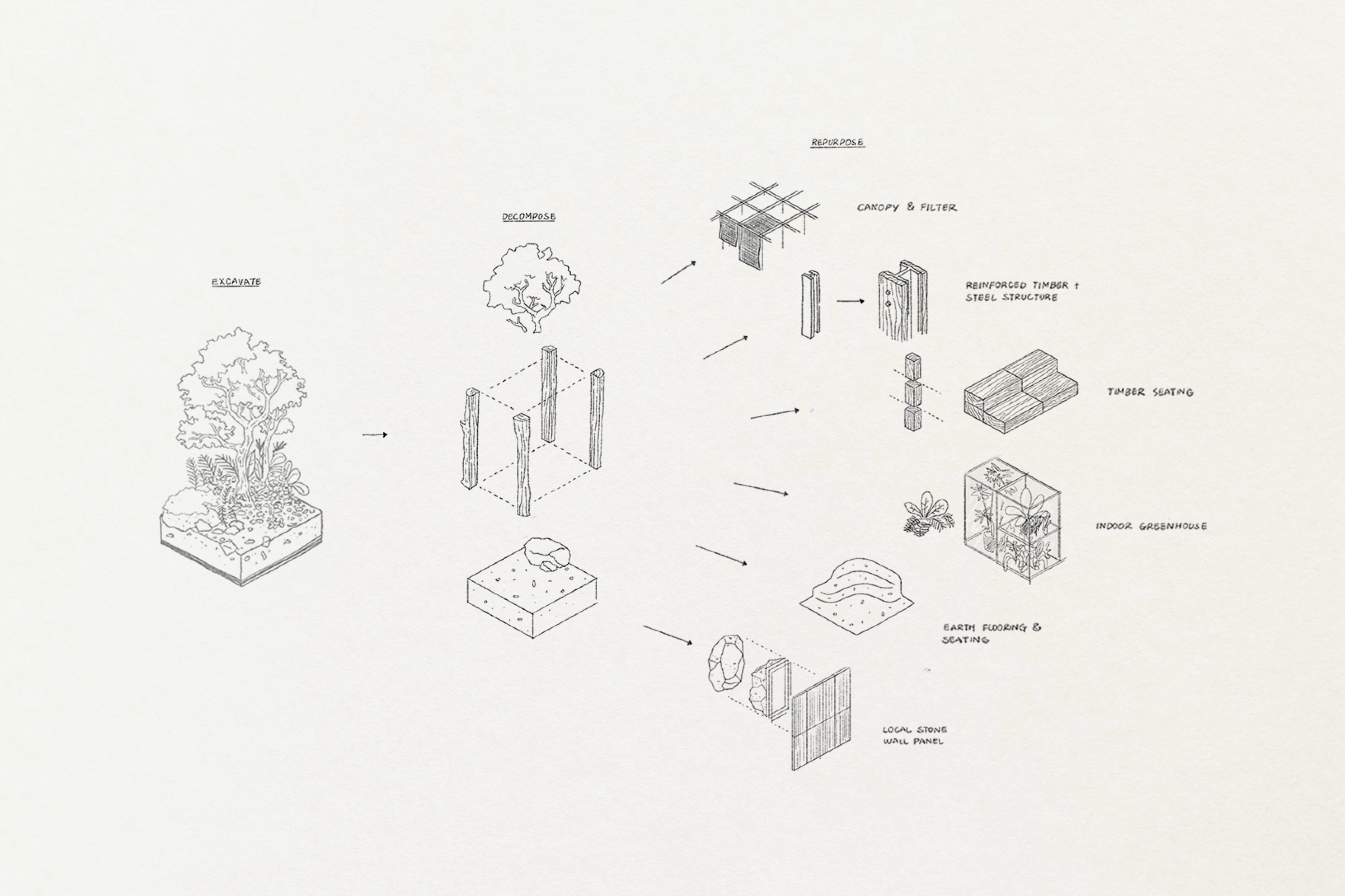
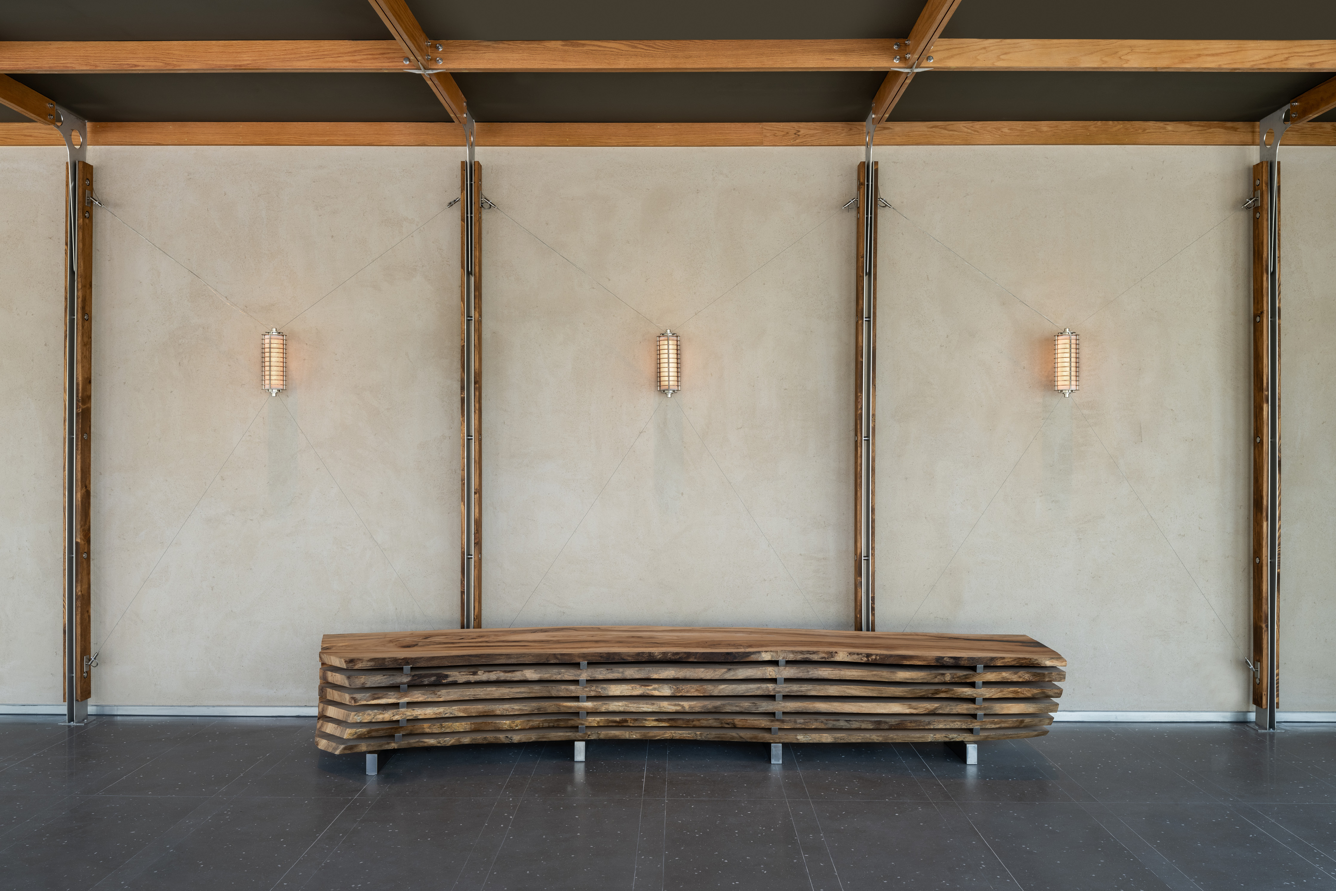
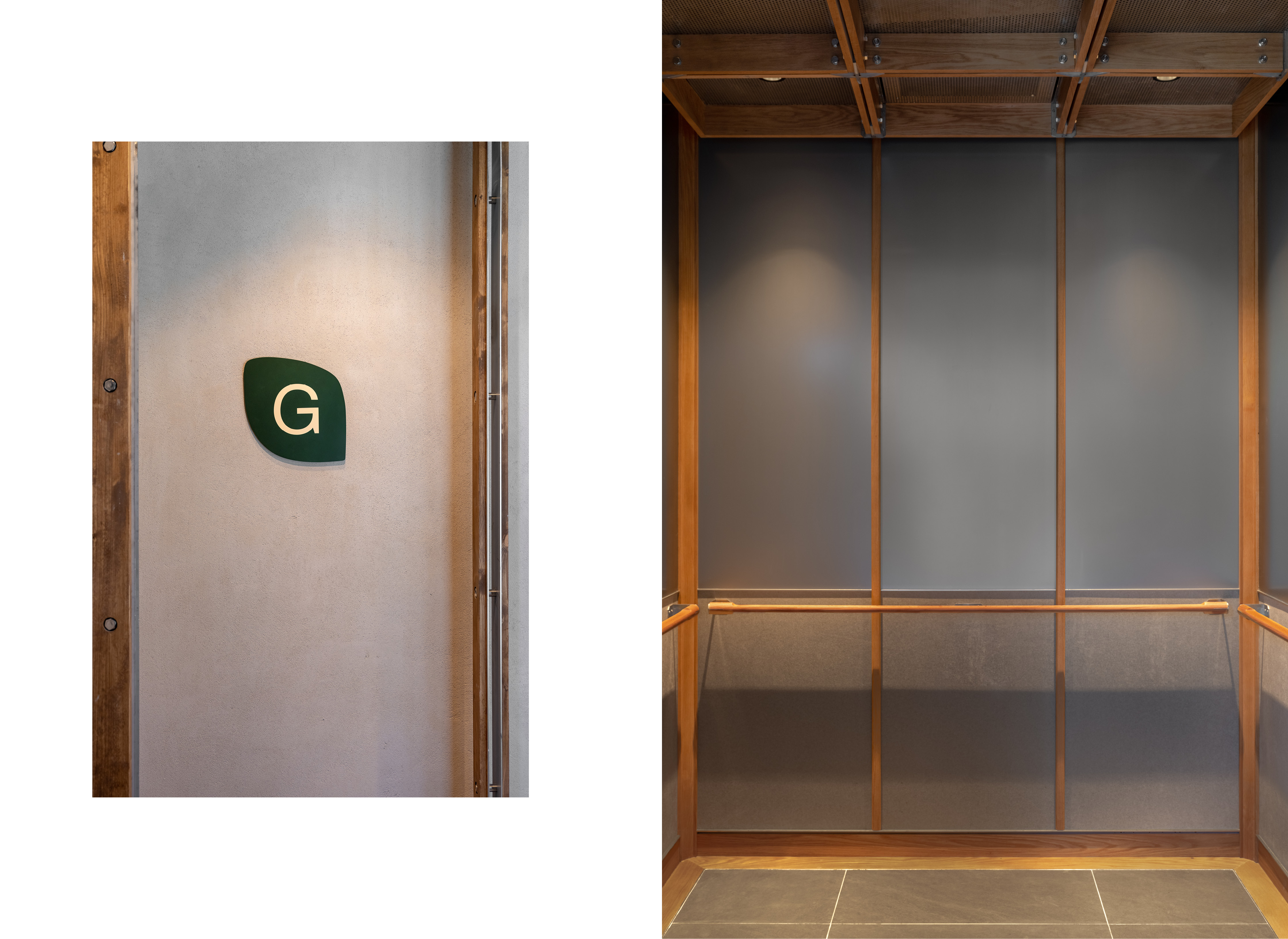
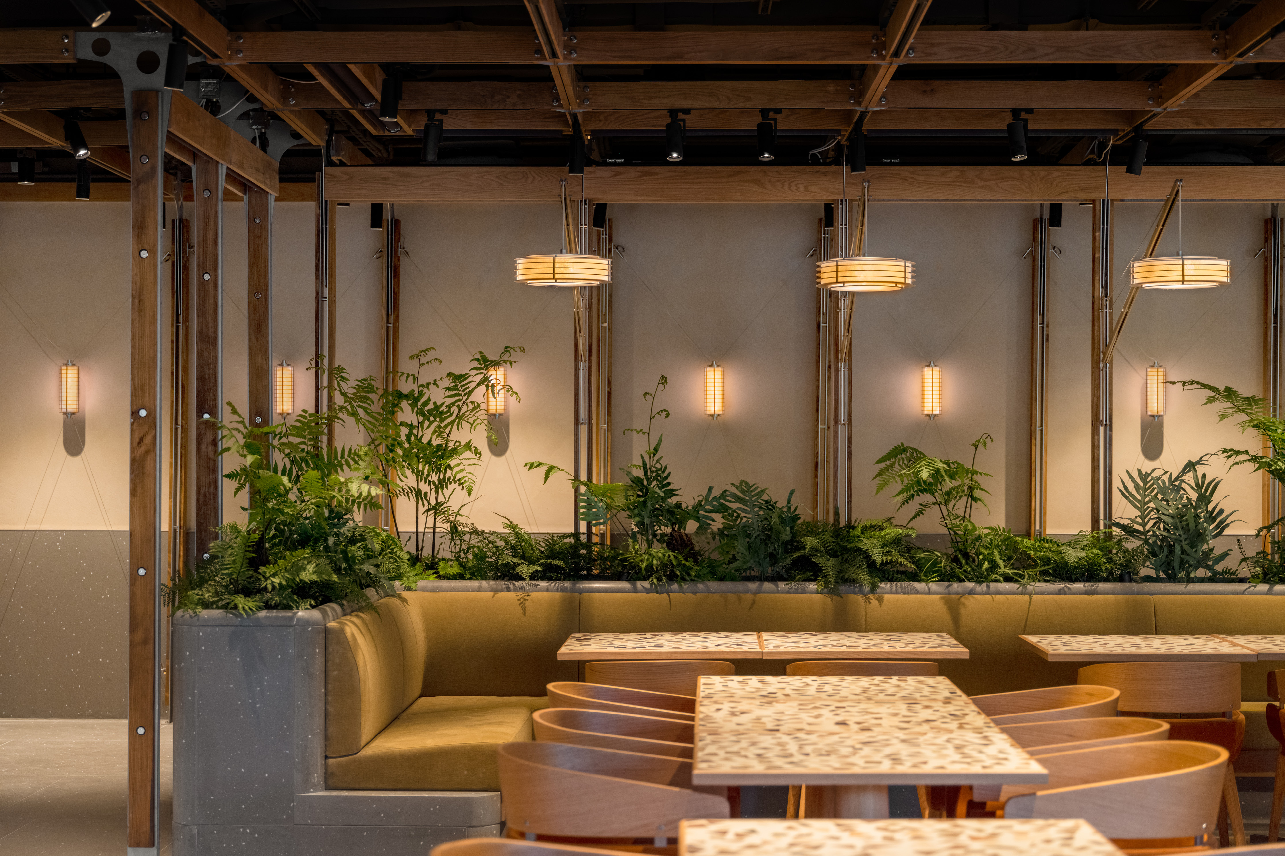
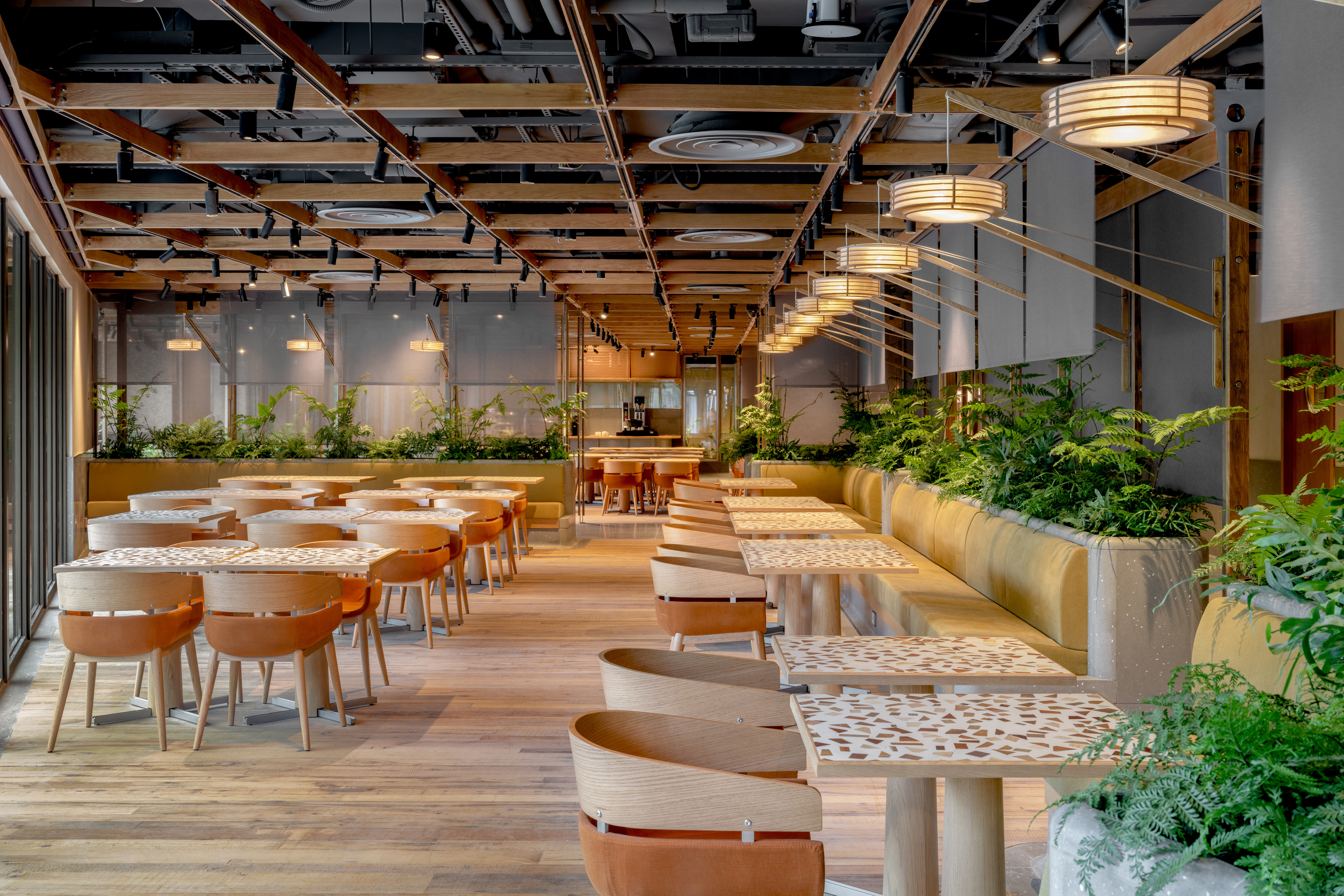
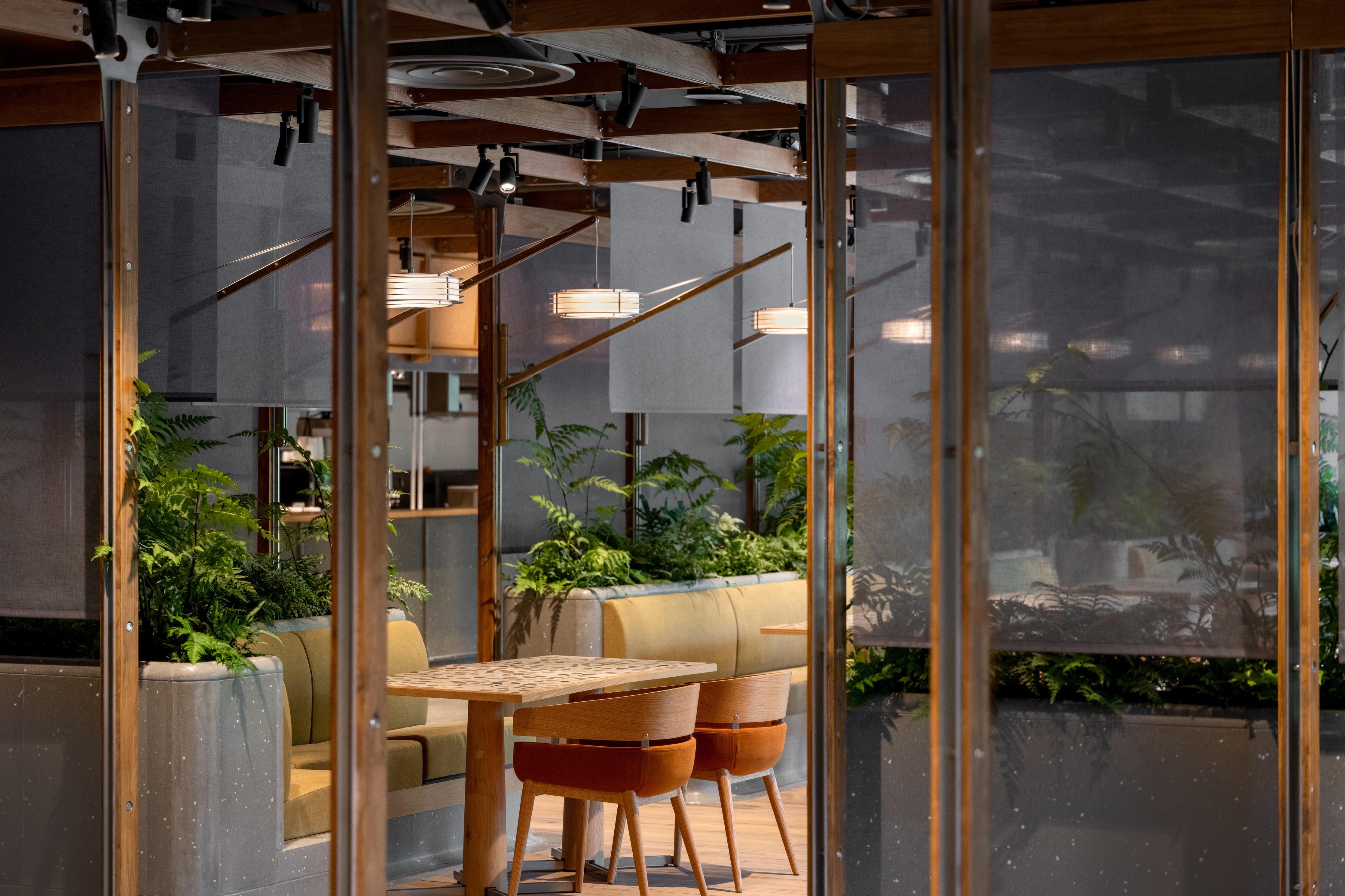
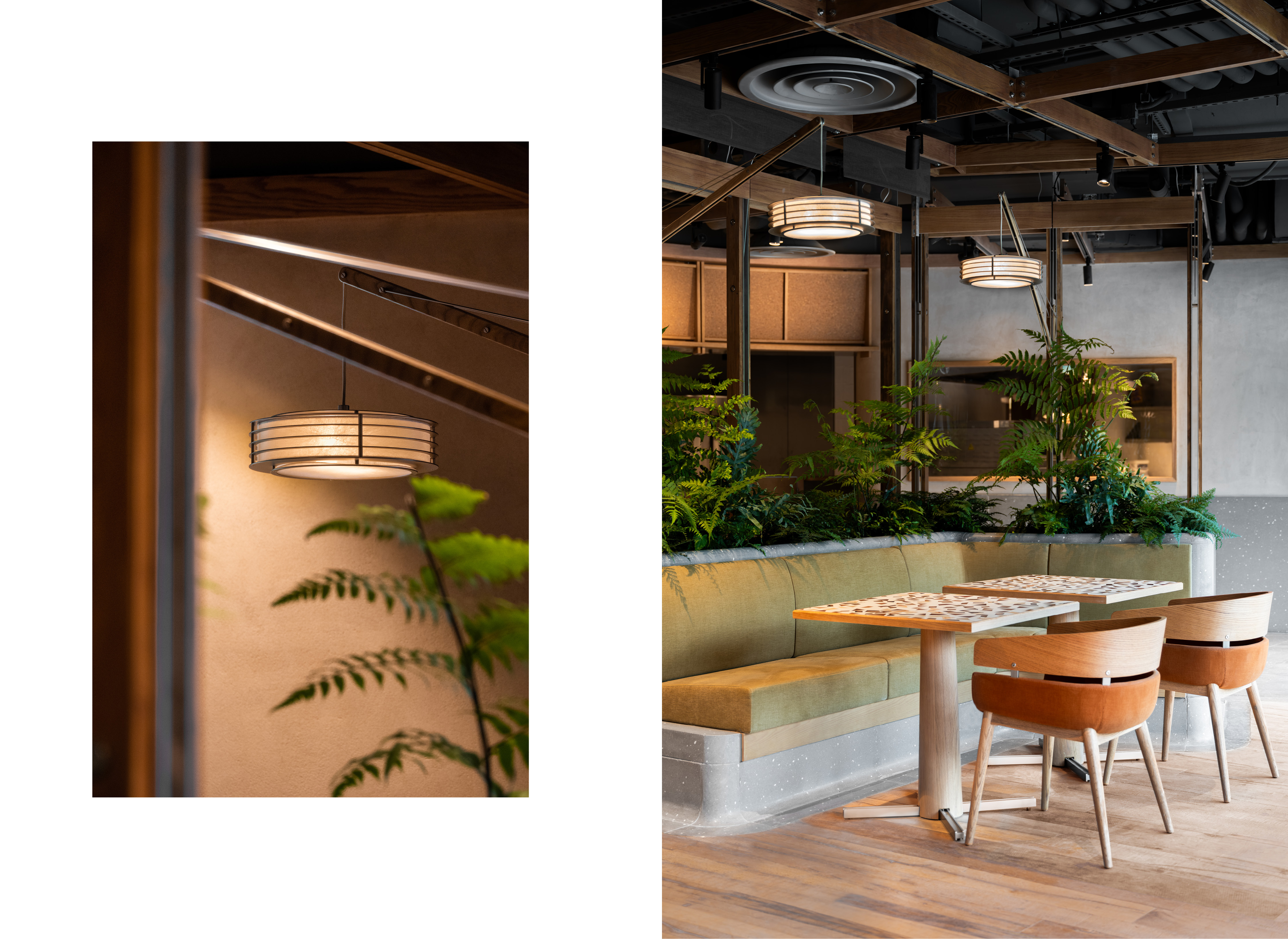
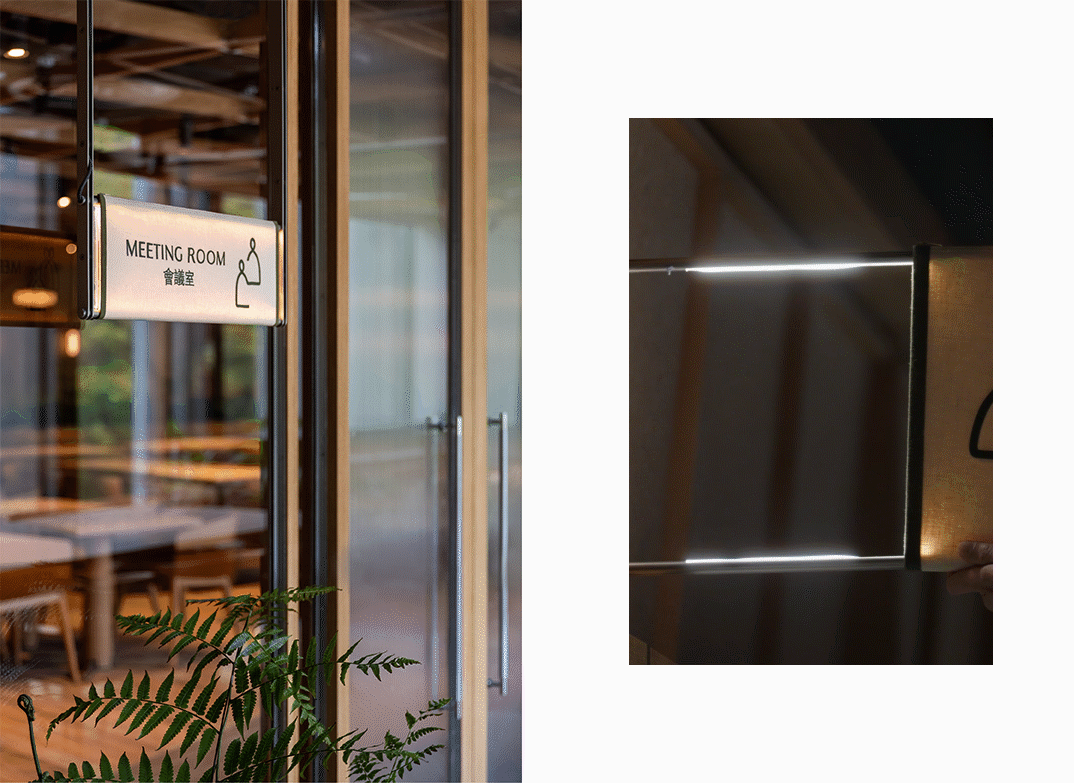
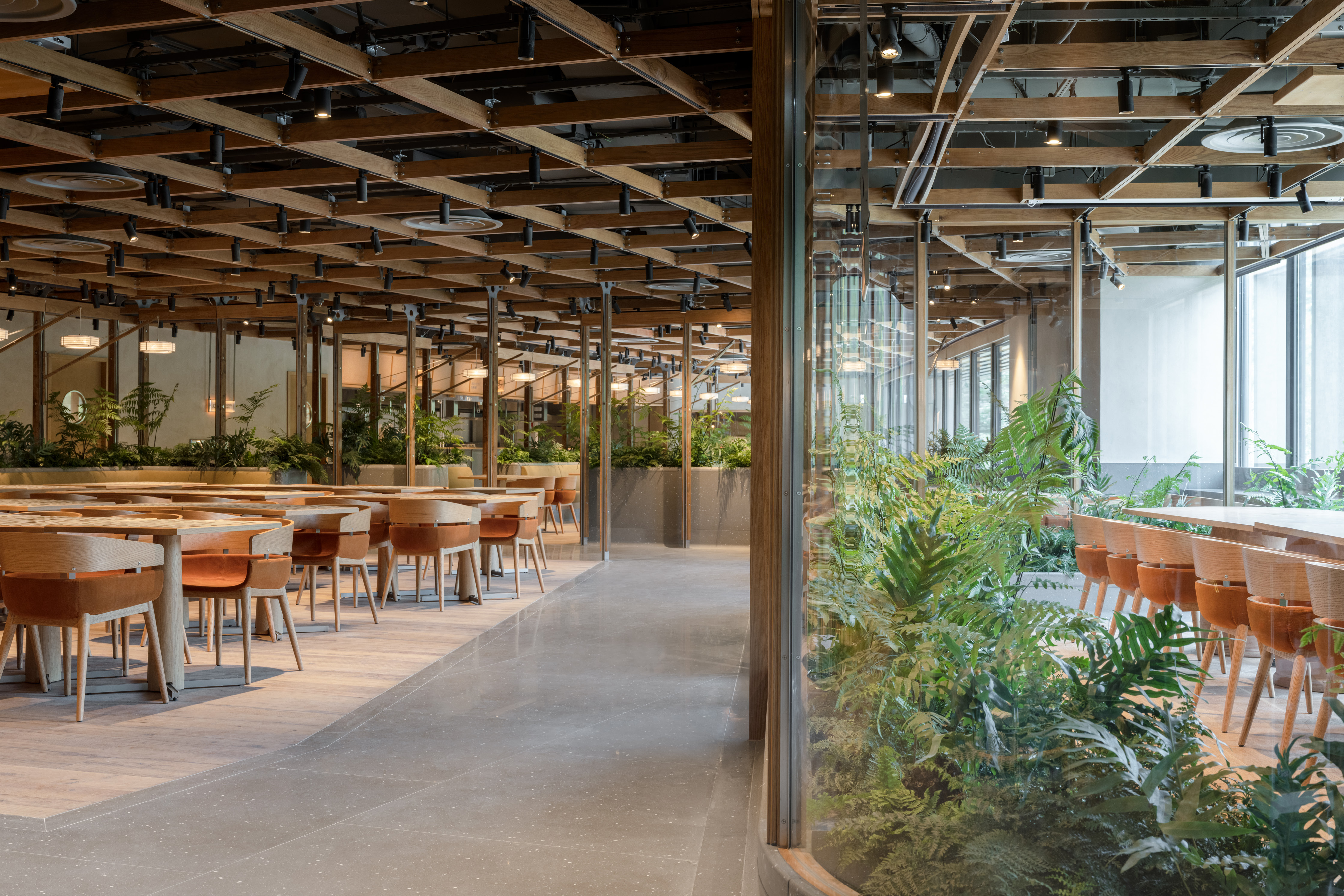
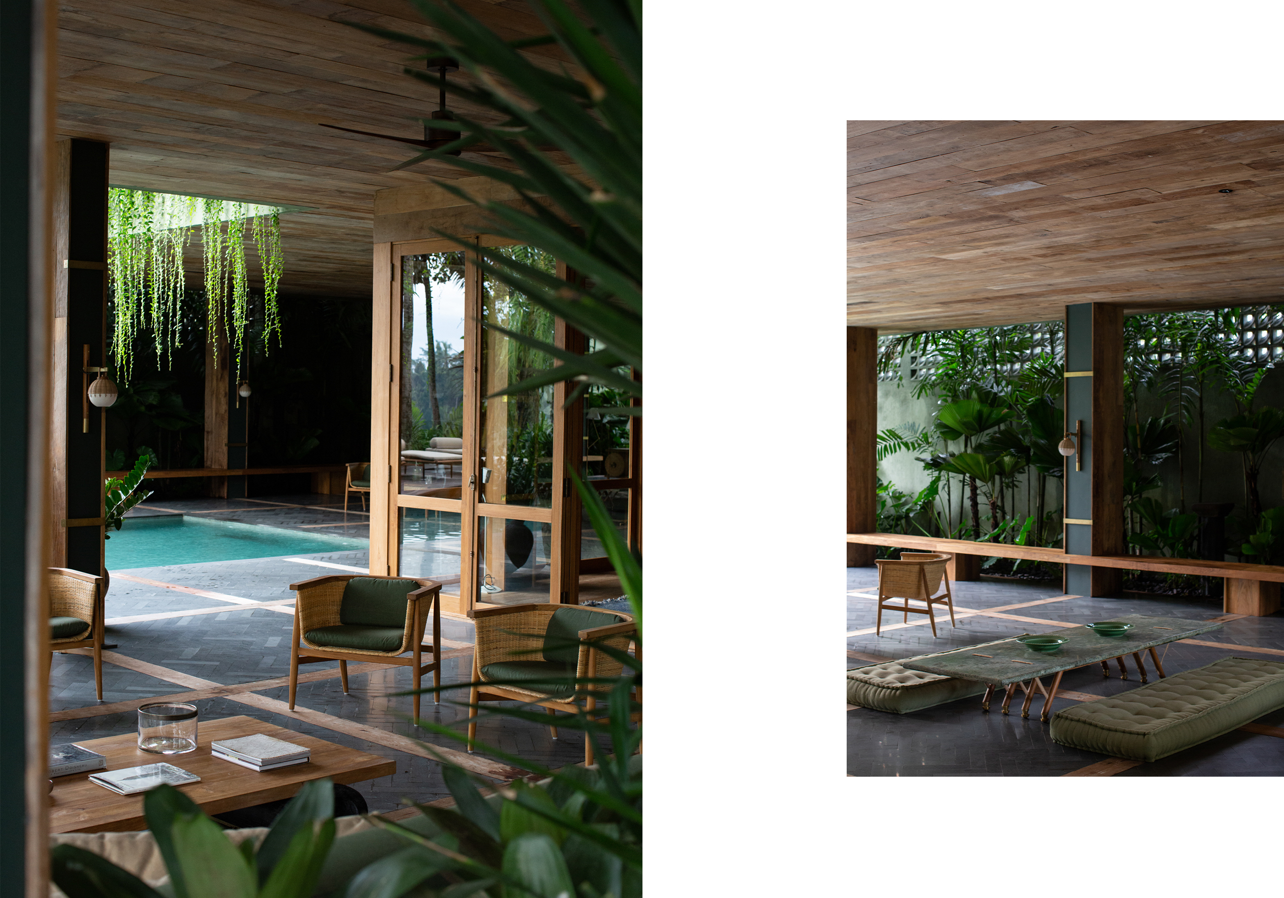
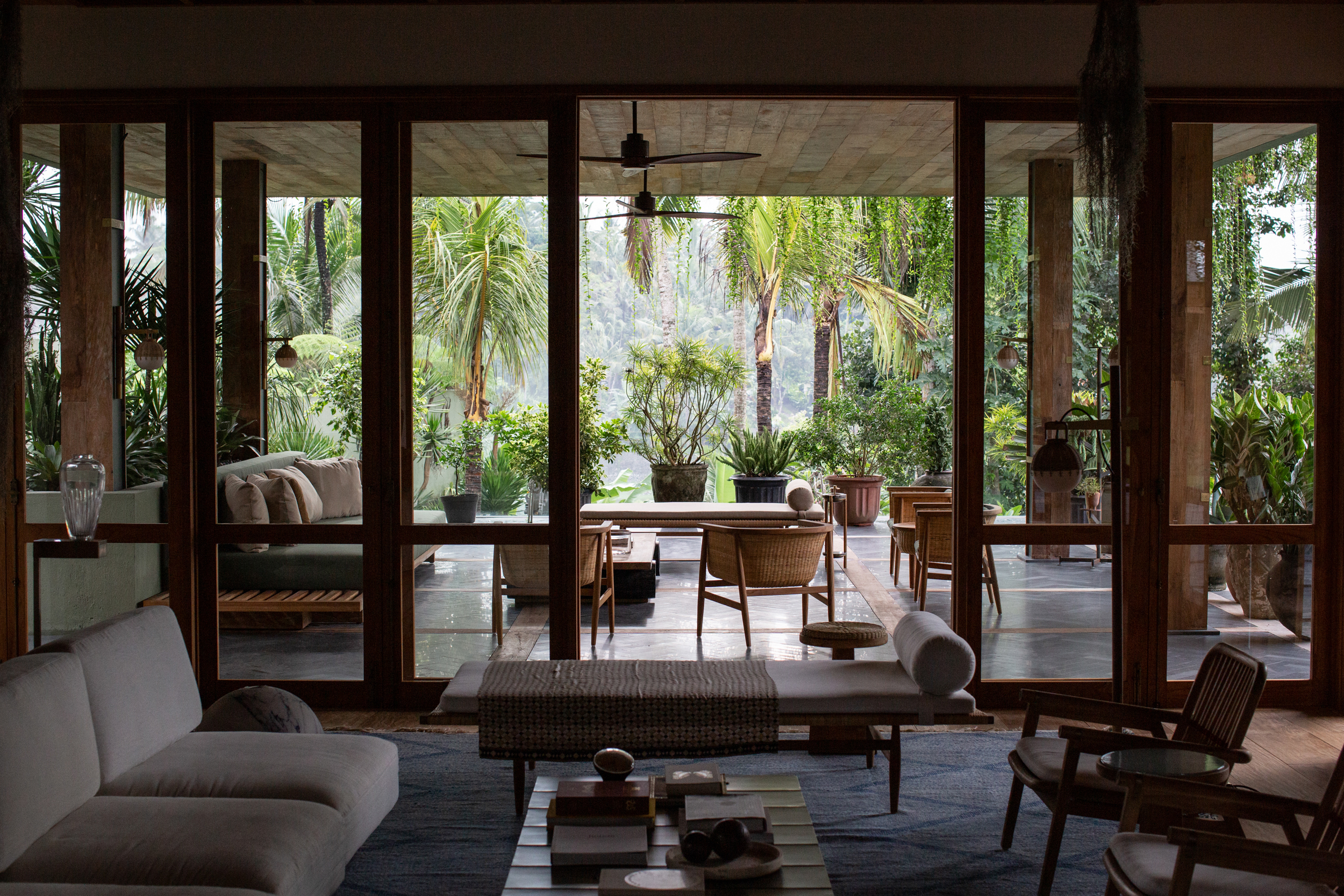
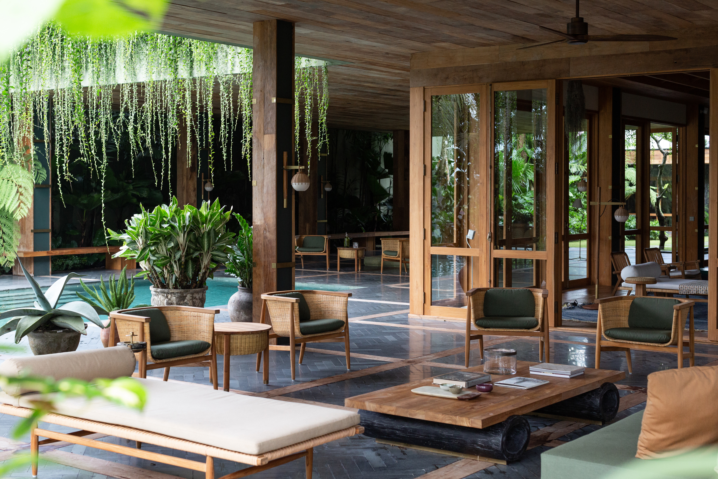
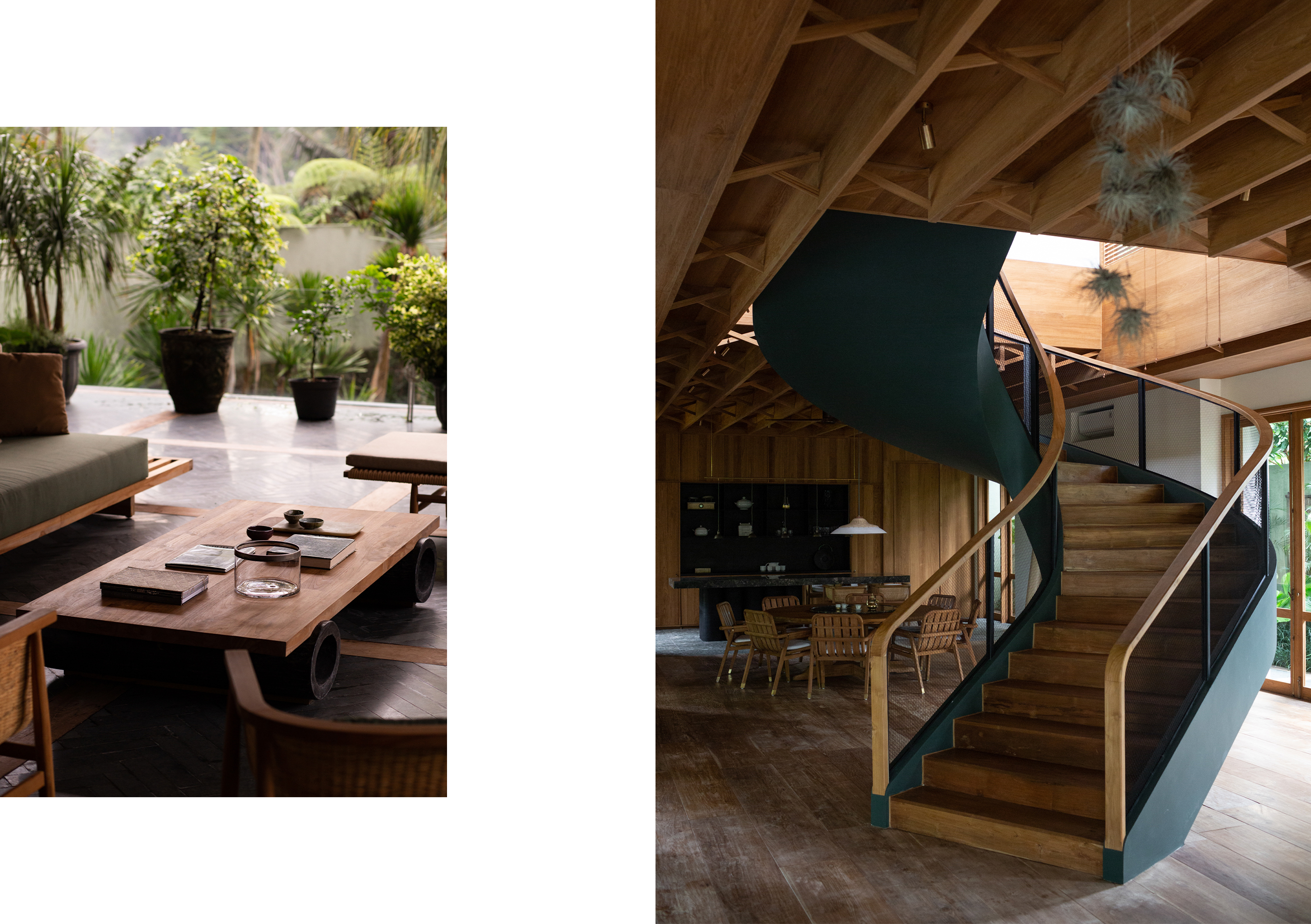
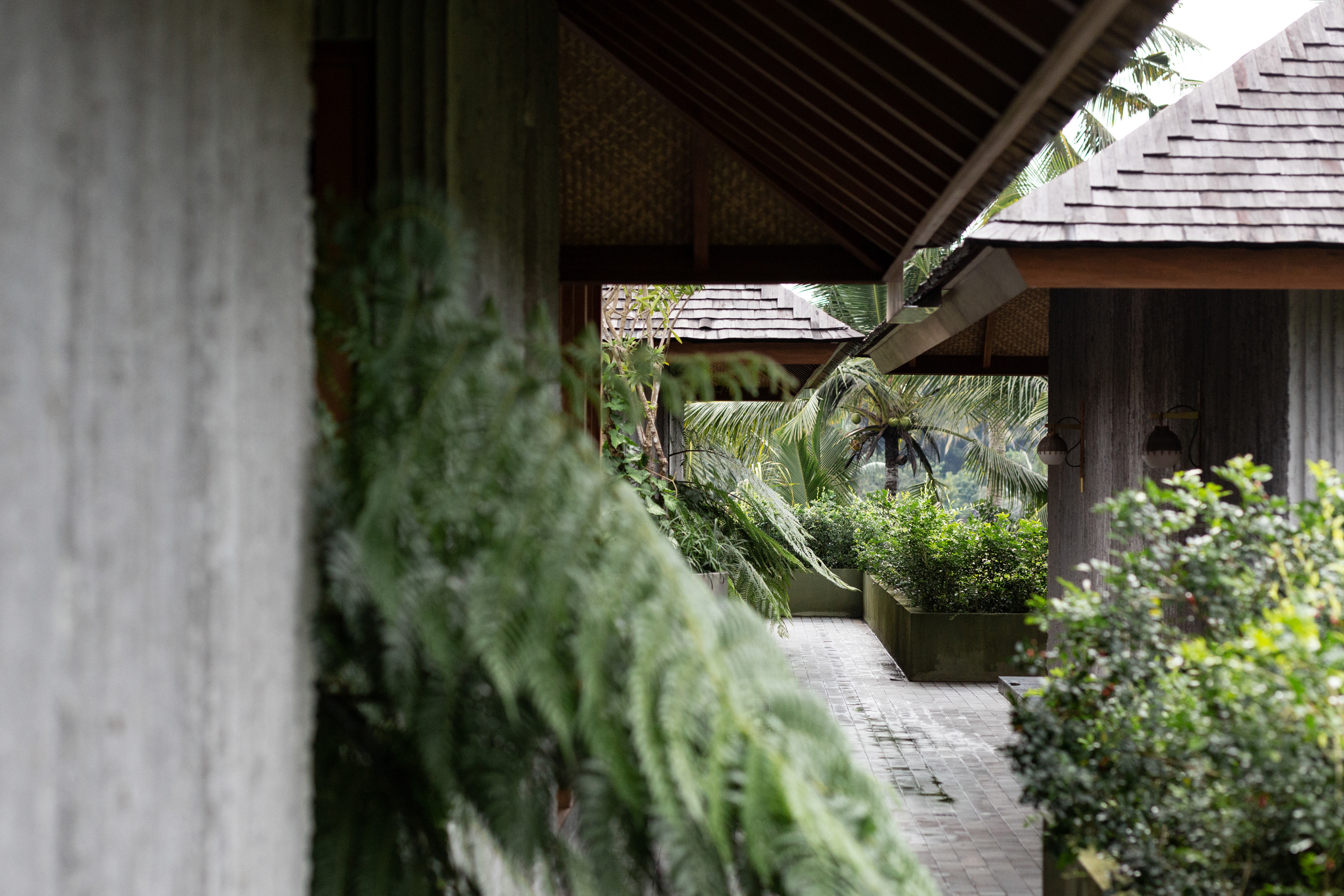
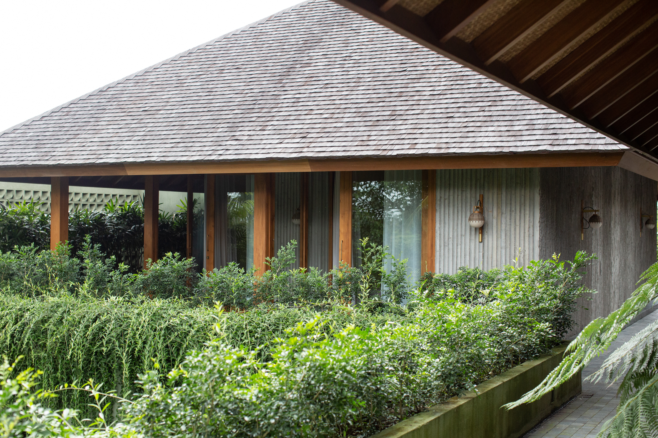
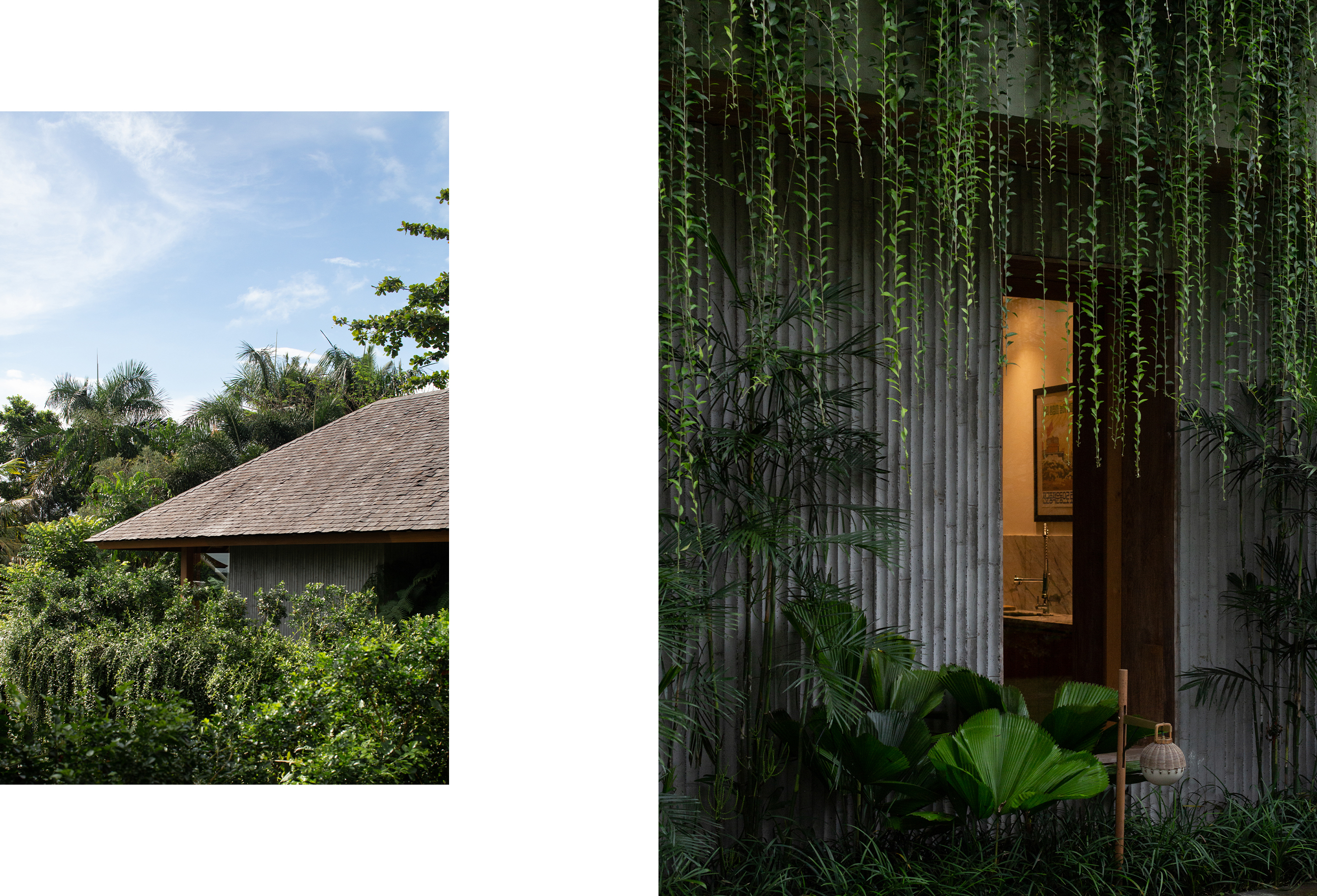
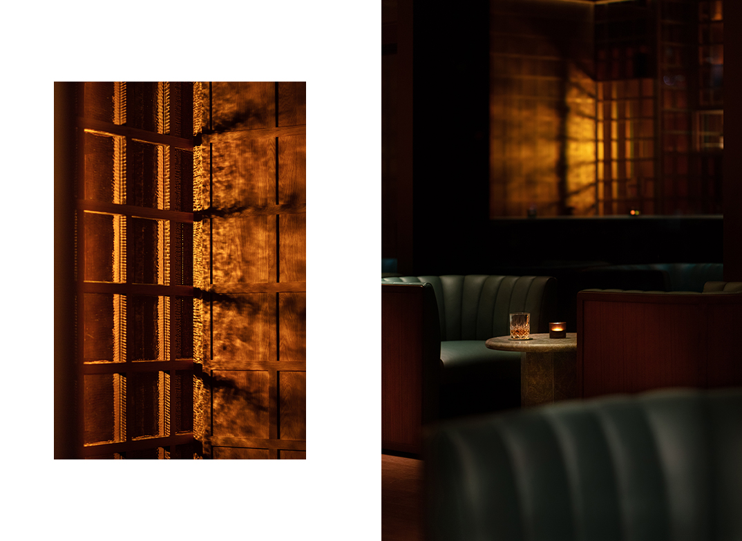
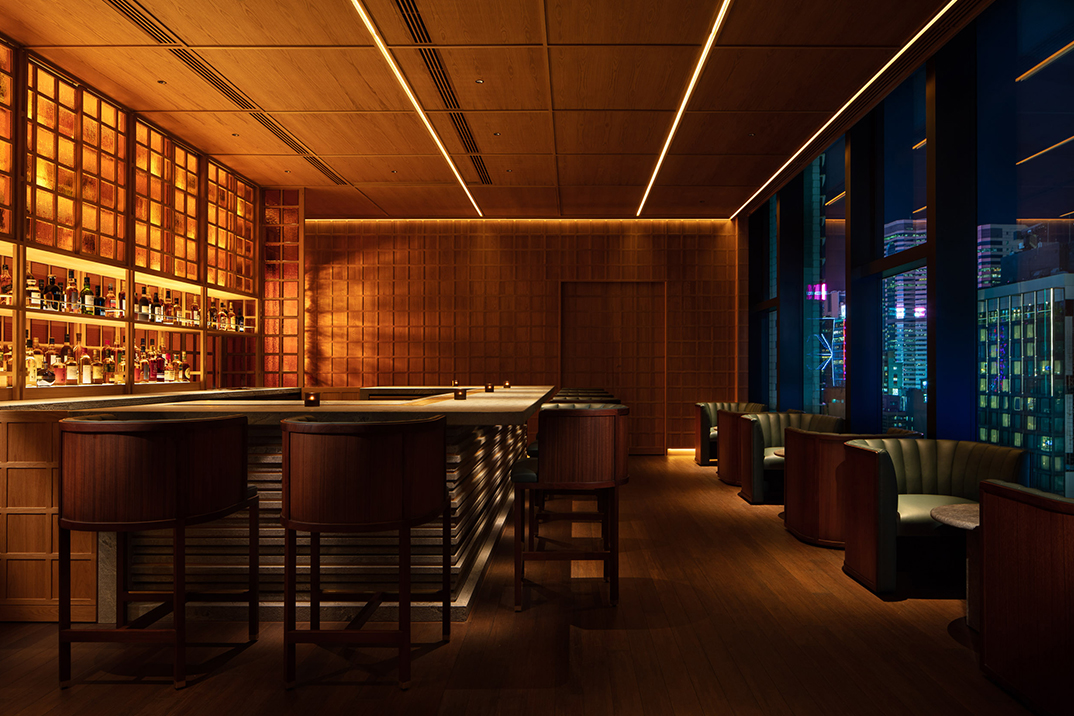
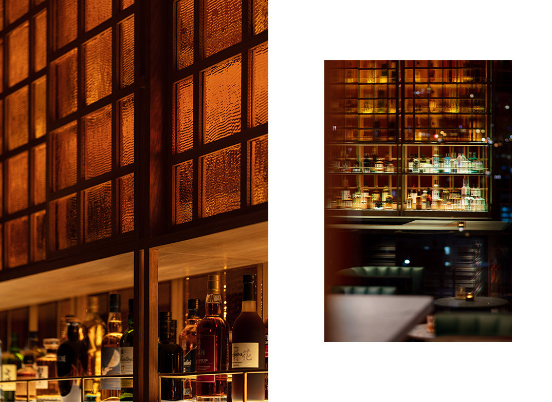
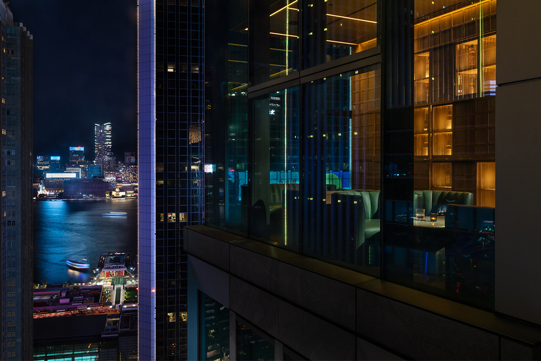
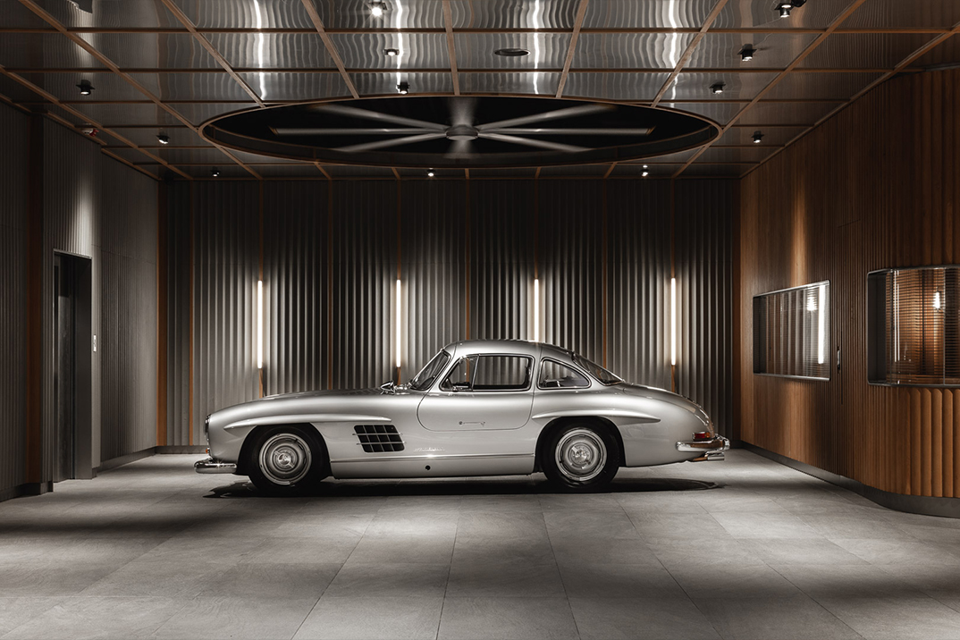
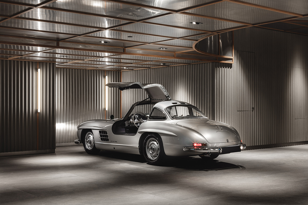
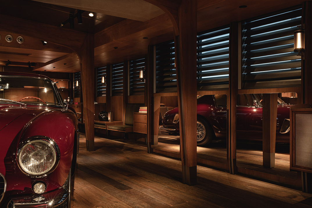
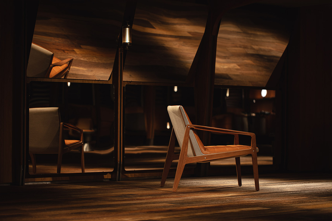
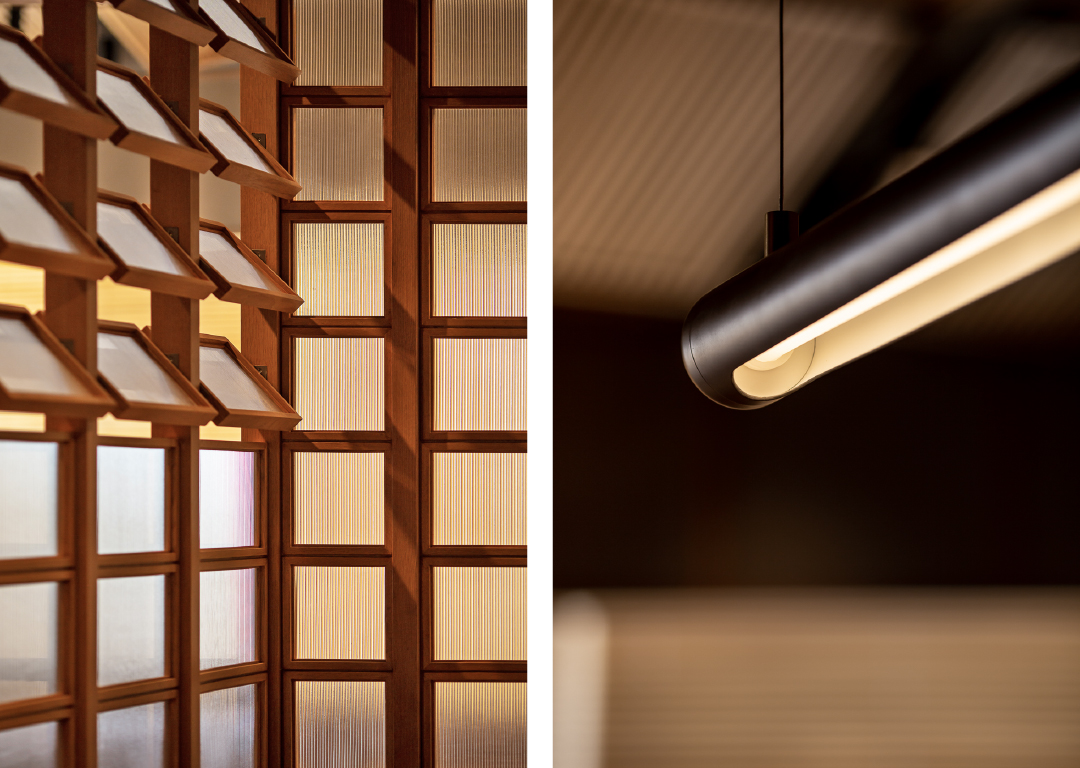
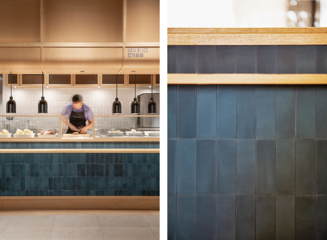
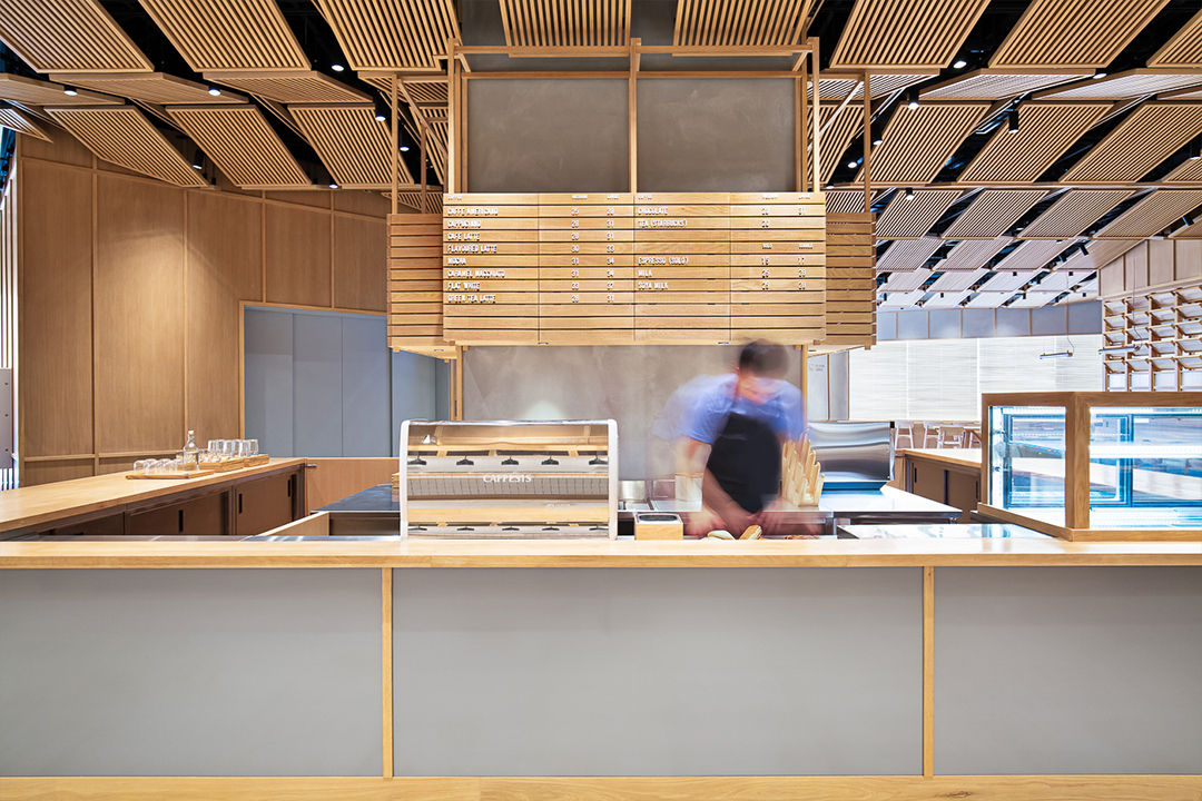
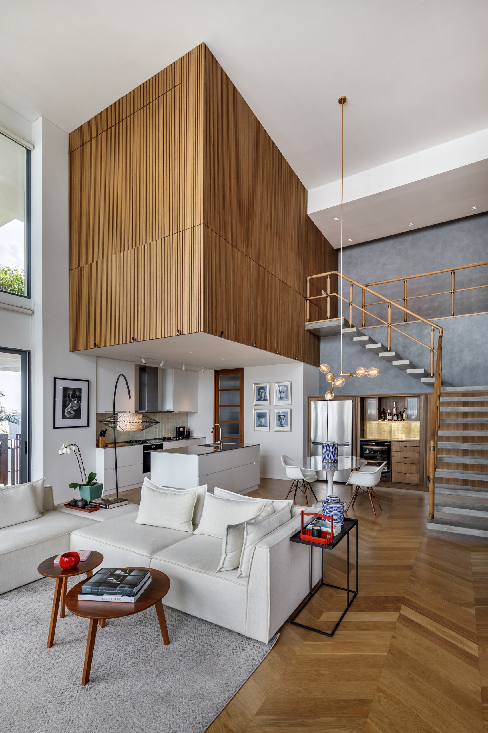
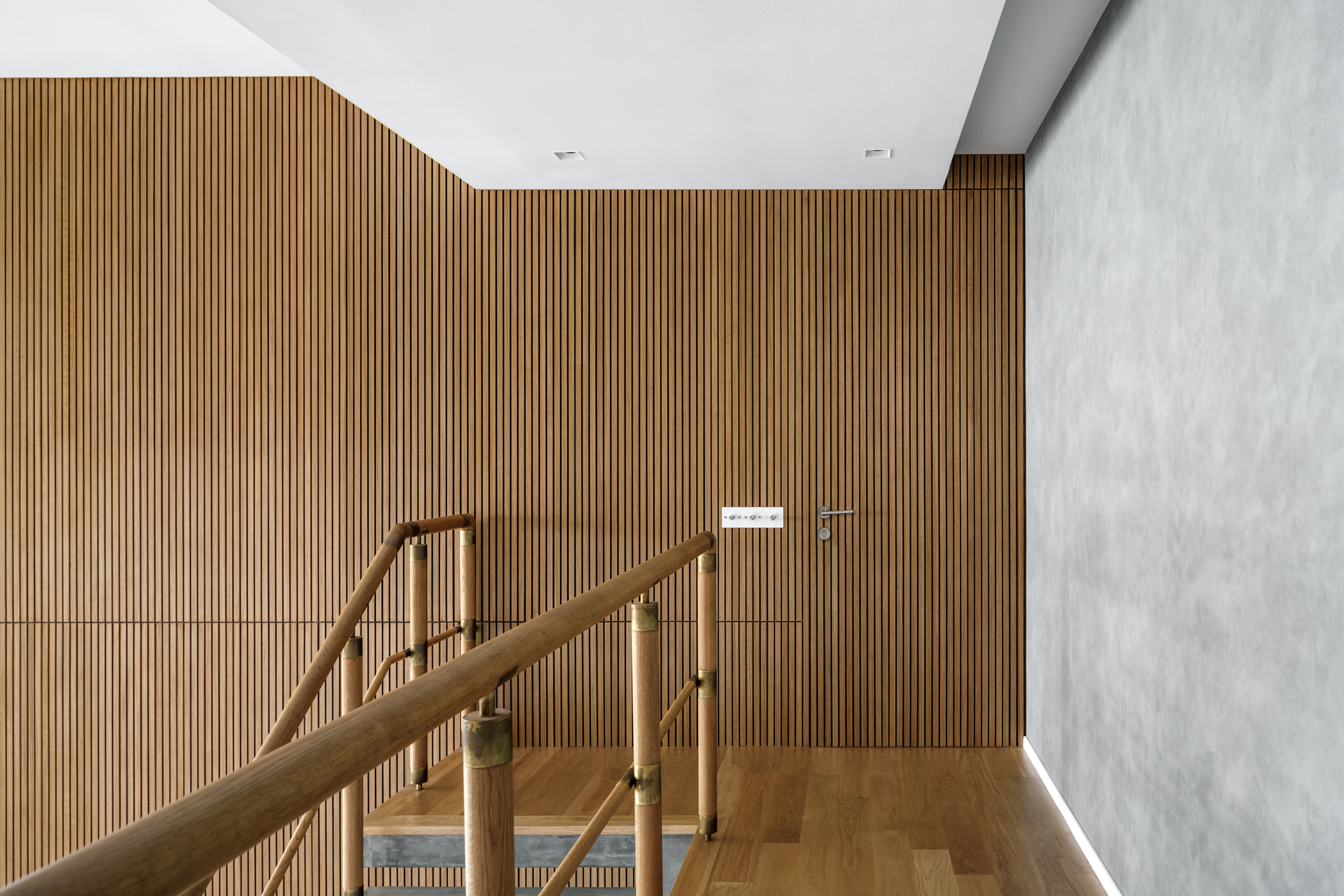
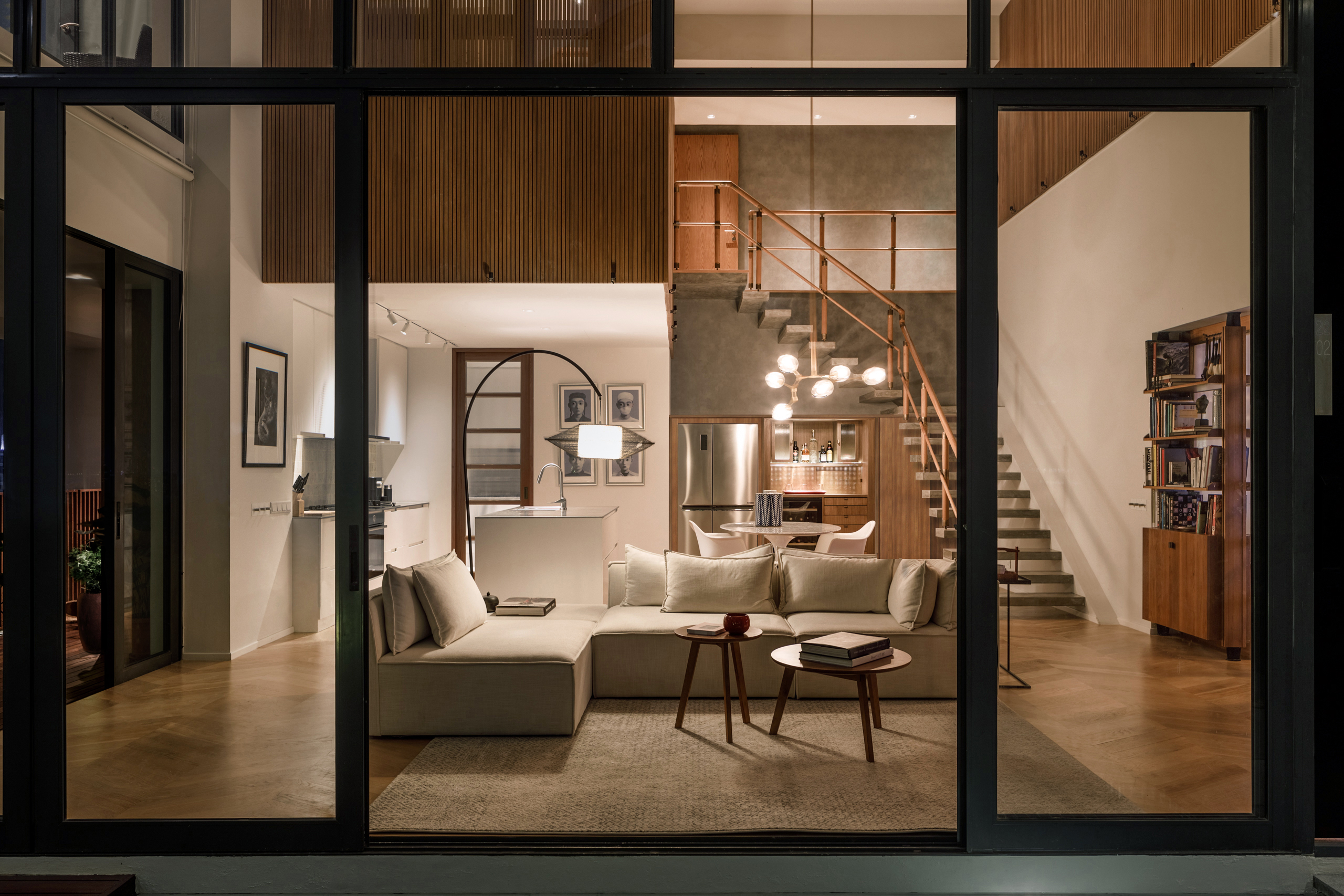
the design transforms a compact layout into a layered volume. soft daylight filters through glass bricks, illuminating shared spaces while maintaining privacy. a timber and fluted metal canopy anchors the interior, fostering connection while defining boundaries. lush terrariums add moments of natural tranquility amidst the drama of hong kong’s urban rhythm—an organic feature that doubles as a natural air filtration system.
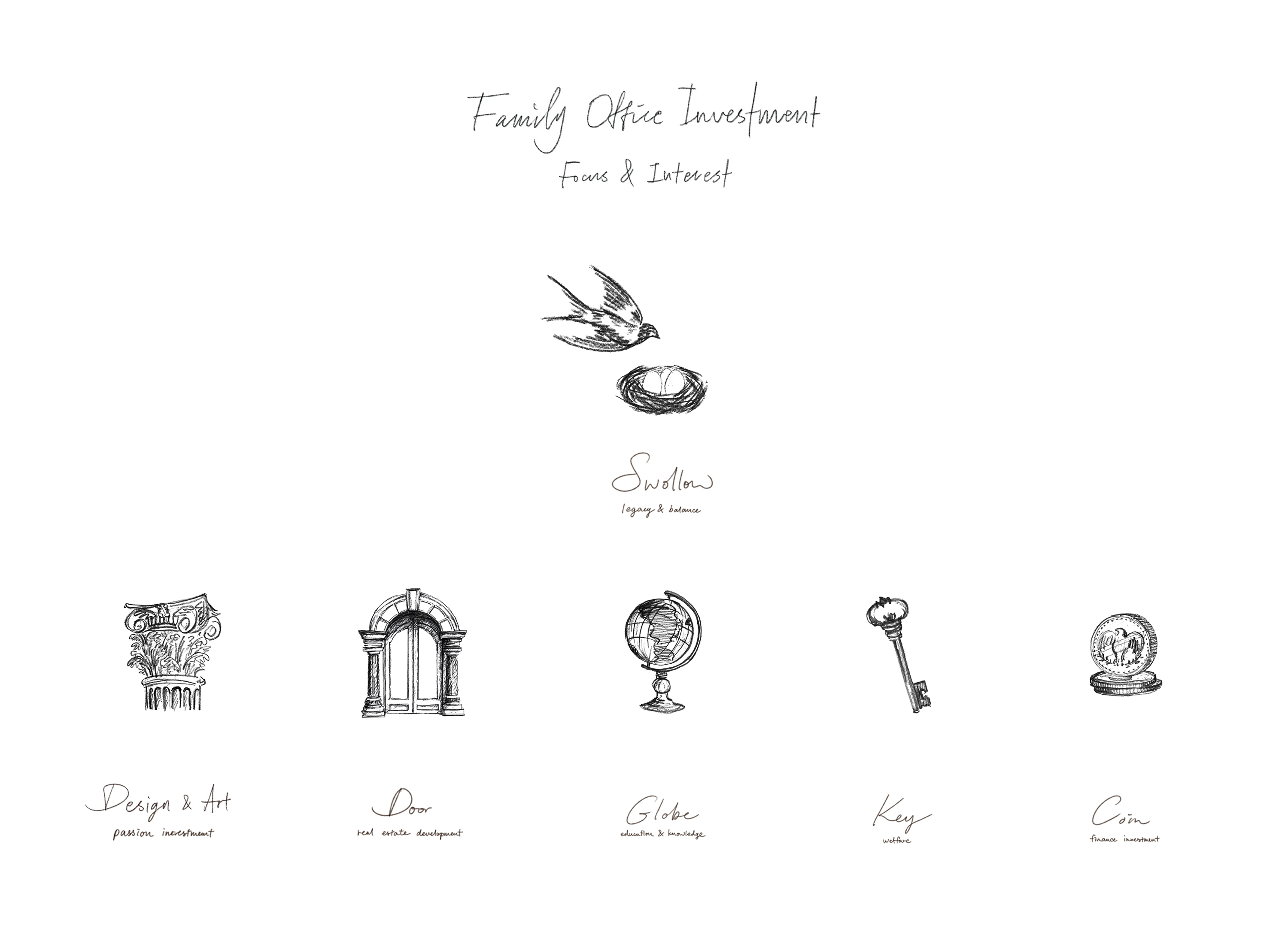
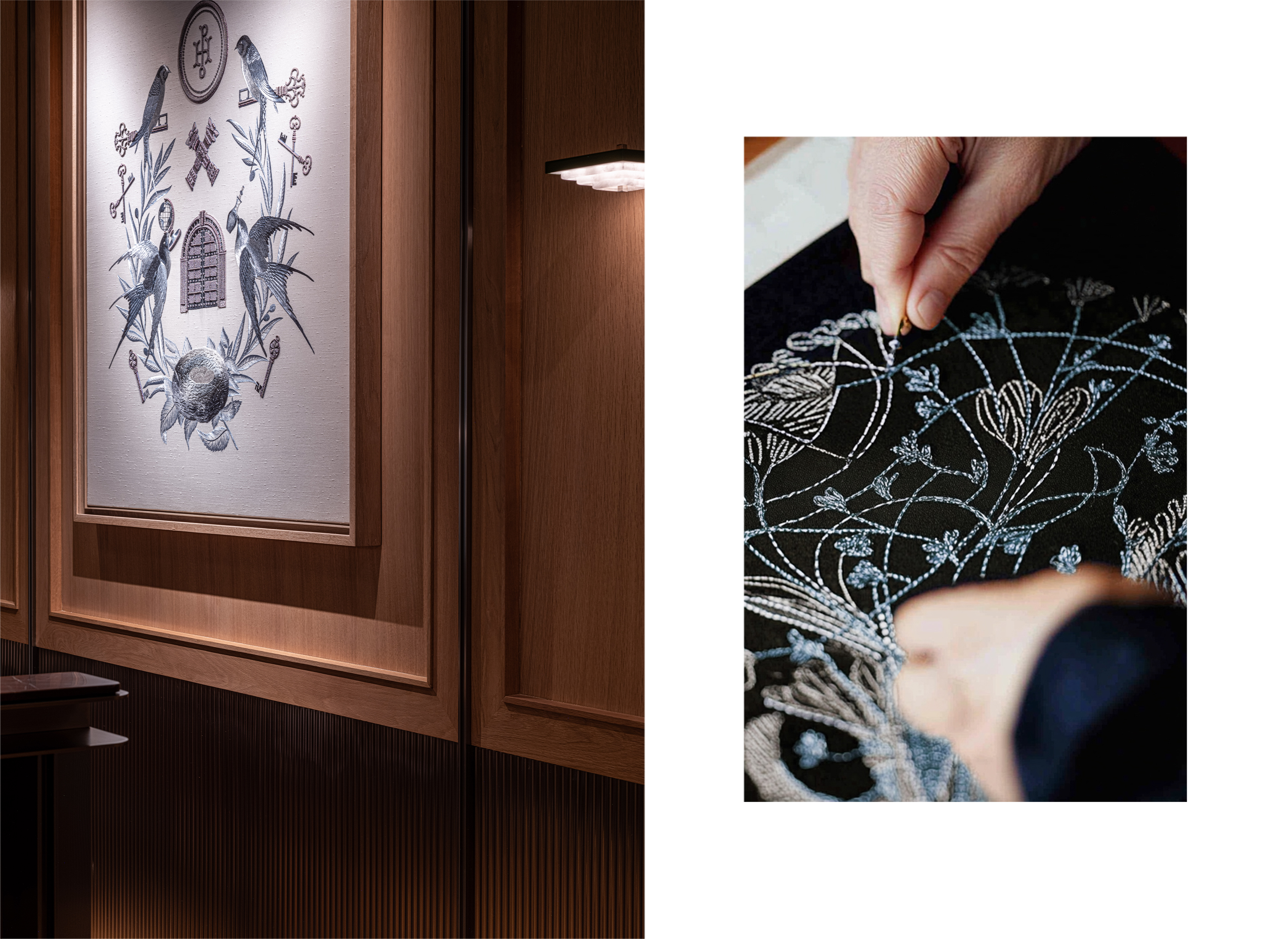
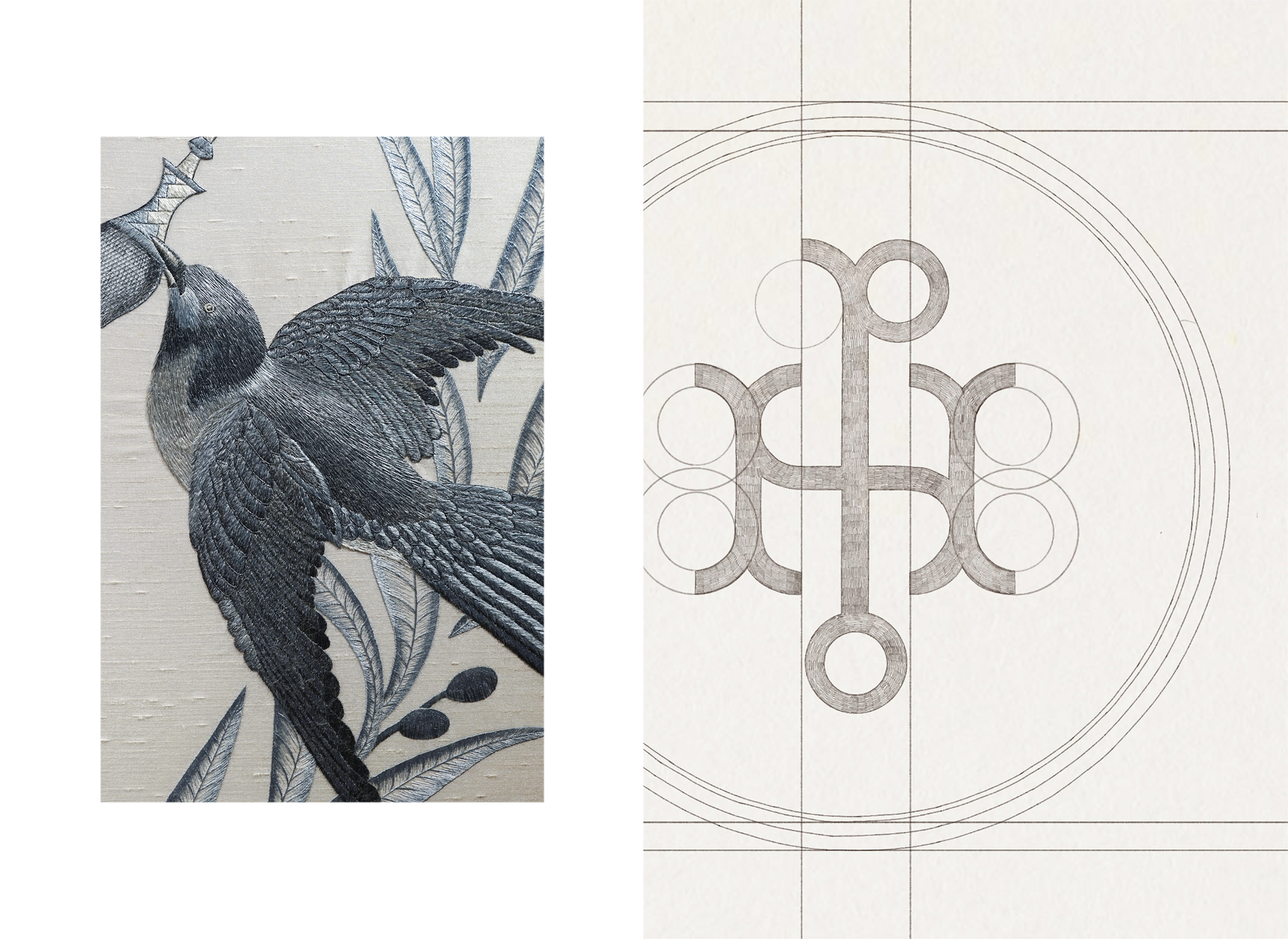
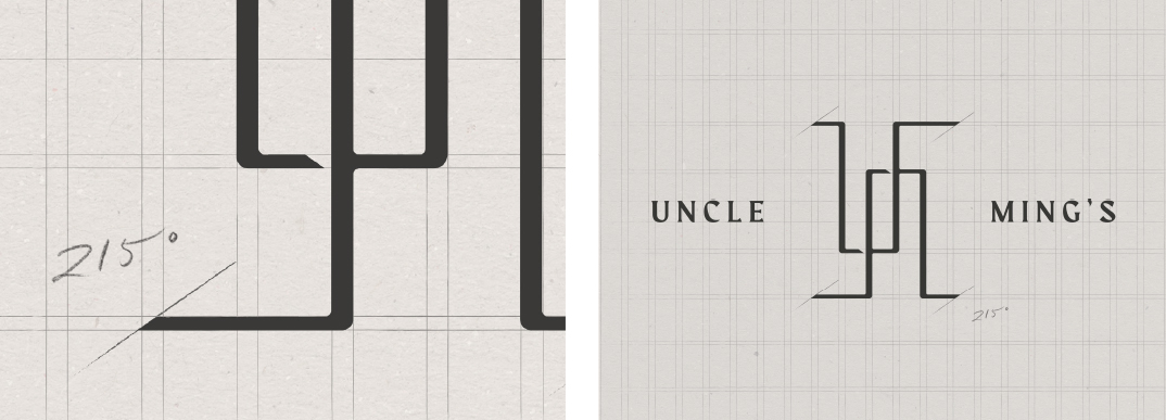
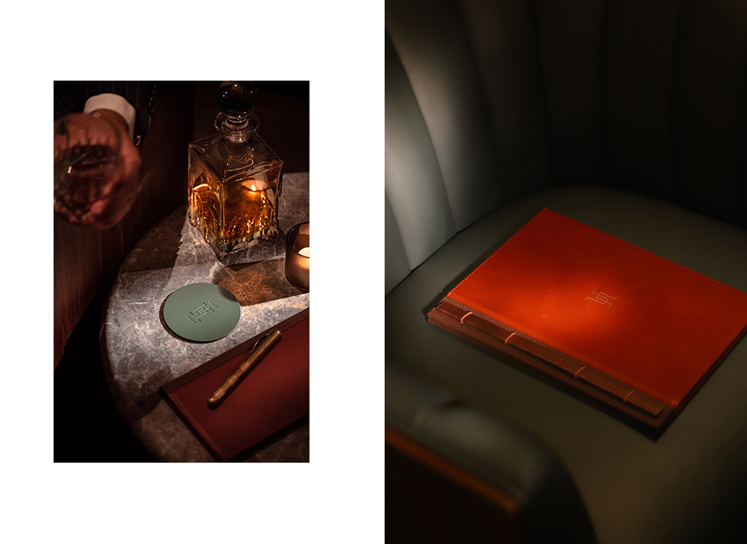
our identity work is expressed through an embroidered family crest: a textured emblem of swallows and cherished objects, symbolizing humility, wisdom, and legacy. this is more than an office; it is a living narrative—a timeless reflection of purpose, passion, and pride.