the year of the ox

admired for its indispensable role in china’s agricultural society, the year of the ox is a celebration of its diligence, integrity, and honesty. we designed five red packets to honour the five grains in ancient china – wheat, broomcorn, rice, foxtail millet, and soybean. wrapped in a packaging that embodies the ox itself, the packets are tucked neatly into a blizzard book mechanism that serves as a carrier for all the stories within.

the idyllic scenes depicting agricultural life are set against the backdrop of ge ba, an unassuming textile artform from the countryside. reminiscent of cubist paintings, the featured ge ba are from the personal collection of françois dautresme, a prolific art collector who amassed over 7,500 items during his 35 years of travel, exploration and discovery in china, and more notably, the beloved and inspiring uncle of substance’s founder maxime dautresme.

aki hotel


accor hotel’s m gallery is a storied collection, boasting over 100 boutique hotels, each with a unique tale to tell. among these exceptional properties is aki hong kong, a giant prism nestled between the low-rise historical buildings and towering skyscrapers of wan chai. it’s a place to pause amid the hustle and bustle of the vibrant neighborhood, offering a quintessential modern hospitality experience with a zen hideaway, a stark contrast to the never-sleeping environment of the bustling commercial area.

despite the district’s intensity, aki hotel’s identity design language responds with a need for calmness, reflecting a guest’s experience once they connect with the building and its interiors. the graphic language draws inspiration from the japanese boro, a textile art form that grew out of medieval necessity (ぼろ), where history is woven into a cultural statement. reinterpreted as a contemporary narrative, the identity system is a tactile vocabulary that unites an atmosphere, a metropolis, and the people. it’s an expression of human resilience, a tool that engages the audience with its cultural and geographical context. the pattern suggests a map, highlighting its location, the hotel’s building attributes, geometry, and materiality, as well as a collection of touchpoints that stimulate thought and dialogue, provoke response, and enhance understanding of its context.


grand majestic sichuan

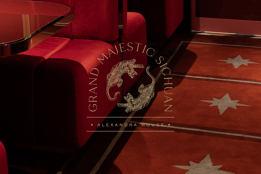
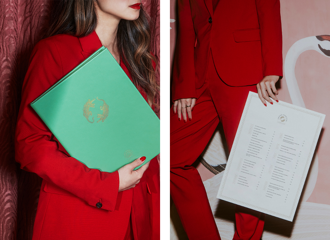
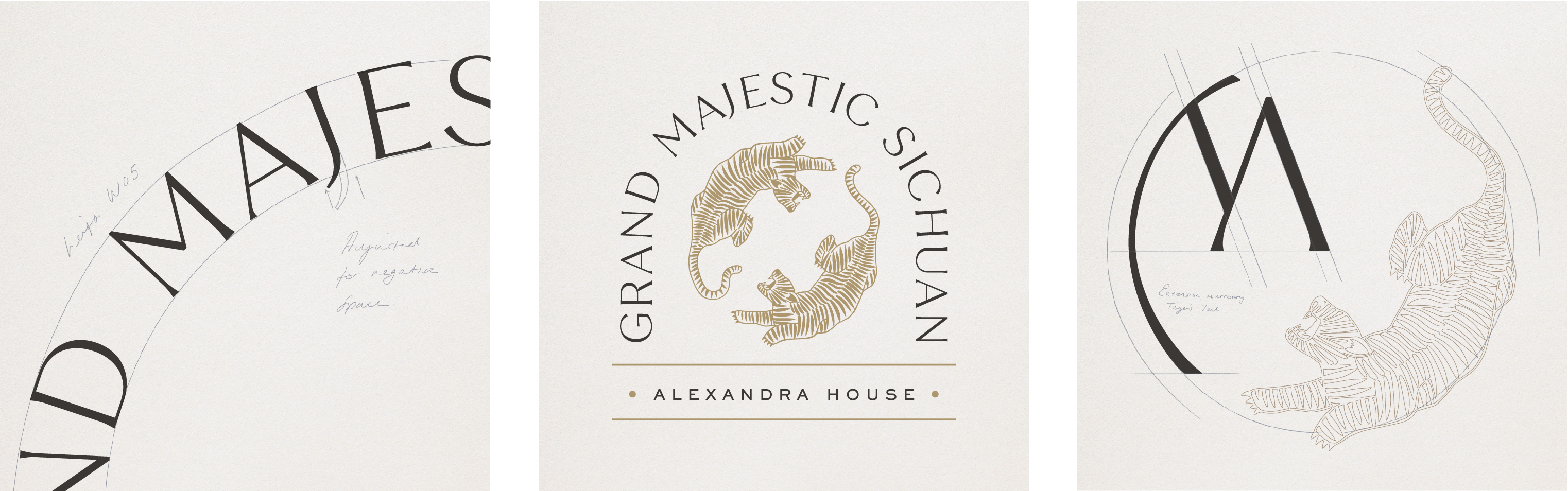
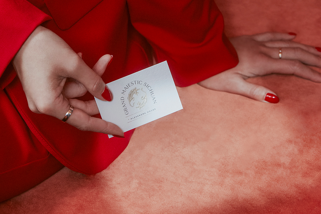
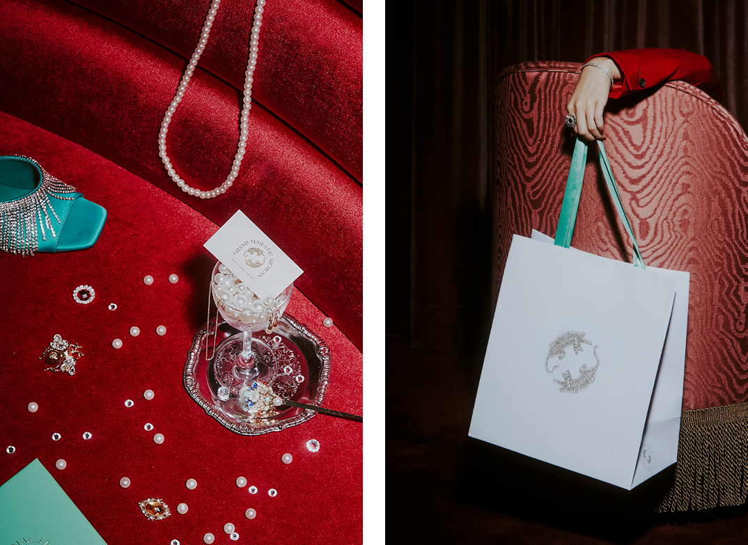
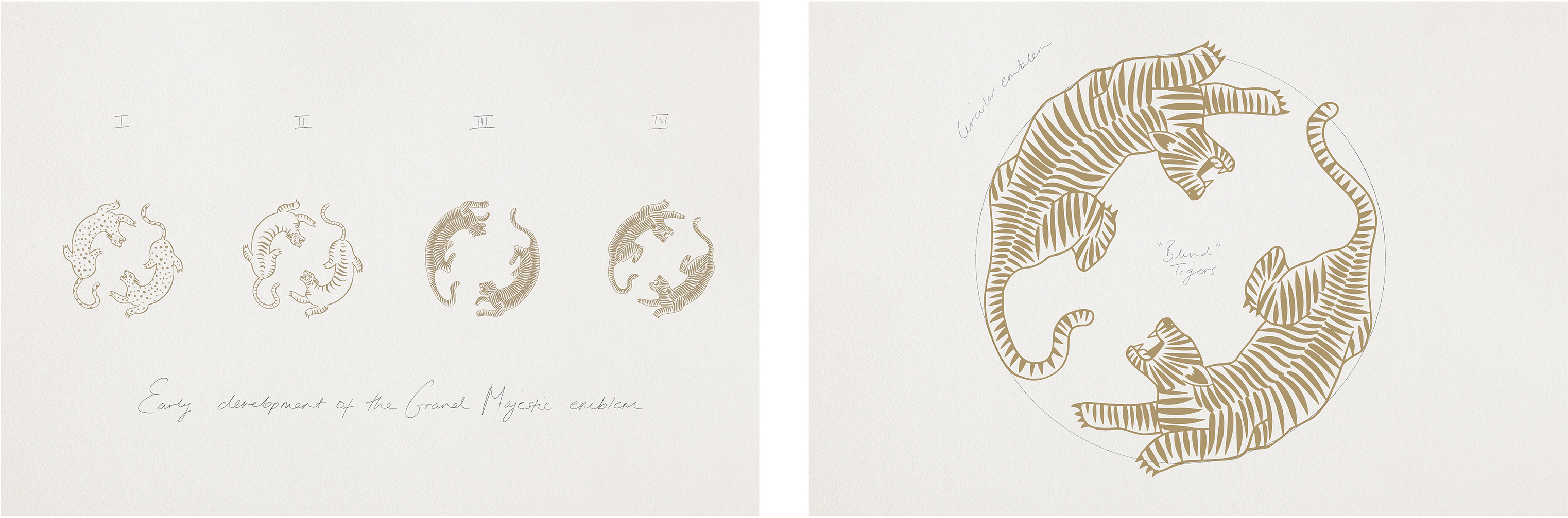
defined by seductive extravagance through a contemporary filter, grand majestic sichuan is a space of glamorous escape. blind tigers on the emblem nod to the exclusivity and freewheeling spirit of the roaring 20s. it is a tantalising lounge for the high-flying younger generation with a sophisticated eye for modern art in a classy yet high octane setting.

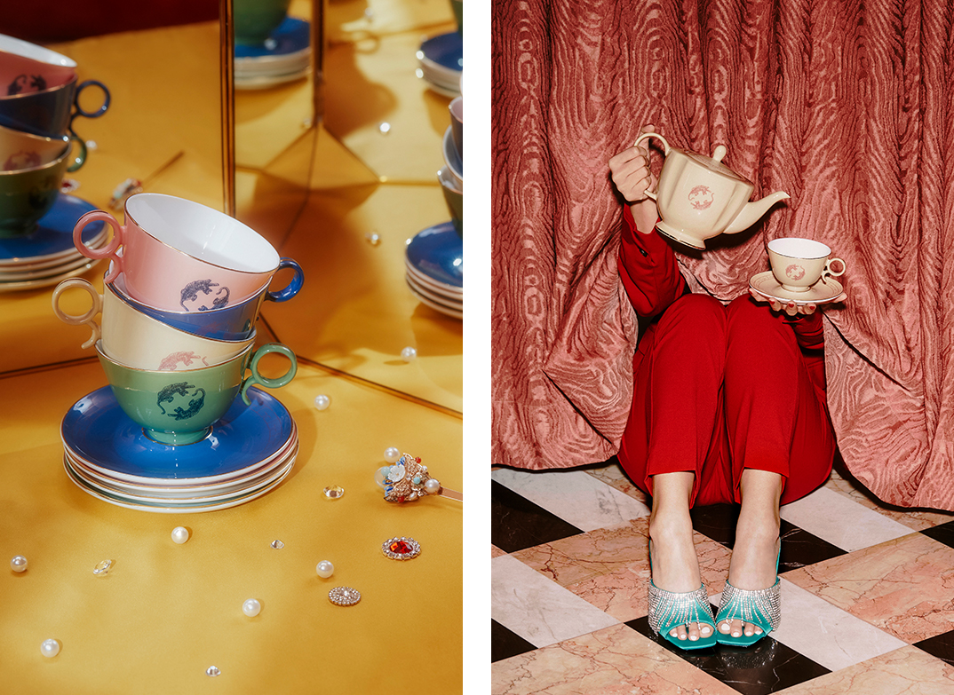
in this irresistible experience, connoisseurs will indulge in spicy sichuan classics, reinvented, all served in whimsical tablewares as the perfect canvas for this visual feast. more is more in this maximalist eatery, a sensory dining experience where the opulent interiors and bold flavours are in an intoxicating two-step.

the year of the pig

the year of the pig carries a symbol of “abundance”. this porky zodiac brings you prosperity, fertility and plenty of luck. to send blessings to everyone in the coming year, we designed 8 auspicious red packets that illustrate an array of fortunes treasured in the pig’s full belly: harmony, morality, happiness, longevity, love, peace, success and wealth. gold stamping and spot uv finishing was applied to bring a sense of crafted opulence with each packet individually hand wrapped in ribbed kraft paper, ready to be gifted to friends and family.

photographs by: judy chen