uncle ming’s

steeped in the spirit of the city, a space that creates a dialogue with the surrounding architecture through a geometric language laying the foundation of a spectacular cityscape. like a house of light suspended in the sky, uncle ming’s guides people towards its trove of fine whiskies, taking guests on a journey of discovery as they unbox the treasures within.

formed by simple, rectilinear shapes and realised through soulful materials, the den unfolds as an enigmatic cubic volume. light is refracted by rippled glass, detailing the walls with shadows and slow, orderly movements that exalt into a quiet allure. minimal yet sumptuous, the spatial experience encapsulates the essence of the city’s polarity.

craftsmanship is celebrated through raw, tactile executions of the brand identity, and a logotype that is a typographical expression of joinery – a hallway between an architectural drawing and a mysterious signature. above the dusky skyline, amidst a luscious bouquet of oak and smoke, spirited conversations and aromatic encounters await.

the library

as a curated library of vast automotive treasures, it is designed with the intent of strengthening the thread that cultivates the avid spirit for driving. fuelled with endless motion and the purest exhilaration, this place introduces an aura of stillness. capturing moments of excitement within a split second and honouring it in all its glory.

home to priceless cars and memorabilia, we aim to celebrate its air of history and unfold the fruitful narrative within. this notion has formed the backbone of our design approach and has allowed us to communicate the beauty of automotive design into the details of the space. inspired by the mechanical nature of cars, we have opted to engineer the space with mobility design in mind. each component and part that has been fittingly integrated within, can be easily assembled and disassembled to the user’s whim. deriving an unparalleled level of modularity, while maintaining an exquisite fit and finish.

our vision was to package this without losing the level of immersion we were seeking for. so we ventured out and experimented with materiality to craft a hall of infinite reflections, utilising polished stainless steel panels to create a visual journey that seamlessly plays with light and forms. exemplary of our attention to detail, we proceeded to recognise what is fundamental to the essence of a car. with cabinetry handles inspired by the ones adorned on a zagato and lounge chairs that pay homage to the ferrari dino, our design creates a platform to preserve the beauty of the past and celebrate the emotions of the future.

the year of the ox

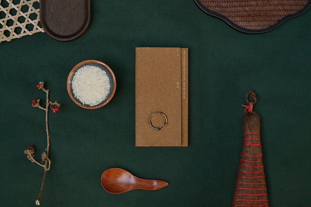
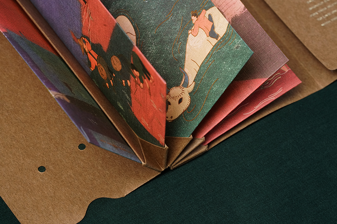
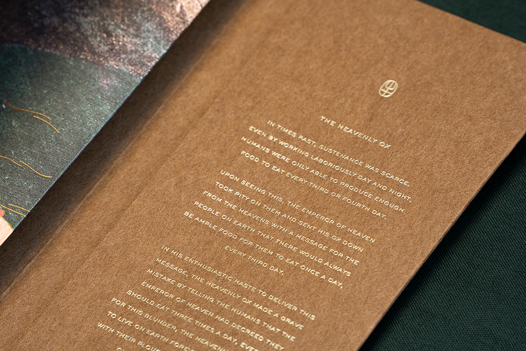
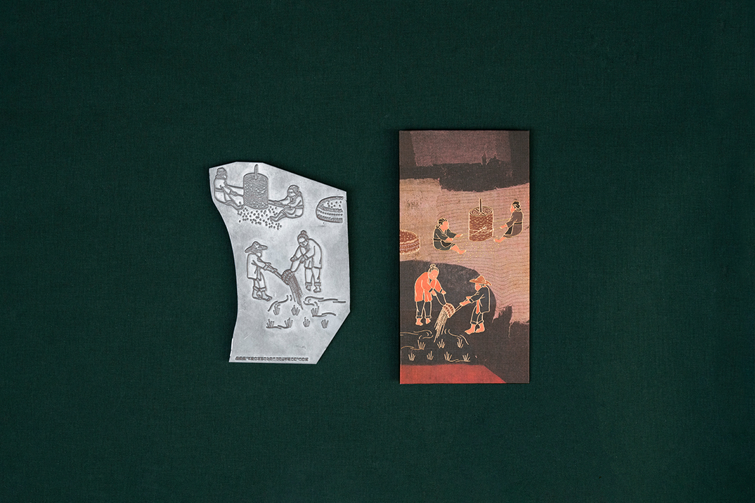
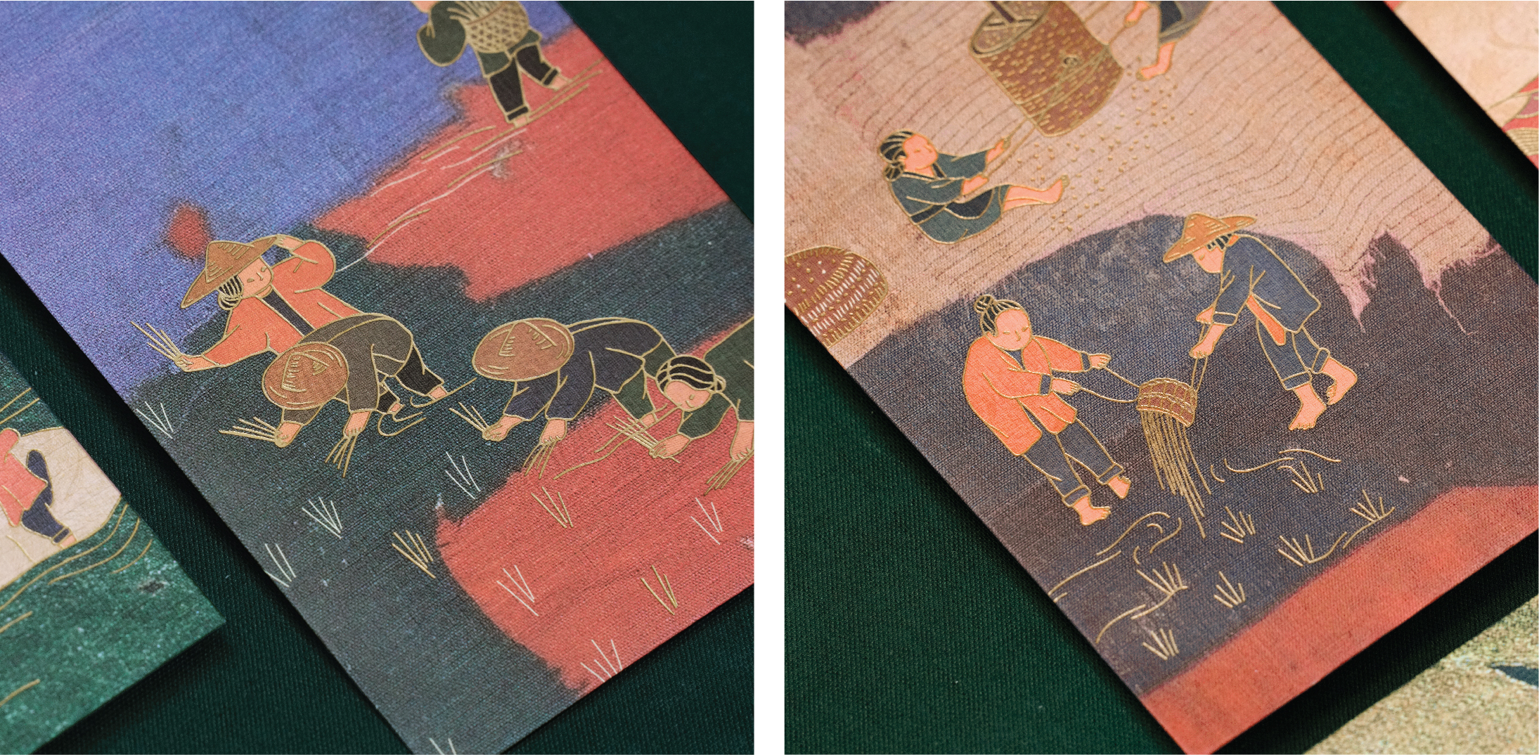
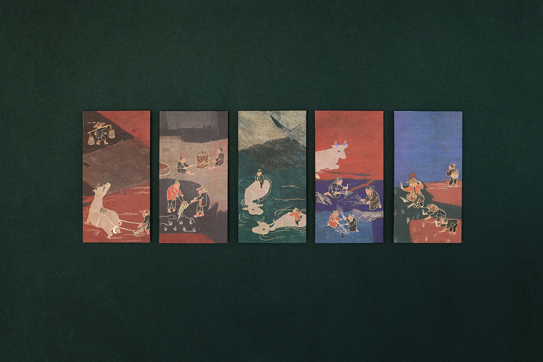
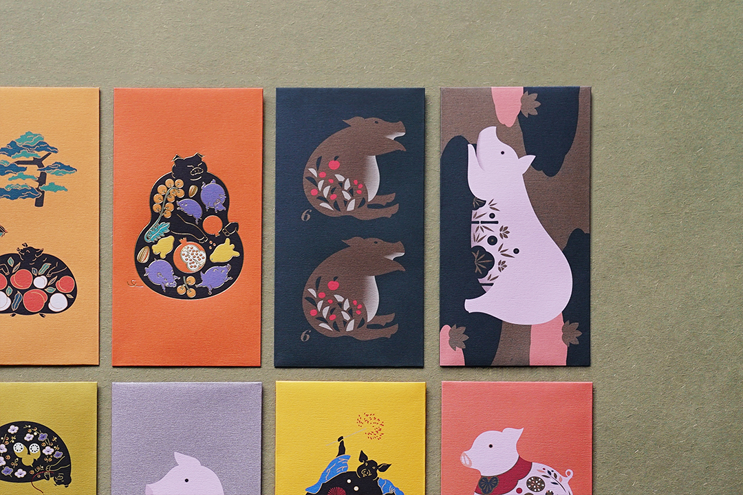
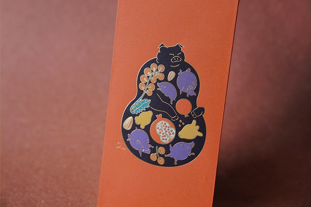
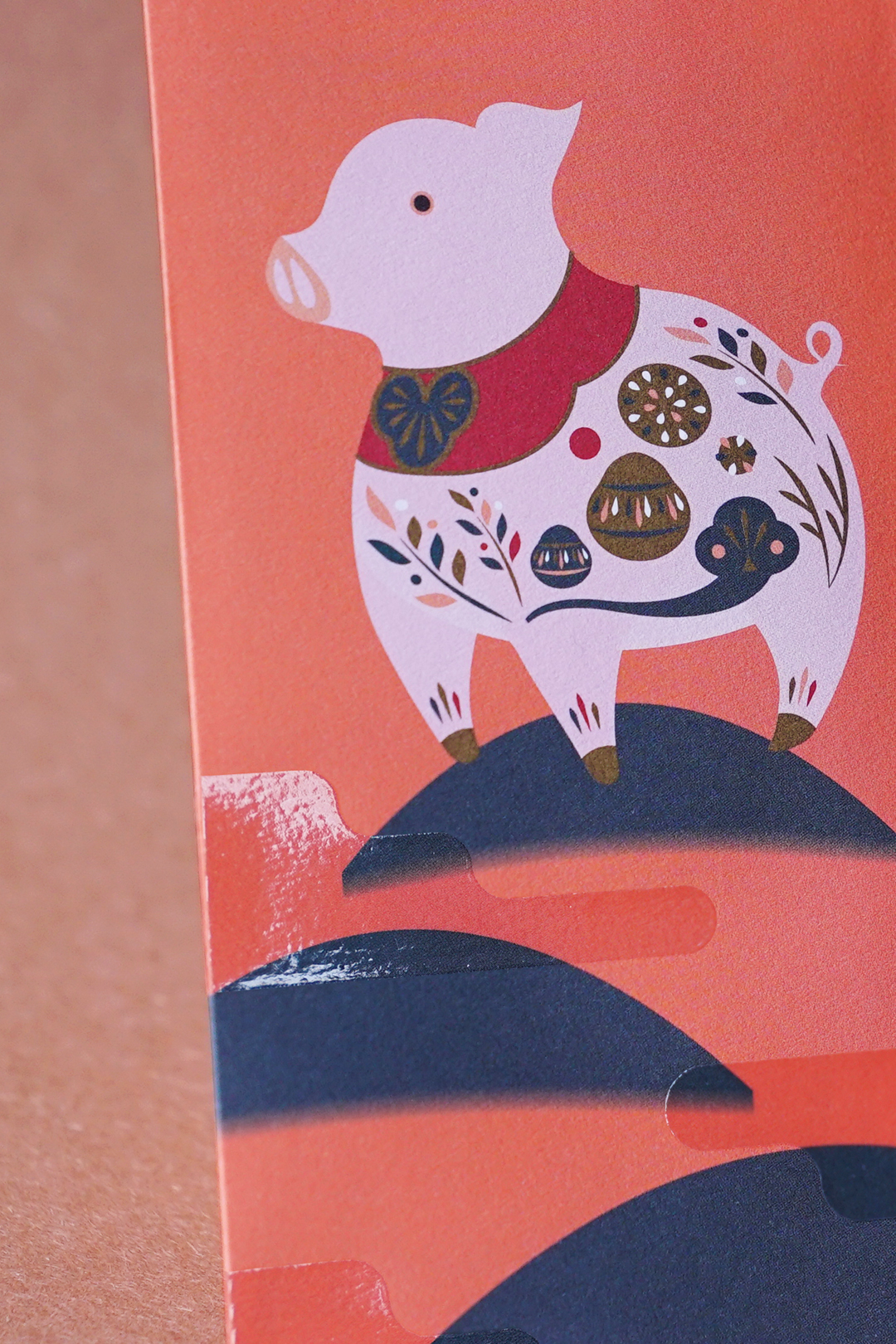
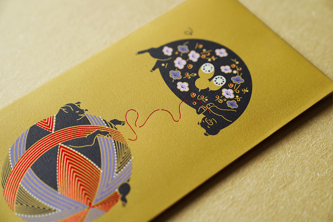
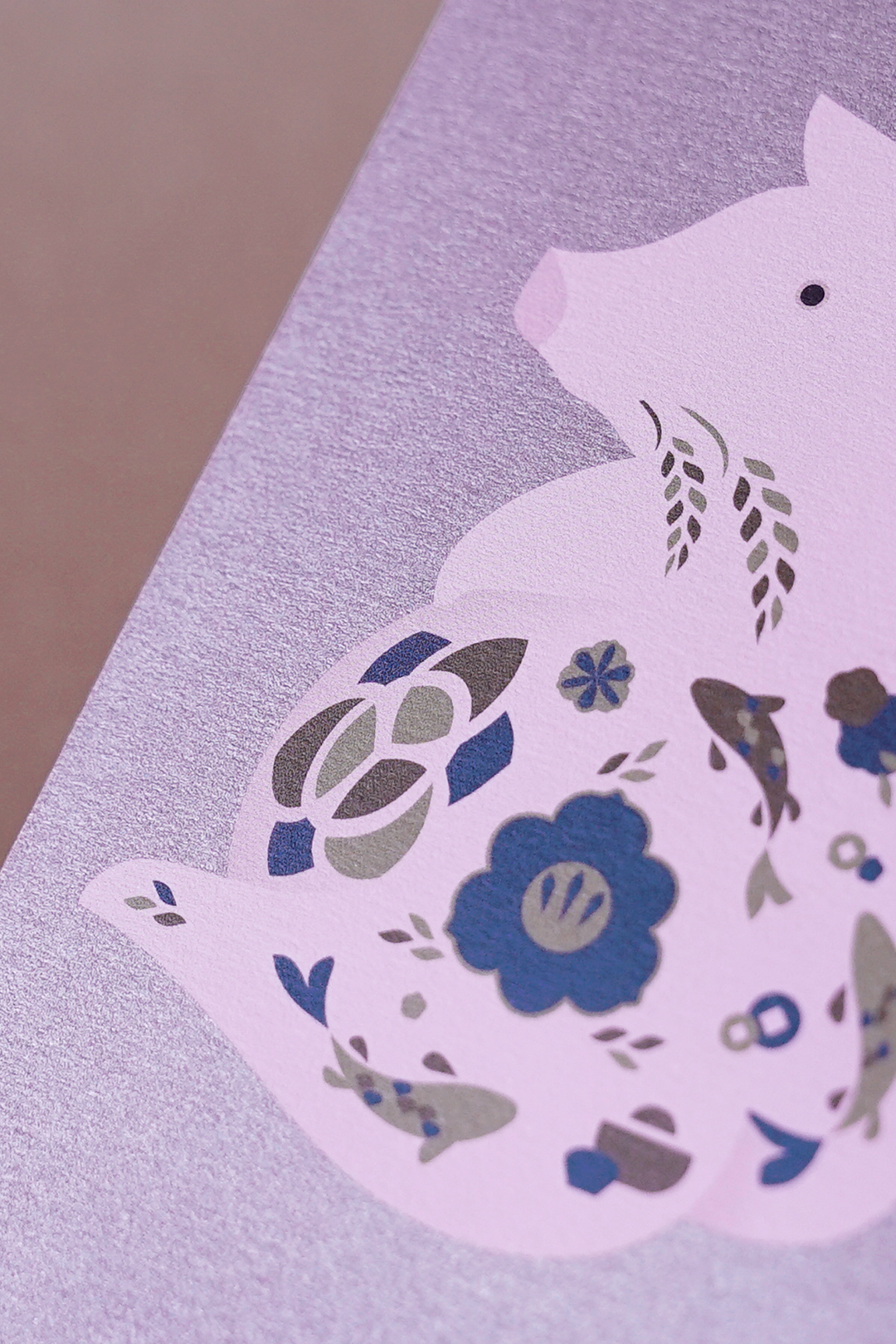
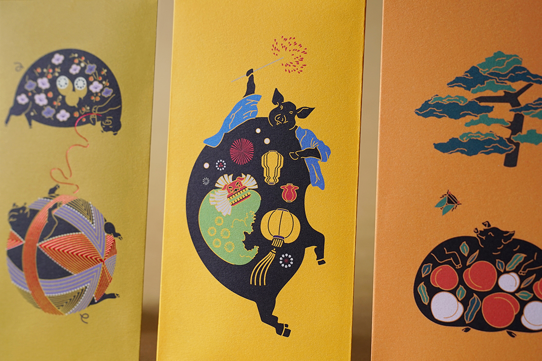
admired for its indispensable role in china’s agricultural society, the year of the ox is a celebration of its diligence, integrity, and honesty. we designed five red packets to honour the five grains in ancient china – wheat, broomcorn, rice, foxtail millet, and soybean. wrapped in a packaging that embodies the ox itself, the packets are tucked neatly into a blizzard book mechanism that serves as a carrier for all the stories within.

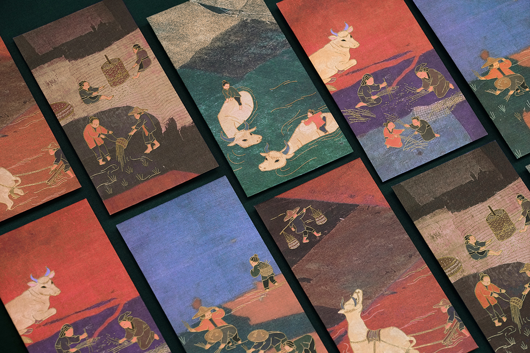
the idyllic scenes depicting agricultural life are set against the backdrop of ge ba, an unassuming textile artform from the countryside. reminiscent of cubist paintings, the featured ge ba are from the personal collection of françois dautresme, a prolific art collector who amassed over 7,500 items during his 35 years of travel, exploration and discovery in china, and more notably, the beloved and inspiring uncle of substance’s founder maxime dautresme.

things of substance

the significance of light throughout time remains unaltered. illuminating our perception of the world, light carries remarkable gravity in the rituals of our day. from cave-man campfires to light bulbs, light permits us to linger in a state of wonder from where we can freely realm in the world of our imaginations.

our lamps are metamorphoses of history in cultures transformed into products of art.

as a result every lamp carries with it the spirit by which it has been created, manifesting into things of substance.

mother pearl

when sipping bubble tea, the spring-loaded pearls of tapioca instantly demands our attention. confronted by the unapologetic chew of the pearls, we unconsciously transcend into a state of unexpected satisfaction.

a pioneering advocate for healthy teahouses in hong kong, mother pearl encapsulates the deeply immersive bubble tea drinking experience through its magical concoctions. serving as a vessel for the sensations that emerge from sipping bubble tea, the negative space in its icon evolves with seasonal and flavour changes.

from the cloud of pearl-shaped lights floating above, to the dark olive green facade that opens a portal to a mystical universe, mother pearl expresses dimension through its organic materiality, drawing the consumer deeper into the sweetness of the present.

the year of the pig

the year of the pig carries a symbol of “abundance”. this porky zodiac brings you prosperity, fertility and plenty of luck. to send blessings to everyone in the coming year, we designed 8 auspicious red packets that illustrate an array of fortunes treasured in the pig’s full belly: harmony, morality, happiness, longevity, love, peace, success and wealth. gold stamping and spot uv finishing was applied to bring a sense of crafted opulence with each packet individually hand wrapped in ribbed kraft paper, ready to be gifted to friends and family.

photographs by: judy chen

trudon

founded in 1643, maison trudon is the oldest candle manufacturer. maison trudon extends its savoir faire and unveils a line of personal fragrance. substance accompanied the brand with its communication strategy, global branding, packaging, print and digital design. our challenge was to subtly express the rich brand heritage whilst reinterpreting a modern approach.

view the site

Brand Identity


Digital


timothy oulton

the redesign of timothy oulton’s website captures the british brand furniture aesthetic and meticulous attention to detail. one of the challenges was to reflect their handcrafted product and timeless design. with retail outlets throughout the globe, the main idea was to extend their retail experience into a compelling and engaging digital experience. the website includes a full responsive interface adapted to all devices.

view the site

Digital

to_digital_01

to_digital_02

to_digital_04


to_digital_03

financial times

“shape your knowledge” was a yearlong integrated campaign directed at educating key media buyers and media planners throughout asia pacific.

the objective was to drive awareness and educate media buyers on identifying the financial time’s readership and profiles. a seamless campaign was created by sending a bonsai tree to key media buyers with an online media kit showcasing newsfeed, widgets on readership profiles and case studies on the financial times. to recapture their attention, a care package was sent 6 months later to convey the bonsai’s relation to the brand’s trust, integrity and wisdom.

ft_award

Direct Mailing

ft_advertising_00 ft_advertising_01 ft_advertising_02 ft_advertising_03 ft_advertising_04

Advertising

ft_advertising_05

Digital

ft_advertising_06 ft_advertising_07