zoobeetle

in the up and coming district of poho, a charming new château has set down roots. more than just a concept, château zoobeetle encapsulates the very essence of being french and carries it off with just the right touch of parisian insouciance.

we were given a split level store space of 1500 sq. ft. to dream up the effortless elegance of a modern apartment on the left bank, upstairs from a hip new brasserie. the architecture epitomises zoobeetle’s multi sensory brand experience; fixtures throughout the space accentuate the house founders’ hand­picked vintage decor. the effect is one of a contemporary atelier, with a facade inspired by the old world elegance of parisian couturiers.

the origin of zoobeetle is the quintessential parisian experience expressed through a line of culturally crafted leather goods, woven by the founders with strands of the house dna including travel, art and photography.

downstairs, the bar’s lighting and shingled tiles convey you to the rooftops of paris. racks behind the bar echo the atelier’s polished fixtures, harmonising with the gleaming brass countertop. sate your tastebuds with a delectable selection of cheeses and charcuterie, while indulging in a sip of sauvignon.

Interiors

the mills


find your thread in hong kong’s techstyle story.

when nan fung textile company first started weaving in the 1950s, cloth was the most important raw material. in today’s globalised fashion industry, the finished garment is one element in the complex, high-tech pursuit of making fashion. talent and creativity are the commodities in demand: talent for ideas, design and reaching consumers through brand and story. drawing on over half a century in the industry, the mills, a groundbreaking project from the nan fung group, recognises that today talent is the raw material that matters. it must be nurtured and developed in the same way that cotton must be woven into fine cloth. to that end, the mills, in the same building it has worked in for the past 50 years, provides aspiring designers, entrepreneurs, and fashion technologists with the tools, the know-how and the space to make a truly modern, global fashion business, through collaborations with other institutions, exhibitions, mentorship programs with skilled artisans and a cutting-edge fabrication lab. 

these are the mills of the 21st century.

Identity

Substance_The Mills_Embroidered Closeup

Substance_The-Mills_Impression

Substance_The-Mills_Poster

Substance_The-Mills_Stationery Branding

Substance_The-Mills_Invitation

Substance_The-Mills_Labels

Substance_The-Mills_Label

Substance_The-Mills_Magazine

Substance_The-Mills_Hardcover-Book

Substance_The-Mills_Bag

Substance_The-Mills_T-shirt

Substance_The-Mills_Tailors-dummies

Substance_The-Mills_Window

Substance_The-Mills_Neon

hotshot

the energy is electric, propelling a youth culture revolution. hotshot, the new all-day diner in Repulse Bay, is inspired by the restless attitude and exploits of surfers and skaters. the brand identity and interior design are direct reflections of fearless low-rider graffiti lifestyle – melding plucky west coast grit and timeless cool.

the restaurant’s hangar interior is modeled around a lifeguard station, with iconic surfboards – each a one-of-a-kind masterpiece – adorning the walls (alongside vintage comics and classic beer crates). the materials used were chosen to reflect the era’s easy going aesthetic, incorporating sun-bleached wood, industrial corrugated steel surfaces, a big ass fan and bright neon signage. every last detail, from the custom airstream catering trailer to the comics on the menu, was custom-made and painstakingly crafted to transport customers back to a simpler, groovier time.
the restaurant mascot, Hotshot, epitomizes the spirit: tough, carefree and more than a little crazy.

Interiors

Hotshot-001

Hotshot-002

Hotshot-003

Hotshot-004

Hotshot-008

Hotshot-009

Hotshot-010

Hotshot-011

Hotshot-012

Hotshot-014

Hotshot-015

Hotshot-016

Hotshot-017b

Hotshot-018

Hotshot-019

Hotshot-020

Hotshot-021

Hotshot-022

Hotshot-023

the ocean

the ocean, protean and primeval, has enchanted many who have come before. along the coast of repulse bay beach, an oceanic sanctum has been imagined as a place of marvels, where one can experience beyond the surface of the sea and into the alluring depths of the unknown.

the restaurant’s interior invites you through a pool of dark blues and cyan, balanced with sandy brown finishes throughout. ceiling-to-floor windows offer a clear panoramic view of the sea-side on the horizon, diving into the deep through the portal frames flourished with silver leafs.

there is an emphasis on intimacy, as the ocean houses three private dining rooms for an added lap of luxury. magic is added with a backdrop of the ocean itself, while the walls of a jellyfish aquarium surrounding each private dining room, submerging each visitor into a pool of conversation as they observe the mystique of nature around them.

but the devil truly is in the details, with tableware and furnishings taking design cues from coral leafs, anemone spirals and fibonacci suites in shells – each designed to reflect the undersea organic geometry lives.

Interiors

the ocean - a work of substance 01

the ocean - a work of substance

the ocean - a work of substance

the ocean - a work of substance

the ocean - a work of substance

the ocean - a work of substance 01

bibo

An elegant building stands on Hollywood Road amongst antique shops and art galleries. Discreetly opulent touches suggest this may be a smart regional office for a prosperous business. Yet inside the building, people gather to enjoy fine French cuisine in a setting filled with important and exciting works of modern and street art.

Substance were challenged to create a restaurant where modern street art, classic French gastronomy, and the space which contained the two could work together in harmony. The inspiration came in the form of 1930’s Art Deco – a design aesthetic modern enough to serve as a backdrop to constantly changing and extremely eclectic artistic expression, but also elegant and comfortable enough as a spatial environment in which to serve classic French gastronomy. The connection between the decade, art works, and cuisine was made through a craftily invented story of an abandoned office building of a formerly prosperous French tram company, now occupied by street artists who express themselves by layering their art on surfaces with a history, tagging their ideas on the physical space that has since become ‘Bibo’.

Identity

bibo-identity-substance-01


bibo-identity-substance-02


Interior

bibo-interior-substance-01


bibo-interior-substance-02


bibo-interior-substance-03


bibo-interior-substance-04


bibo-interior-substance-05


bibo-interior-substance-06


bibo-interior-substance-07


bibo-interior-substance-08


bibo-interior-substance-09


bibo-interior-substance-10


bibo-interior-substance-12


bibo-interior-substance-13


bibo-interior-substance-14


bibo-interior-substance-15


bibo-interior-substance-16


bibo-interior-substance-17


bibo-interior-substance-22

a boy named sue

a boy named sue – a multi-brand ecommerce store, offering a collection of socially and eco conscious for one’s sartorial desires. a boy named sue was inspired by a classic johnny cash song who’s father named him sue and faced ridicule his whole life. sue learns his name is to make him tough and strong-willed reflecting the brand’s promise of strong quality aesthetics and personality.

the identity was designed on a system by which it could be effortlessly redefined to create a series of new shapes. much like there is no one singular solution to eco-fashion, the form needed to be dynamic and transitional. the packaging and stationary also follow the system of the visual identity, with bold folds and bright patterns lining the seams, the visuals embrace a refined eclecticism. the website was the final piece of the puzzle, an interactive space that came together as a curated, easy to navigate and intuitive experience.

Identity

aboynamedsue_identity_00 aboynamedsue_identity_01 aboynamedsue_identity_03 aboynamedsue_packaging_004 aboynamedsue_packaging_05

Digital

aboynamedsue_digital_05 aboynamedsue_digital_06 aboynamedsue_digital_07

sal curioso

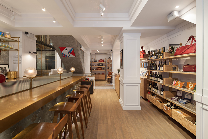
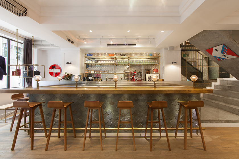
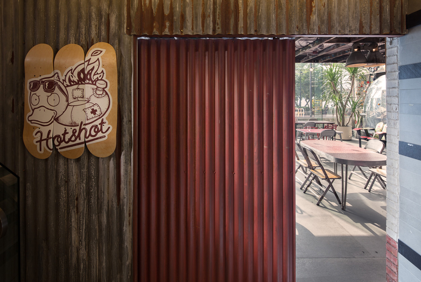
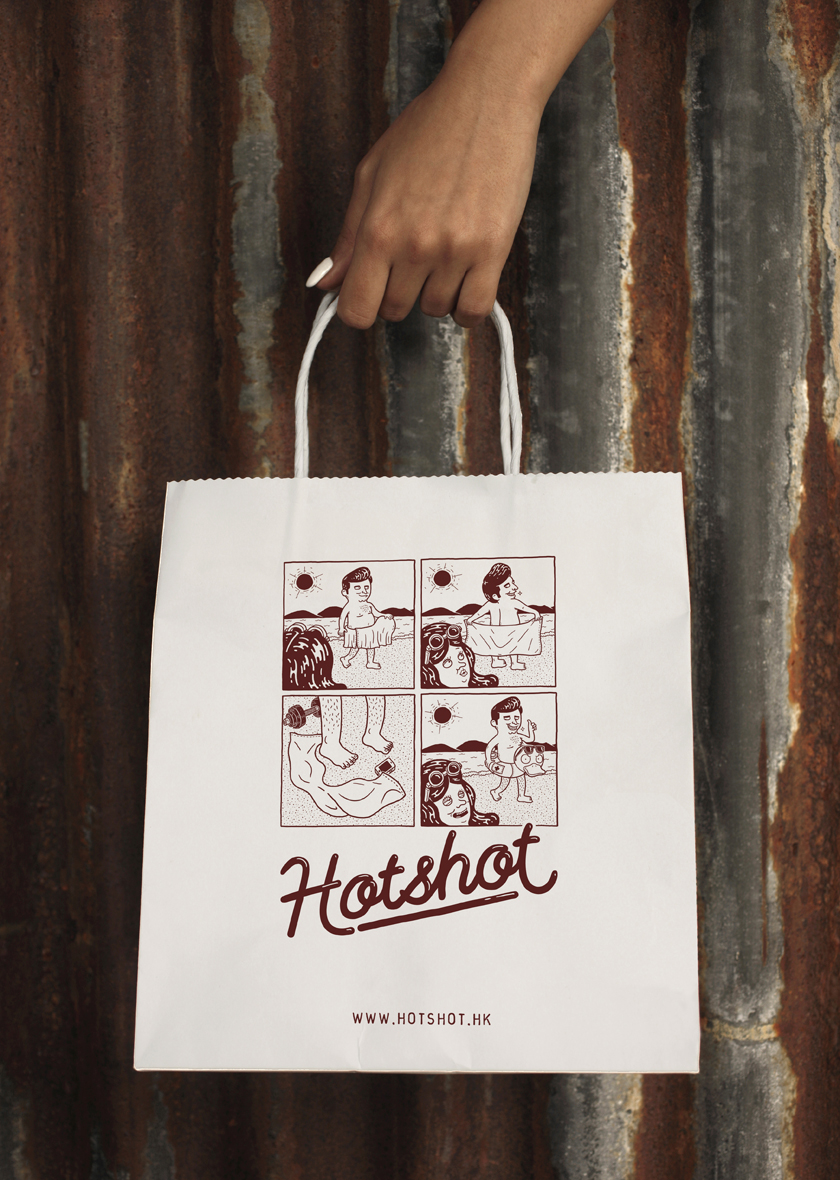
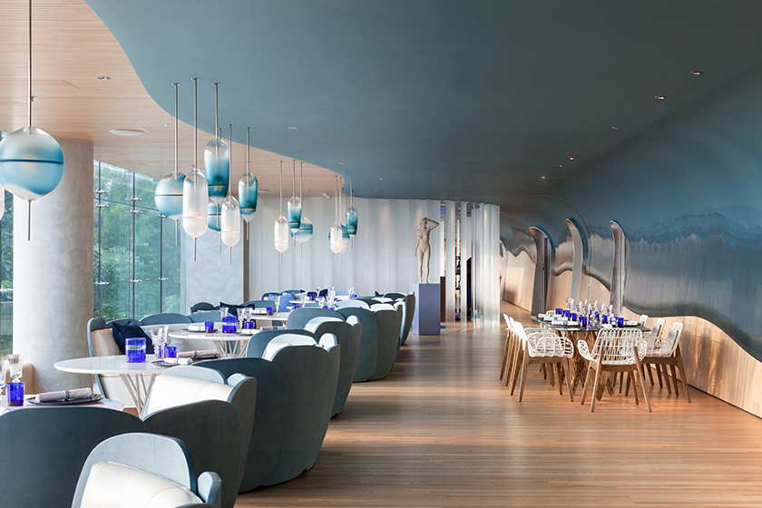
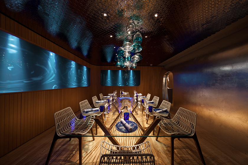
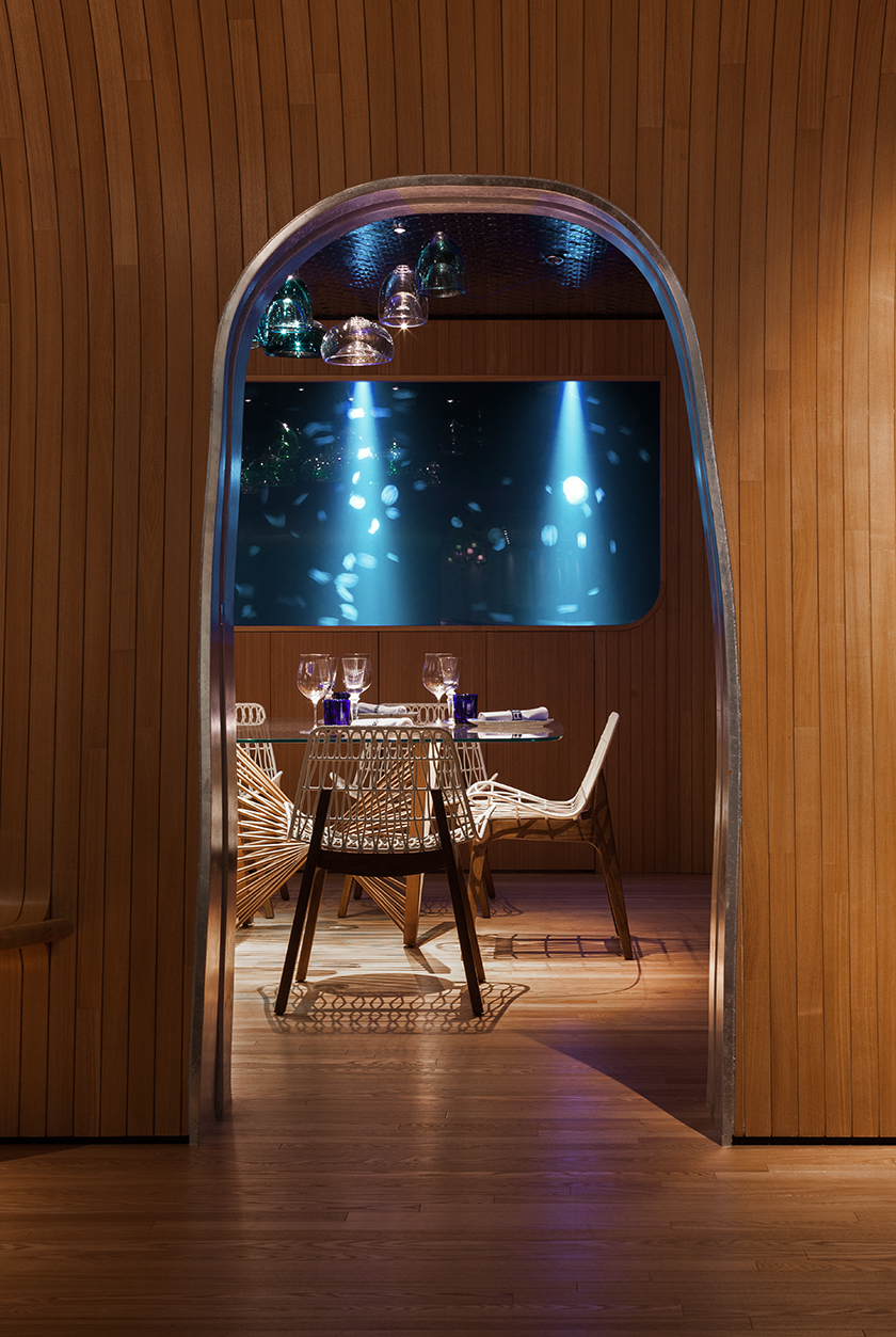
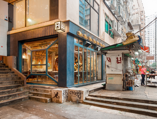
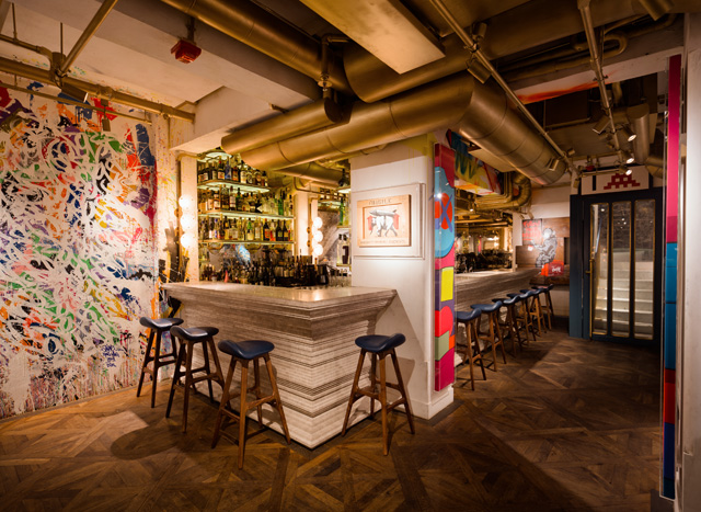
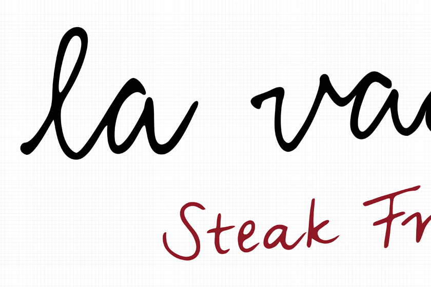
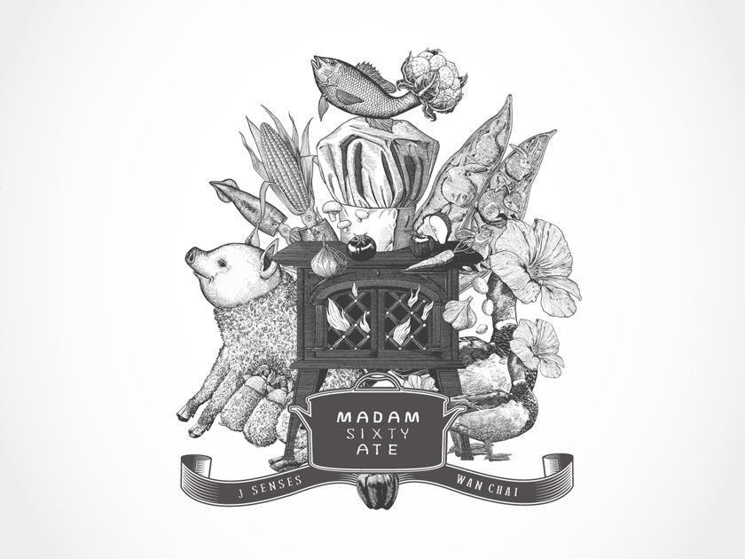
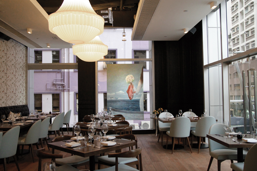
after the success of madam sixty ate, a european restaurant founded by a whimsical chef of great imagination, we were appointed to brand a second restaurant with spanish influences in the hub of hong kong’s vibrant culinary scene.

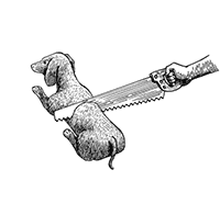
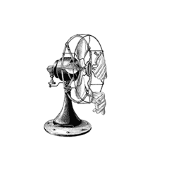
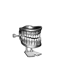
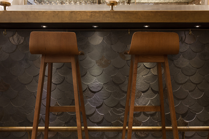
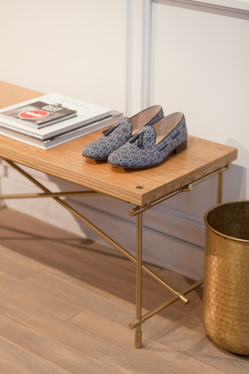
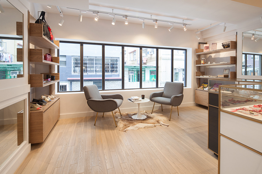
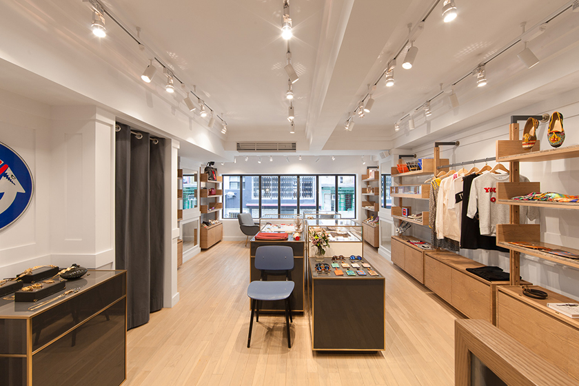
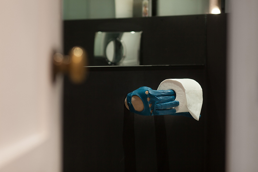
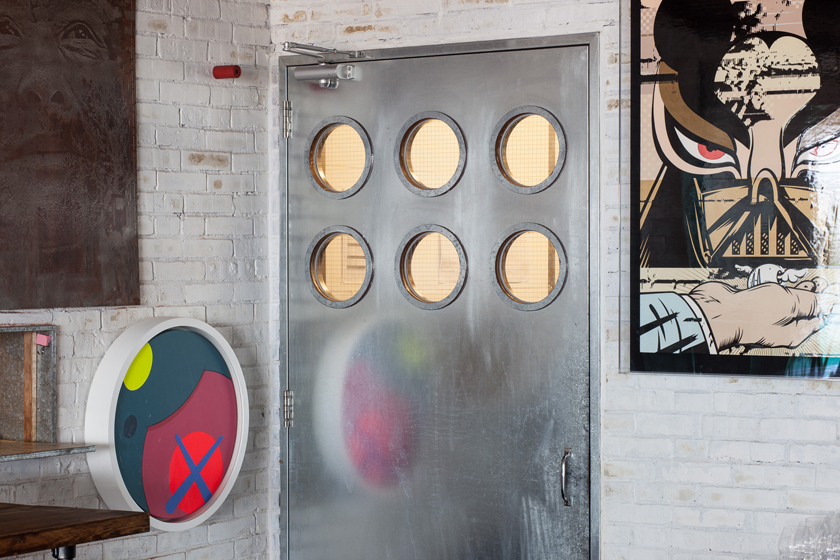
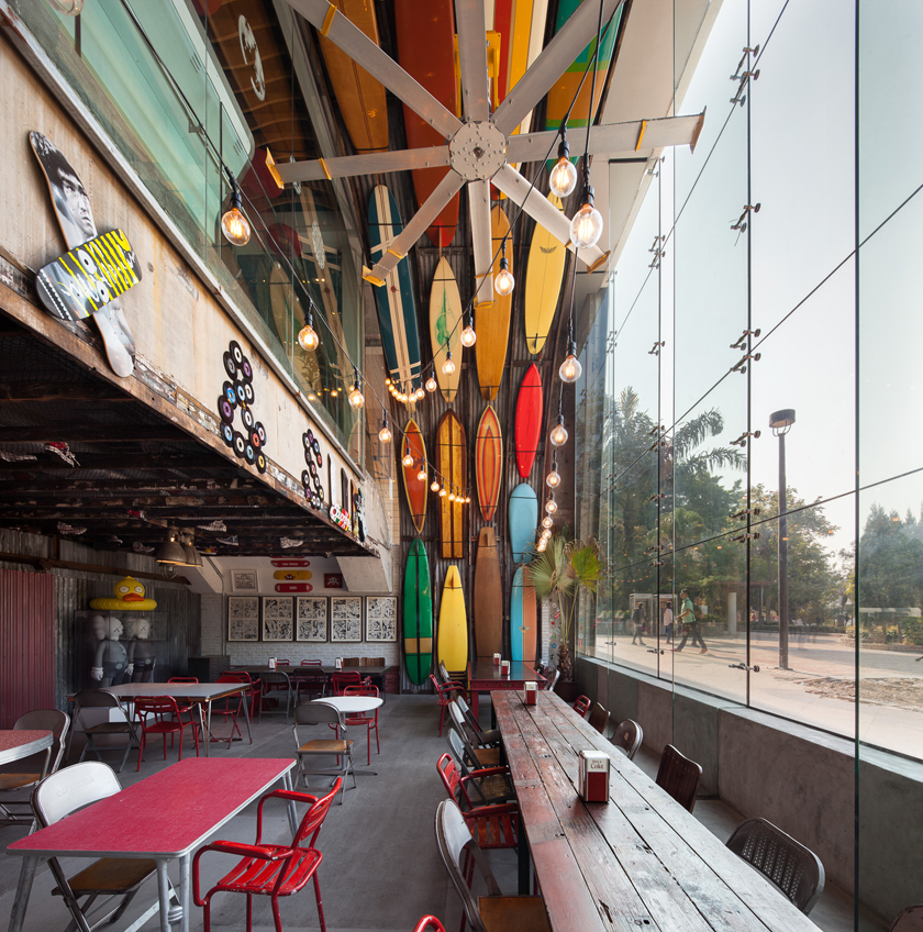
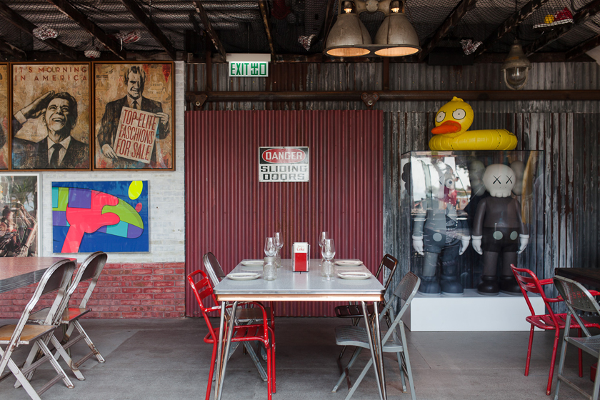
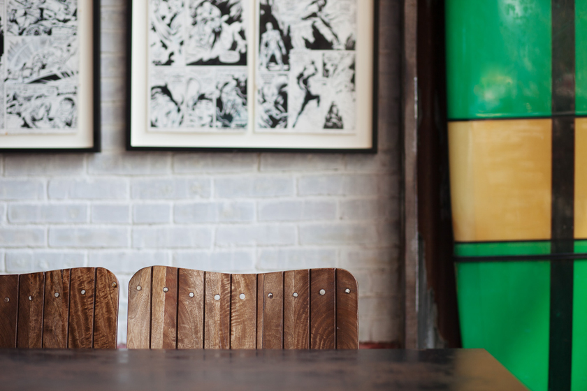
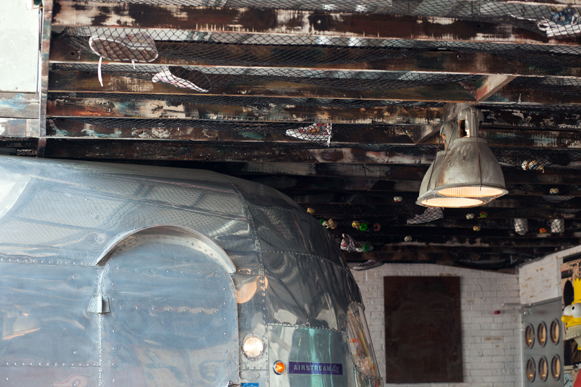
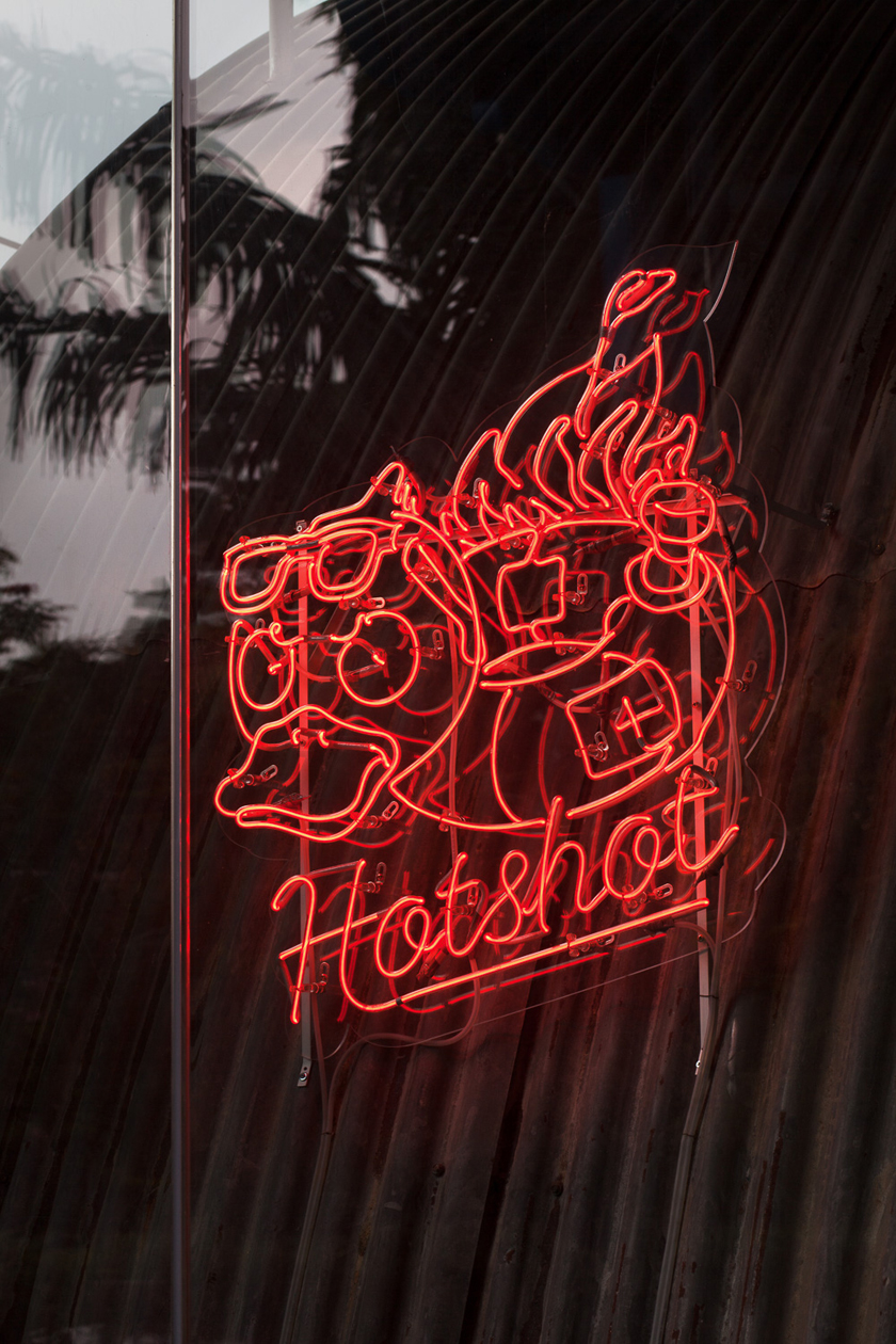
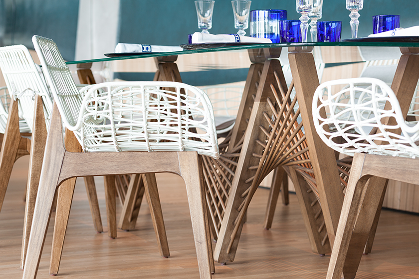
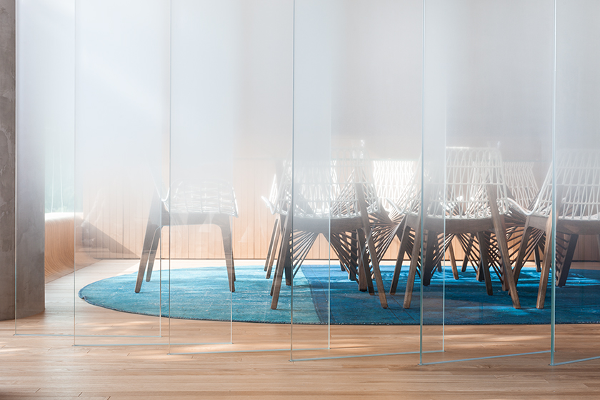
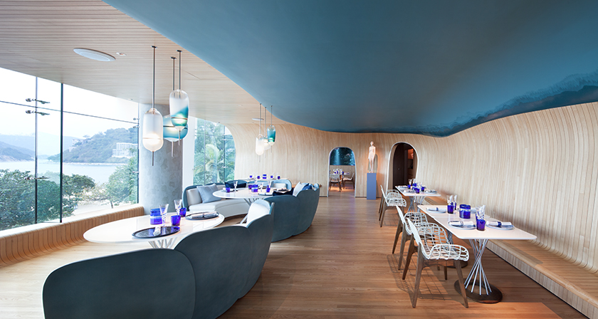
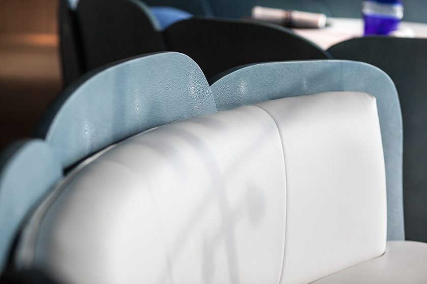
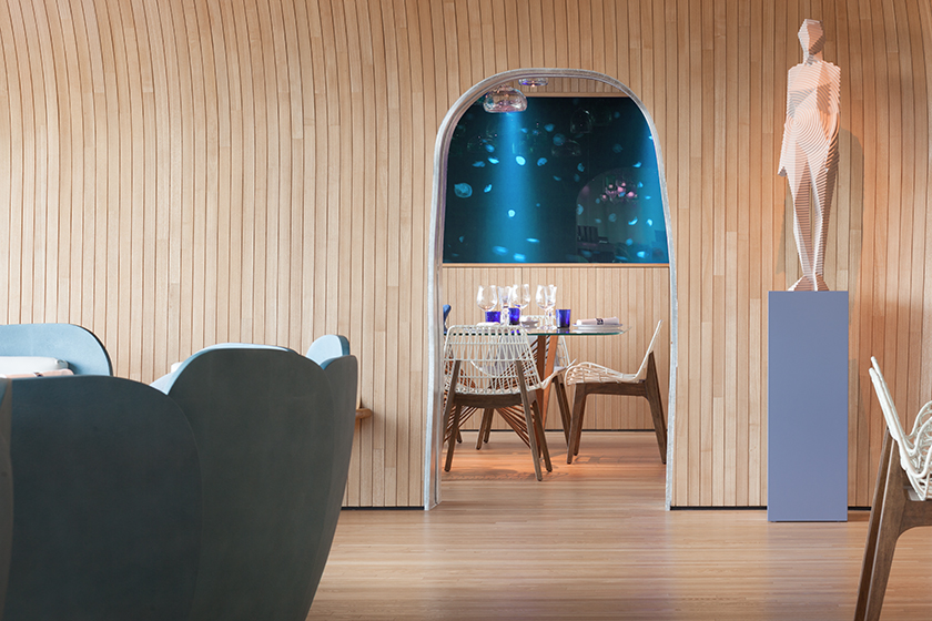
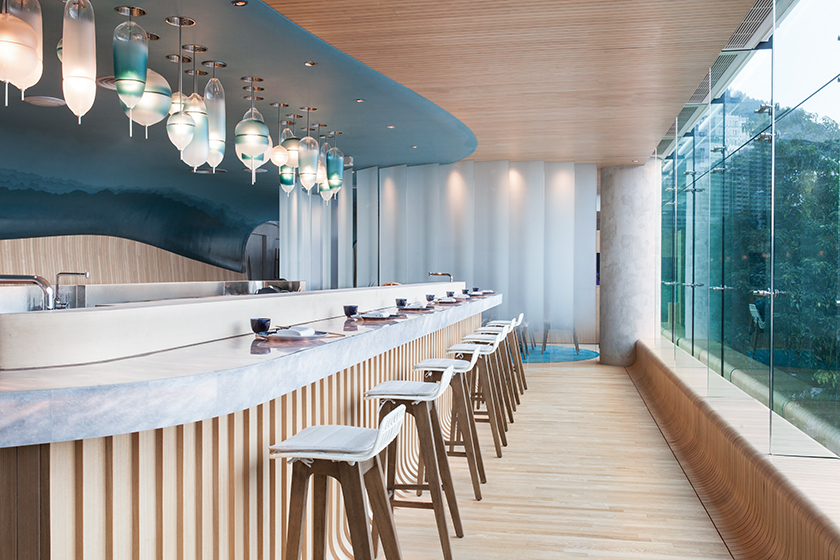
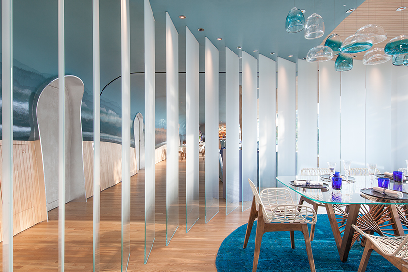
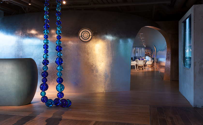
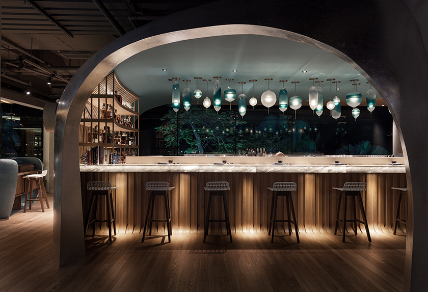
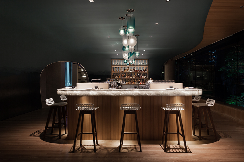
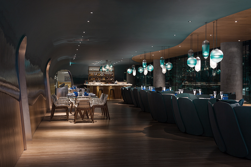
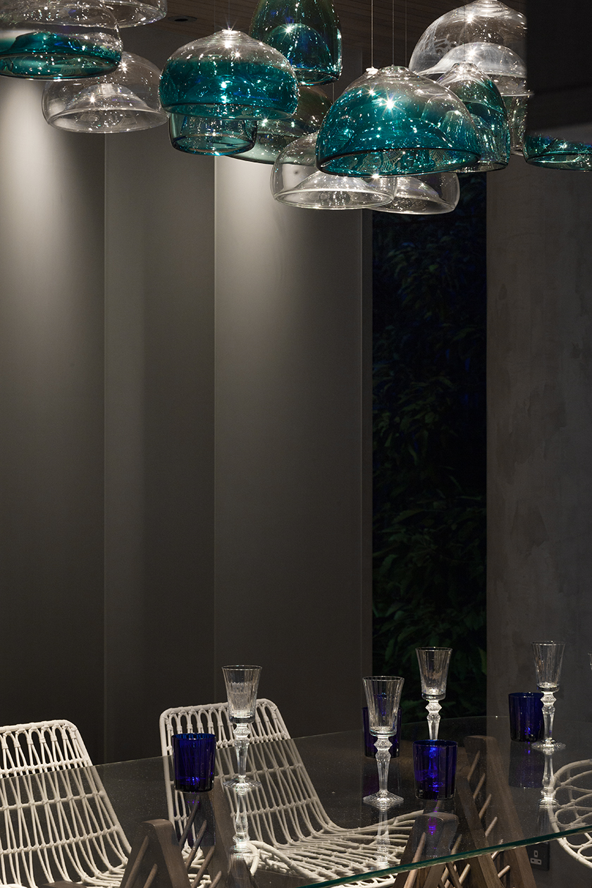
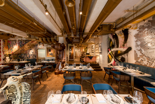
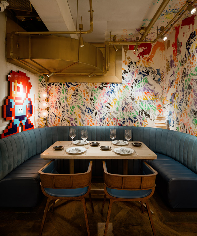
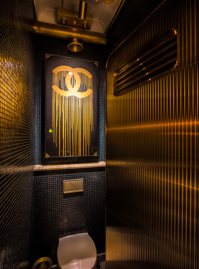
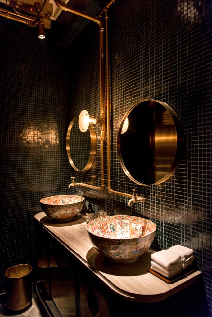
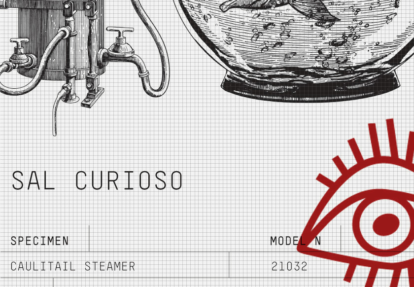
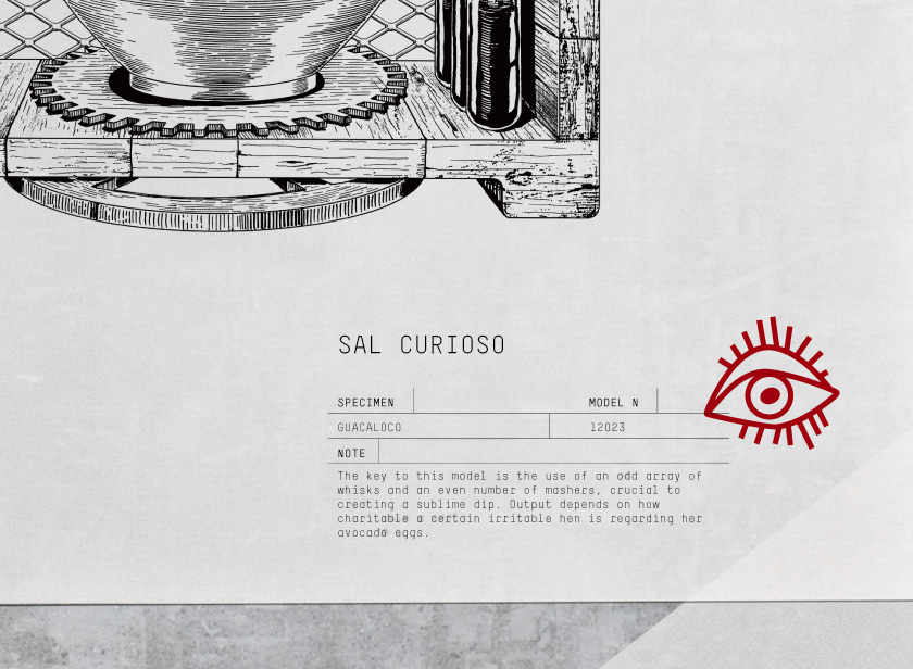
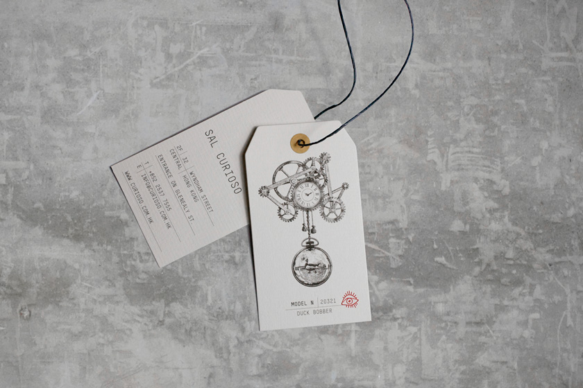
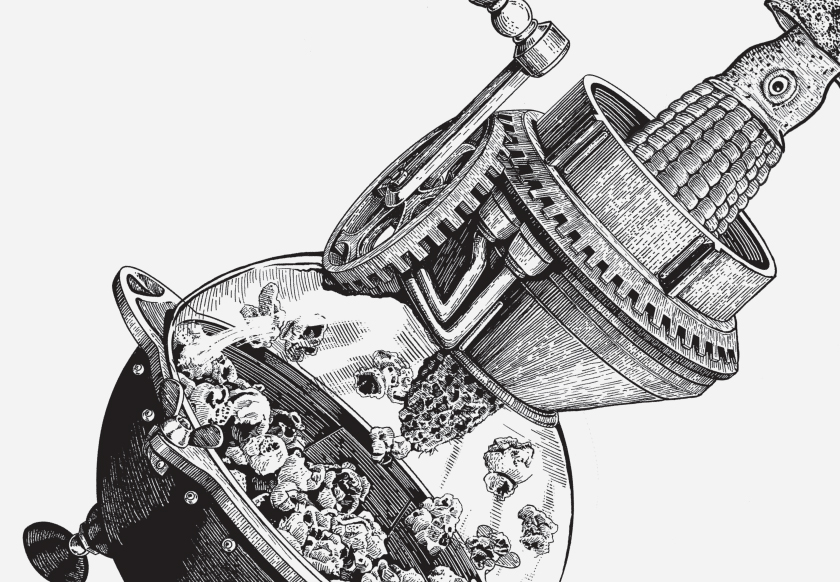
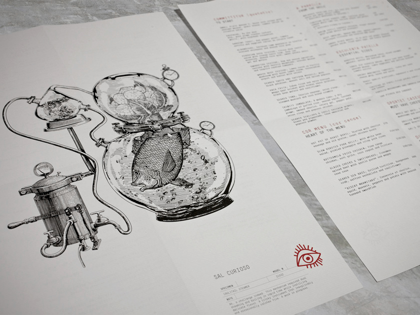
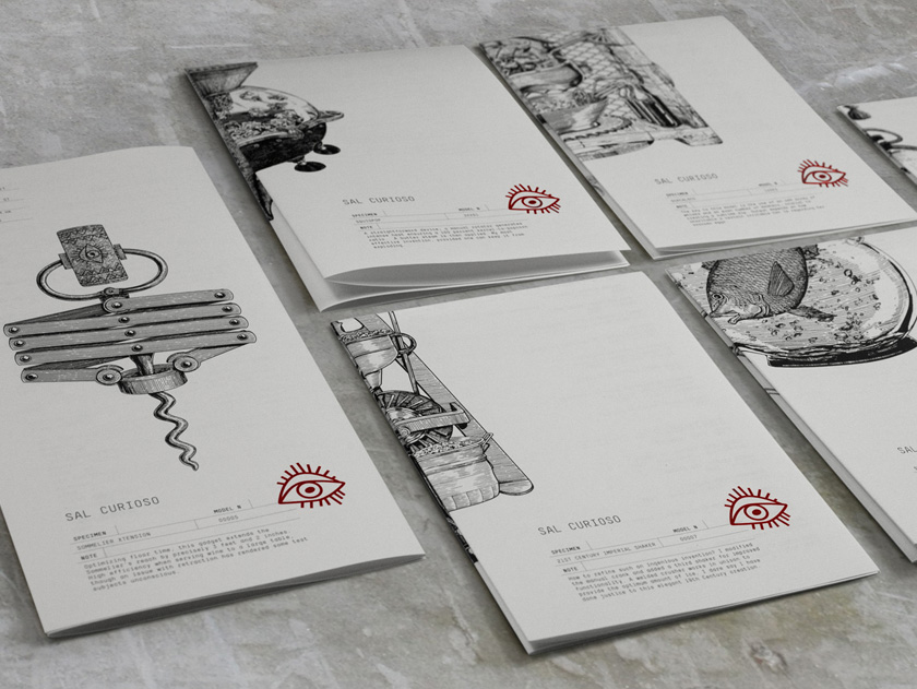
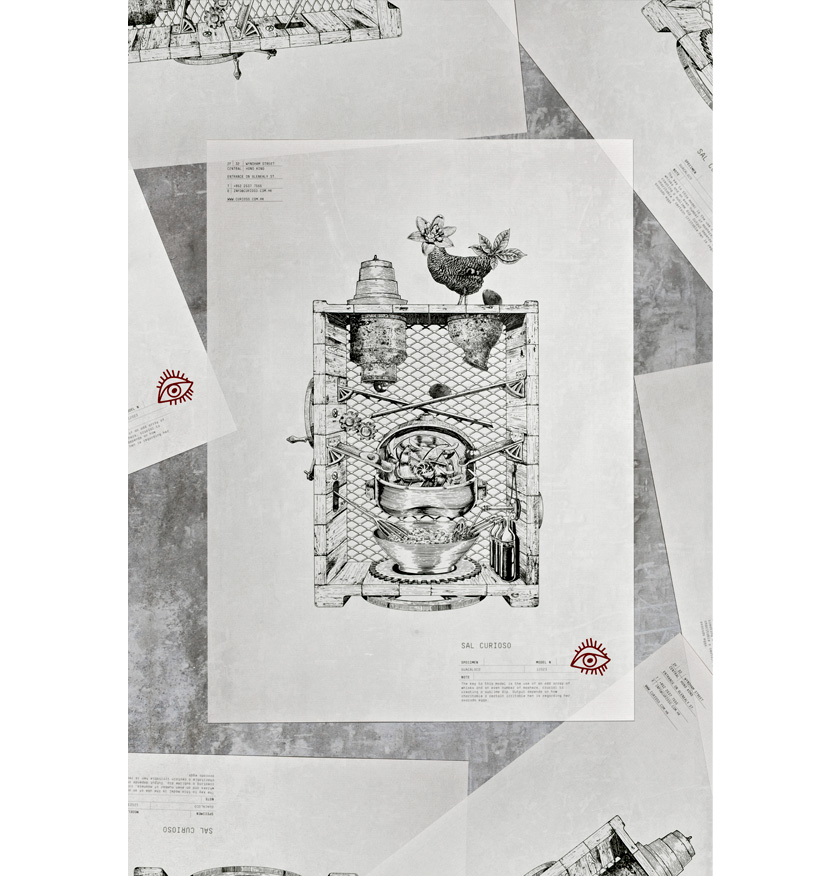
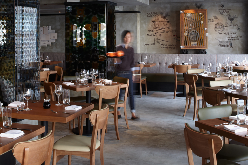
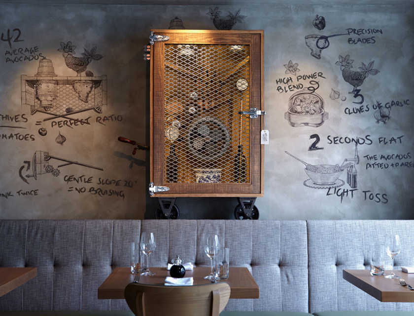
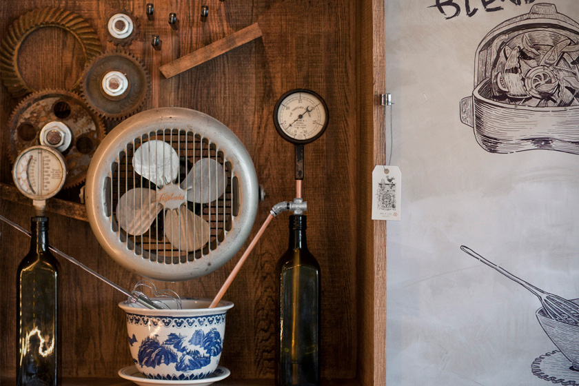
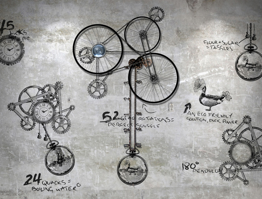
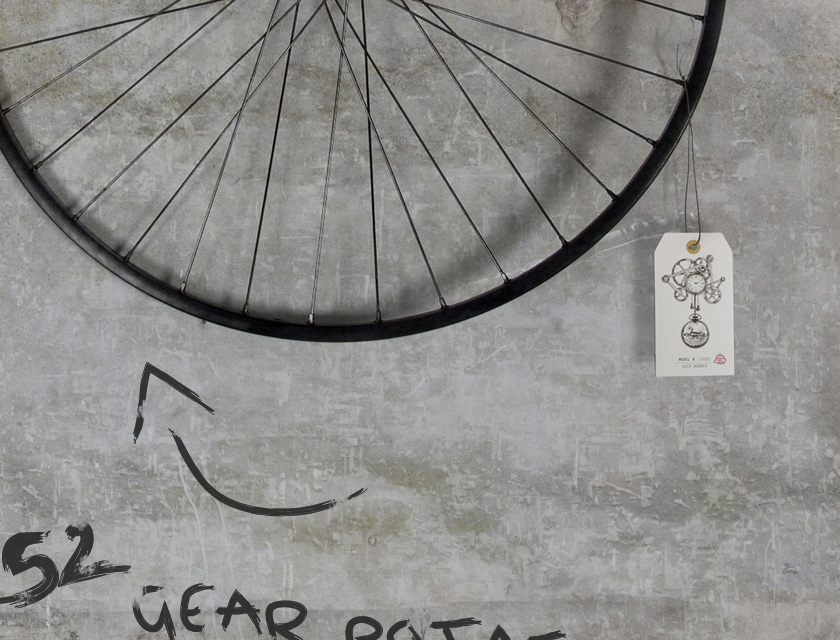
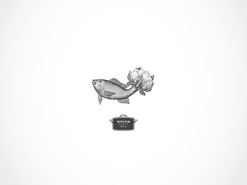
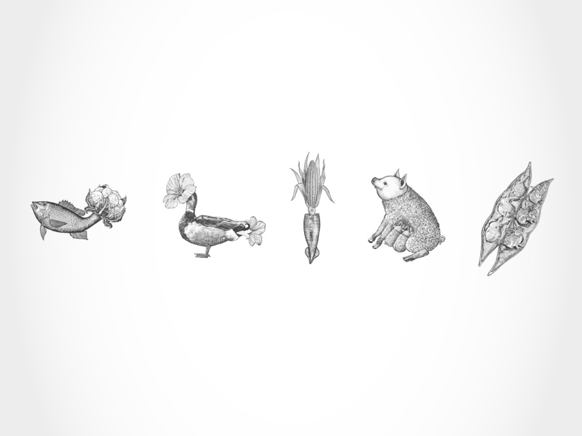
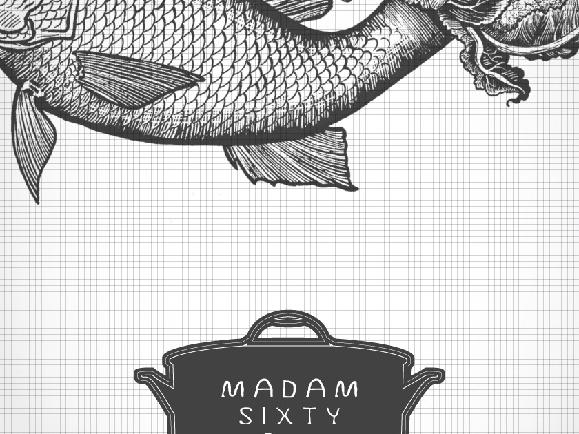
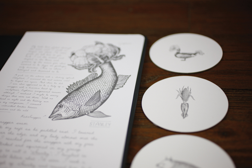
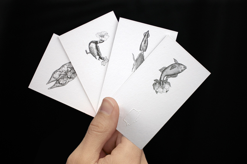
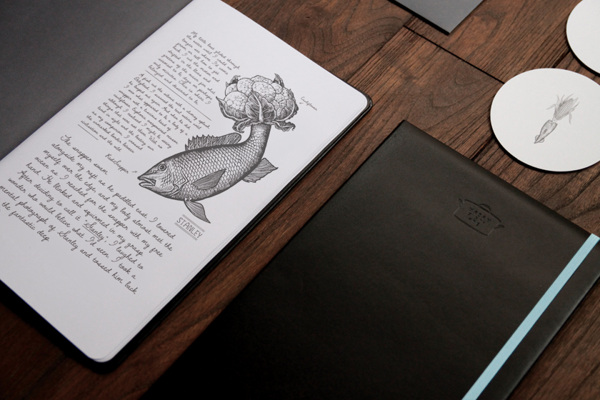
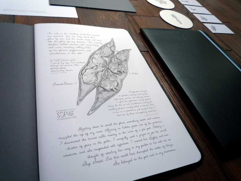
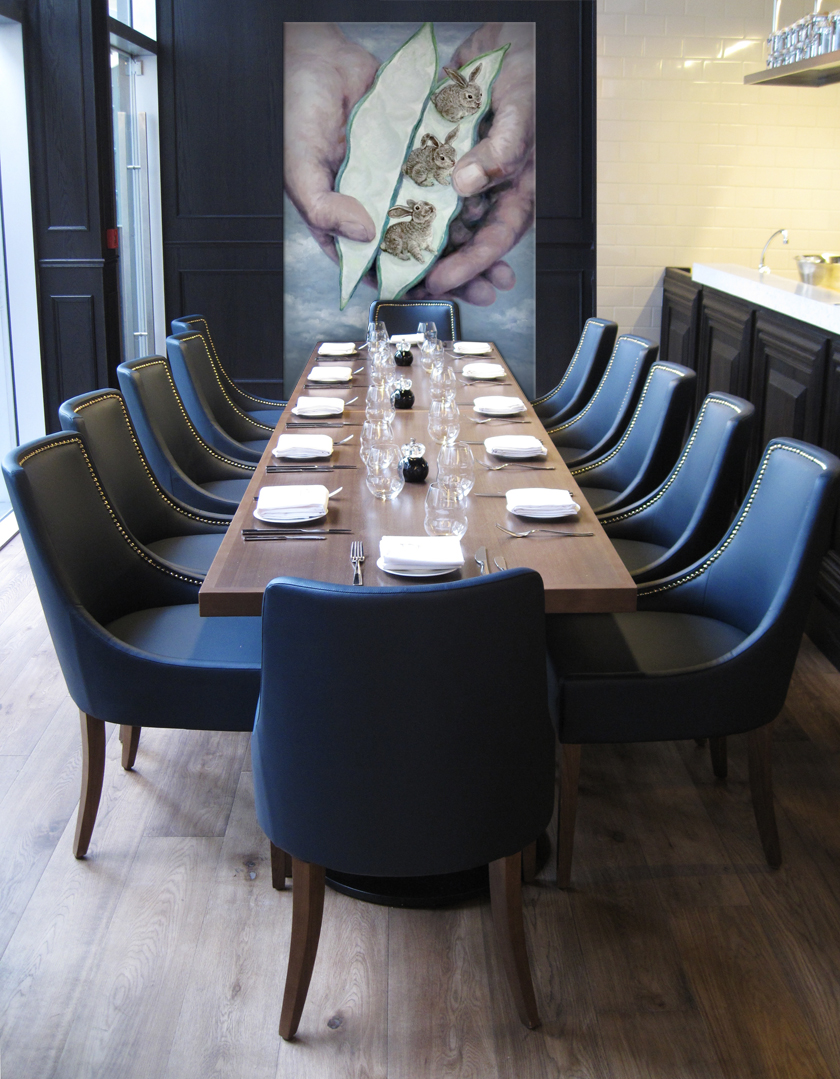
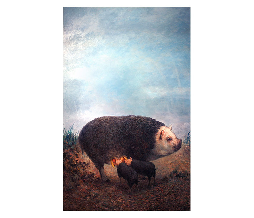
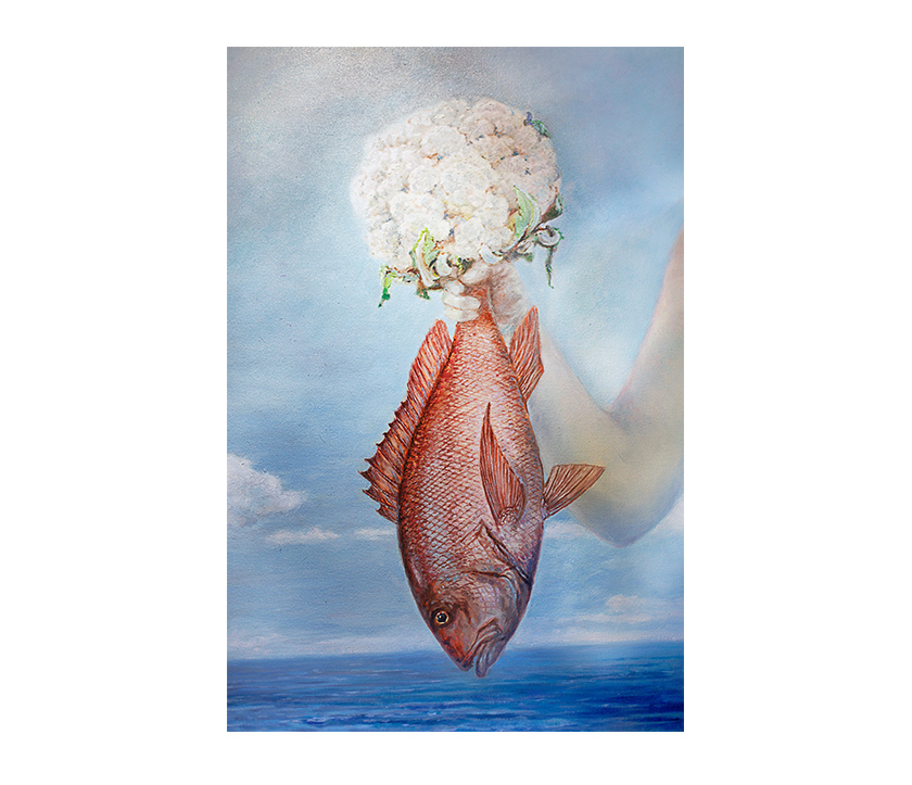
madam’s story centered on her strange journeys and encounters with surreal animals, so it seemed natural to provide her with a quirky companion who could share her discoveries. sal curioso is madam’s spanish ex-lover, an eccentric inventor and an uncommon genius. he meticulously designs and builds contraptions specifically to best broil, steam or pop the strangely shaped animals from madam’s travels into a delicious dish. his inventions include the duck bobber, caulitail steamer, guacaloco and squid pop, all displayed throughout the 2,000 square foot space. it is madam’s dishes, featuring among others, joseph the flower-headed duck and pedro the fish with a cauliflower tail, that inspire each invention.

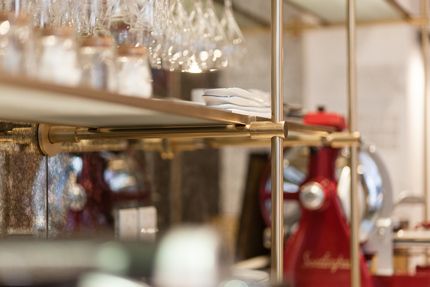
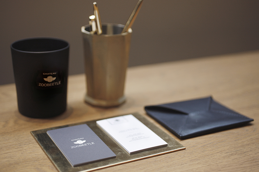
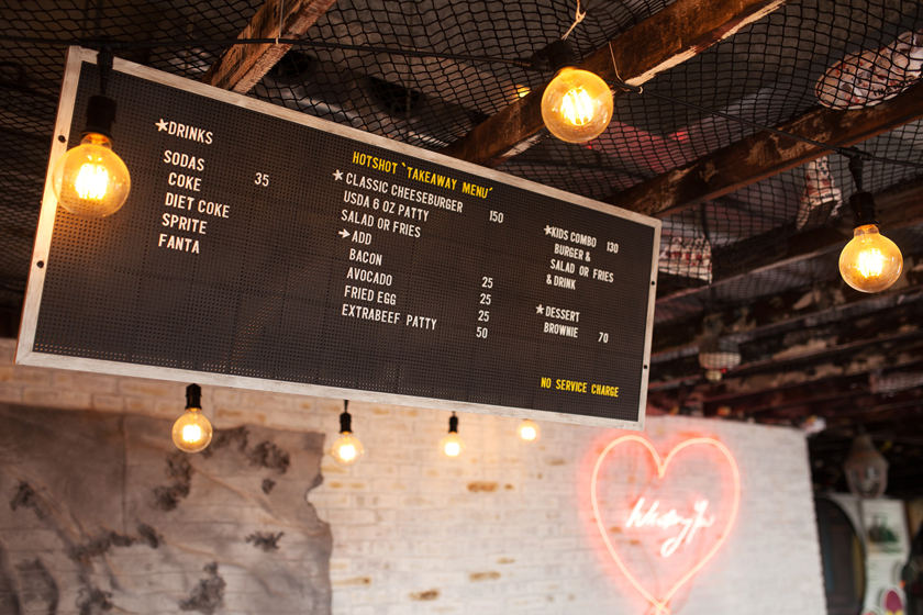
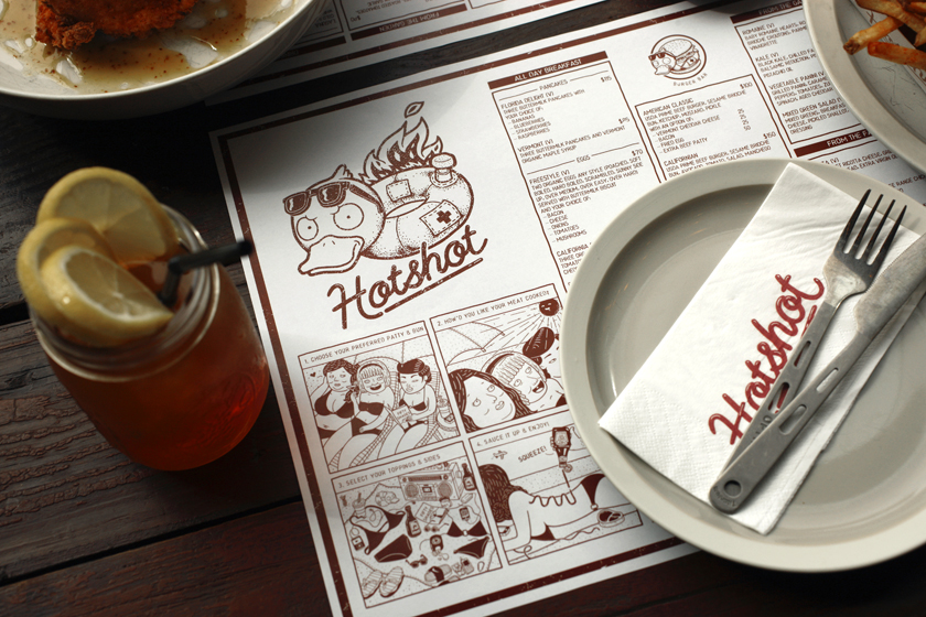
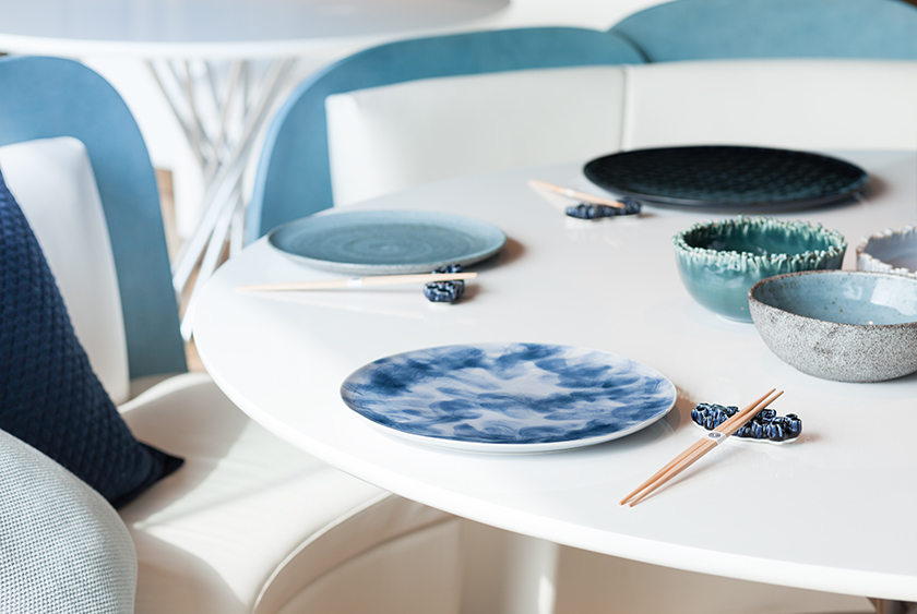
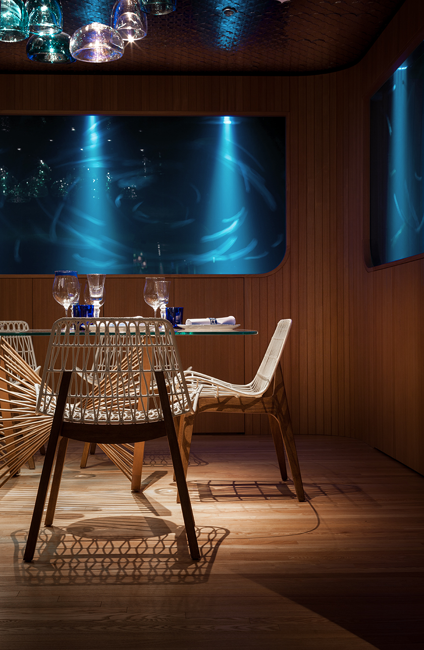
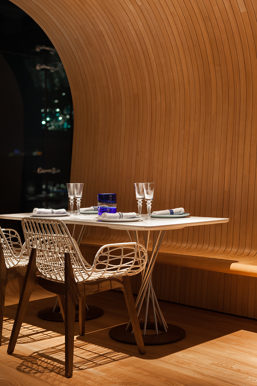
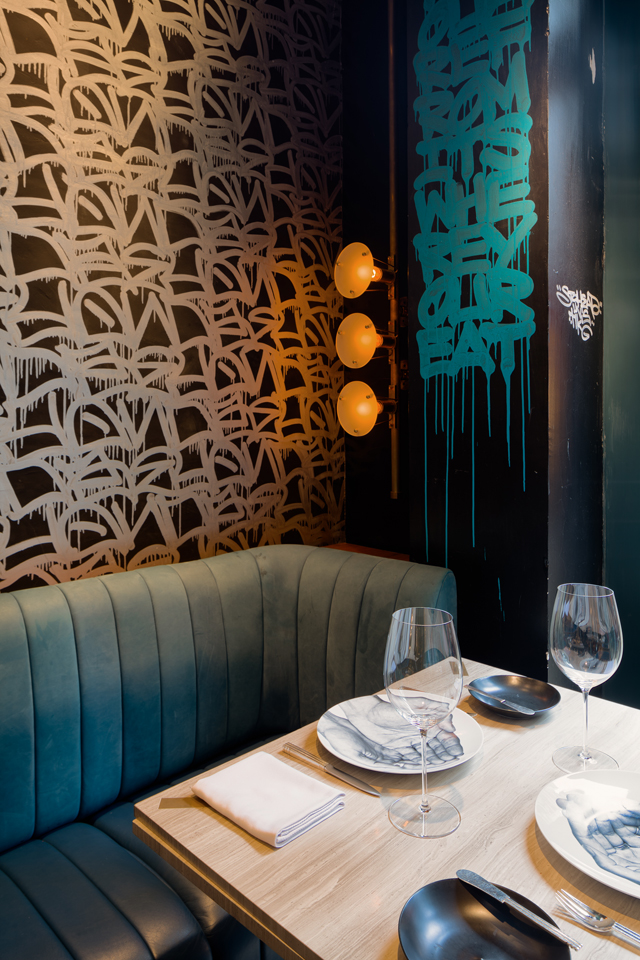
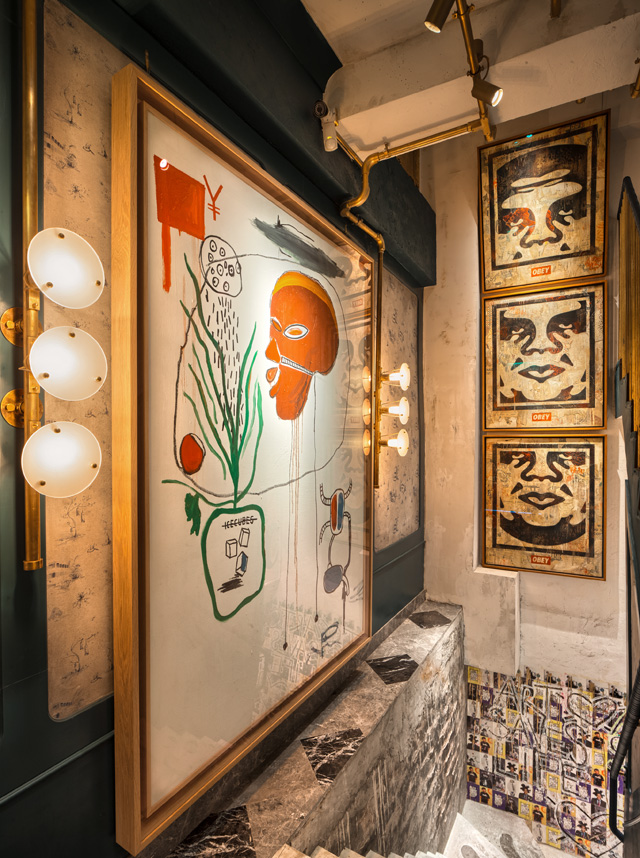
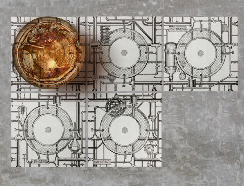
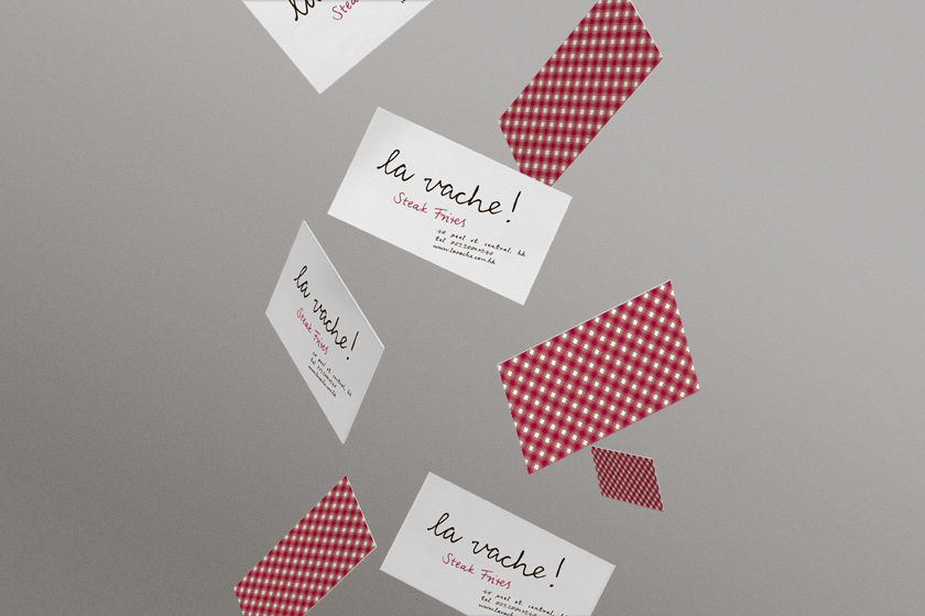
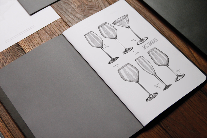
each device is accompanied by sal’s personal annotations of his design, construction process and his creative scrawls of his registered trademarks. the collection of schematic drawings and documents fill the food menus as patents, the interior is his studio occupied by his machines, hung with business card as licensing labels for copyrights. even the coasters on tables are not immune from sal’s touch – they are designed to draw water condensation from cocktails, a piping system that transports the liquid when coasters are placed together to connect the pipes.

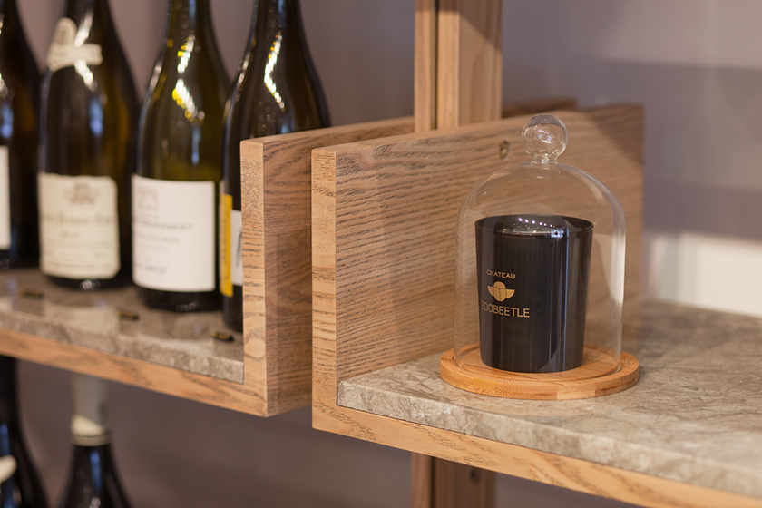
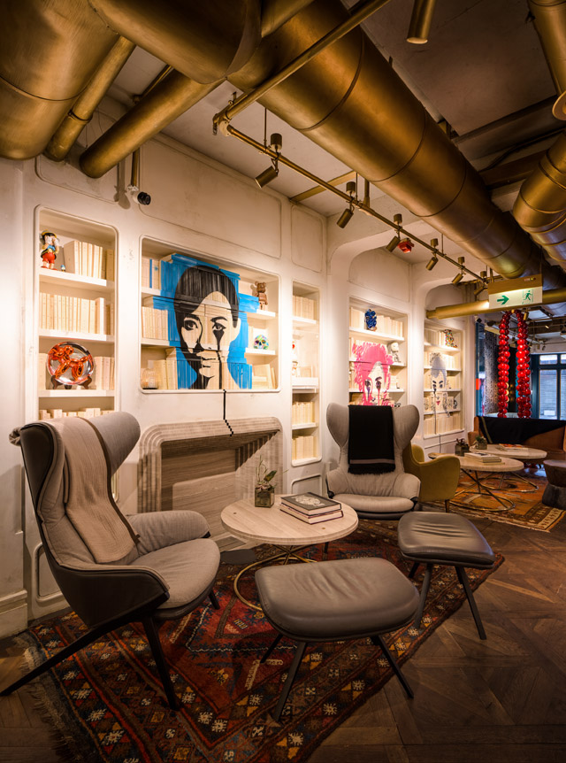
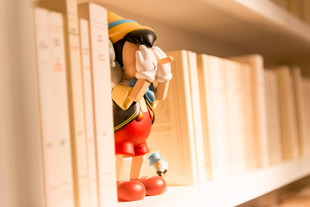
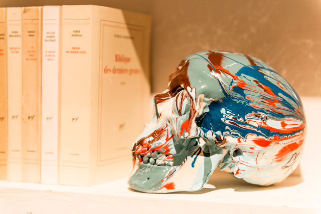
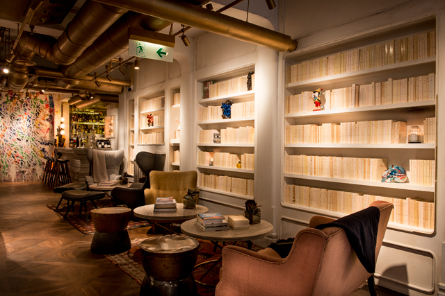
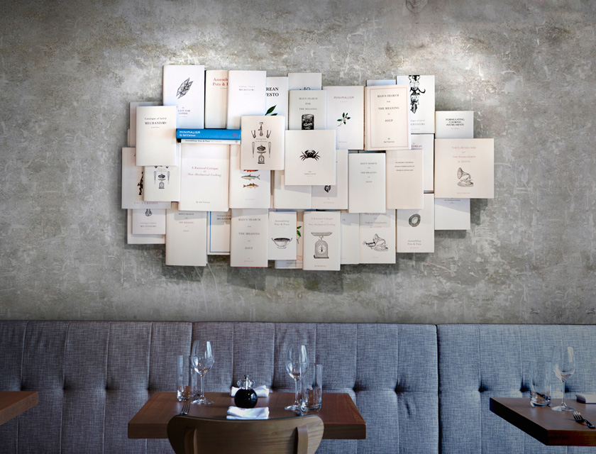
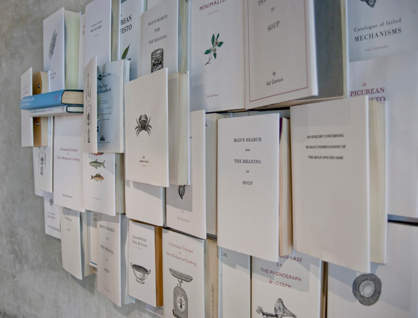
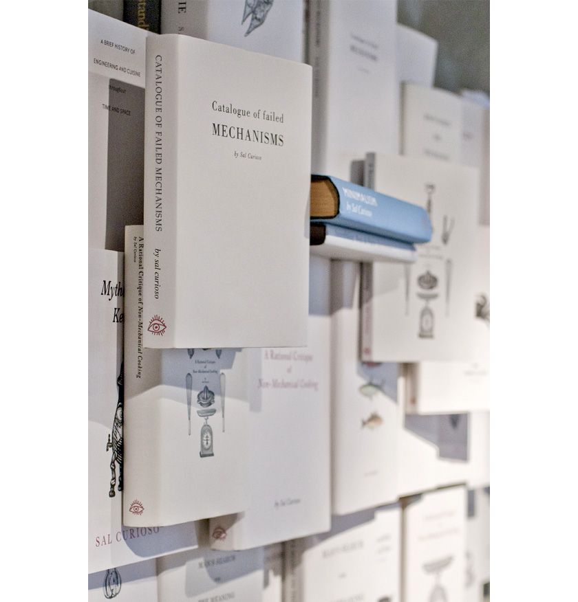
a great thinker, sal is a prolific writer who displays his wall of books written and illustrated  himself, displaying a fascination for innovative cooking techniques and antiquated culinary history.

sal_award

Identity

sal curioso_identity_01 sal curioso_identity_02_b sal curioso_identity_02_c sal curioso_identity_02 sal curioso_identity_03 sal curioso_identity_04 sal curioso_identity_05_b sal curioso_identity_05

Interiors

sal curioso_identity_06 sal curioso_identity_07 sal curioso_identity_09 sal curioso_identity_10 sal curioso_identity_11 sal curioso_identity_12 sal curioso_identity_13 sal curioso_identity_15

la vache!

paying homage to the classic parisian steak & frites la vache! brings forth the parisian bistro culinary staple to hong kong’s restaurant scene.

we were inspired by the french cartoonist jean-jacques sempé’s humorous style and created a playground for him to express his witty la vache! moments: tables, walls, coasters, wine labels, toilet paper…

view the site

Identity

lavache-identity-substance-01 lavache-identity-substance-02 lavache-identity-substance-03 lavache-identity-substance-04 lavache-identity-substance-05 lavache-identity-substance-06 lavache-identity-substance-07 lavache-identity-substance-08 lavache-identity-substance-09

Digital

lavache-identity-substance-10

madam sixty ate

we created the exploits of a mythical person that reflected the chef’s vision and the surprise pairing of ingredients. madam sixty ate is a mysterious adventurer and eclectic writer who delights us with her palate and imagination. her world view is modern with a twist, mirroring the style of food. her surreal experiences and astounding stories are reflected consistently throughout the brand using paintings, journal entries within menus, coasters and ultimately through the cuisine. the journey from discovering a new restaurant to after dinner farewell is a reflection of the journey madam has when she discovers the variable species which capture our imaginations.

view the site

msa_awards

Branding

000

001

002

003

004

005

_57X6723

006

_MG_5281_t

IMG_5276_t

P1010358

Digital

msa_digital_01

msa_digital_02

Interior

_MG_5342_t

IMG_3962

msa_deco_03

msa_deco_04

blacksheep

black sheep restaurants is a hong kong-based hospitality group committed to offering a smattering of dining gems in a neighborhood clutter of restaurants. the black sheep team is focused on providing culinary experiences that master the basics.

we wanted to express the personality of the brand’s legacy in creating unforgettable mementos by developing a graphic language that holds a harmony of personalities. each detail has a special characteristic and quality that makes the member integral within the family.

view the site

Branding

blacksheep-identity-substance-01

blacksheep-identity-substance-02

blacksheep-identity-substance-03

blacksheep-identity-substance-04

blacksheep-identity-substance-05

blacksheep-identity-substance-06

blacksheep-identity-substance-07

blacksheep-identity-substance-08

blacksheep-identity-substance-09

blacksheep-identity-substance-10

blacksheep-identity-substance-11


Digital

blacksheep-identity-substance-12

blacksheep-identity-substance-13