uncle ming’s

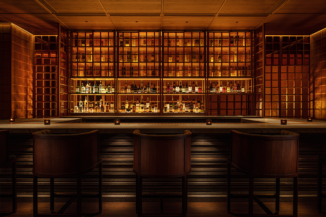
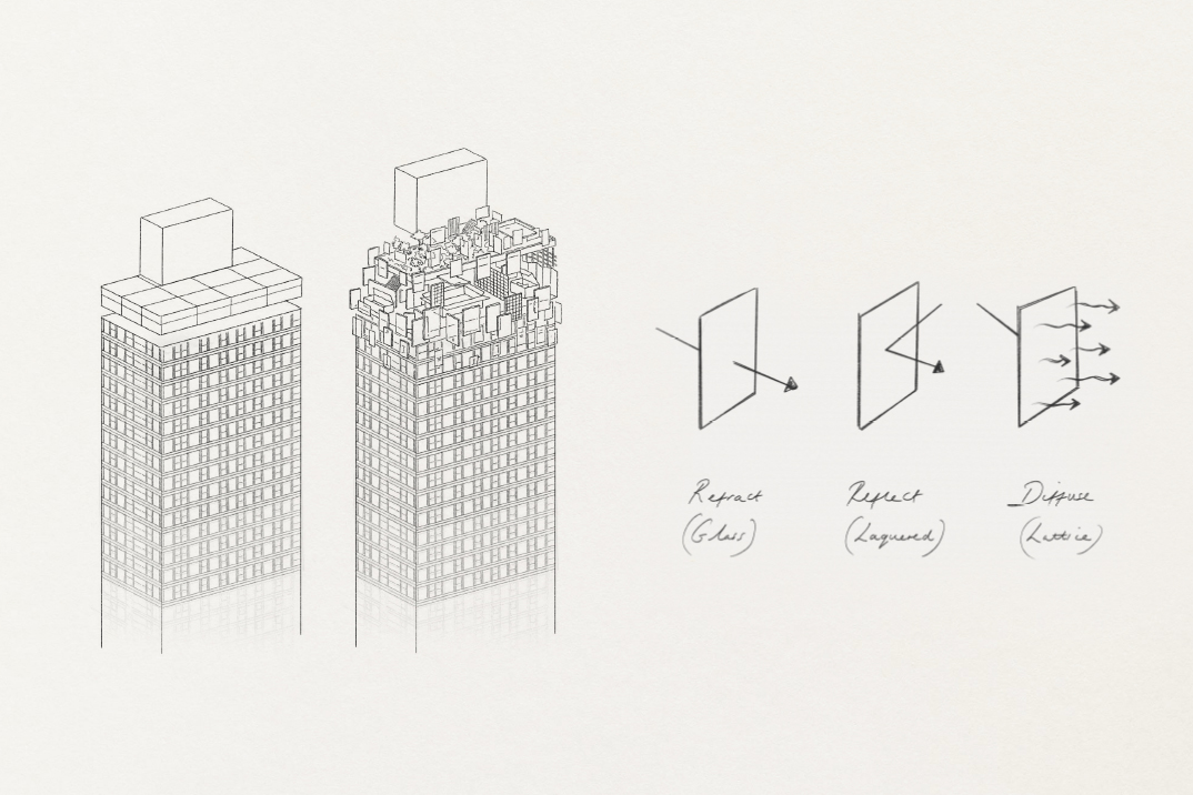
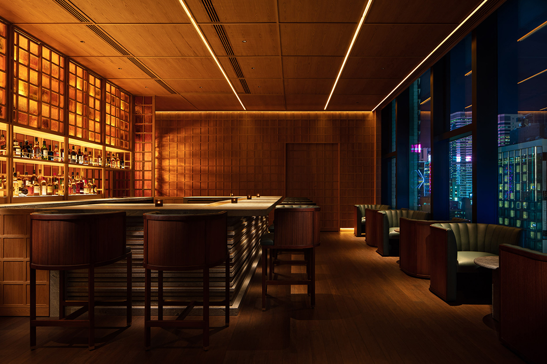
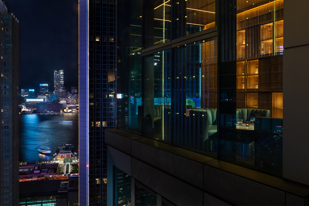
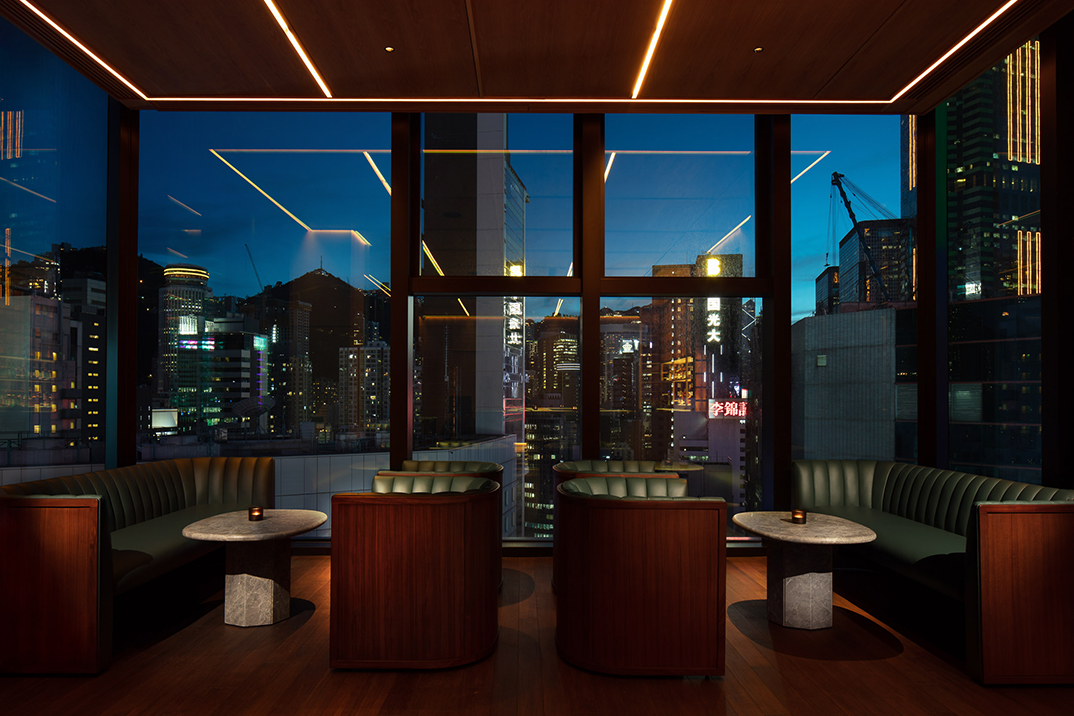
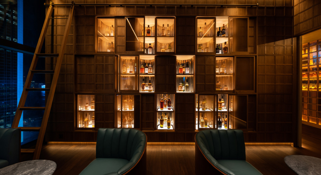
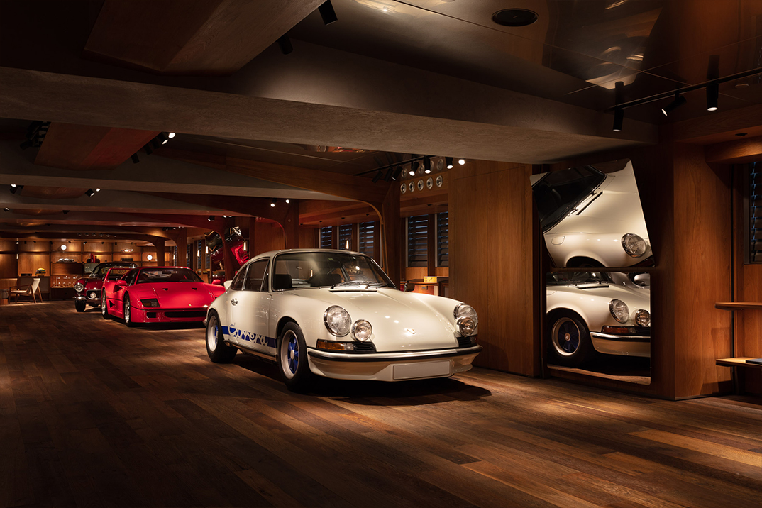
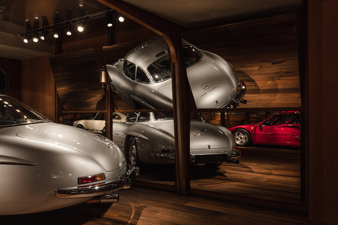
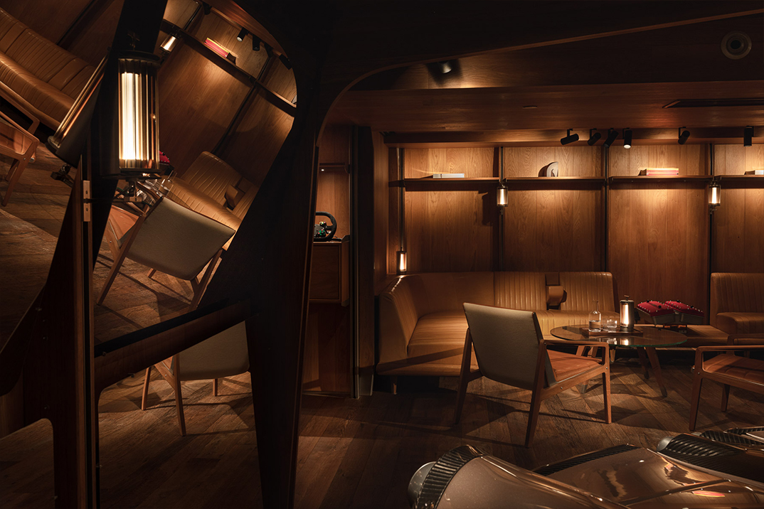
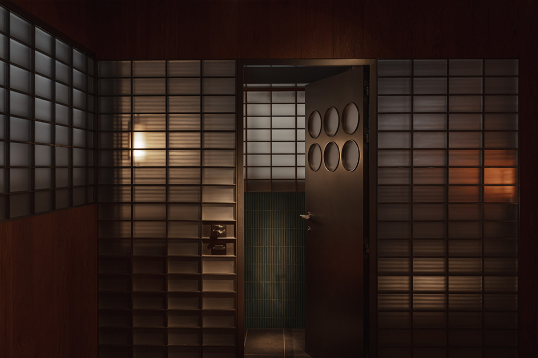
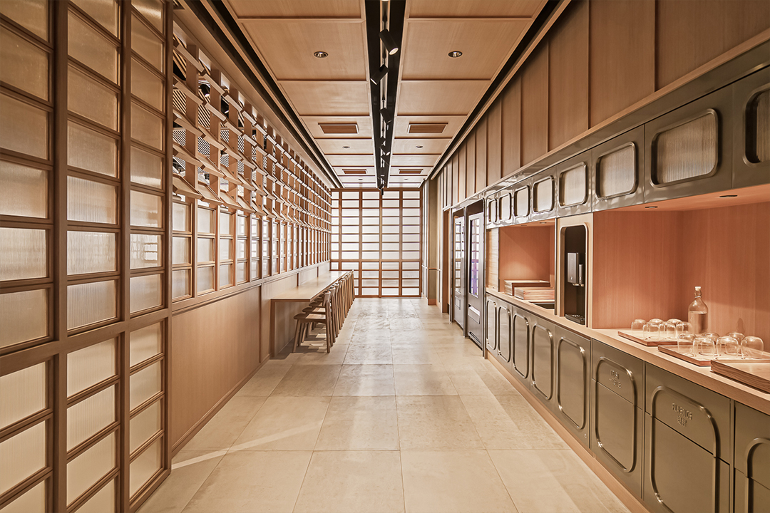
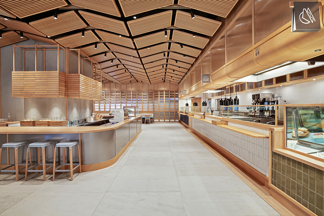
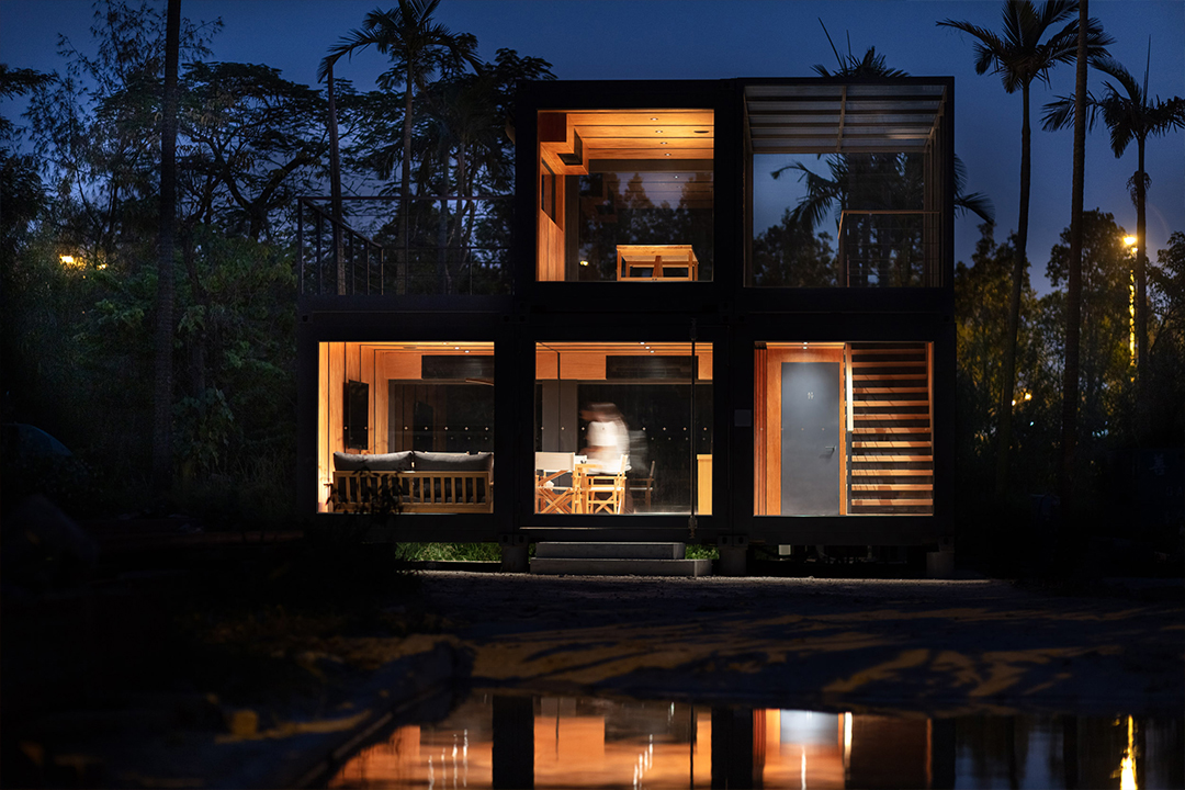
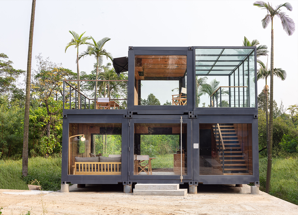
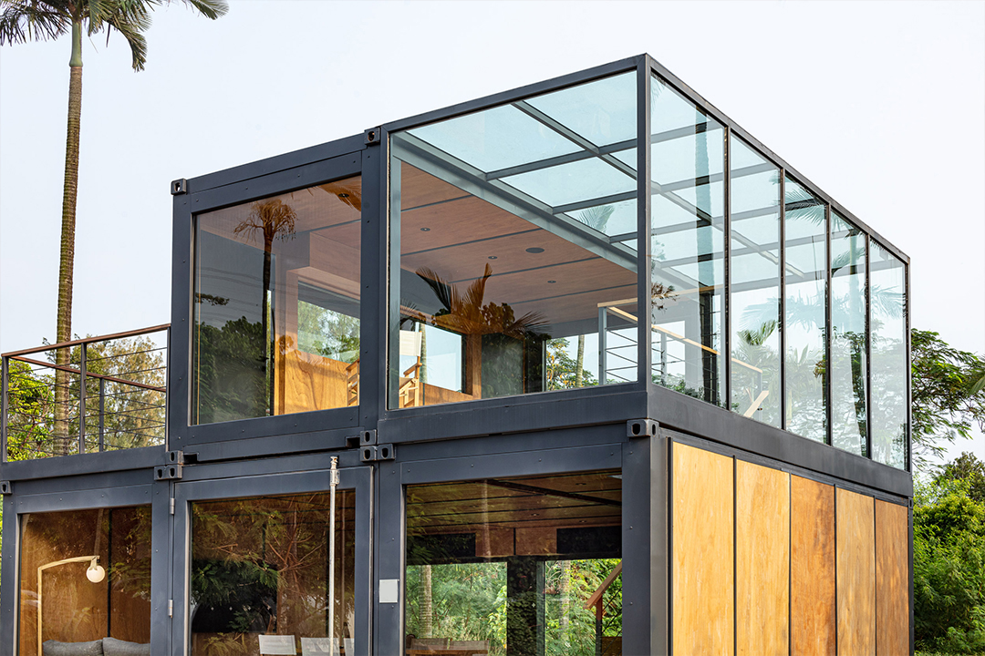
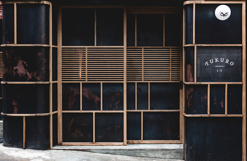
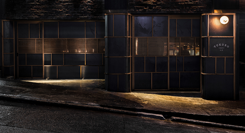
steeped in the spirit of the city, a space that creates a dialogue with the surrounding architecture through a geometric language laying the foundation of a spectacular cityscape. like a house of light suspended in the sky, uncle ming’s guides people towards its trove of fine whiskies, taking guests on a journey of discovery as they unbox the treasures within.

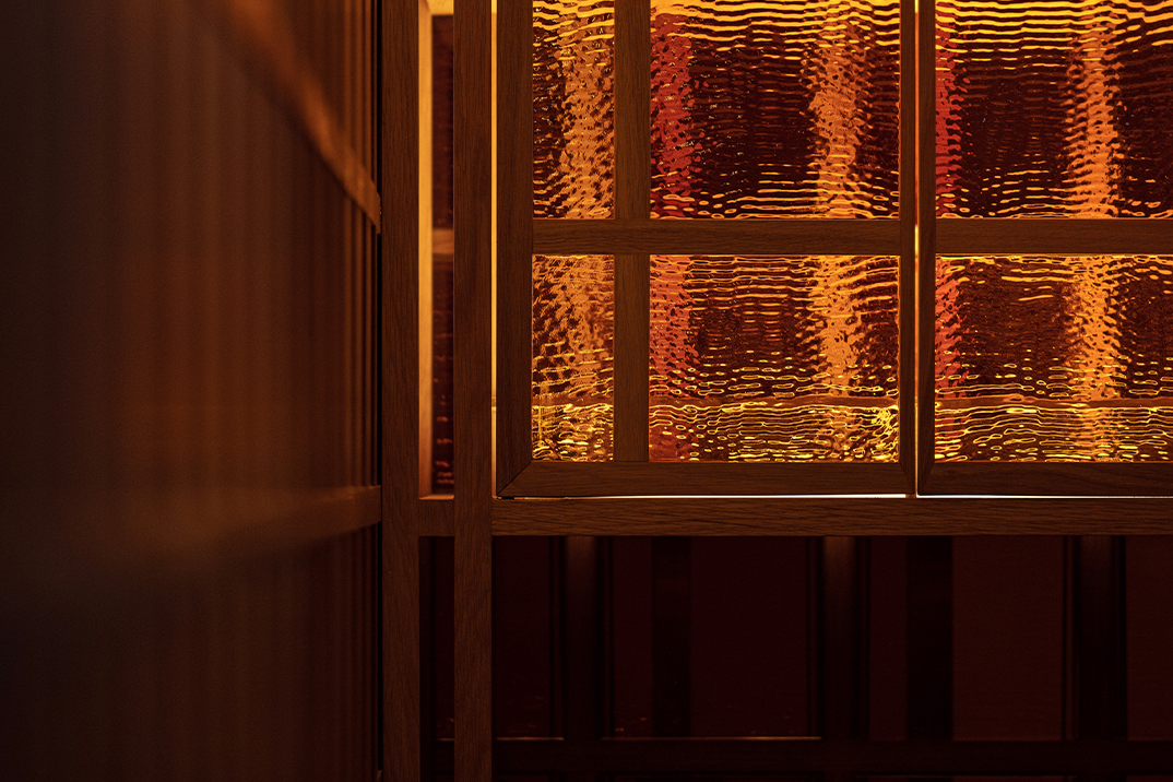
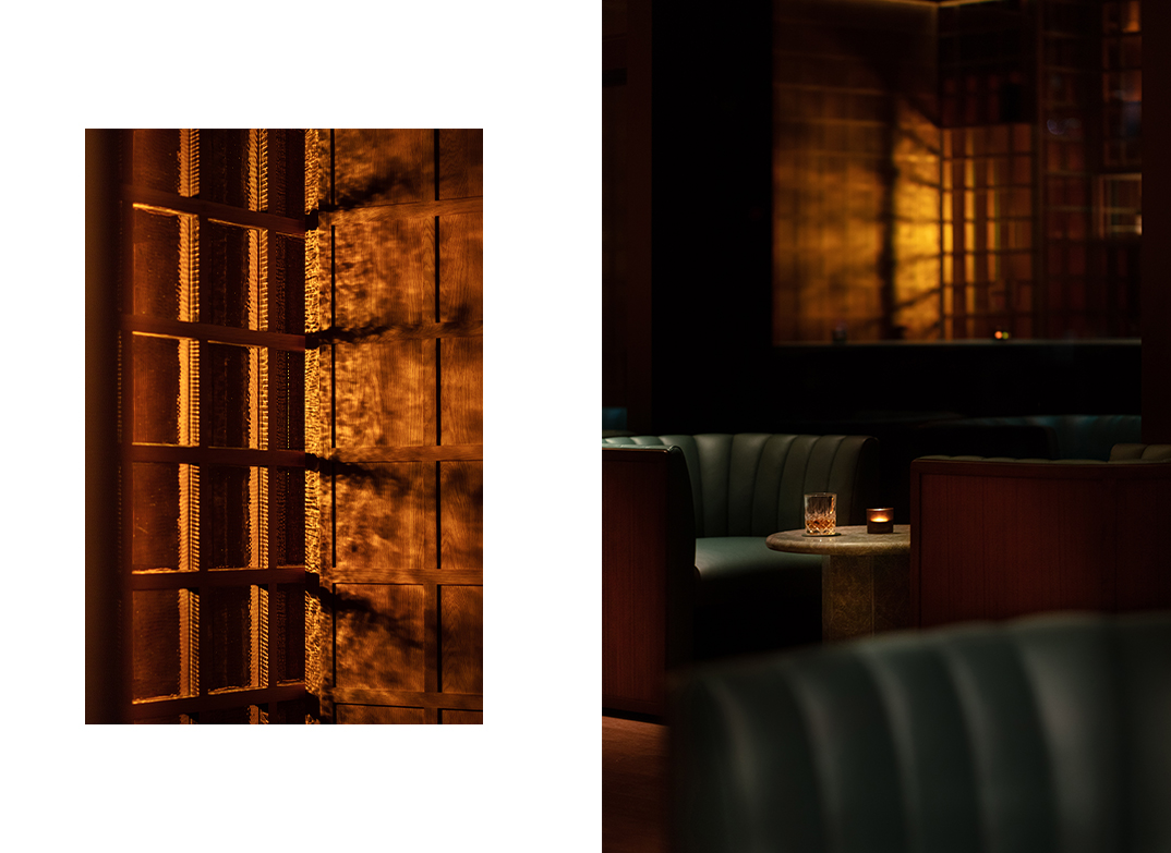
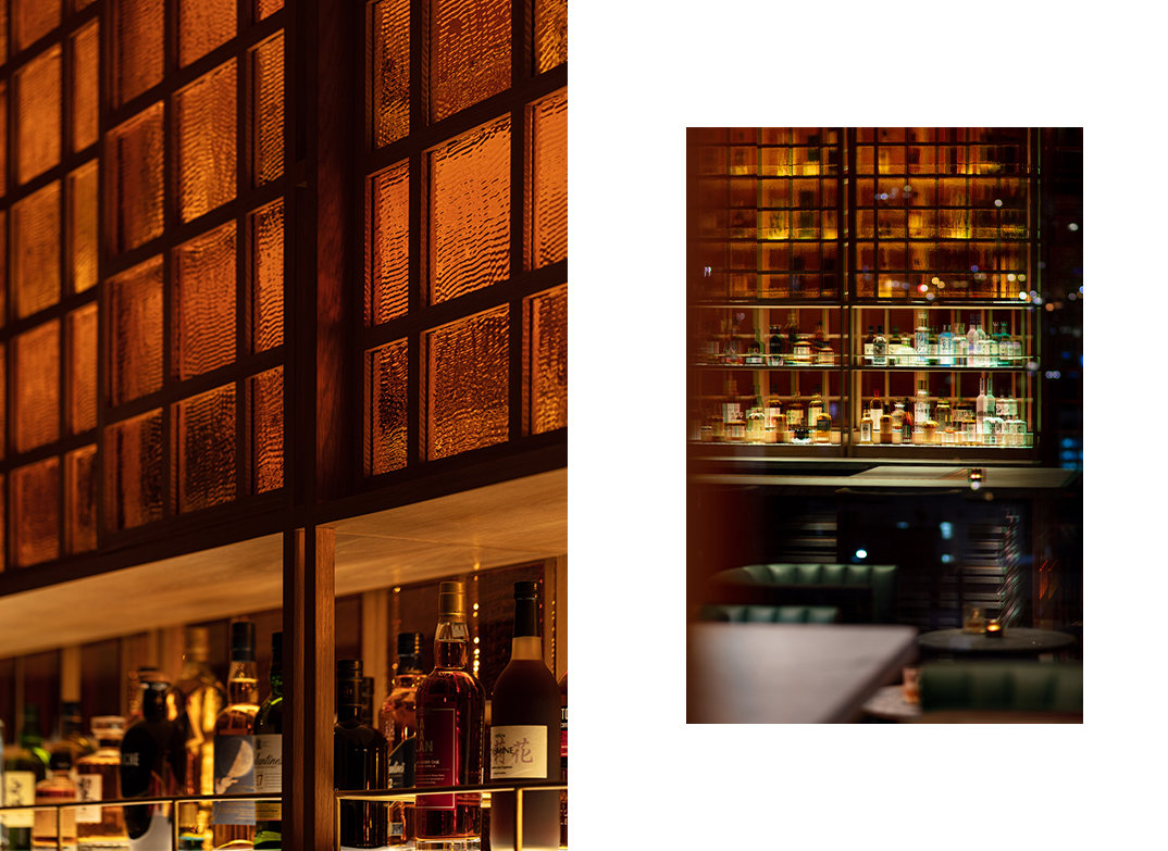
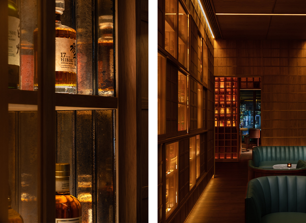
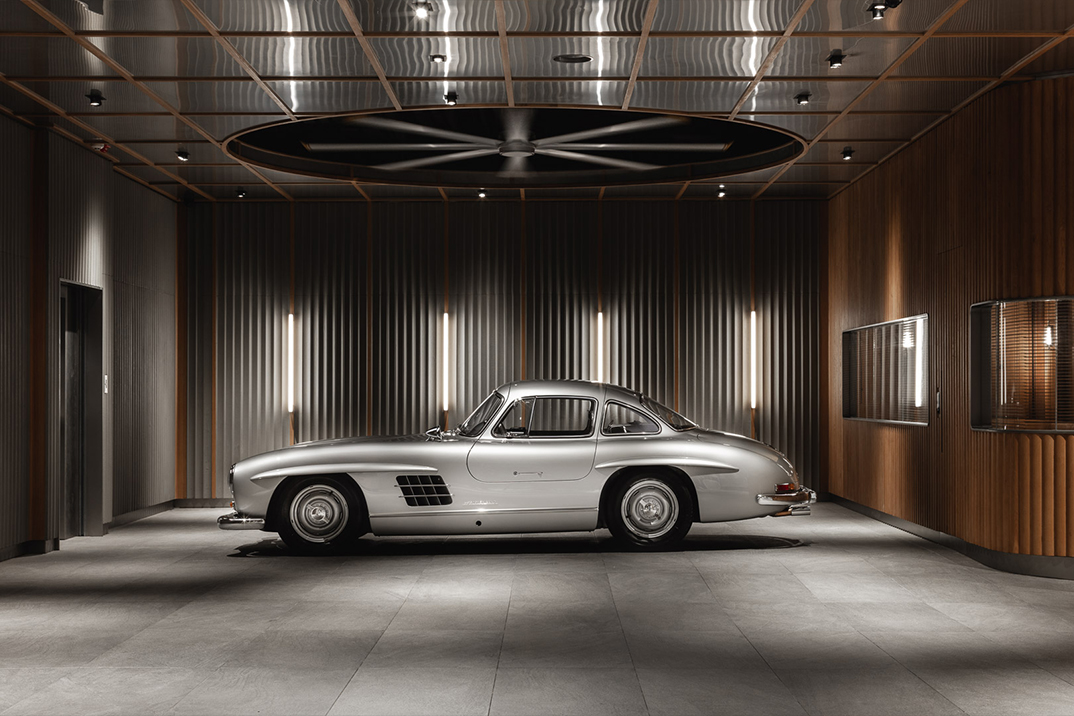
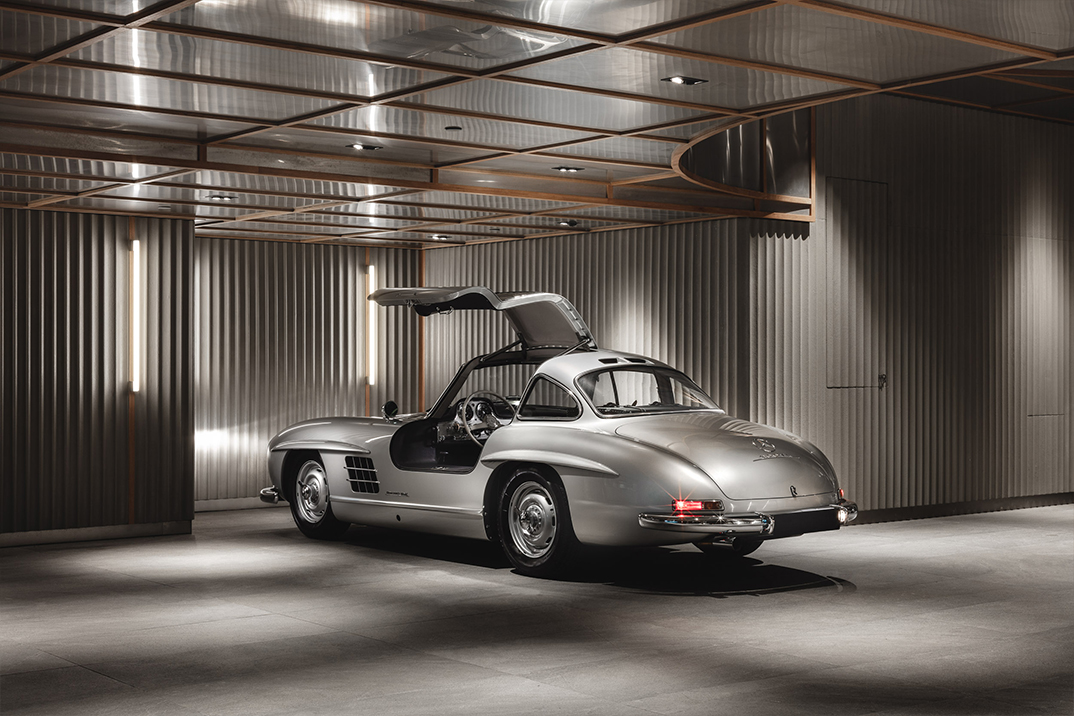
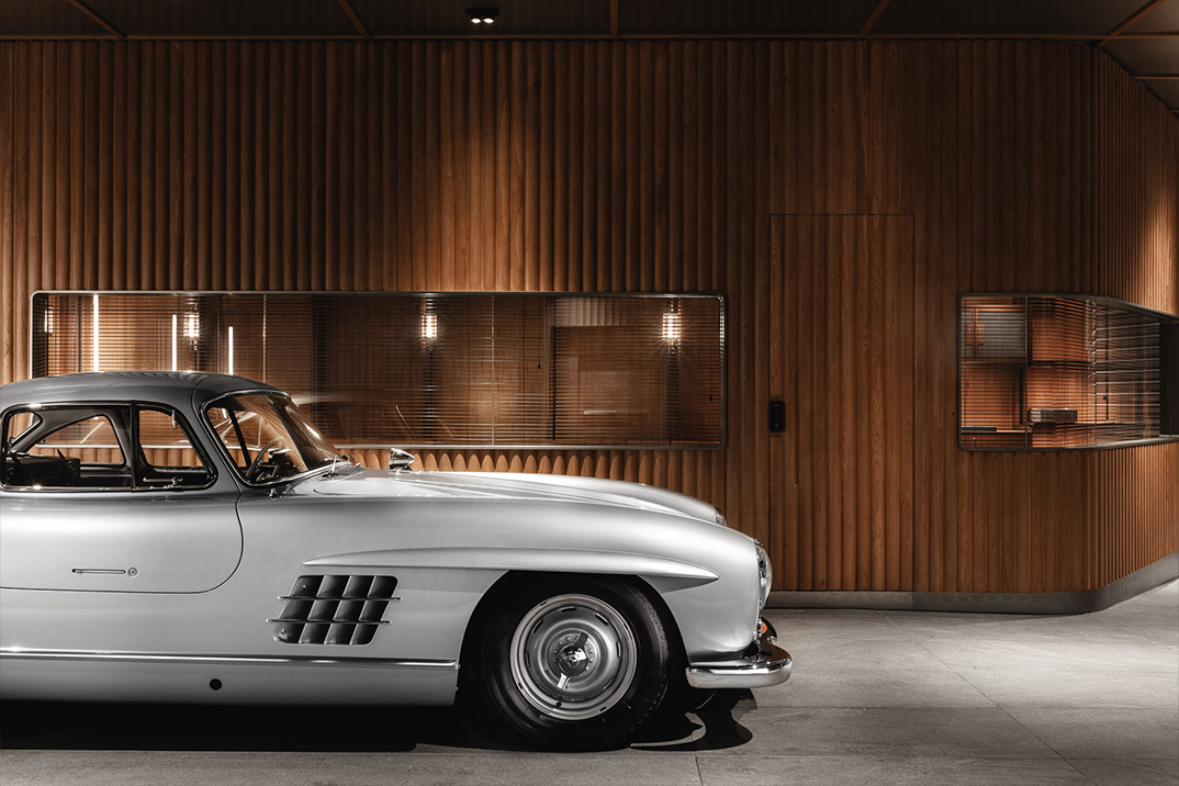
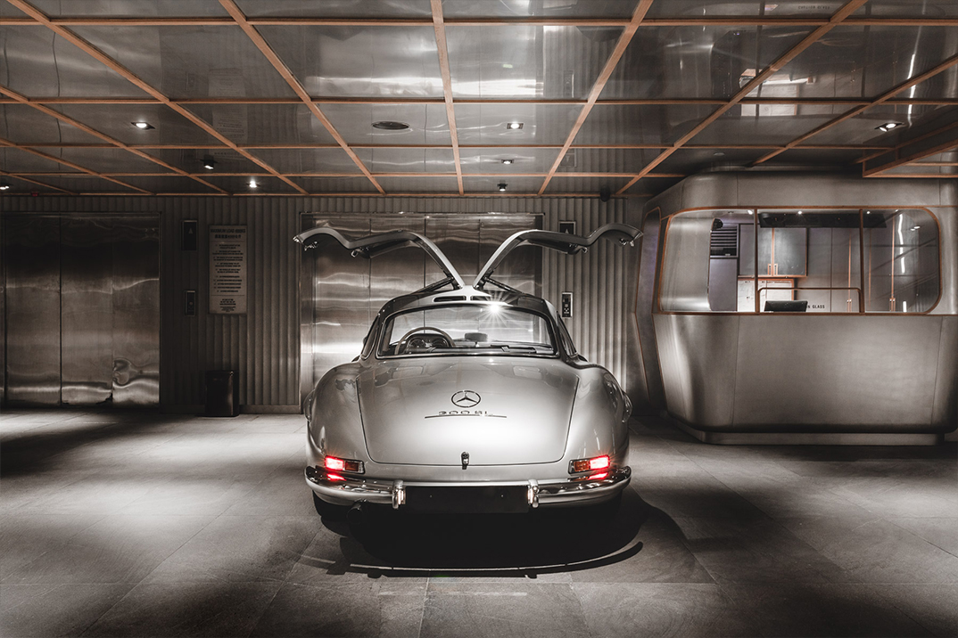
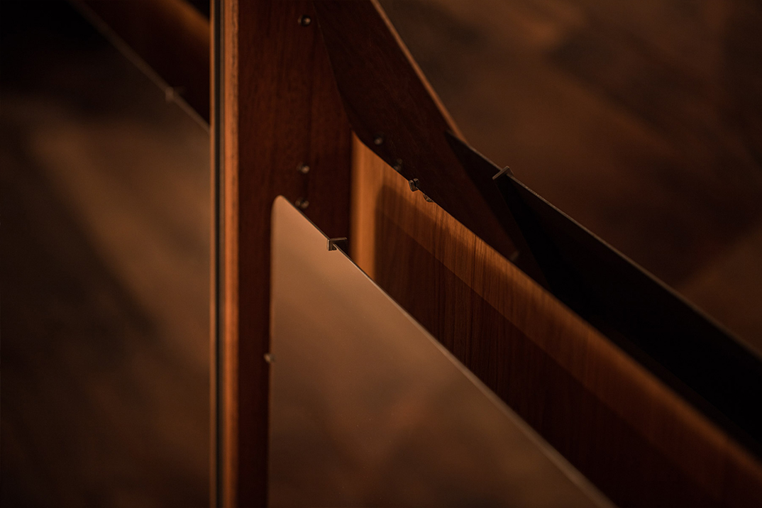
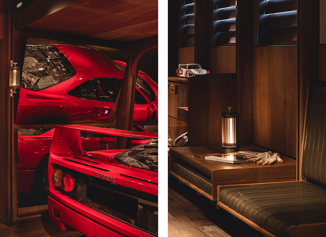
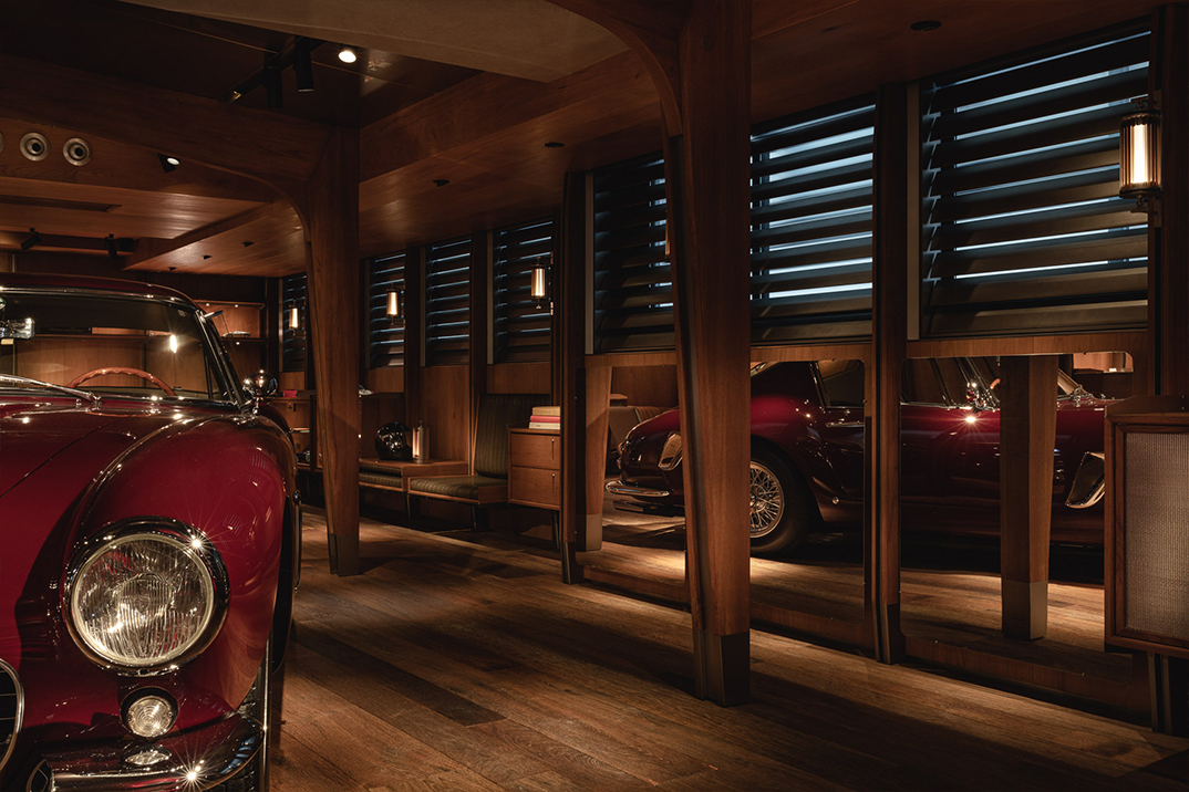
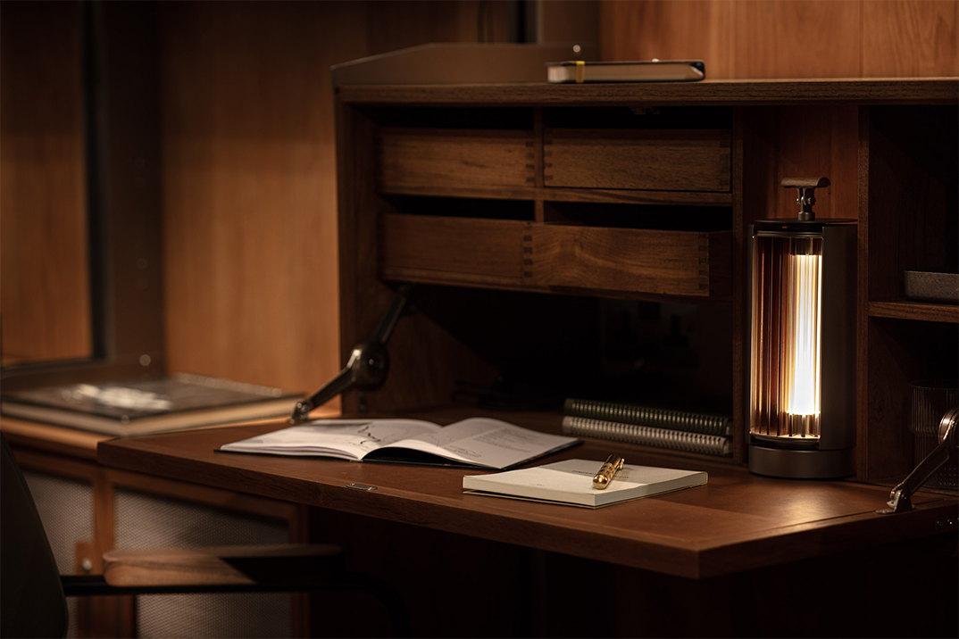
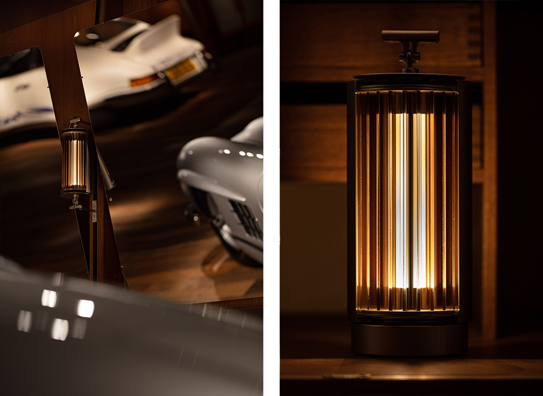
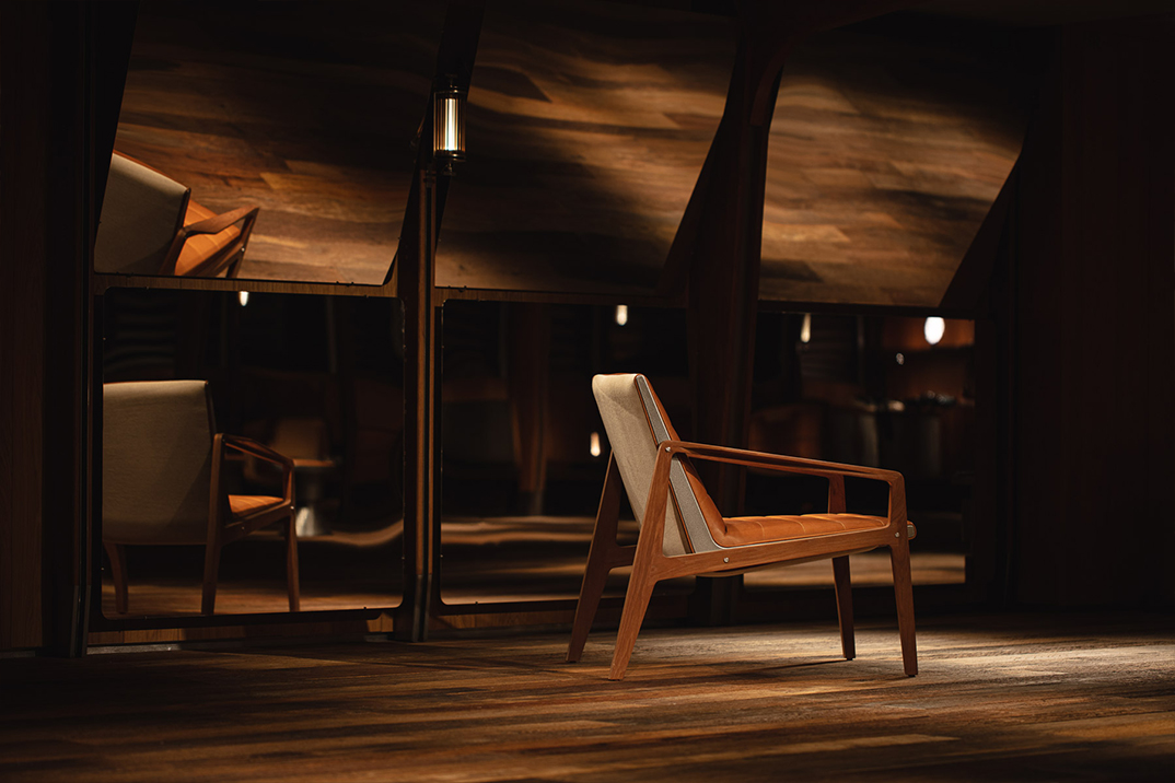
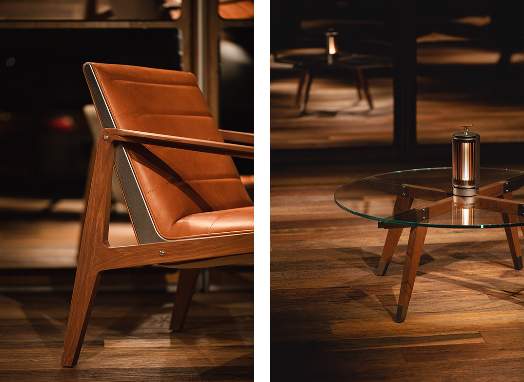
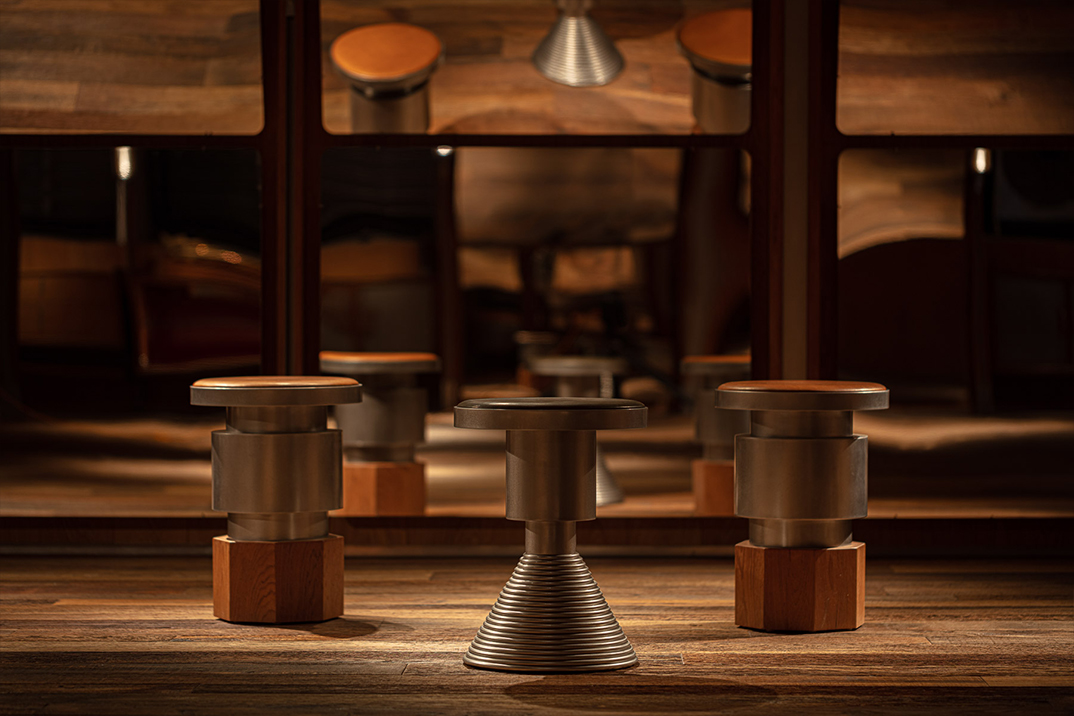
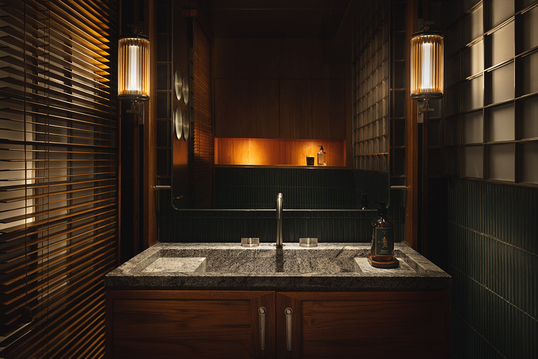
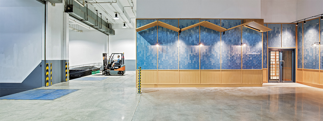
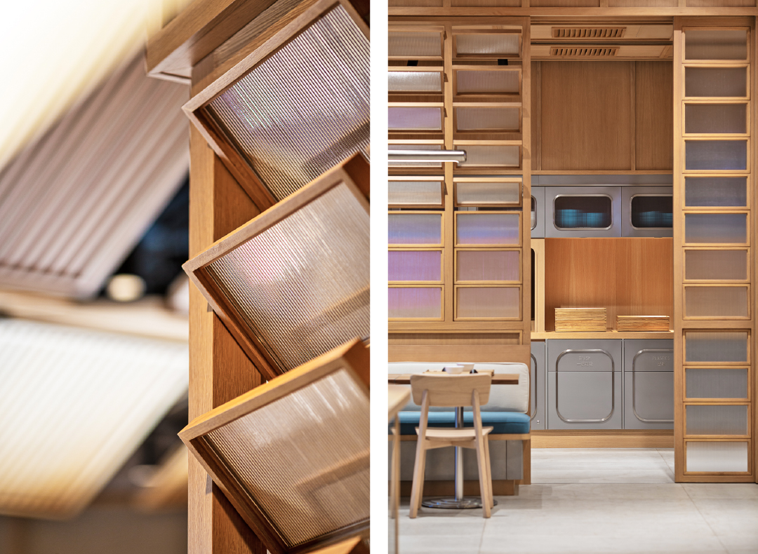
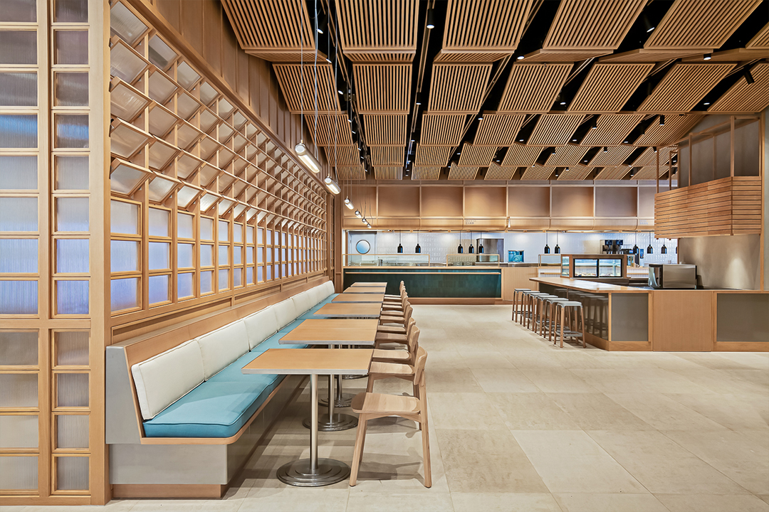
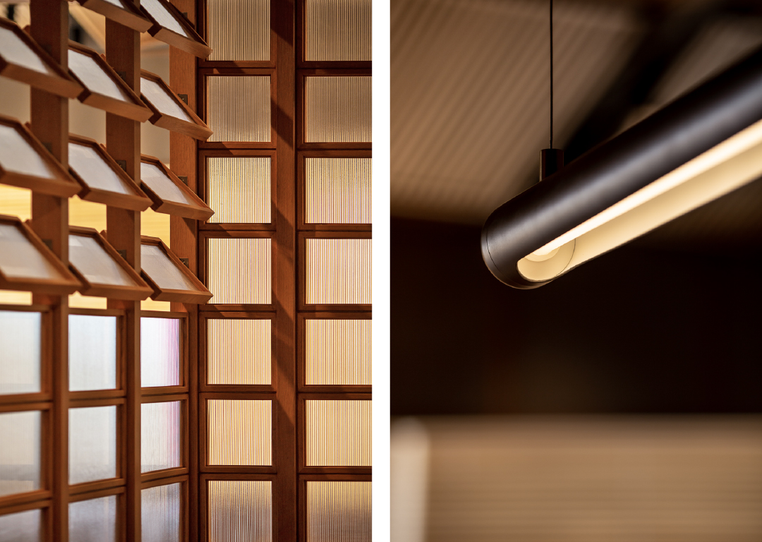
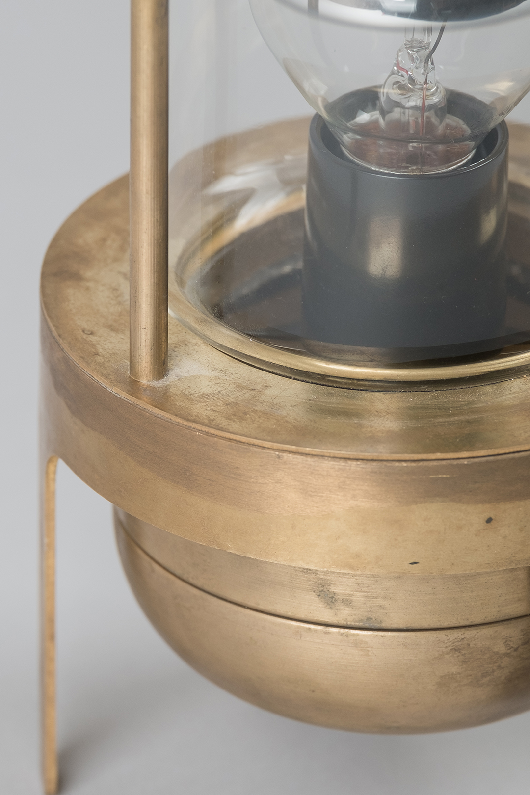
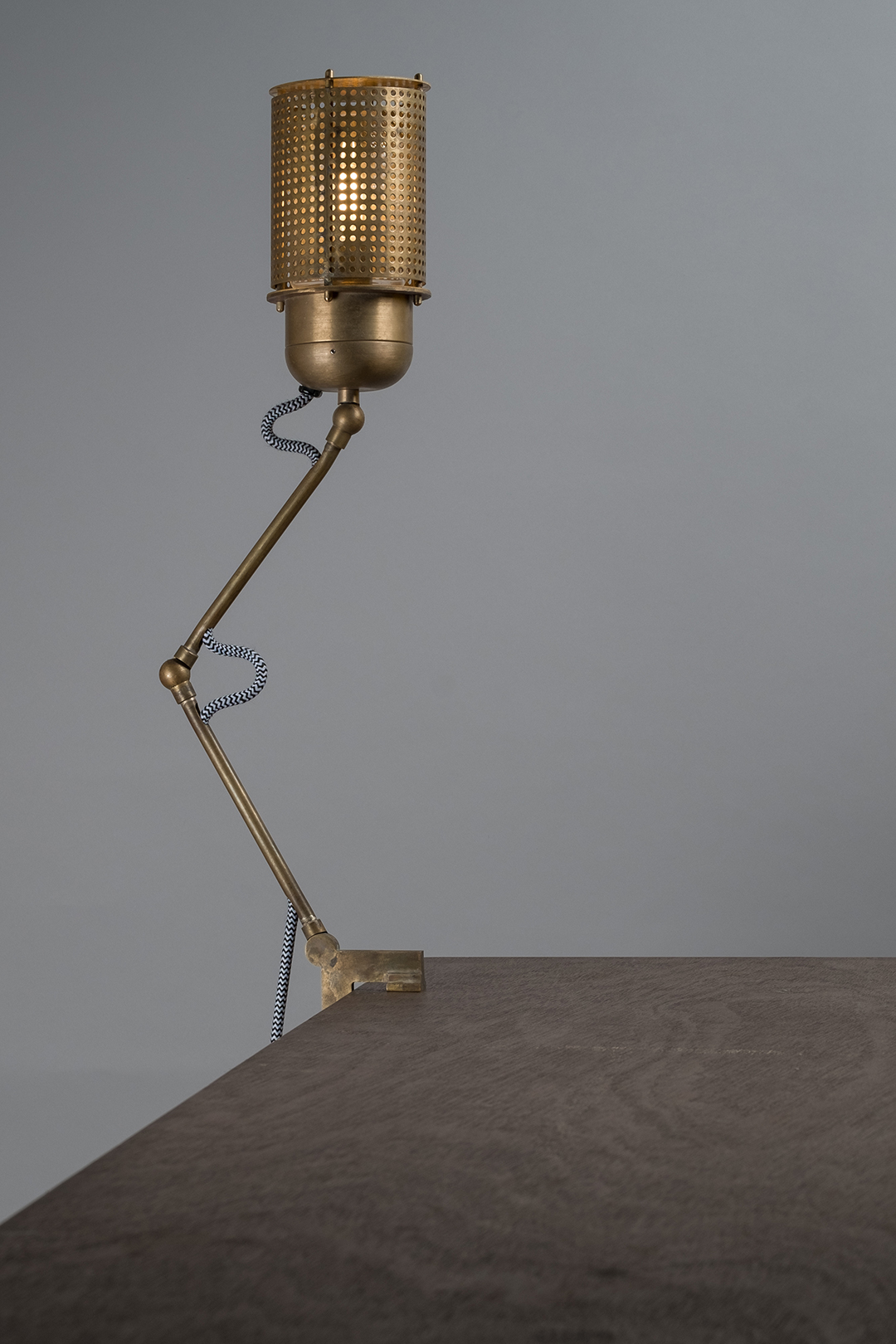
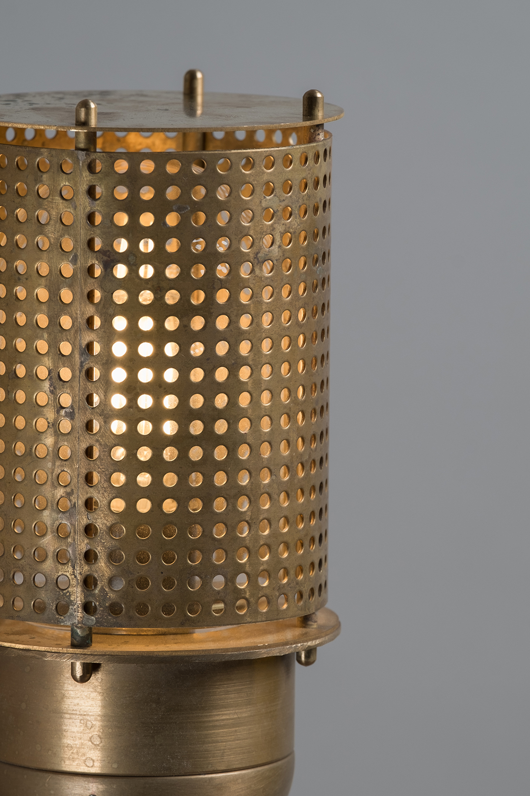
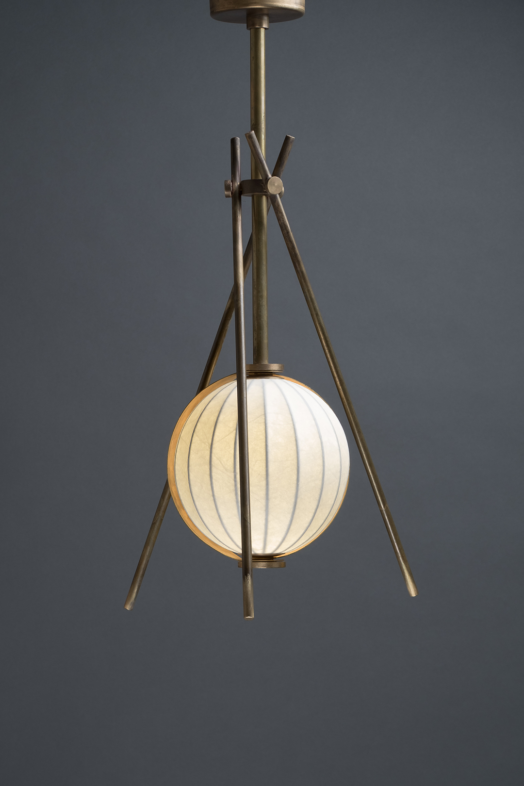
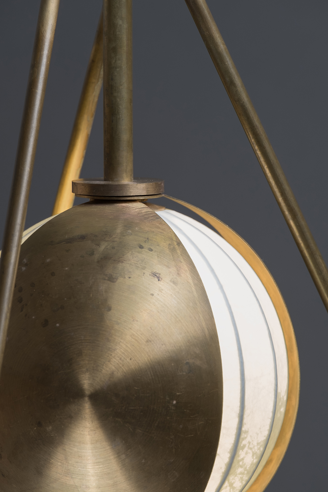
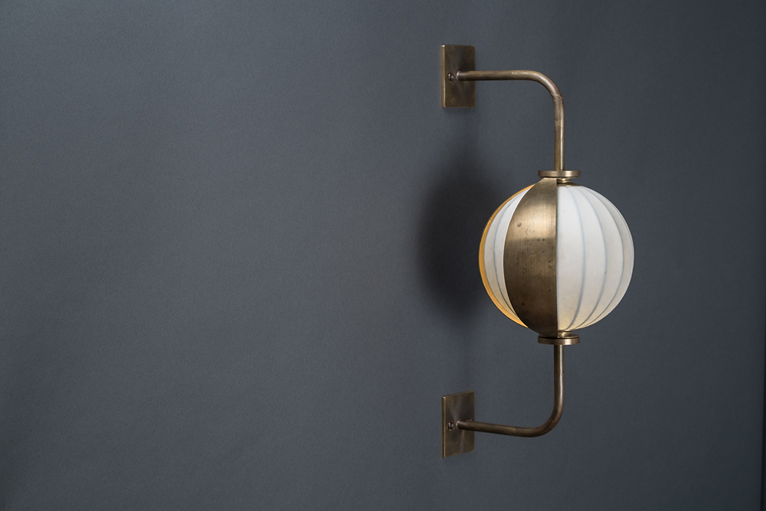
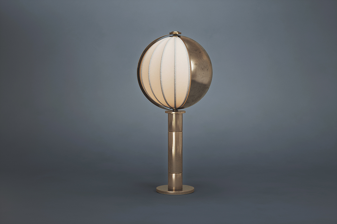
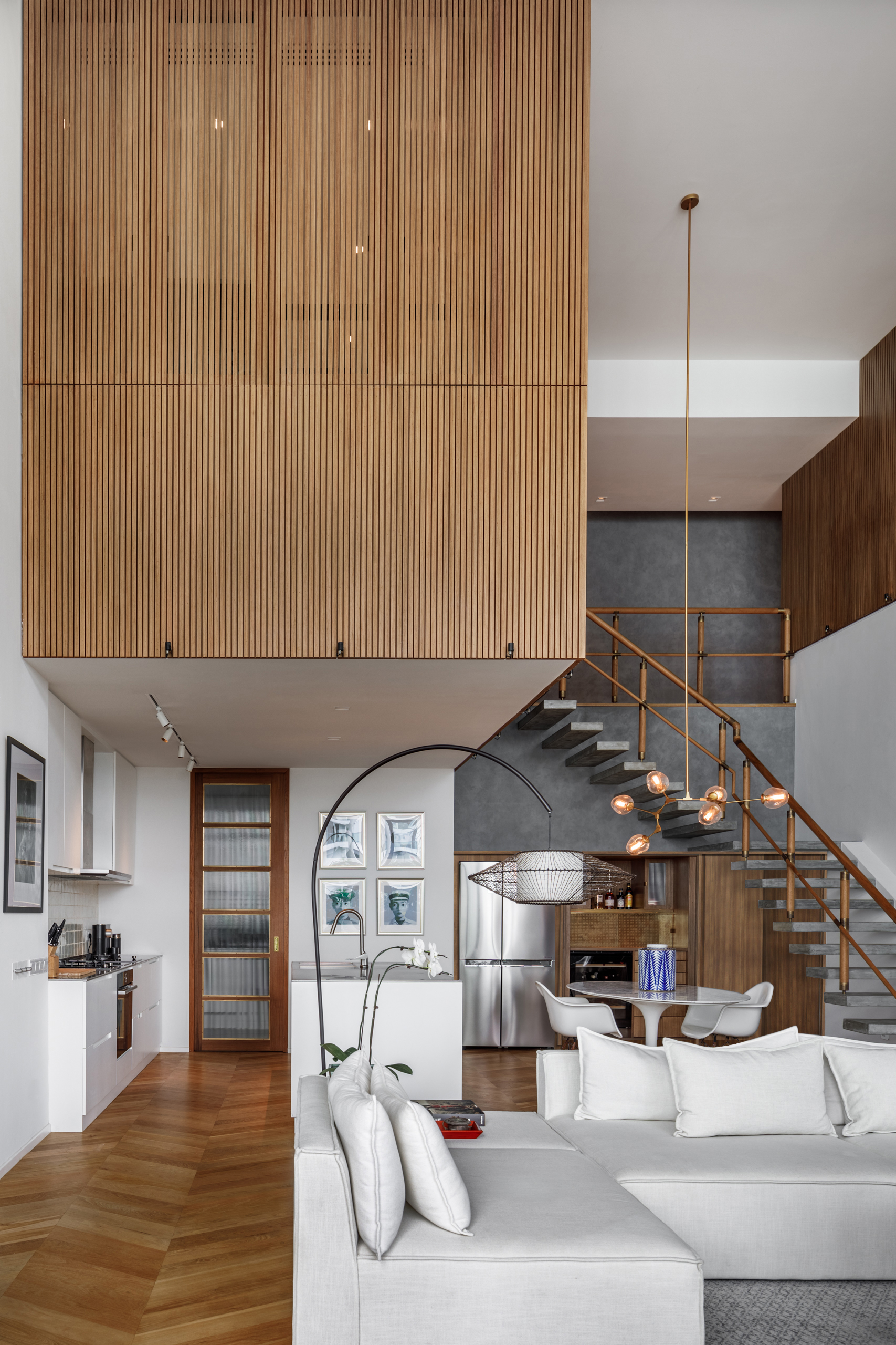
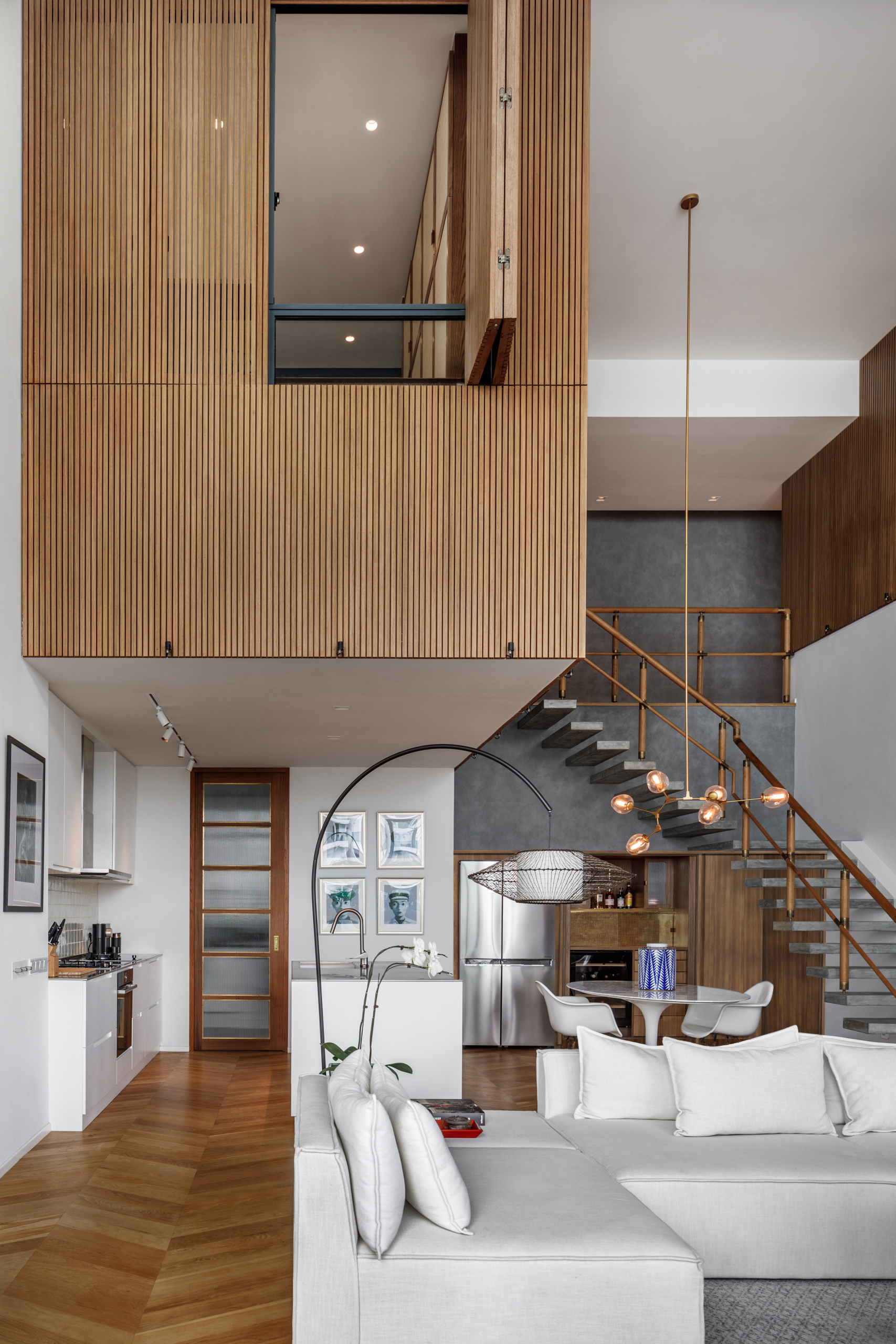
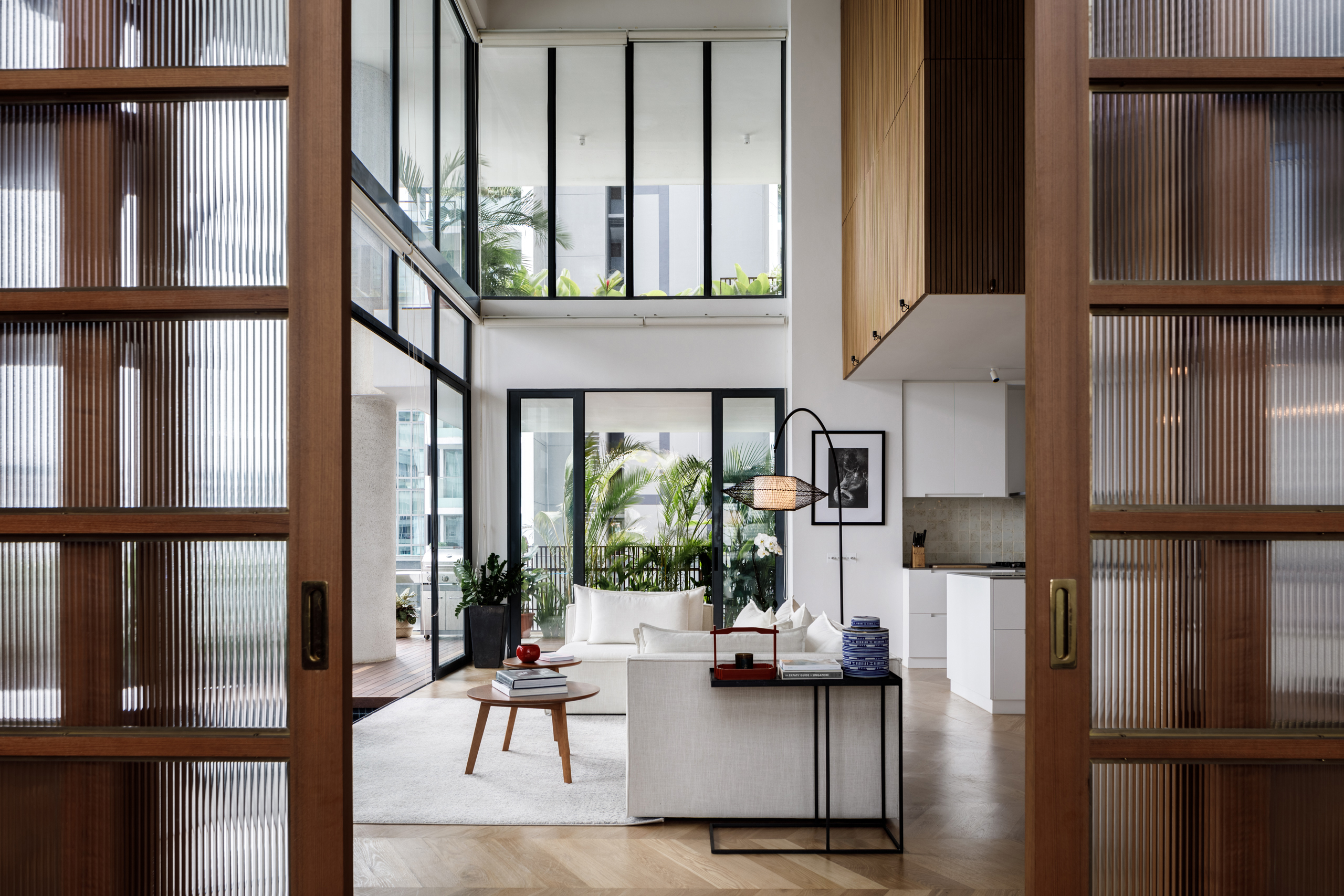
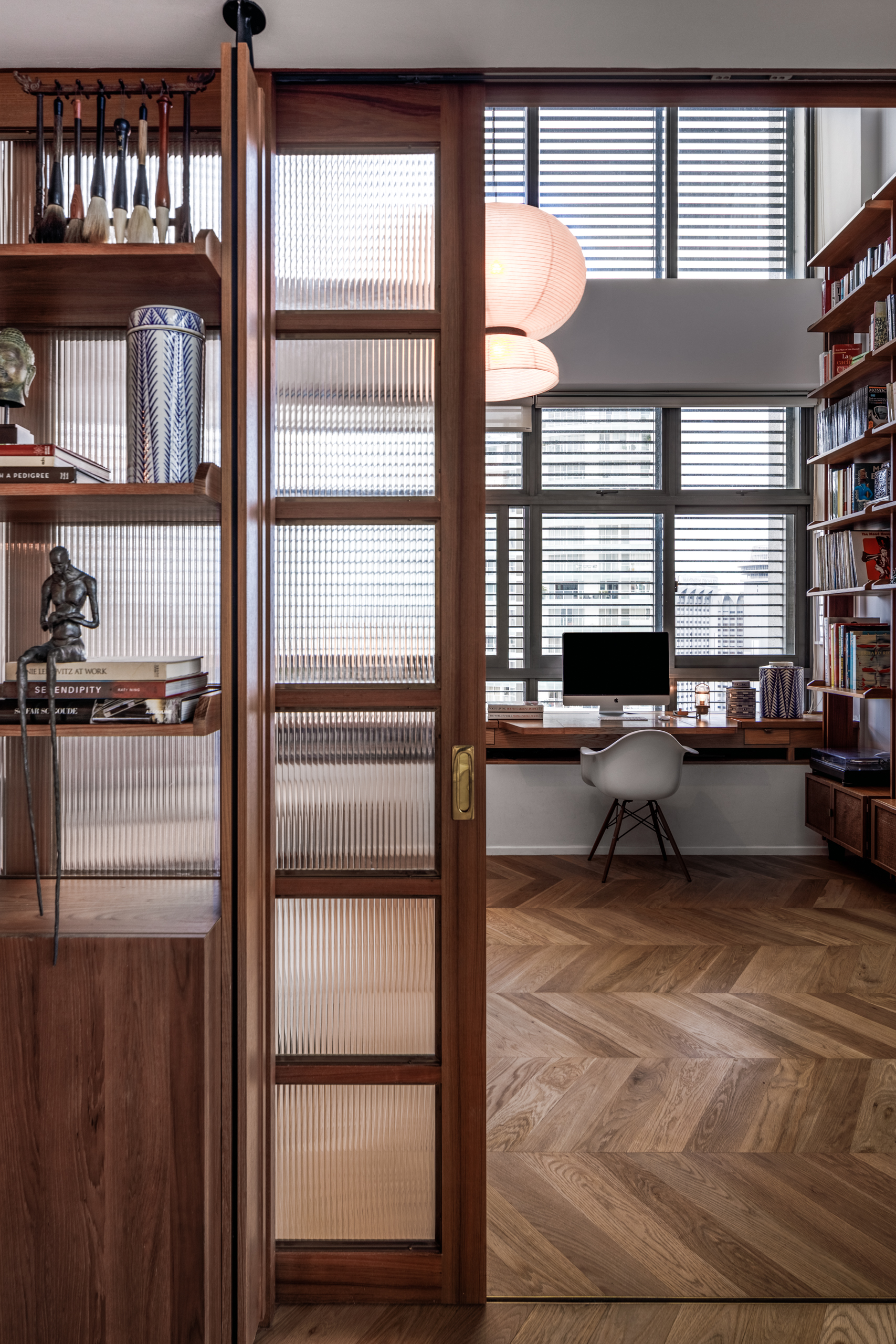
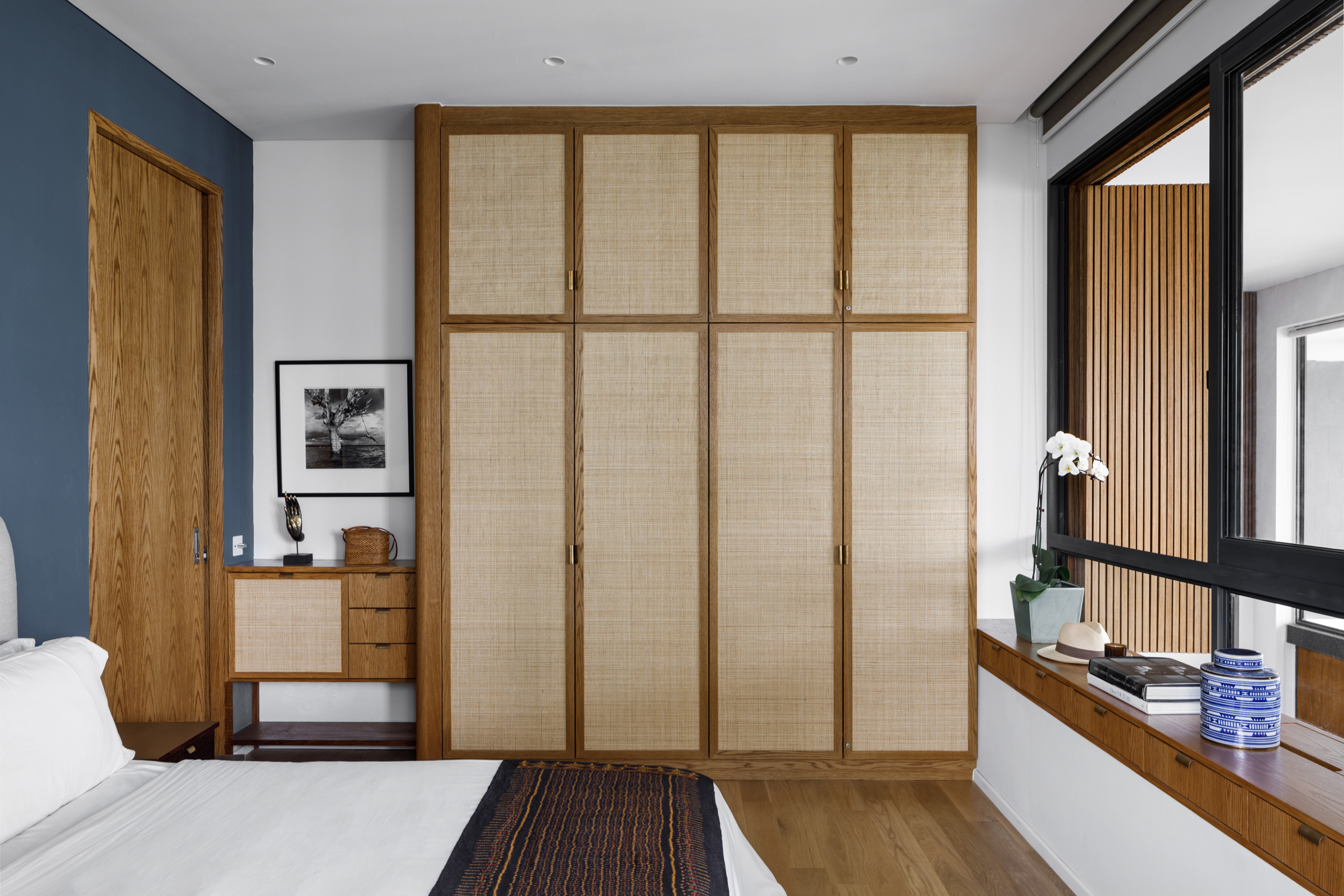
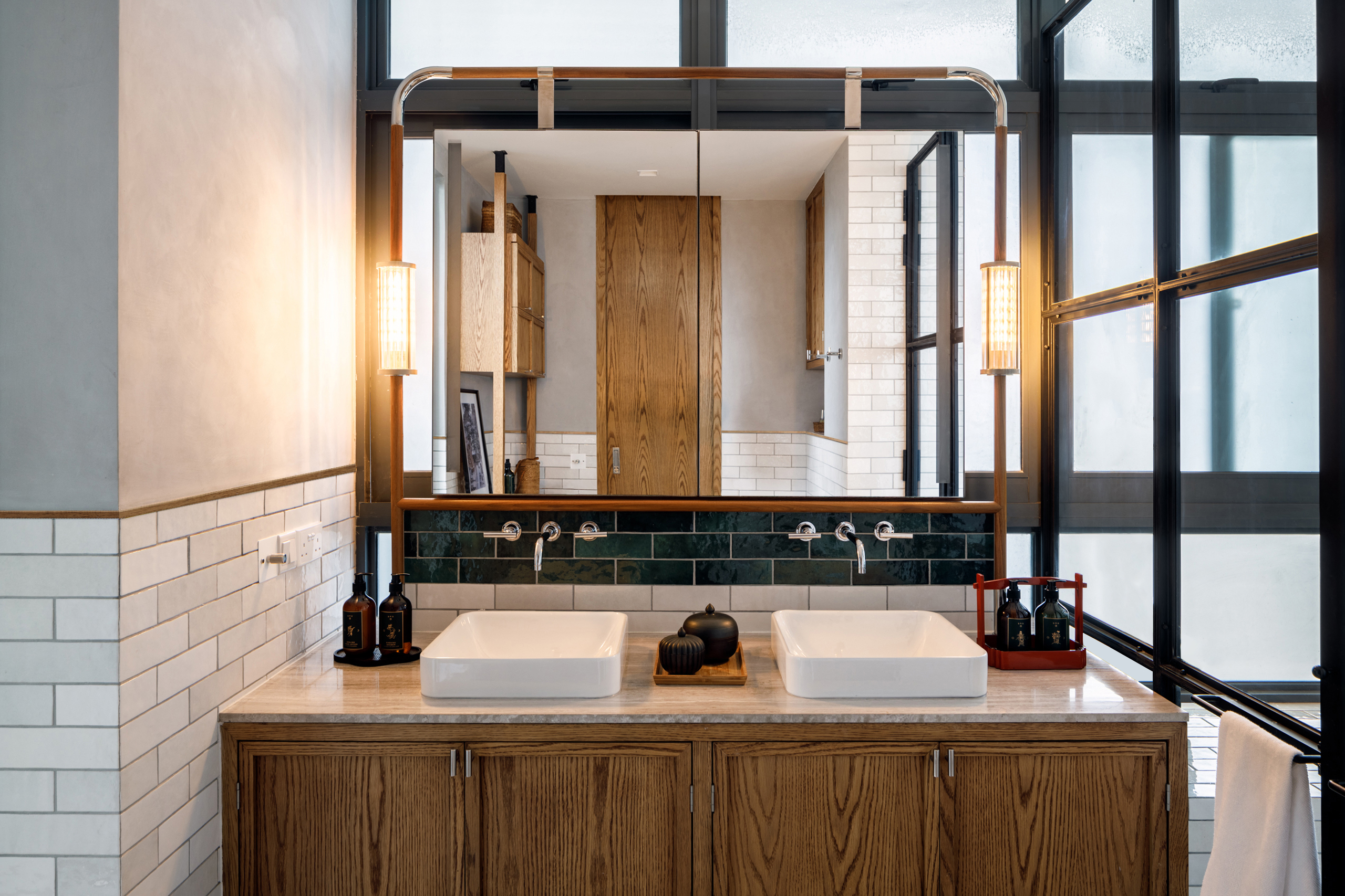
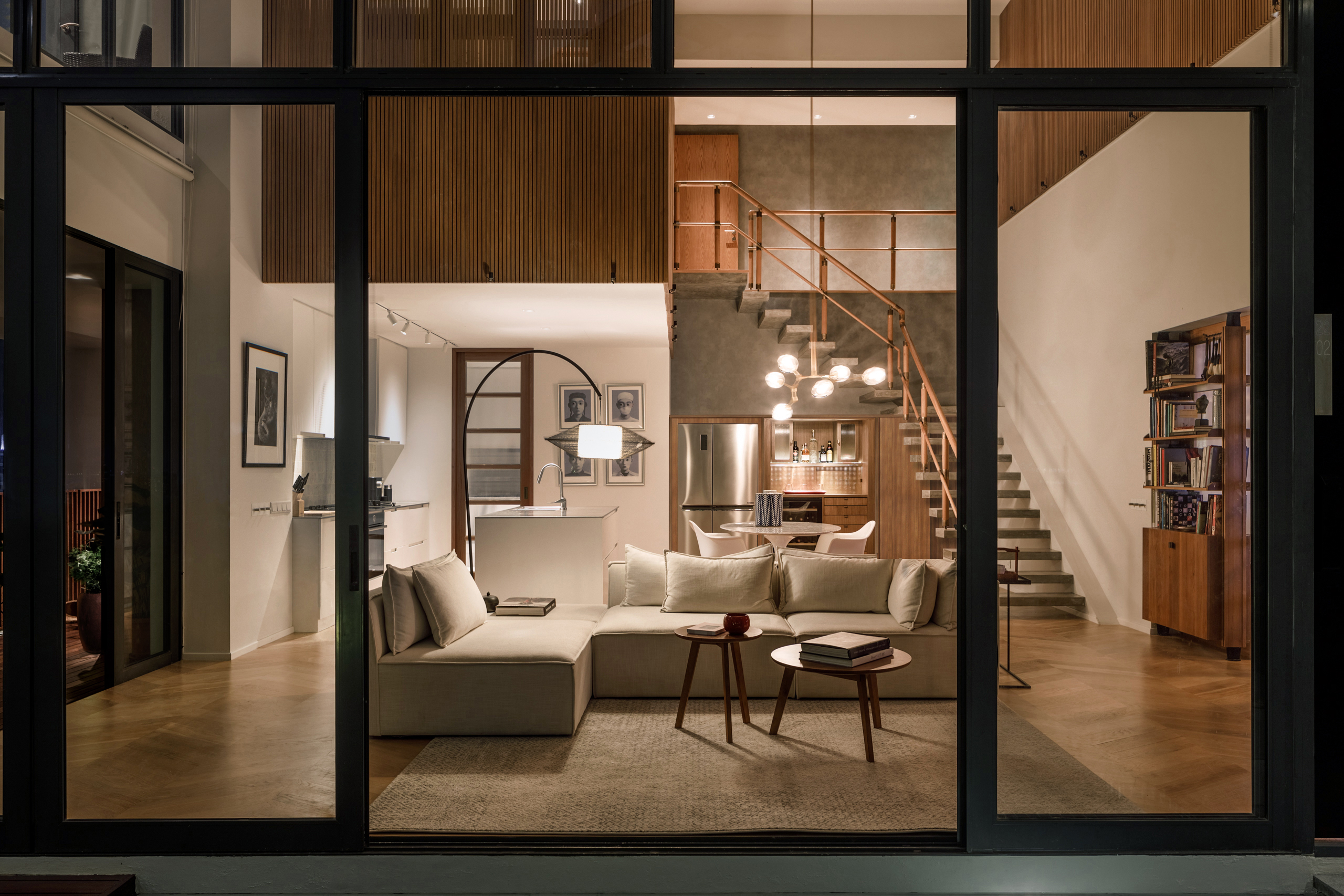
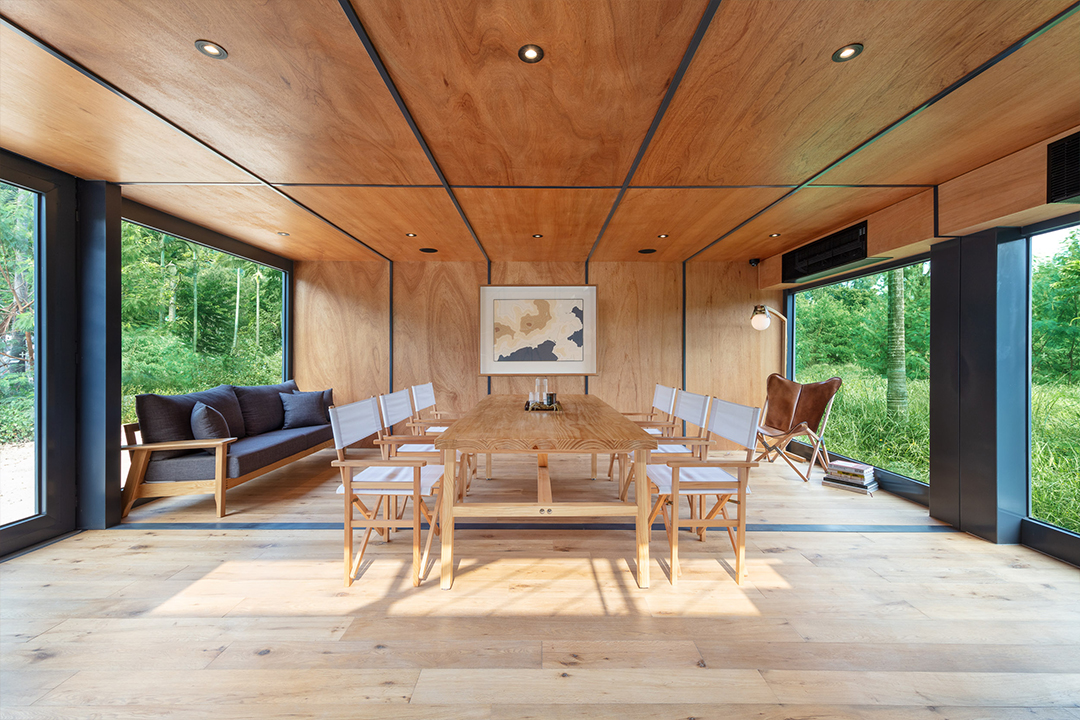
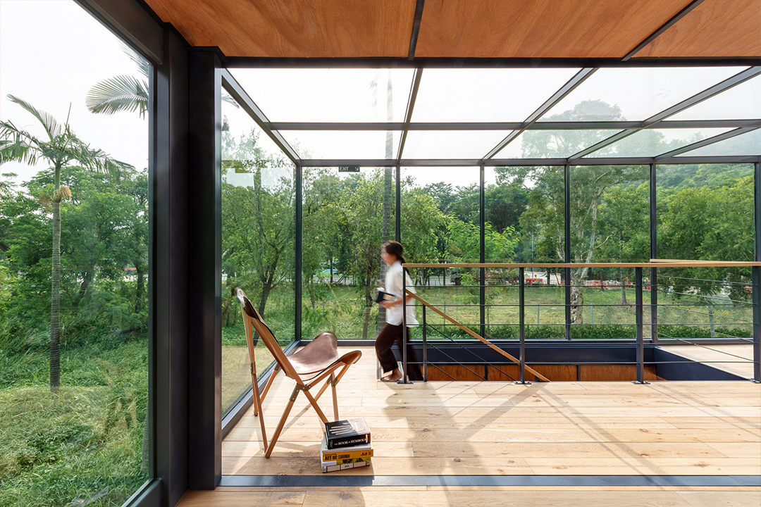
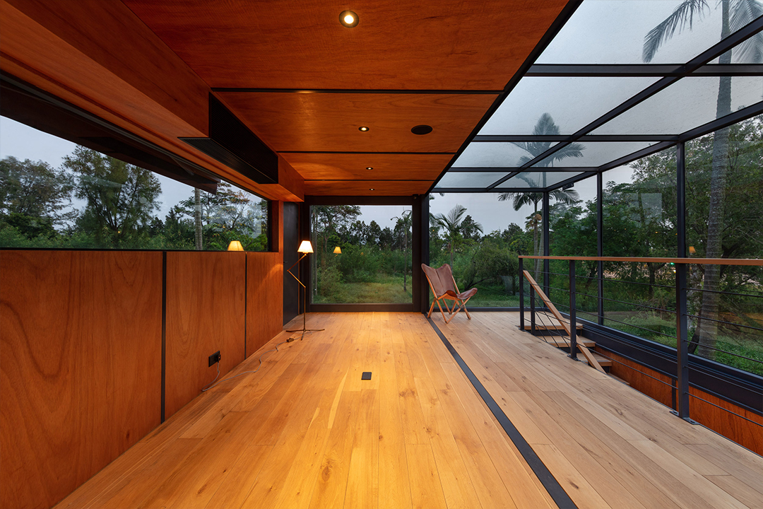
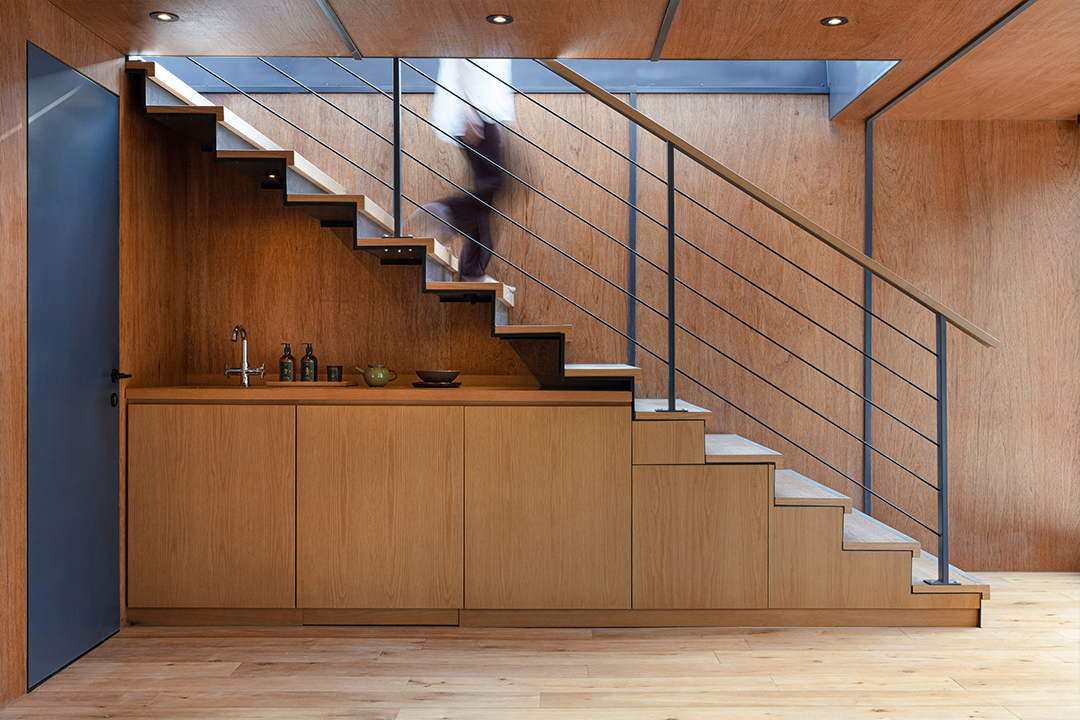
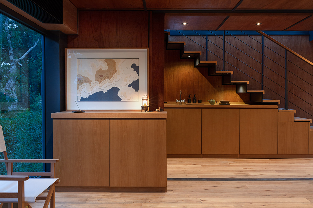
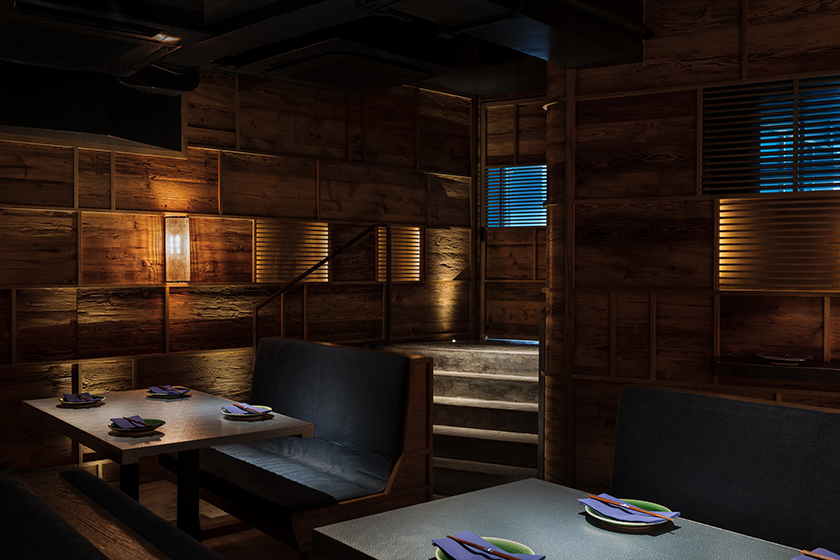
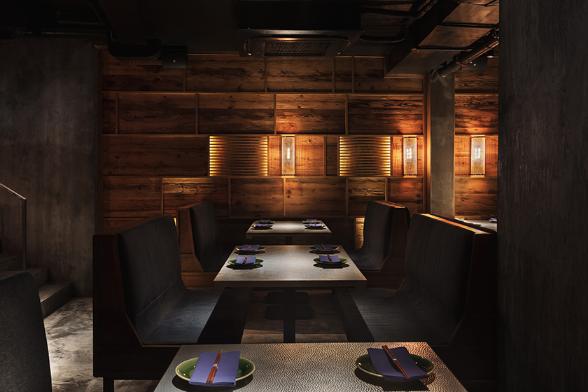
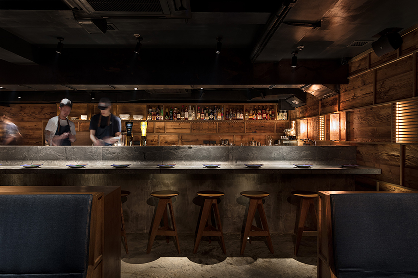
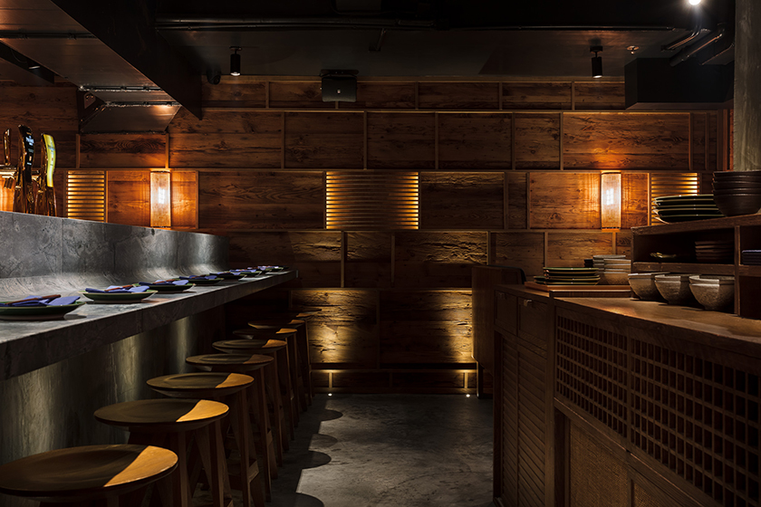
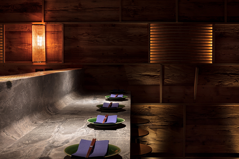
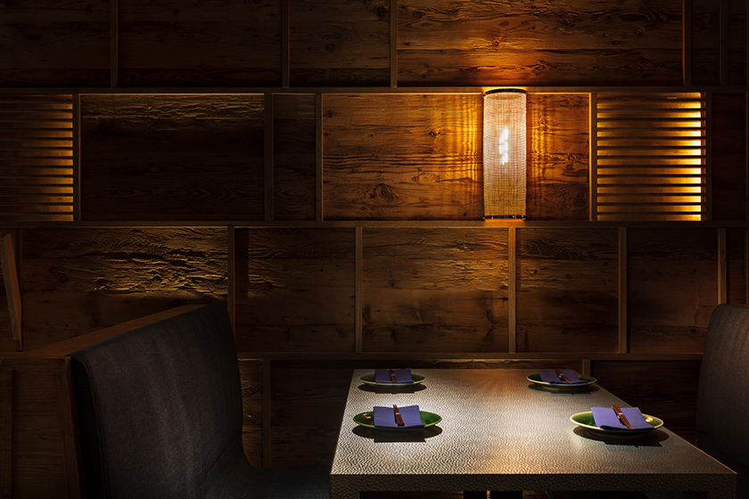
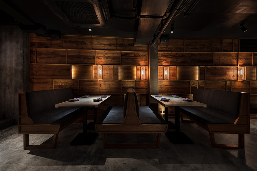
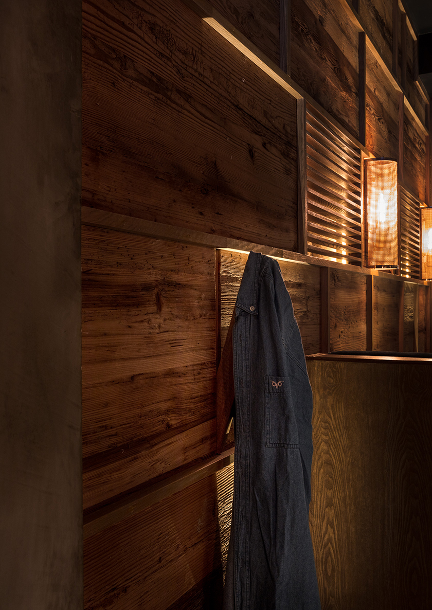
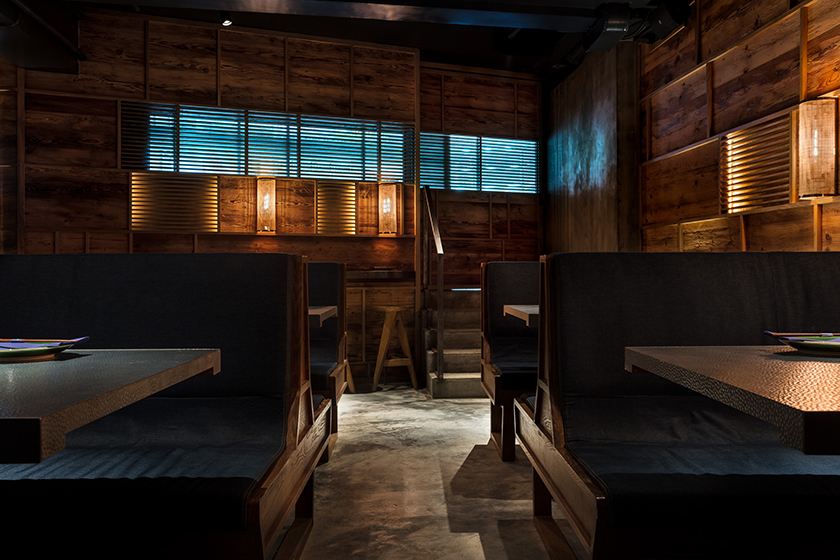
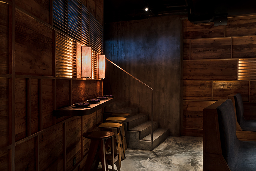
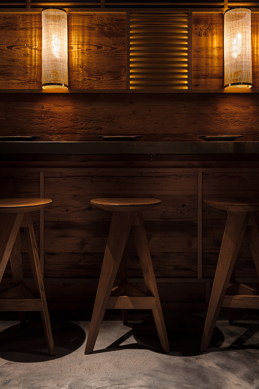
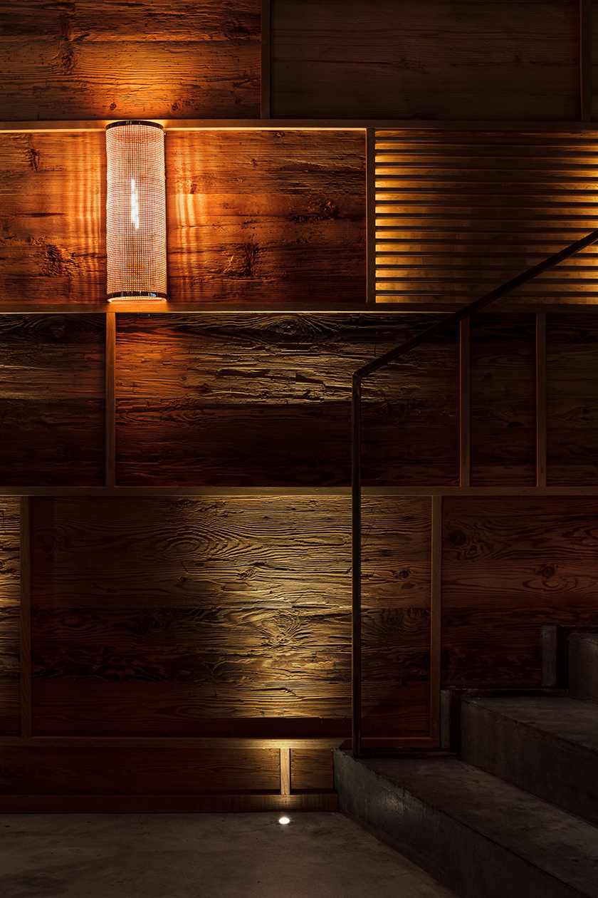
formed by simple, rectilinear shapes and realised through soulful materials, the den unfolds as an enigmatic cubic volume. light is refracted by rippled glass, detailing the walls with shadows and slow, orderly movements that exalt into a quiet allure. minimal yet sumptuous, the spatial experience encapsulates the essence of the city’s polarity.

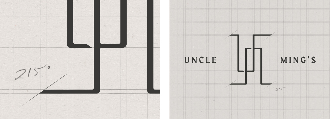
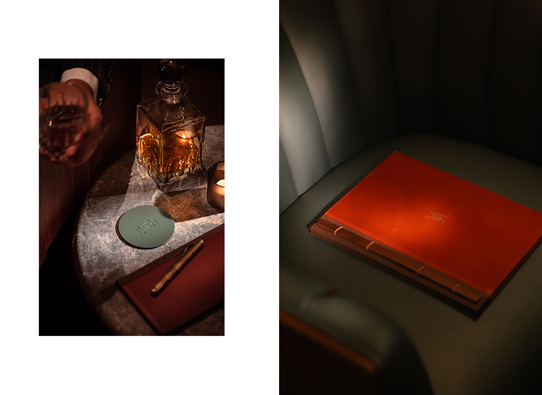
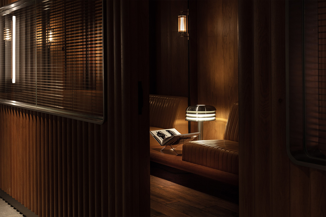
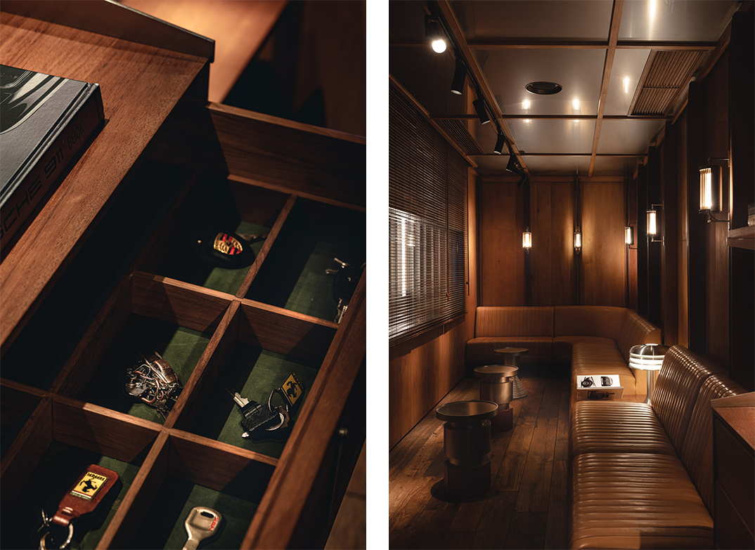
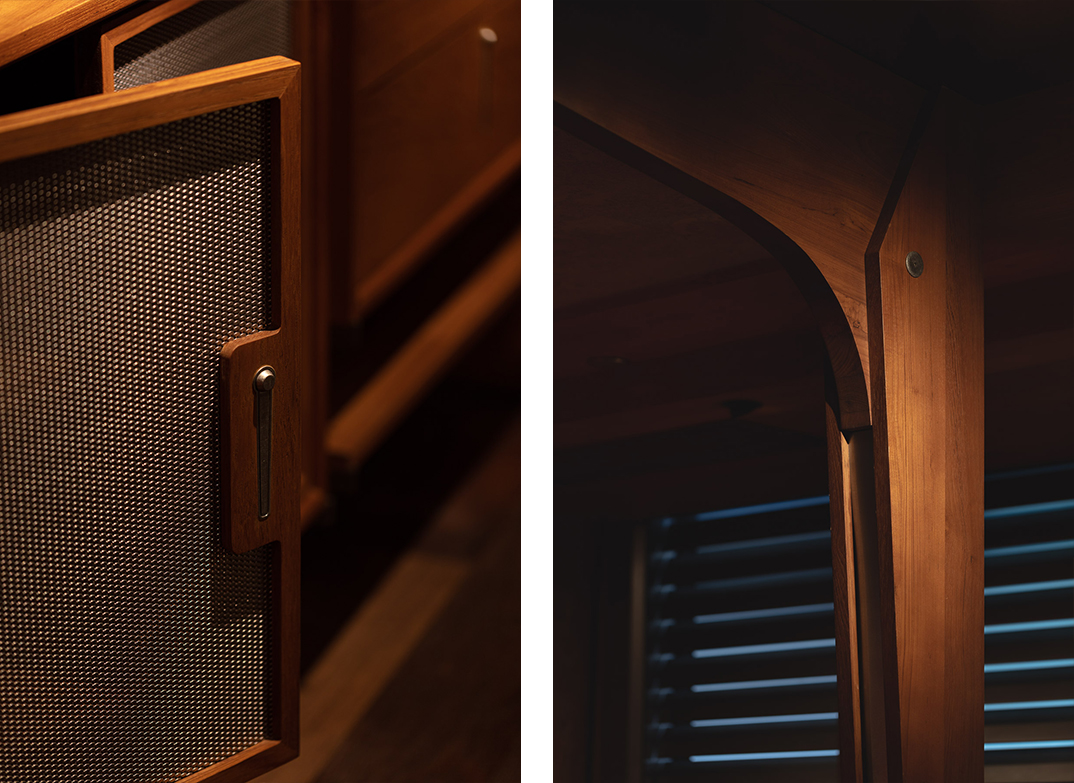
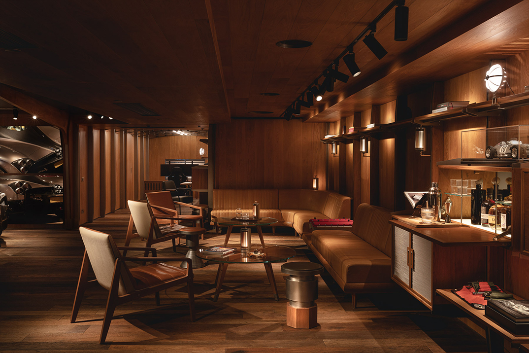
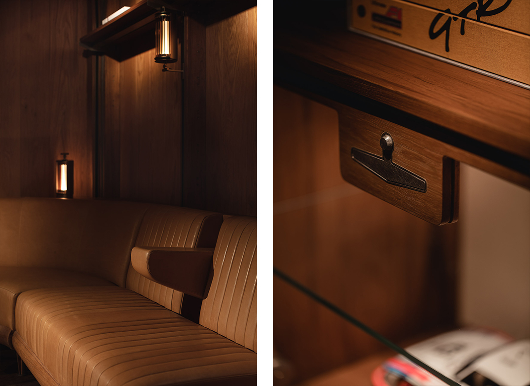
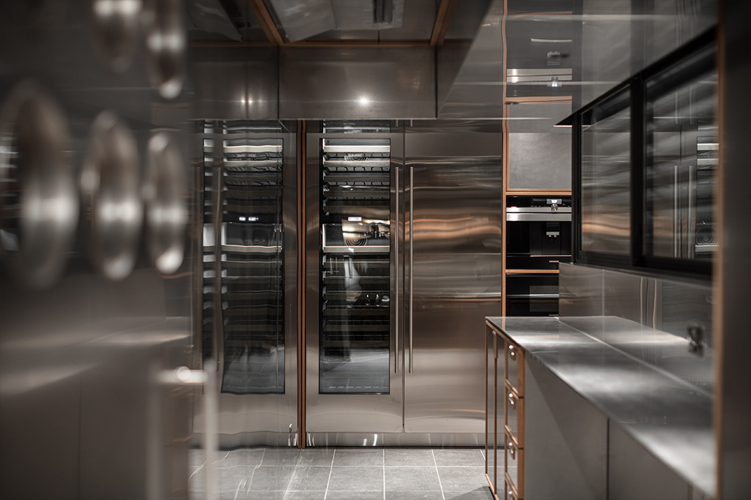
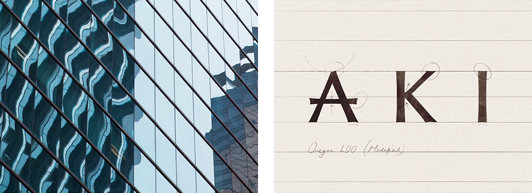
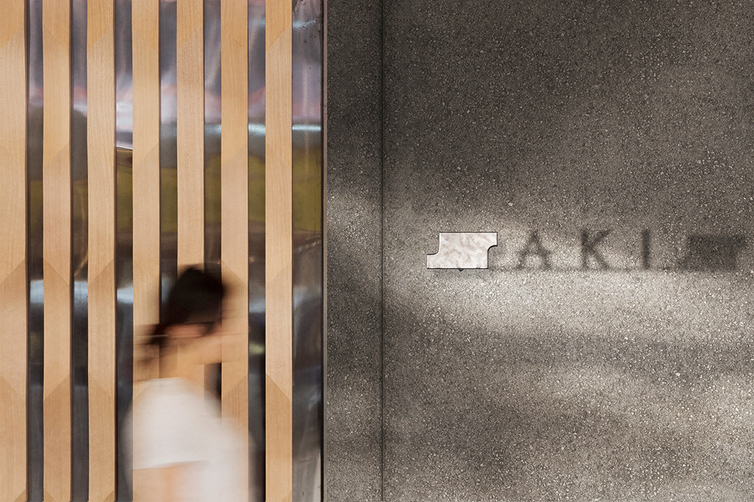
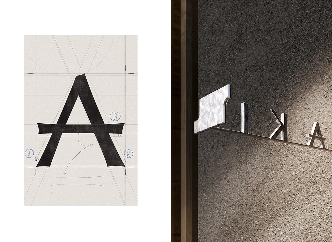
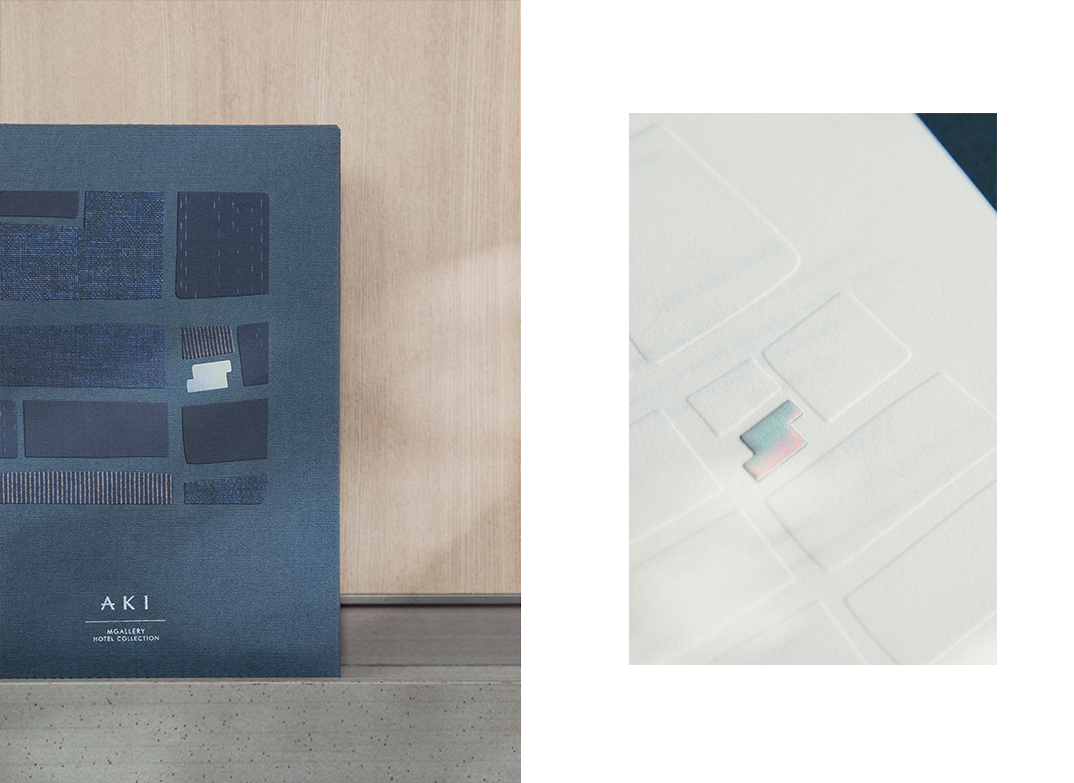
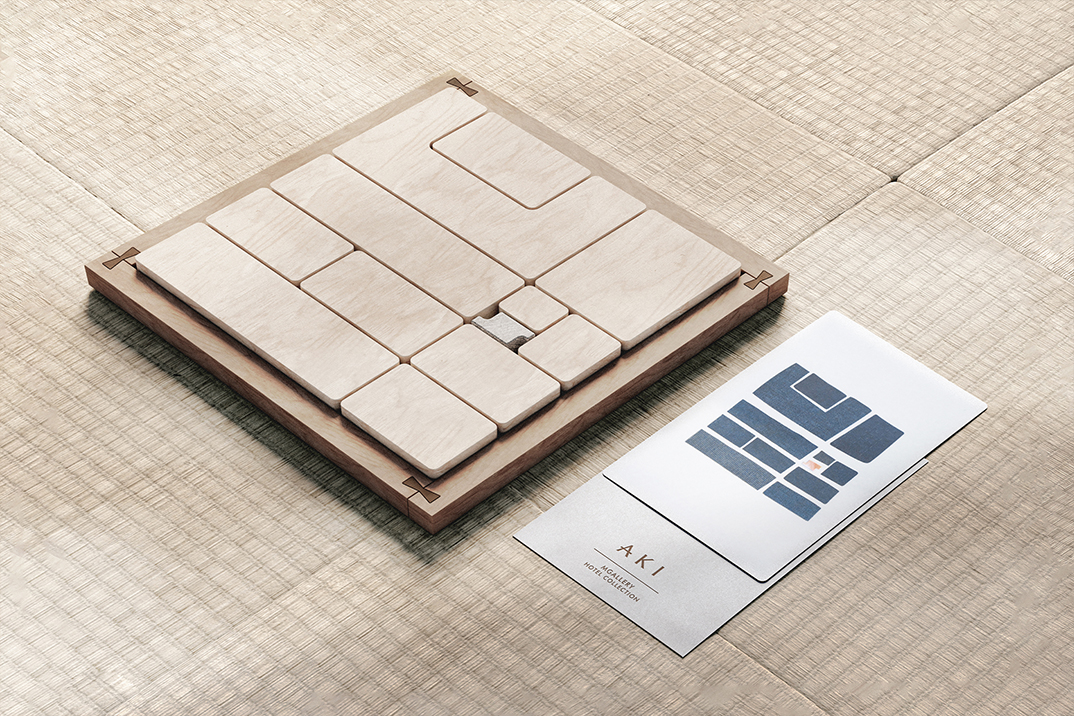
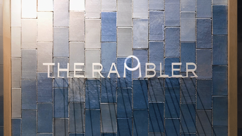
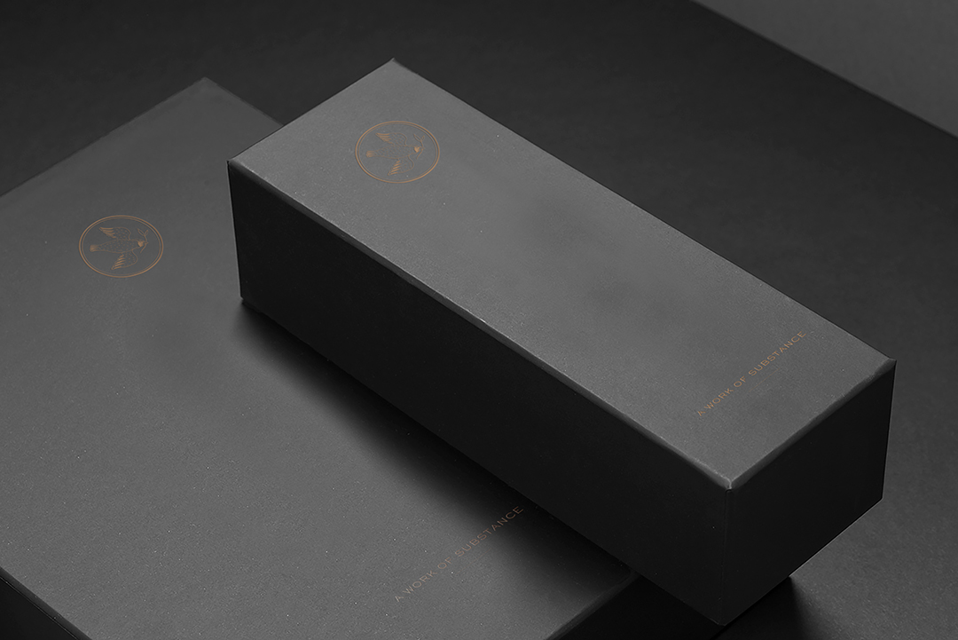
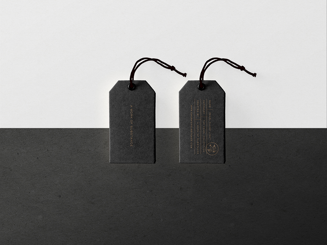
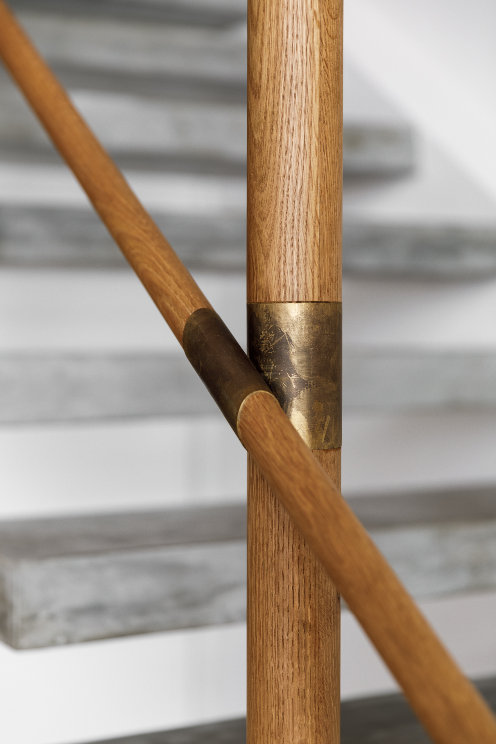
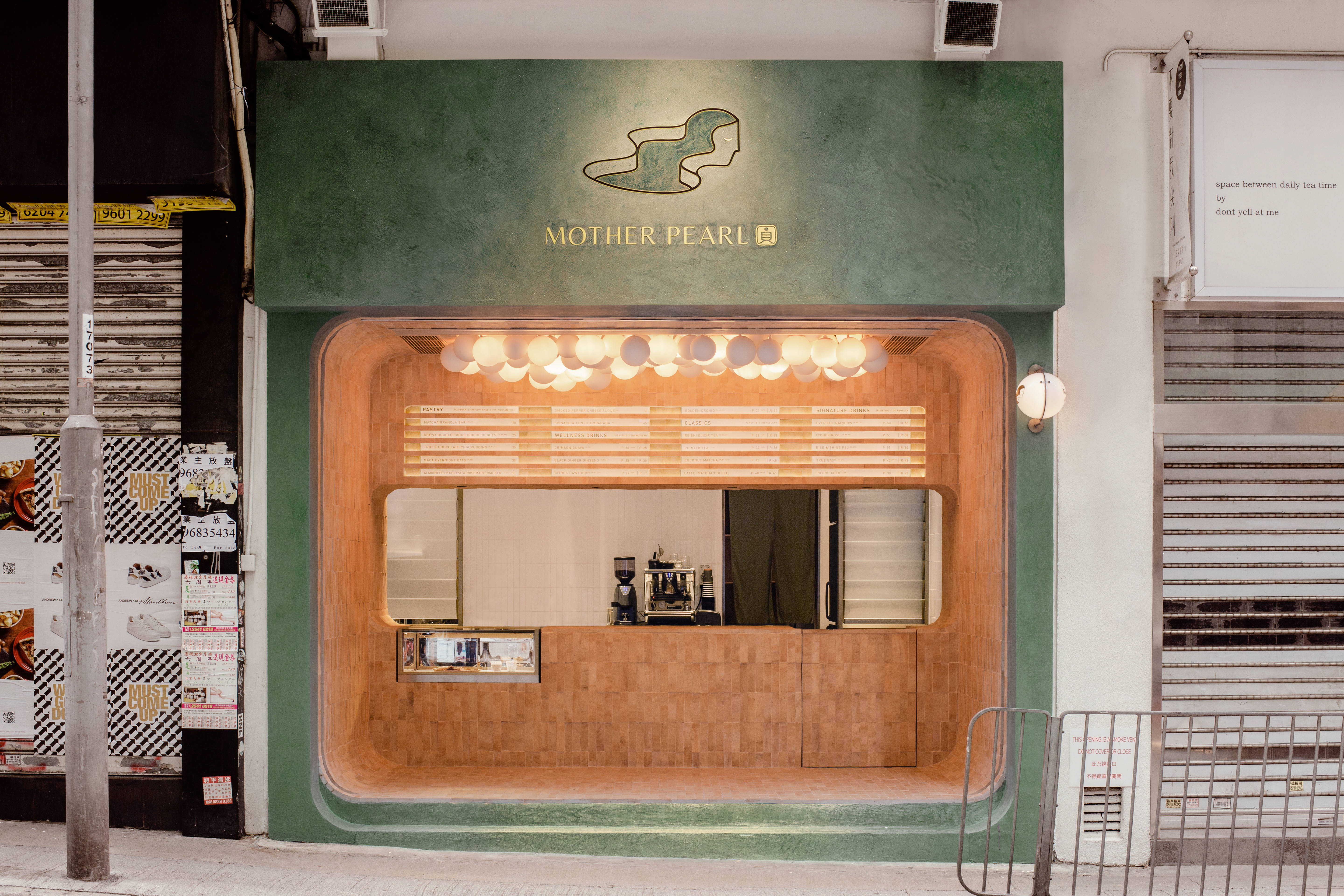
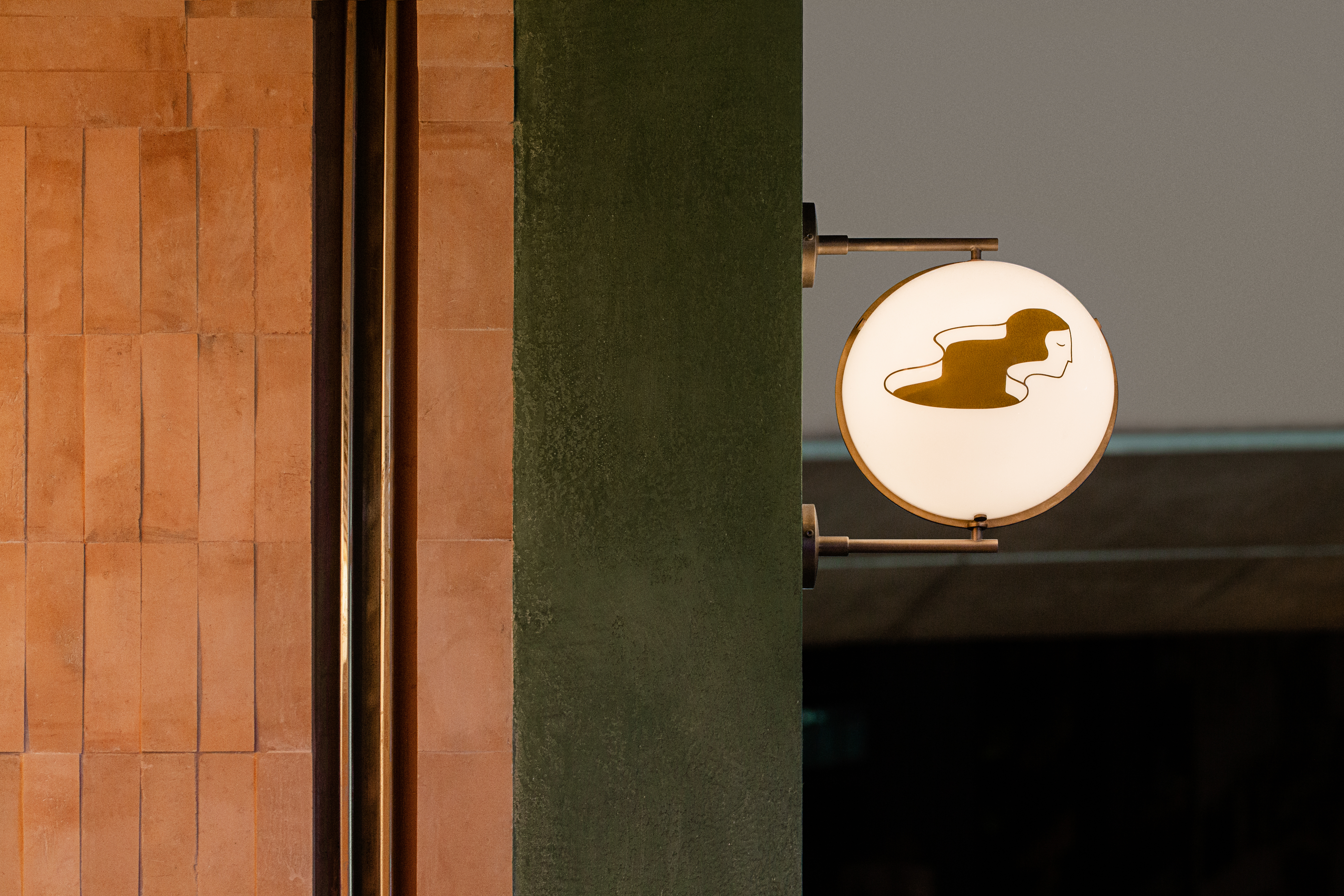
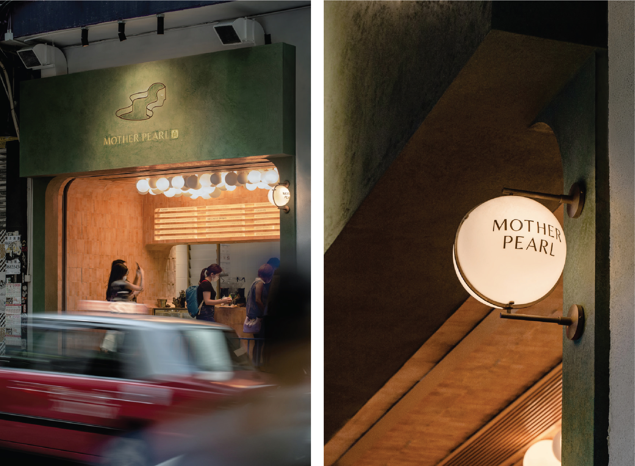
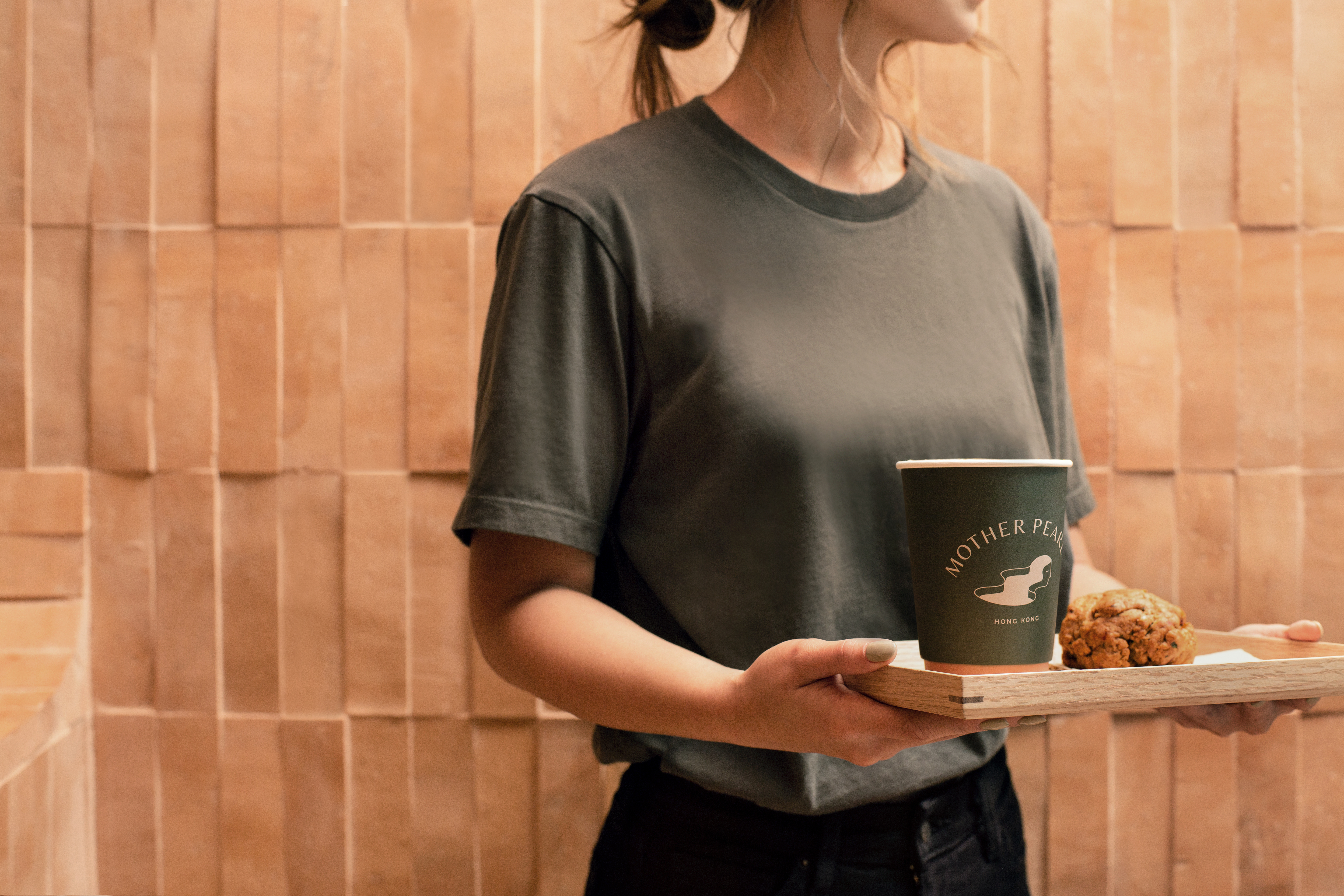
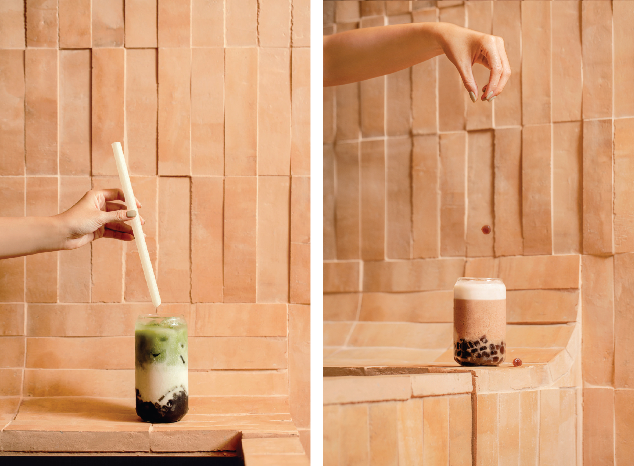
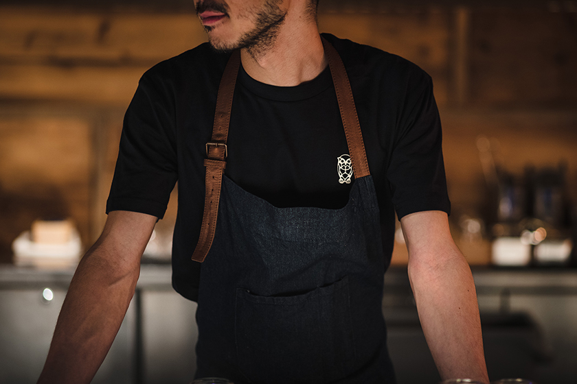
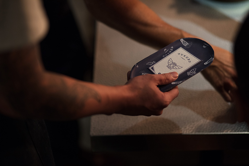
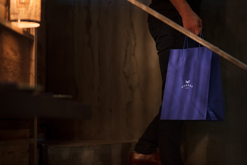
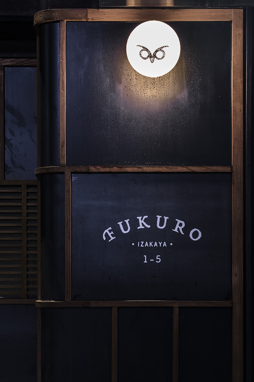
craftsmanship is celebrated through raw, tactile executions of the brand identity, and a logotype that is a typographical expression of joinery – a hallway between an architectural drawing and a mysterious signature. above the dusky skyline, amidst a luscious bouquet of oak and smoke, spirited conversations and aromatic encounters await.

the library

as a curated library of vast automotive treasures, it is designed with the intent of strengthening the thread that cultivates the avid spirit for driving. fuelled with endless motion and the purest exhilaration, this place introduces an aura of stillness. capturing moments of excitement within a split second and honouring it in all its glory.

home to priceless cars and memorabilia, we aim to celebrate its air of history and unfold the fruitful narrative within. this notion has formed the backbone of our design approach and has allowed us to communicate the beauty of automotive design into the details of the space. inspired by the mechanical nature of cars, we have opted to engineer the space with mobility design in mind. each component and part that has been fittingly integrated within, can be easily assembled and disassembled to the user’s whim. deriving an unparalleled level of modularity, while maintaining an exquisite fit and finish.

our vision was to package this without losing the level of immersion we were seeking for. so we ventured out and experimented with materiality to craft a hall of infinite reflections, utilising polished stainless steel panels to create a visual journey that seamlessly plays with light and forms. exemplary of our attention to detail, we proceeded to recognise what is fundamental to the essence of a car. with cabinetry handles inspired by the ones adorned on a zagato and lounge chairs that pay homage to the ferrari dino, our design creates a platform to preserve the beauty of the past and celebrate the emotions of the future.

aki hotel


accor hotel’s m gallery is a storied collection, boasting over 100 boutique hotels, each with a unique tale to tell. among these exceptional properties is aki hong kong, a giant prism nestled between the low-rise historical buildings and towering skyscrapers of wan chai. it’s a place to pause amid the hustle and bustle of the vibrant neighborhood, offering a quintessential modern hospitality experience with a zen hideaway, a stark contrast to the never-sleeping environment of the bustling commercial area.

despite the district’s intensity, aki hotel’s identity design language responds with a need for calmness, reflecting a guest’s experience once they connect with the building and its interiors. the graphic language draws inspiration from the japanese boro, a textile art form that grew out of medieval necessity (ぼろ), where history is woven into a cultural statement. reinterpreted as a contemporary narrative, the identity system is a tactile vocabulary that unites an atmosphere, a metropolis, and the people. it’s an expression of human resilience, a tool that engages the audience with its cultural and geographical context. the pattern suggests a map, highlighting its location, the hotel’s building attributes, geometry, and materiality, as well as a collection of touchpoints that stimulate thought and dialogue, provoke response, and enhance understanding of its context.


the rambler

named after goodman interlink’s unique and strategic location in the rambler channel, the rambler is a new take on café design, offering a refreshing space for customers, their workers and their guests to meet, socialise and recharge.

the selection of natural elements is a stark contrast to the industrial building the café resides in. a warm palette of materials interspersed throughout with timber wrapped around to nourish the soul and breathe life into the space – echoing the feel of a haven across day and night. the use of blue hues through a gradient of hand-glazed ceramic tiles reflects the lull of water and washes over with an air of contemplation.


things of substance

the significance of light throughout time remains unaltered. illuminating our perception of the world, light carries remarkable gravity in the rituals of our day. from cave-man campfires to light bulbs, light permits us to linger in a state of wonder from where we can freely realm in the world of our imaginations.

our lamps are metamorphoses of history in cultures transformed into products of art.

as a result every lamp carries with it the spirit by which it has been created, manifesting into things of substance.

singapore penthouse

a house in the sky amongst concrete skyscrapers and lush greenery, this penthouse sits in harmony with its surroundings like a treehouse. having studied the personalities and routines of the family of four, we created private and social spaces accordingly. the existing architecture of the apartment provided a platform on the upper floor that serves as a protective canopy for the social space below, and to highlight this characteristic, the upper floor is wrapped in warm timber strips to evoke the nestled, elevated feeling of a treehouse.

different levels of privacy are created through the flexible windows and shutters, which can be opened or closed to expose or conceal the space. to reflect the more dynamic purpose of the ground floor living and dining room spaces, transparent materials and a lighter palette are used, and the entire glass façade can be opened up to the terrace, blending indoor and outdoor living.

with the main living area naturally lit through expansive windows, most of the lighting efforts are decorative or uplights used on landscape and wooden trellises.


mother pearl

when sipping bubble tea, the spring-loaded pearls of tapioca instantly demands our attention. confronted by the unapologetic chew of the pearls, we unconsciously transcend into a state of unexpected satisfaction.

a pioneering advocate for healthy teahouses in hong kong, mother pearl encapsulates the deeply immersive bubble tea drinking experience through its magical concoctions. serving as a vessel for the sensations that emerge from sipping bubble tea, the negative space in its icon evolves with seasonal and flavour changes.

from the cloud of pearl-shaped lights floating above, to the dark olive green facade that opens a portal to a mystical universe, mother pearl expresses dimension through its organic materiality, drawing the consumer deeper into the sweetness of the present.

marketing suite

containers are multifaceted; a strong symbol of a logistics company and a celebrator of sustainable architecture. its modular construct naturally allowed us to use 4 containers to create 6 different spaces as a marketing suite, with the flexibility to adapt to an evolving site. we maximised the opportunity to have extensive glass openings, which allows potential clients to have an overview of the surrounds. the layering of timber and glass softens the features of an inherently industrial product, establishing harmony amongst nature whilst bringing in light and tropical backdrops into the space. at the end, the build can be collapsed and transported, leaving minimal imprint on the original landscape.

the year of the pig

the year of the pig carries a symbol of “abundance”. this porky zodiac brings you prosperity, fertility and plenty of luck. to send blessings to everyone in the coming year, we designed 8 auspicious red packets that illustrate an array of fortunes treasured in the pig’s full belly: harmony, morality, happiness, longevity, love, peace, success and wealth. gold stamping and spot uv finishing was applied to bring a sense of crafted opulence with each packet individually hand wrapped in ribbed kraft paper, ready to be gifted to friends and family.

photographs by: judy chen

fukuro

after a long day of work, wearied salarymen of tokyo trail back to the comforting glow of izakayas, where they take refuge and unwind with food, drinks and uninhibited conversations. echoing these nocturnal waterholes, fukuro embodies a mystical ambience, whilst exuding a warmth that sparks spirited interactions between visitors. as a messenger of the night and a protector from hardship in japanese symbolism, the owl icon manifests the outlet’s identity. the profusion of wood crafted by simple carpentry oozes an intimate and relaxed atmosphere for visitors to indulge in a spin on a quintessential japanese experience.