mother pearl

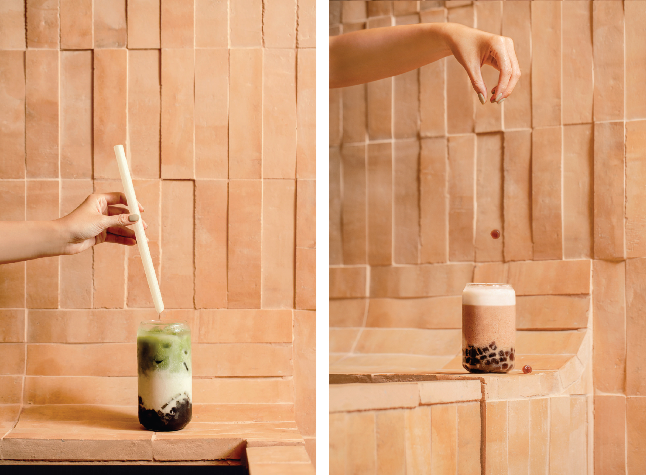
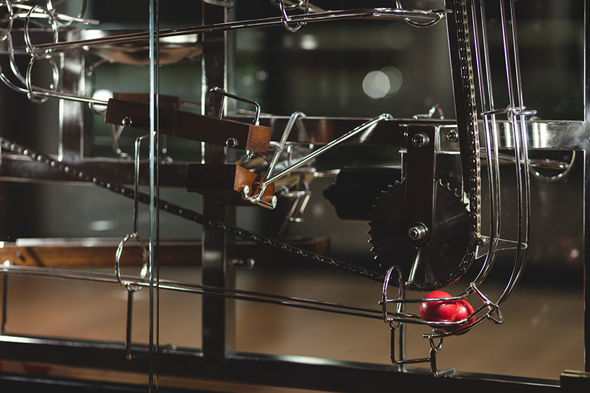
when sipping bubble tea, the spring-loaded pearls of tapioca instantly demands our attention. confronted by the unapologetic chew of the pearls, we unconsciously transcend into a state of unexpected satisfaction.

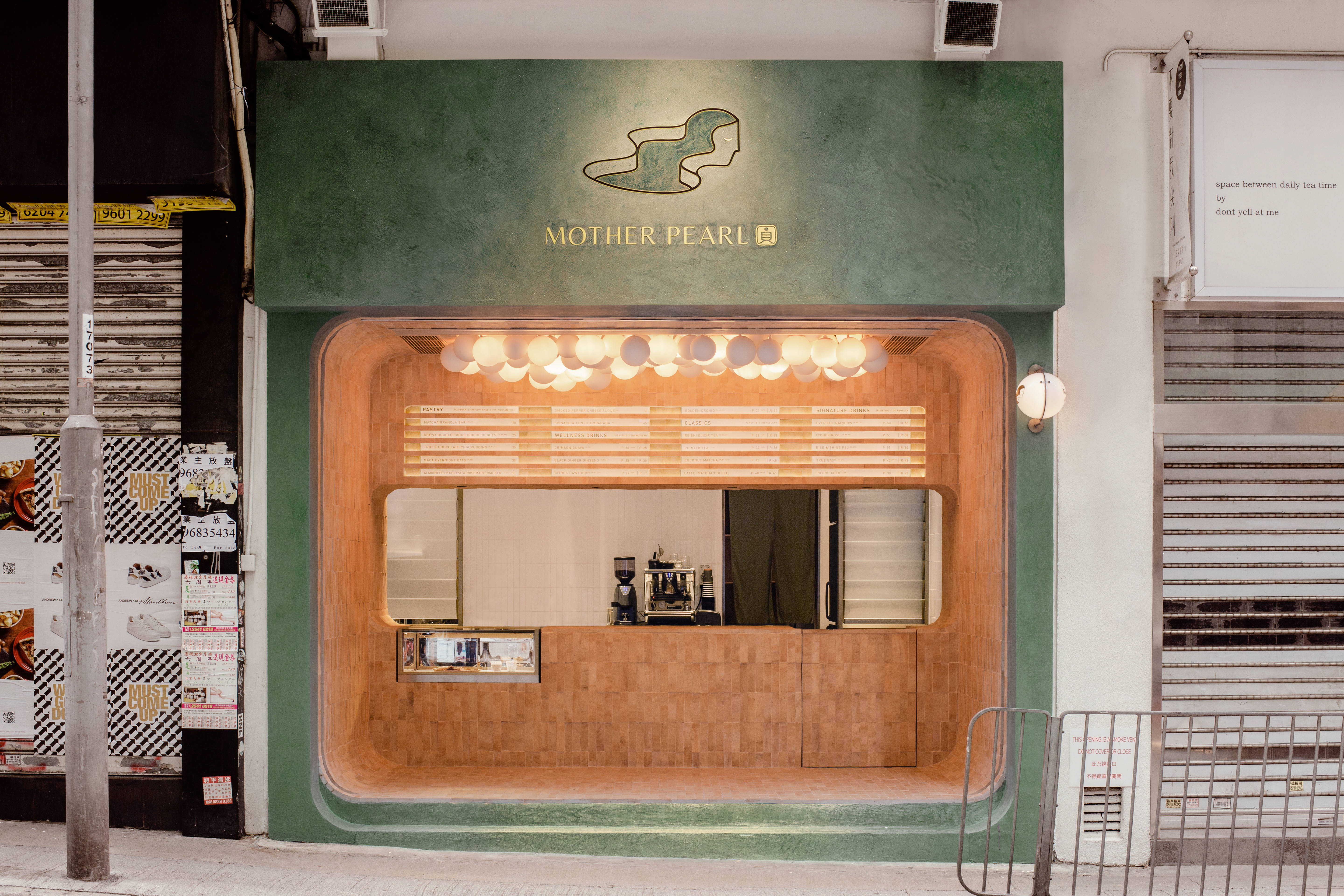
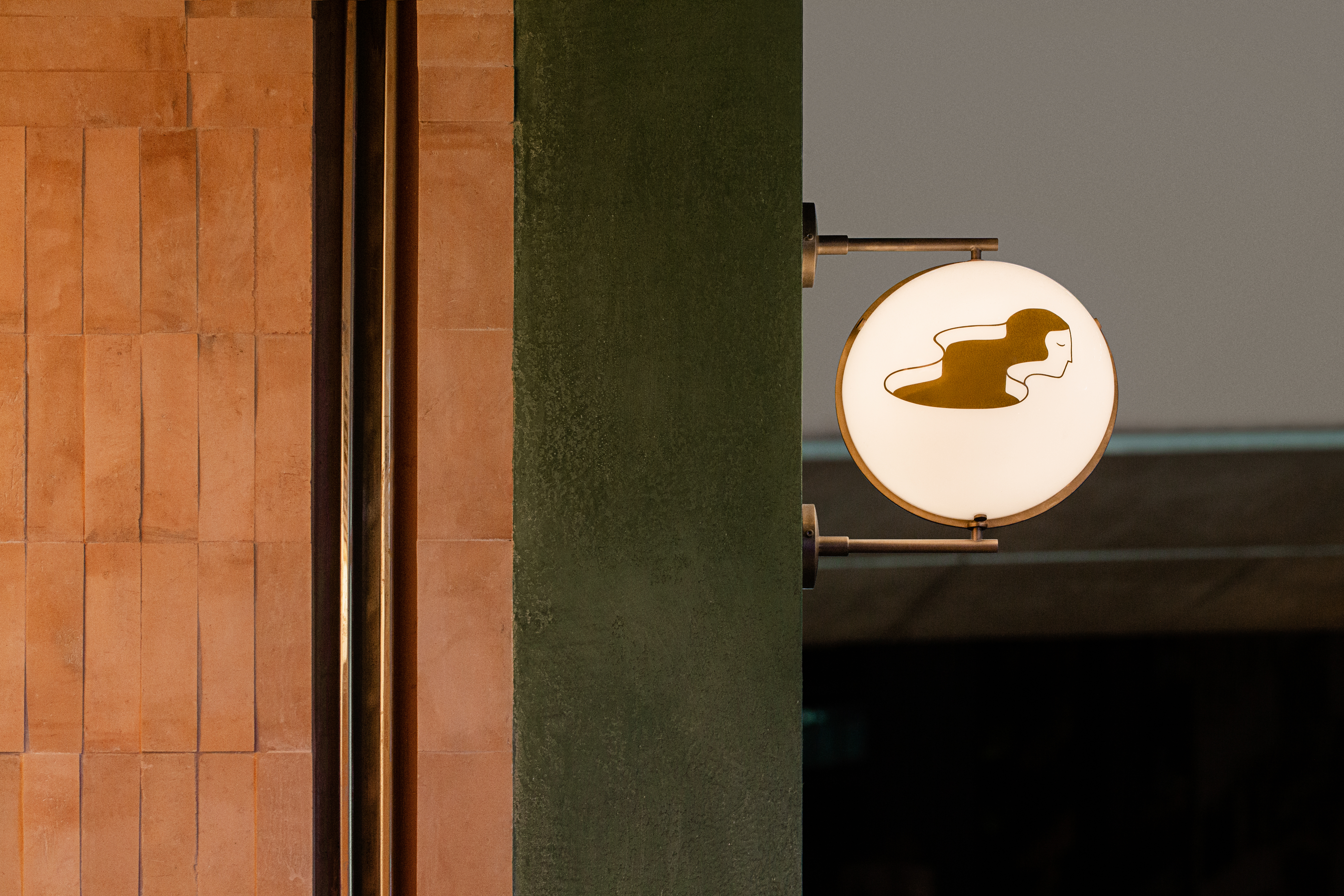
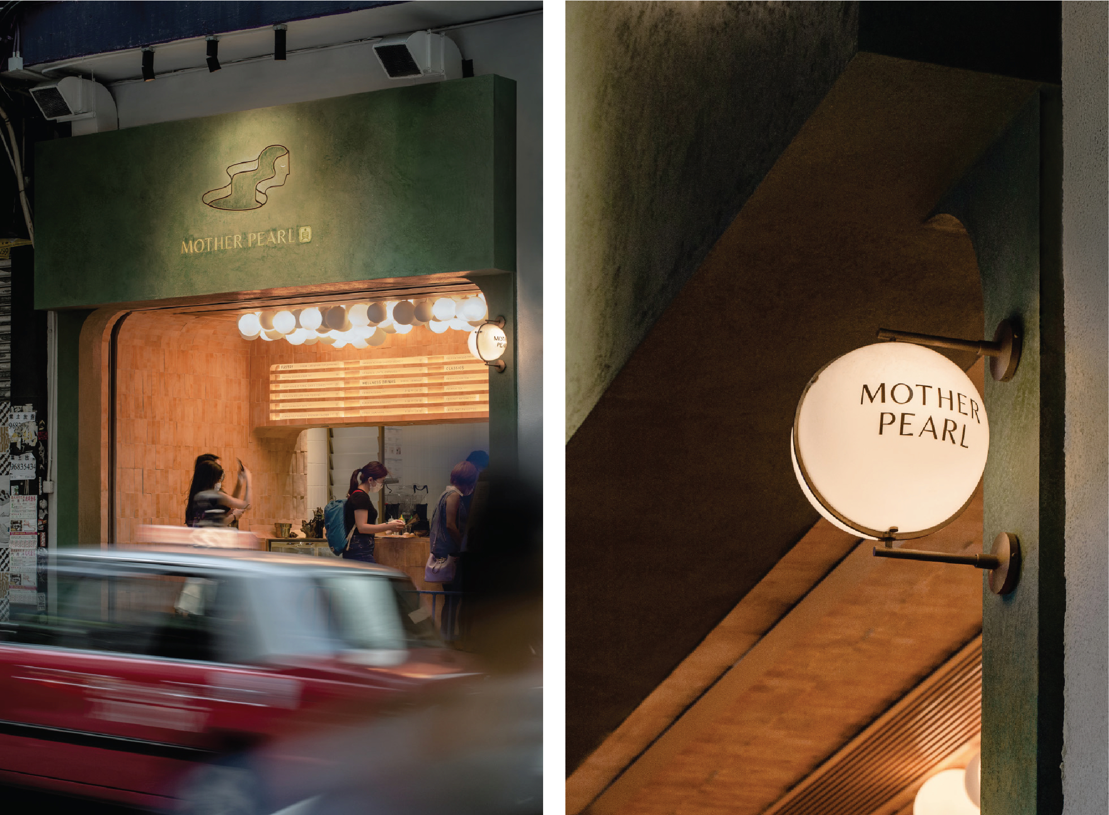
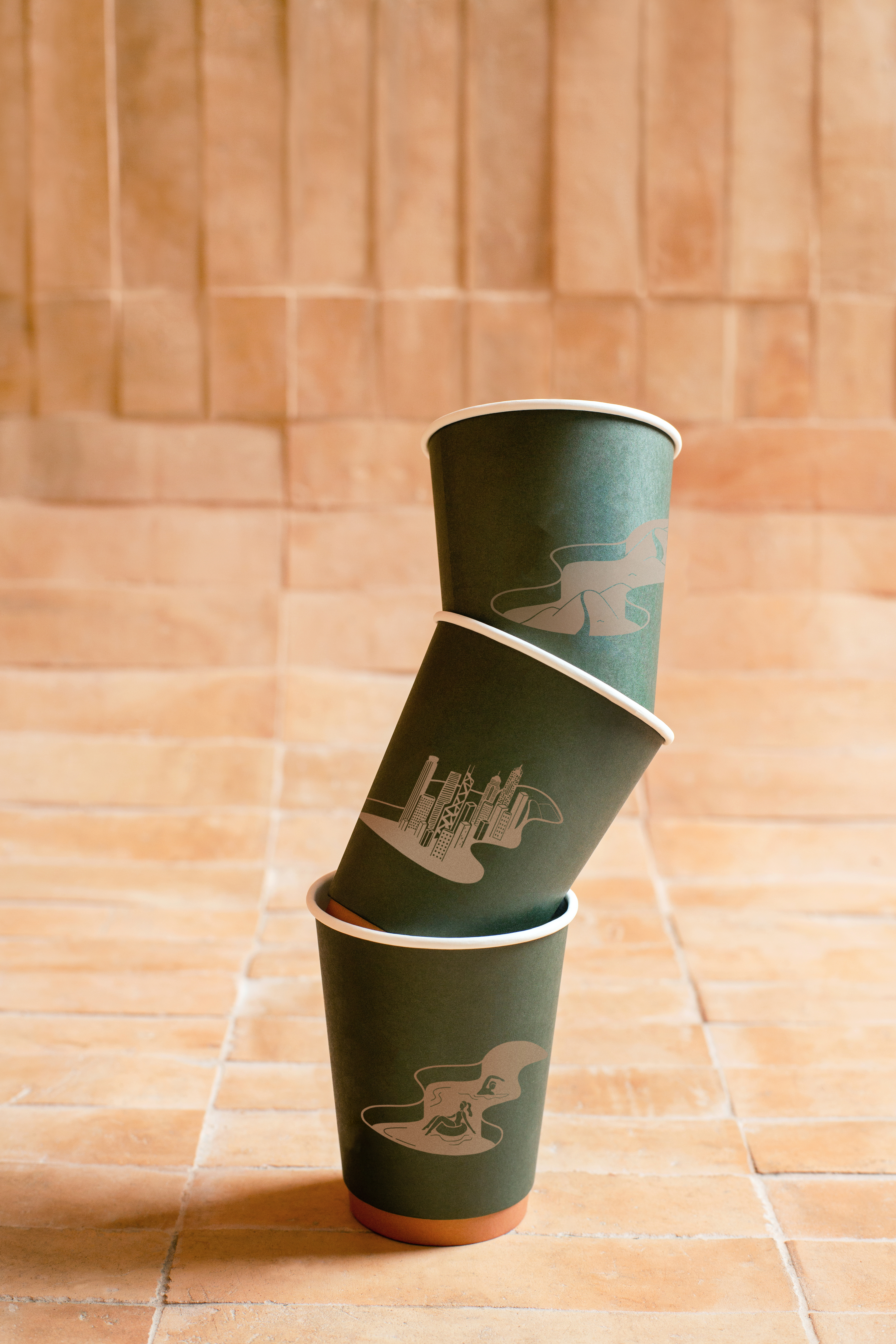
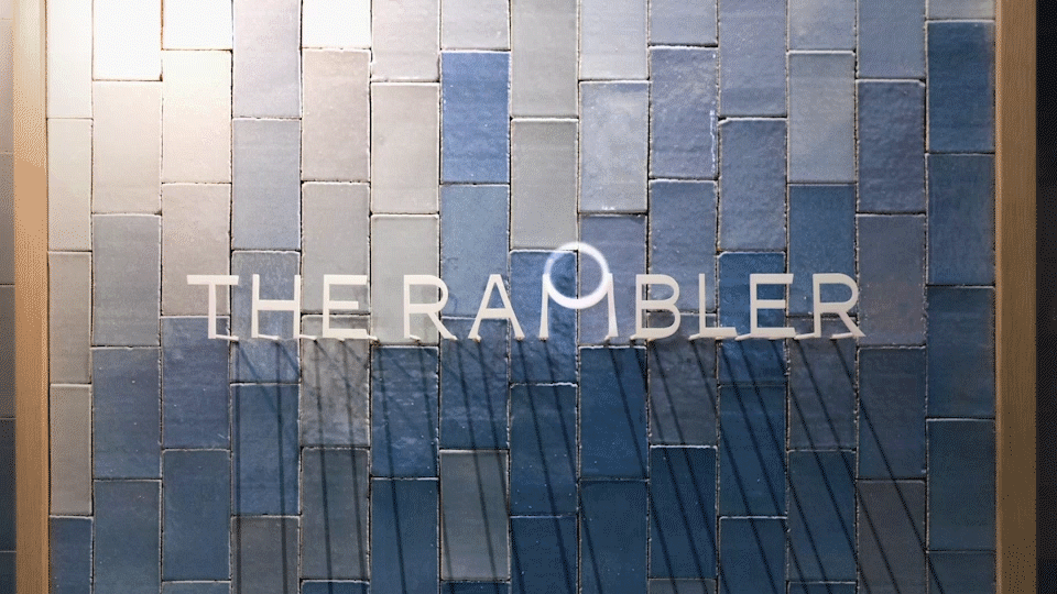
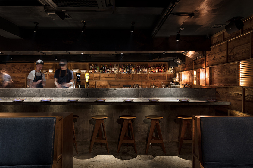
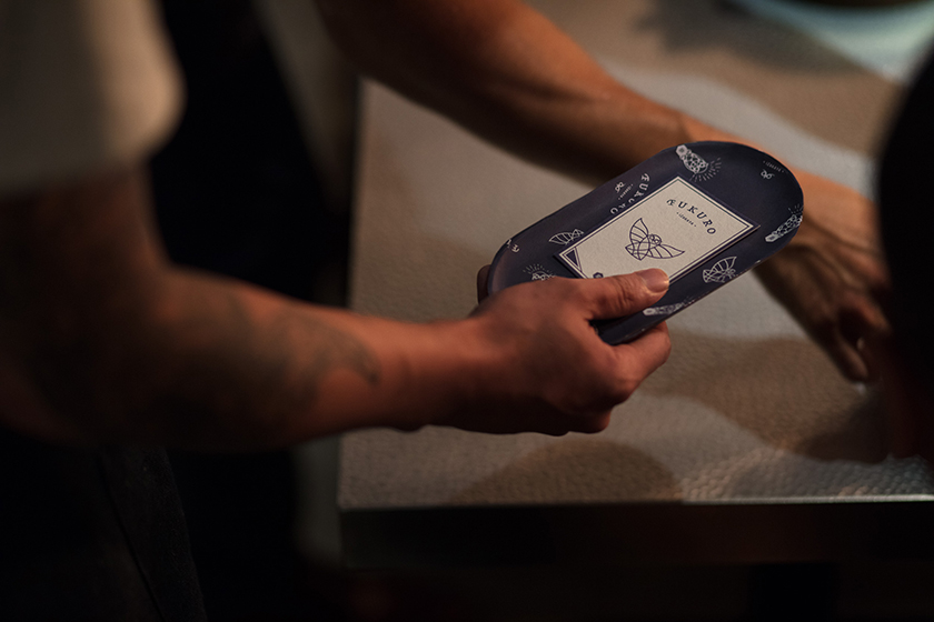
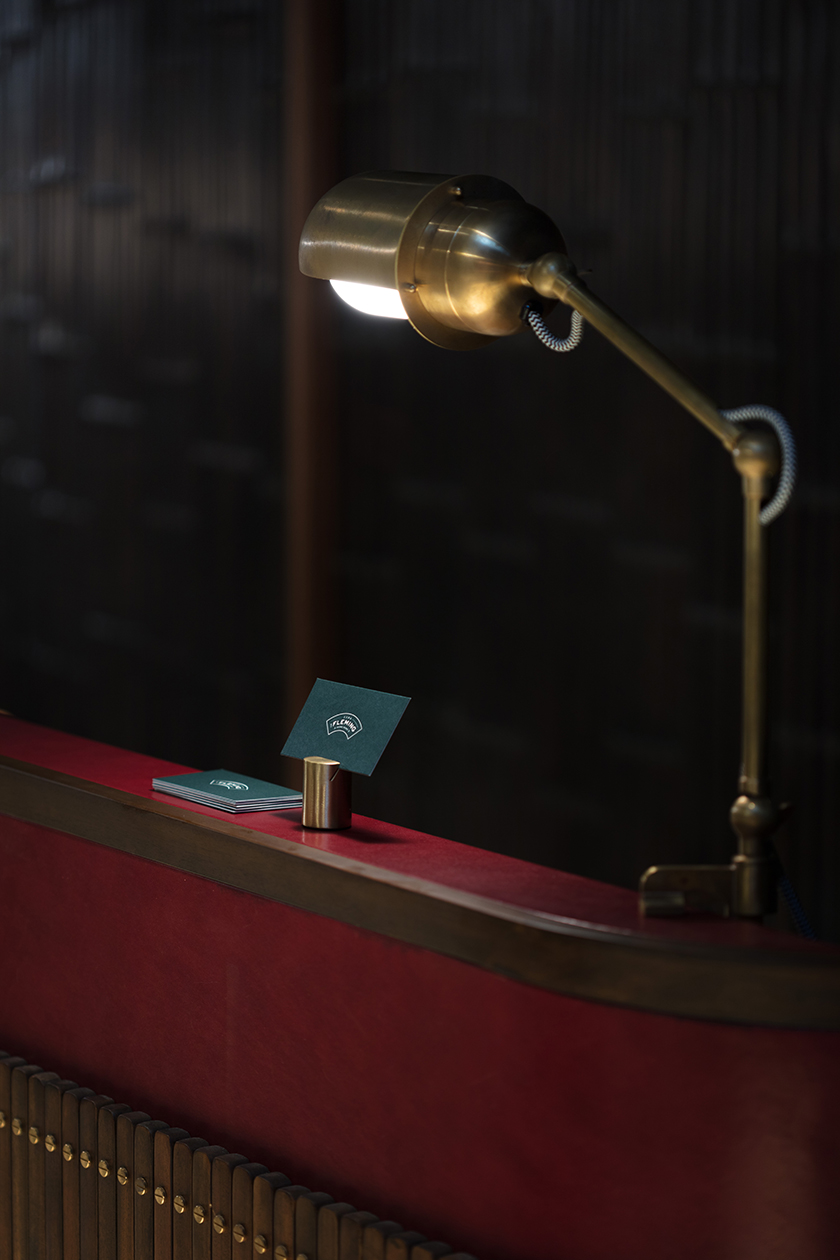
a pioneering advocate for healthy teahouses in hong kong, mother pearl encapsulates the deeply immersive bubble tea drinking experience through its magical concoctions. serving as a vessel for the sensations that emerge from sipping bubble tea, the negative space in its icon evolves with seasonal and flavour changes.

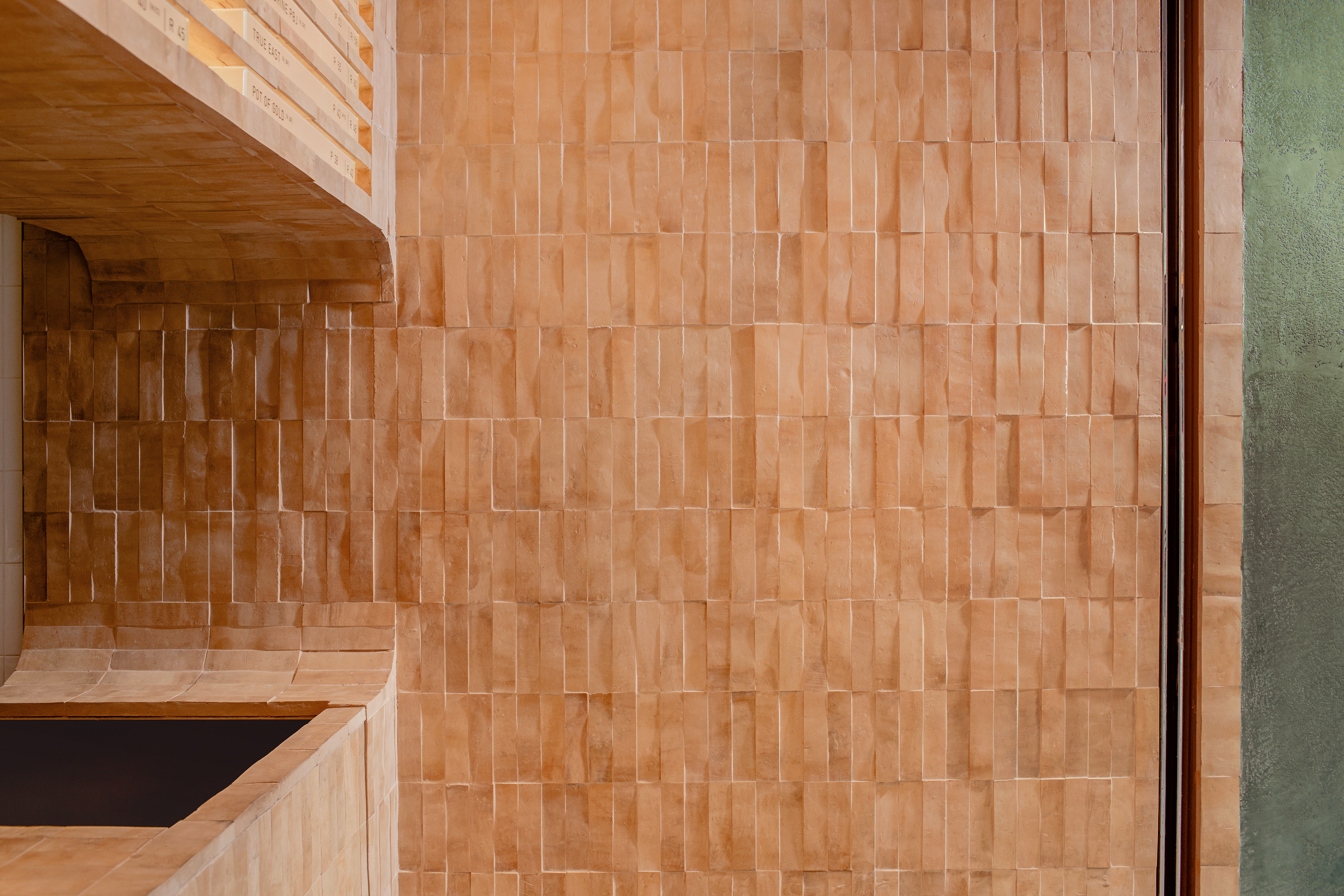
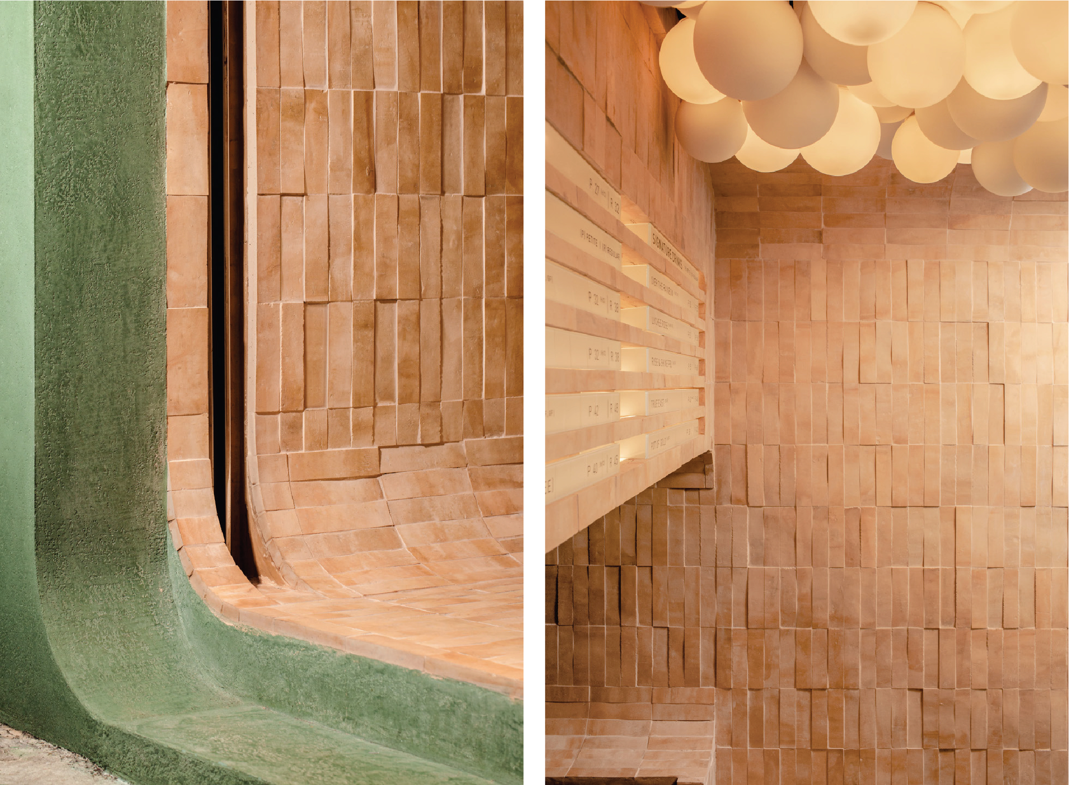
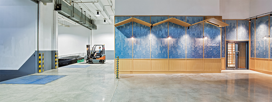
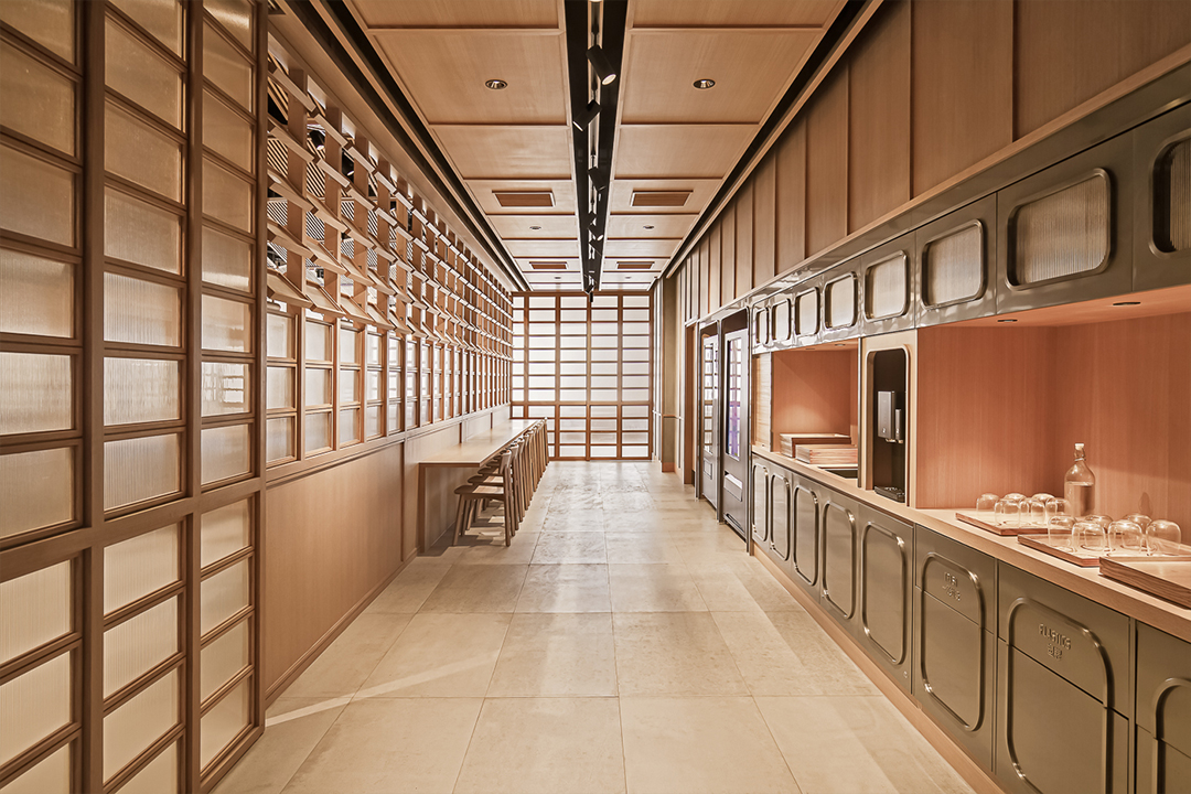
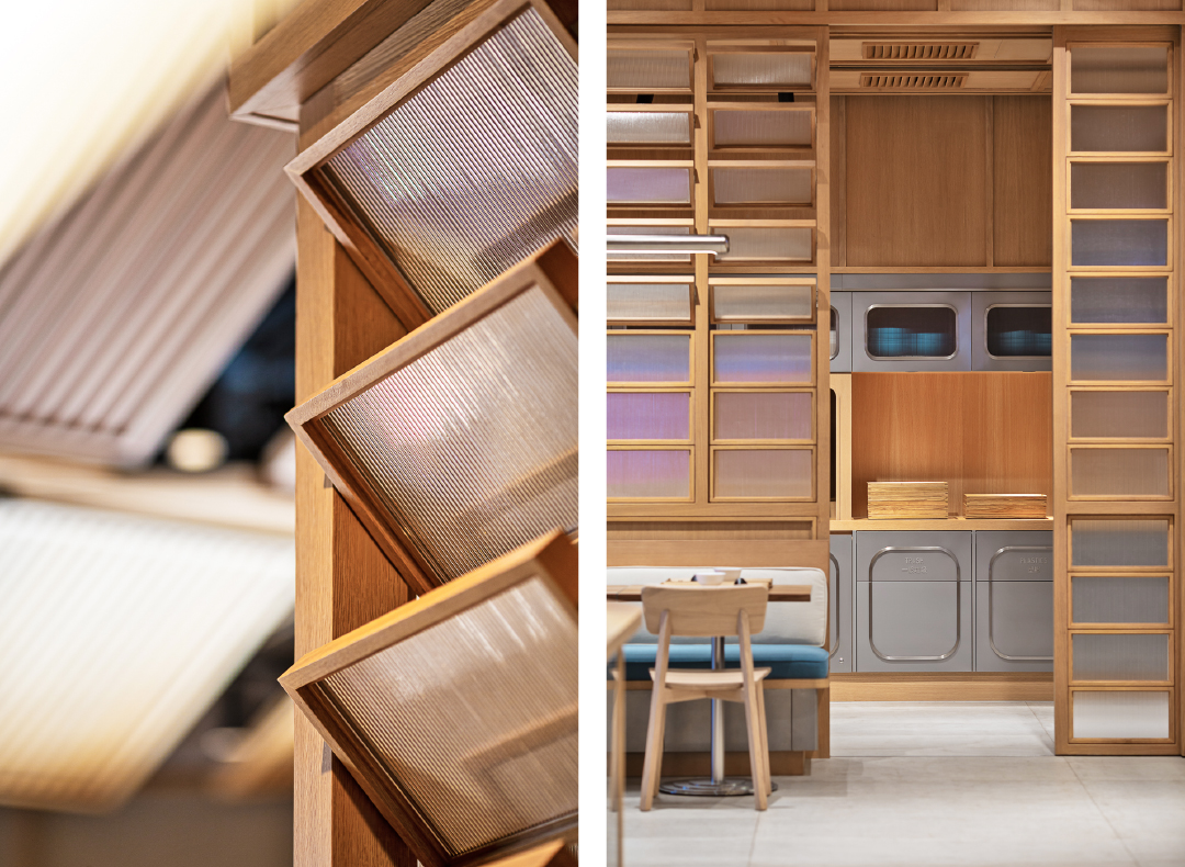
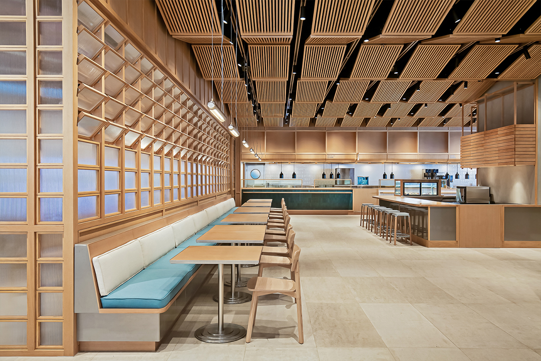
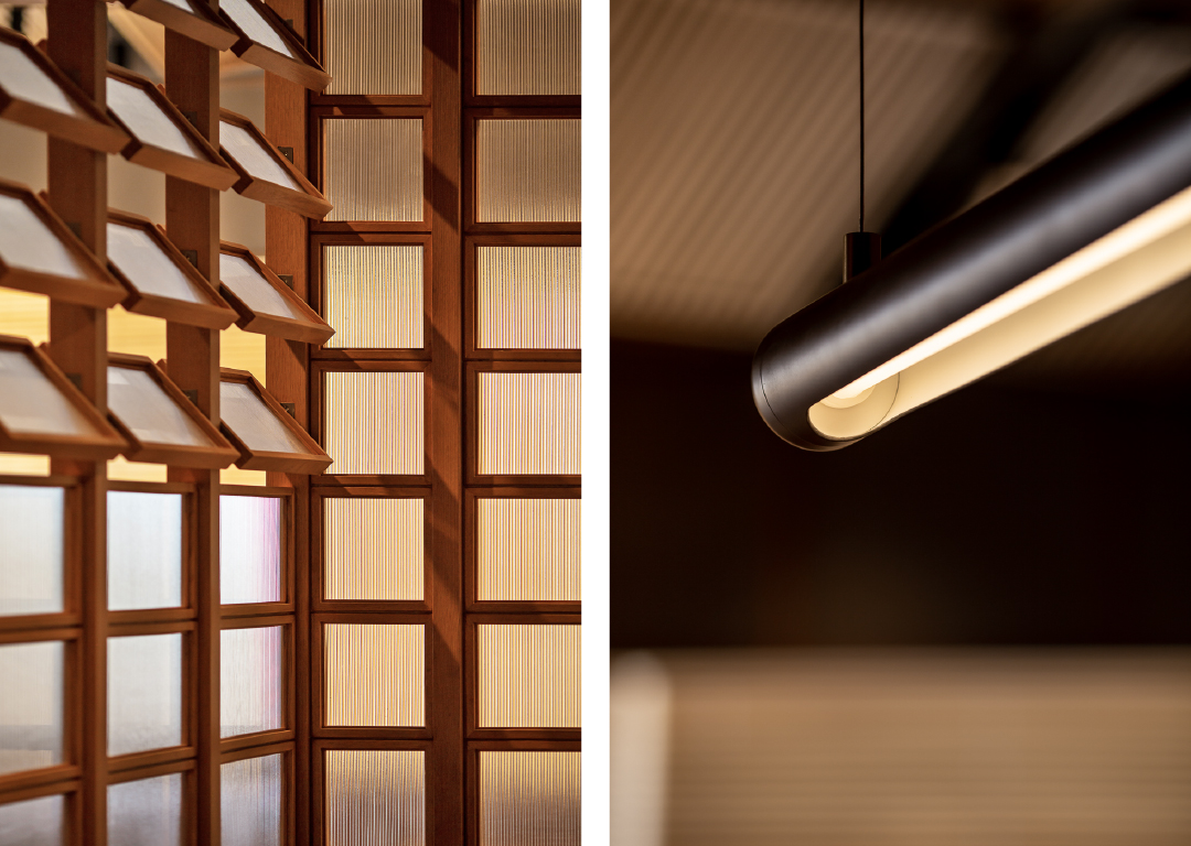
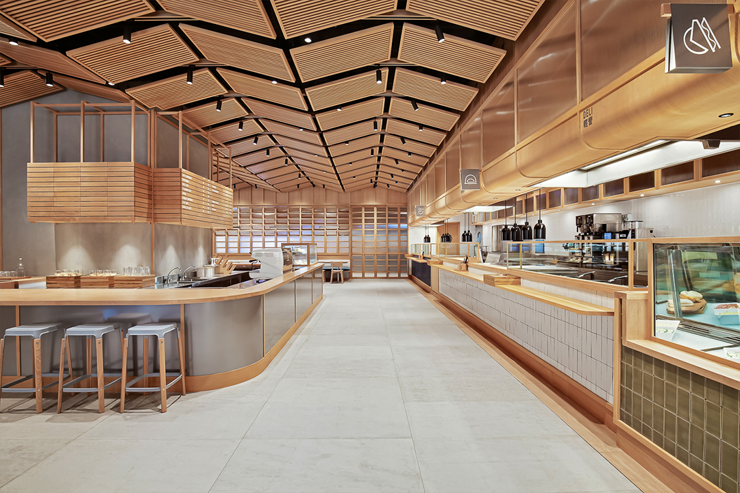
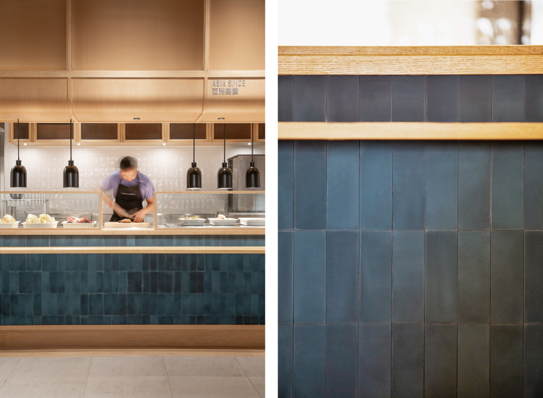
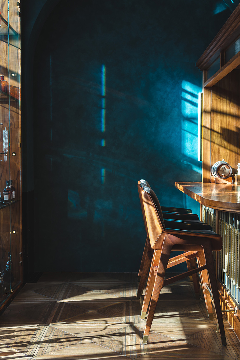
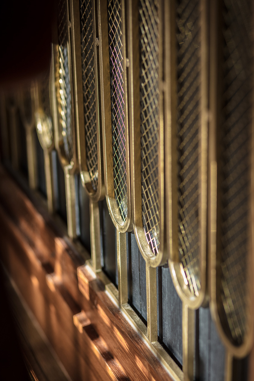
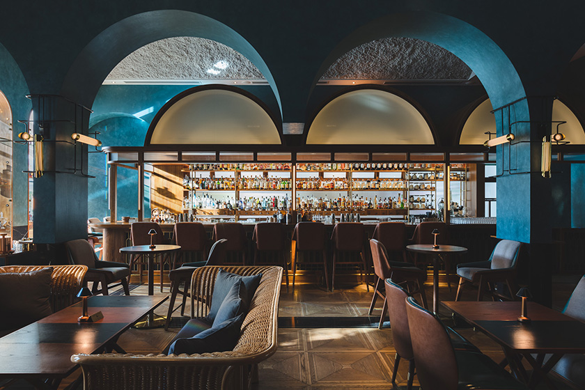
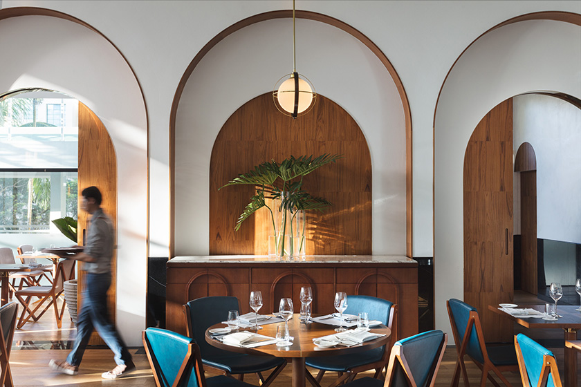
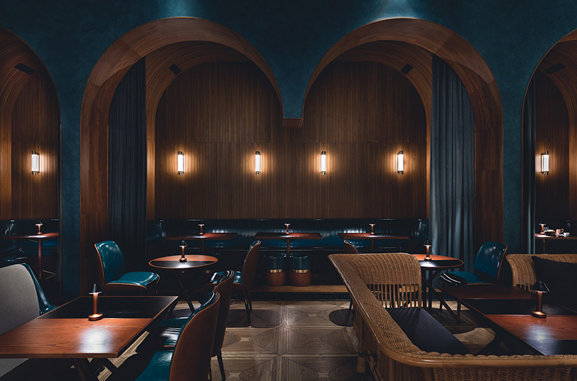
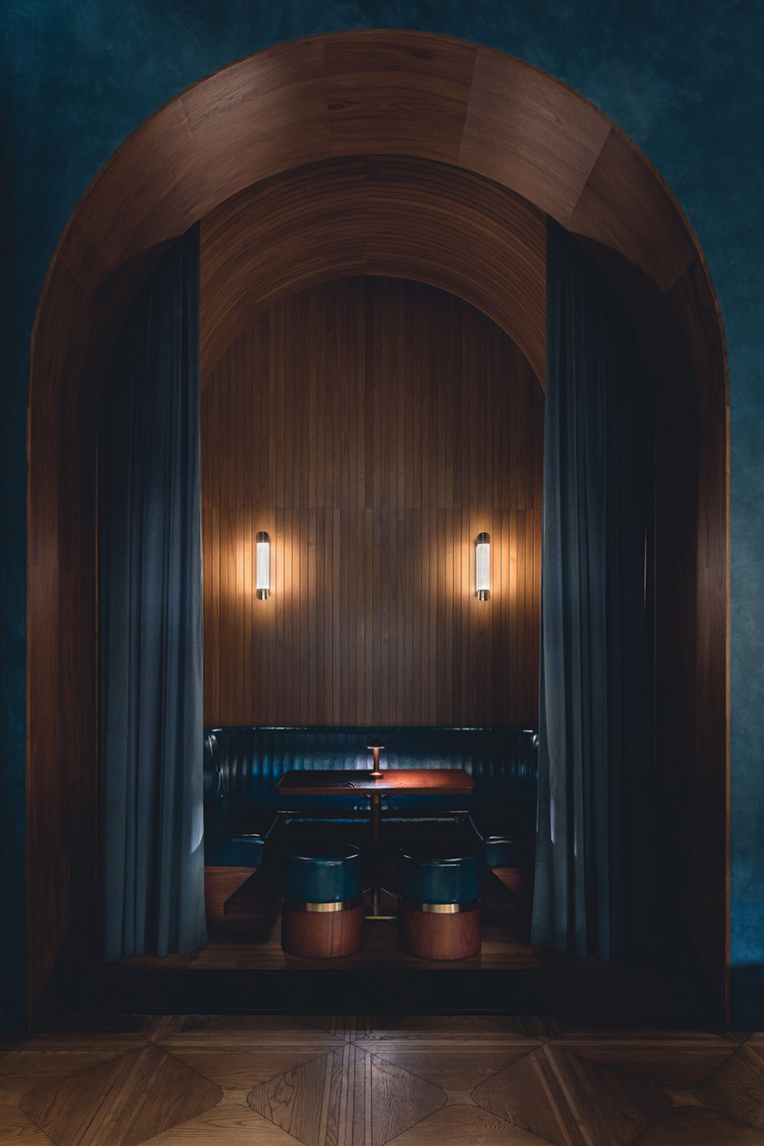
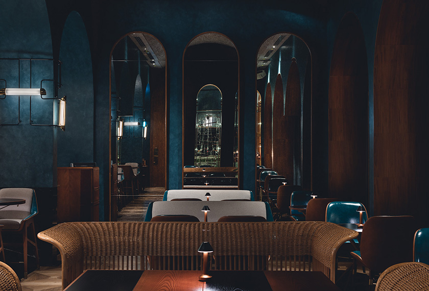
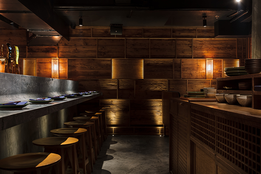
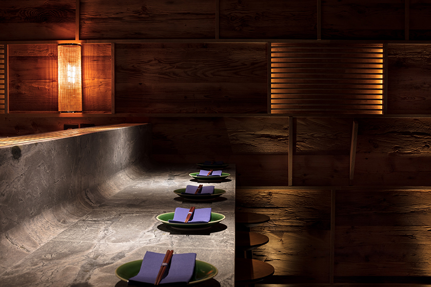
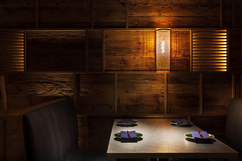
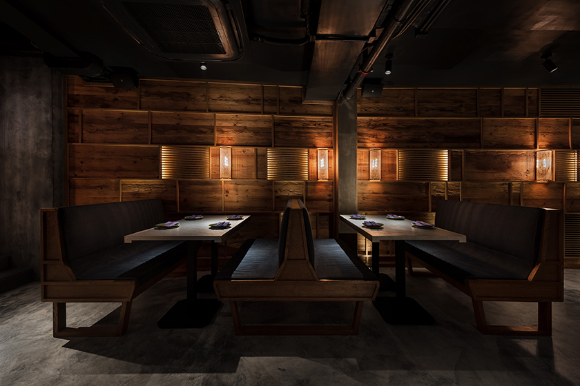
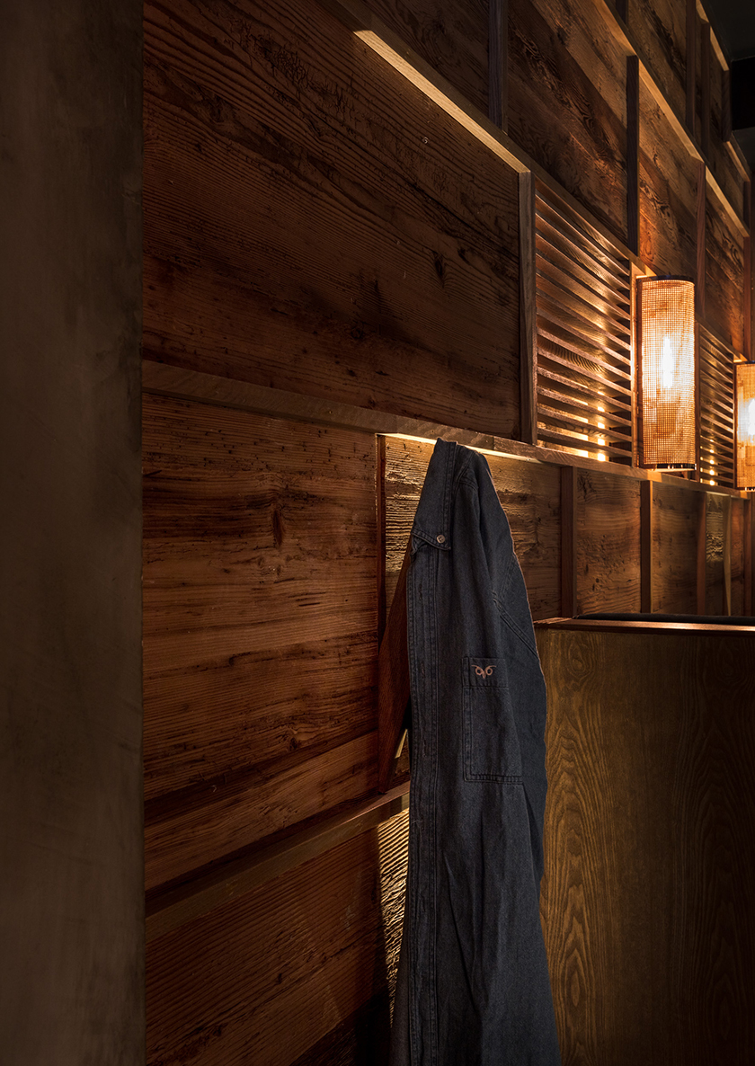
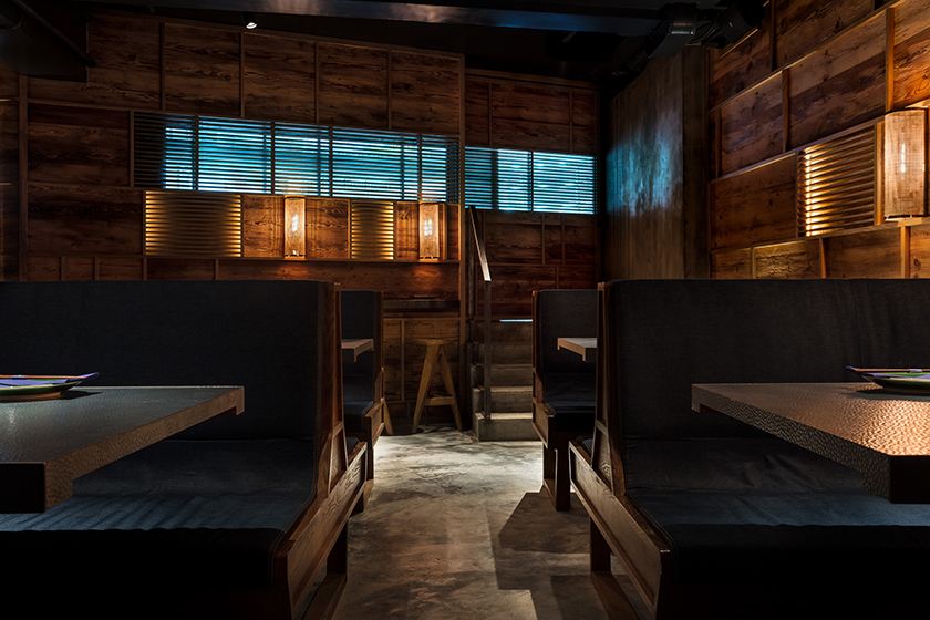
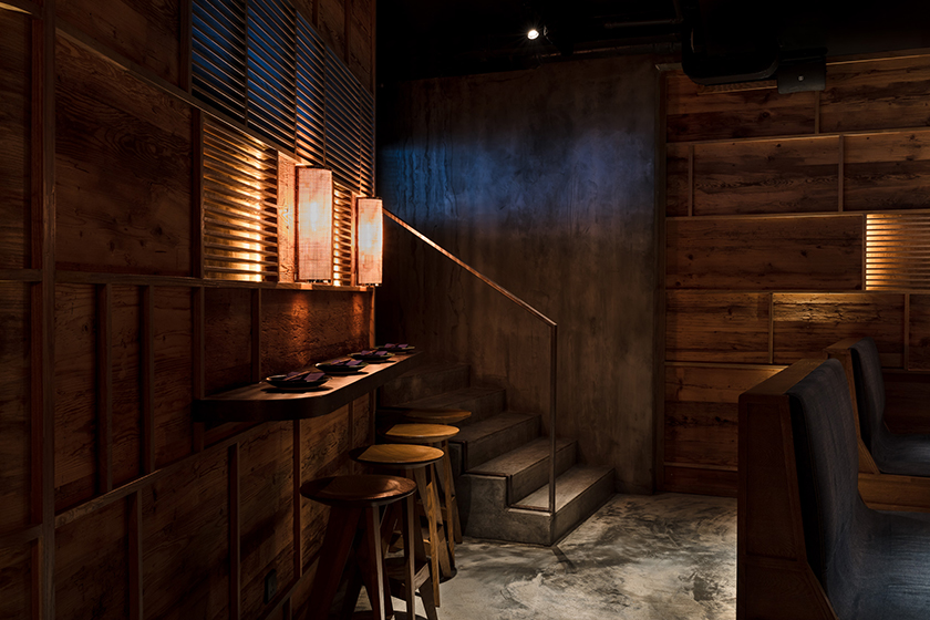
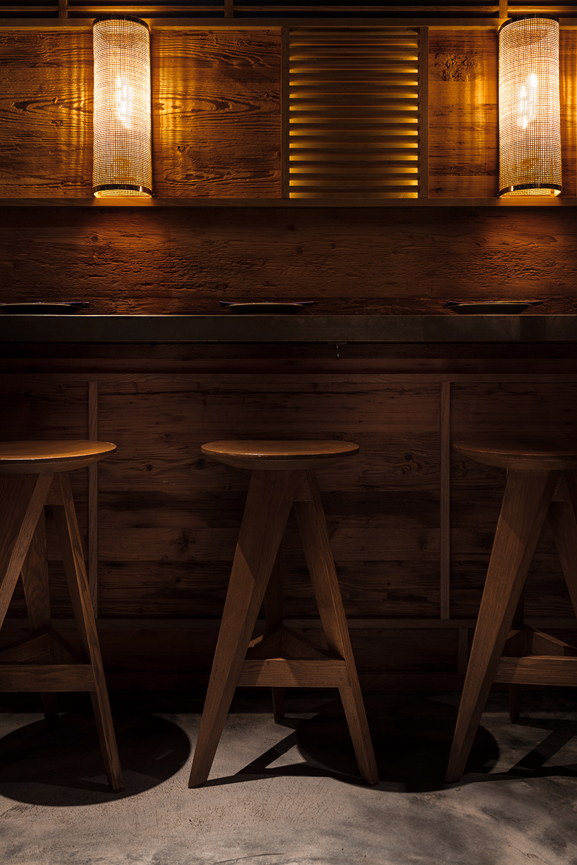
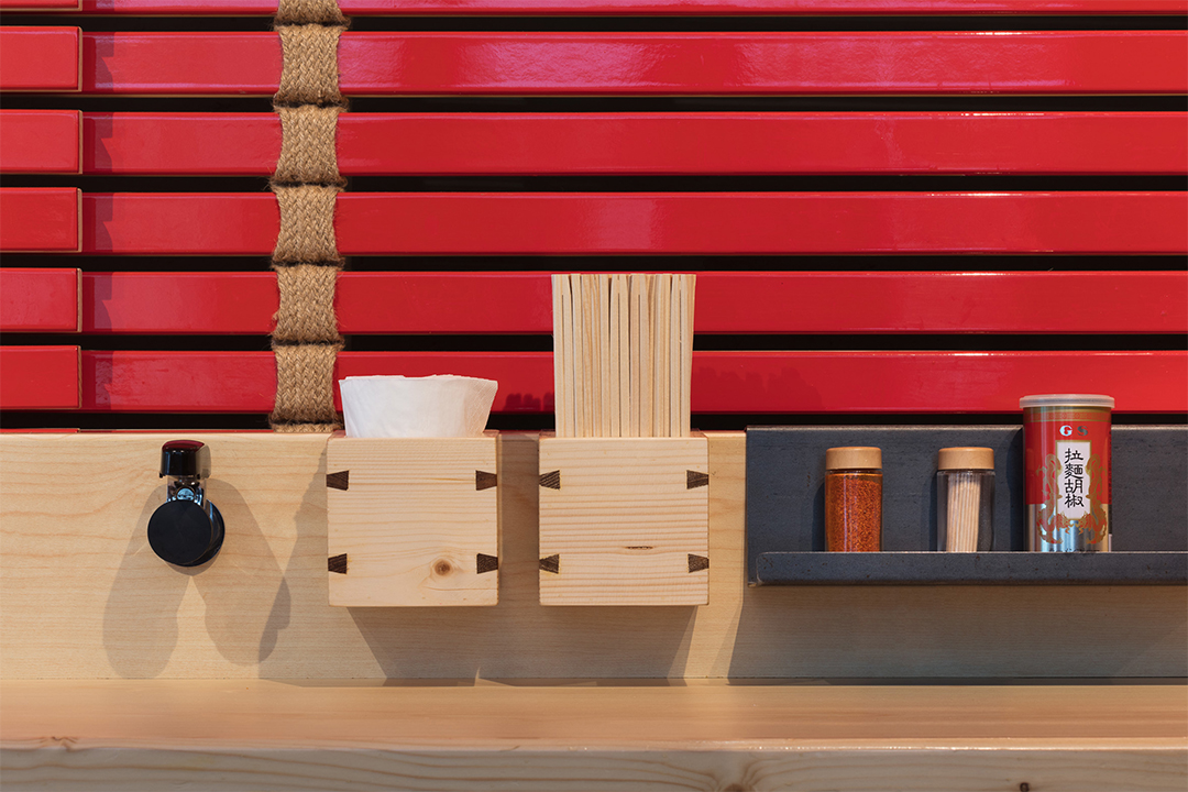
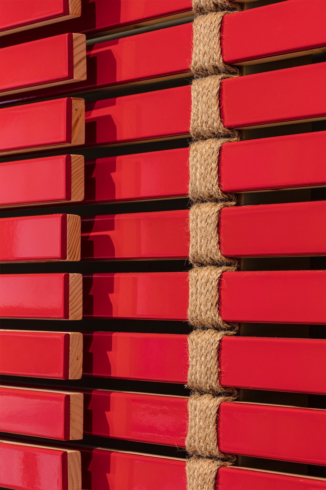
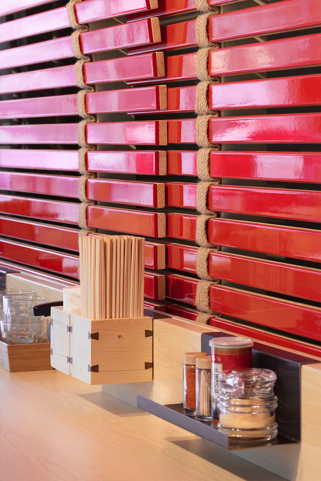
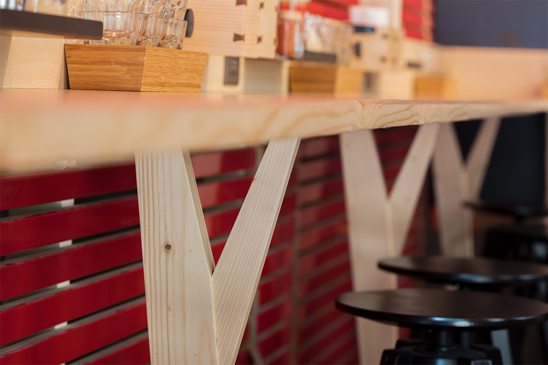
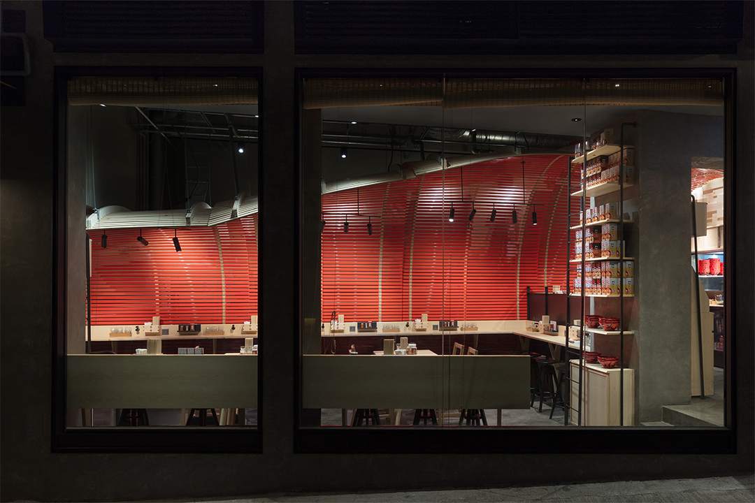
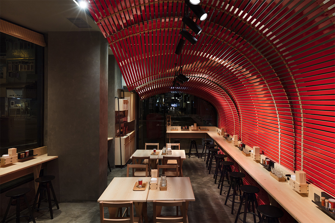
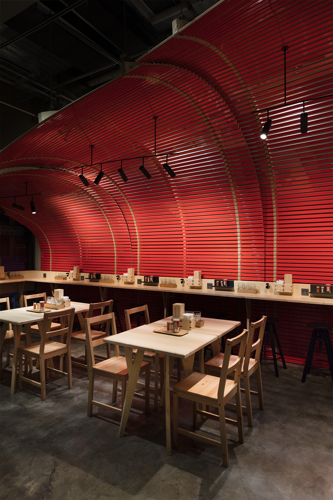
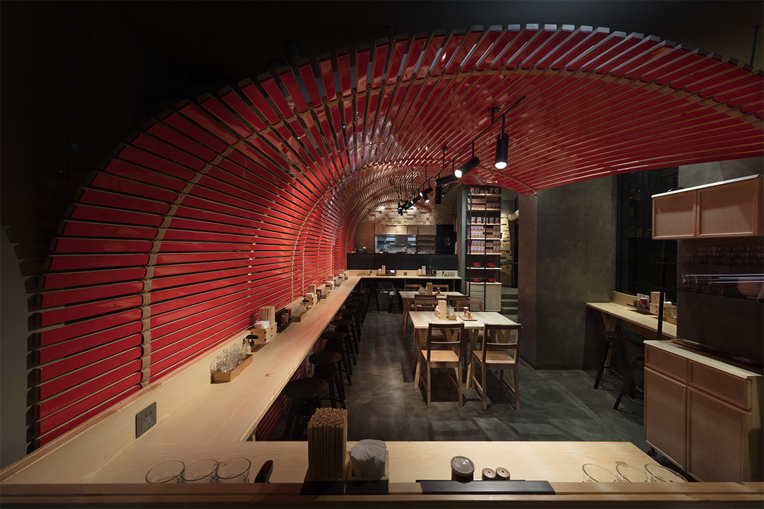
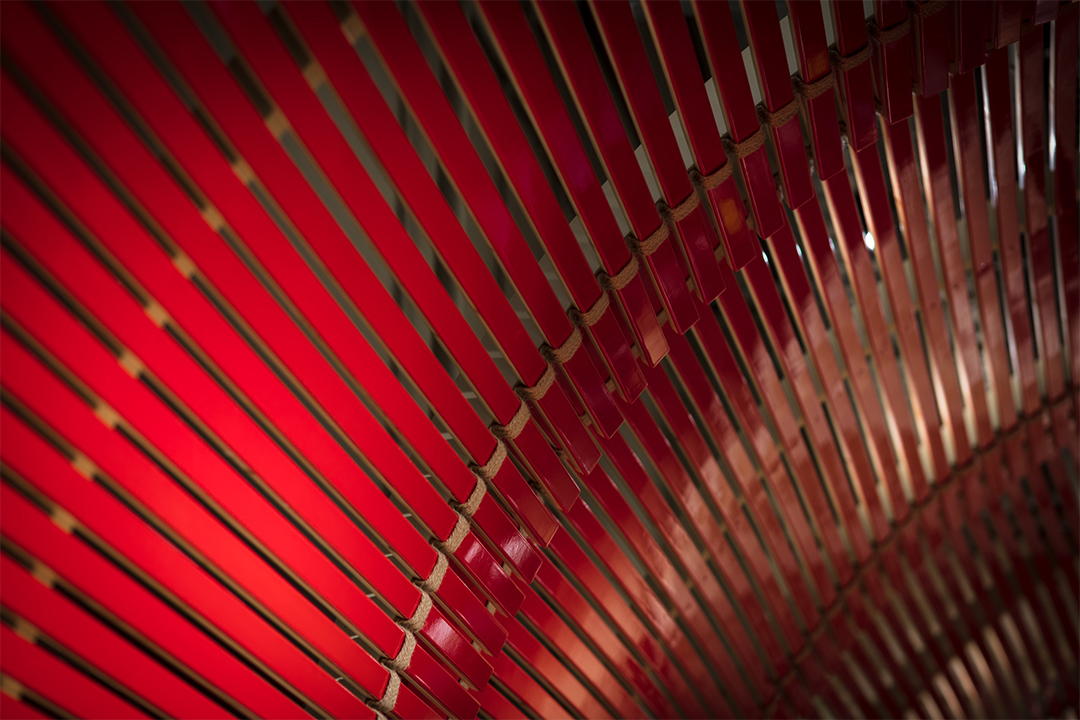
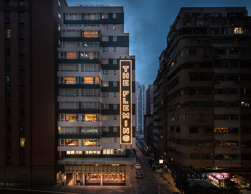
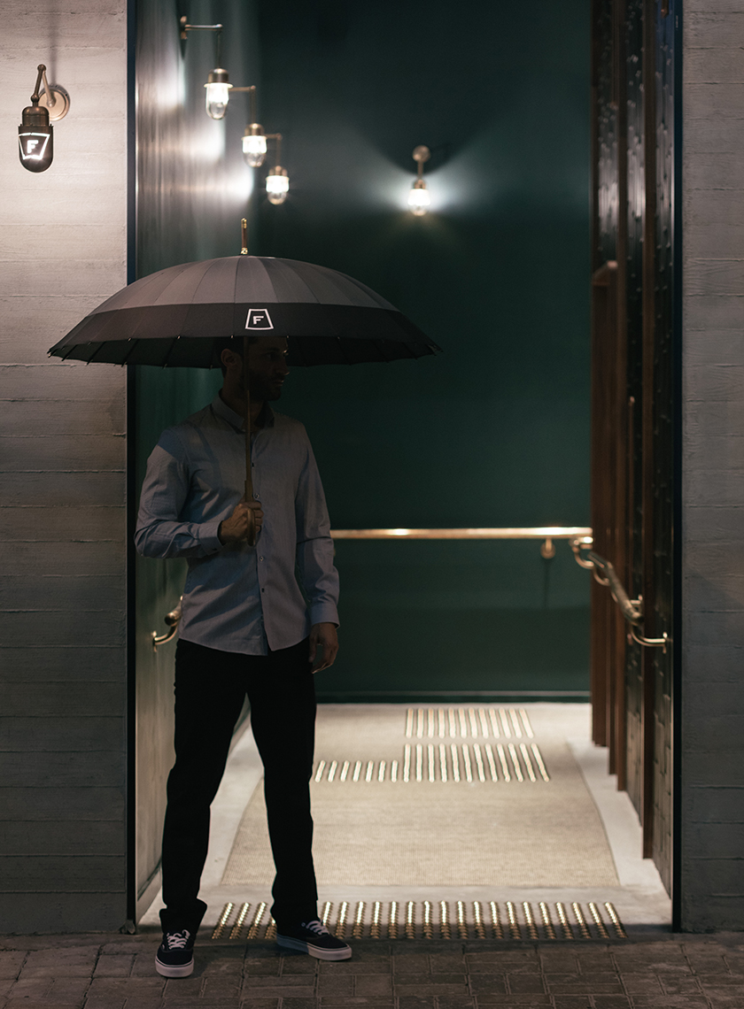
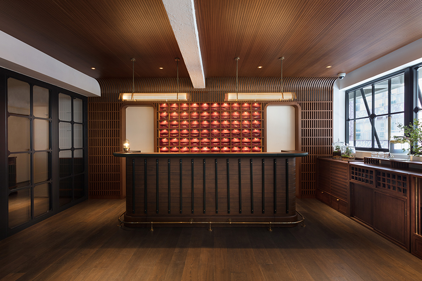
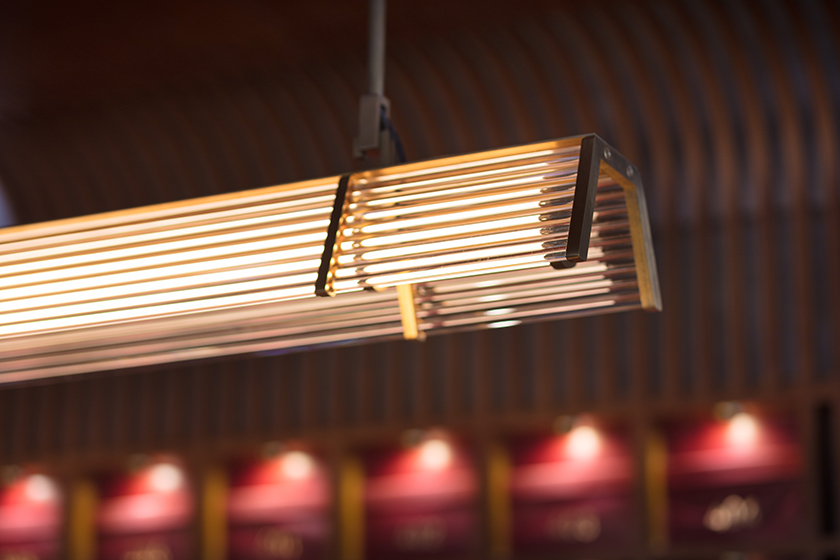
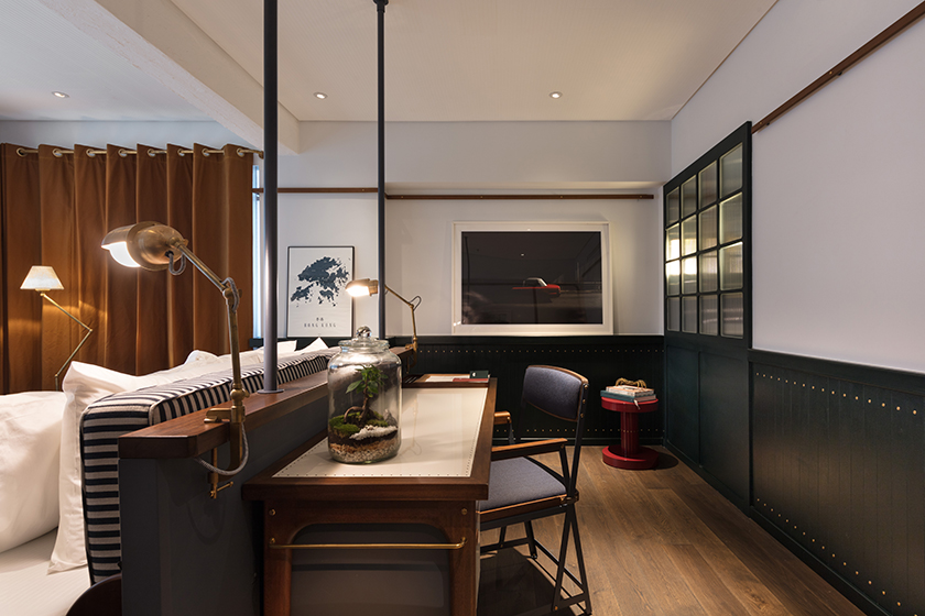
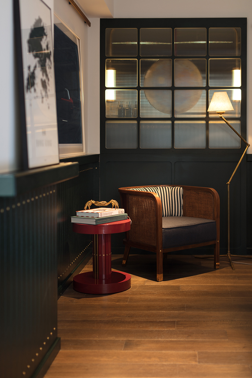
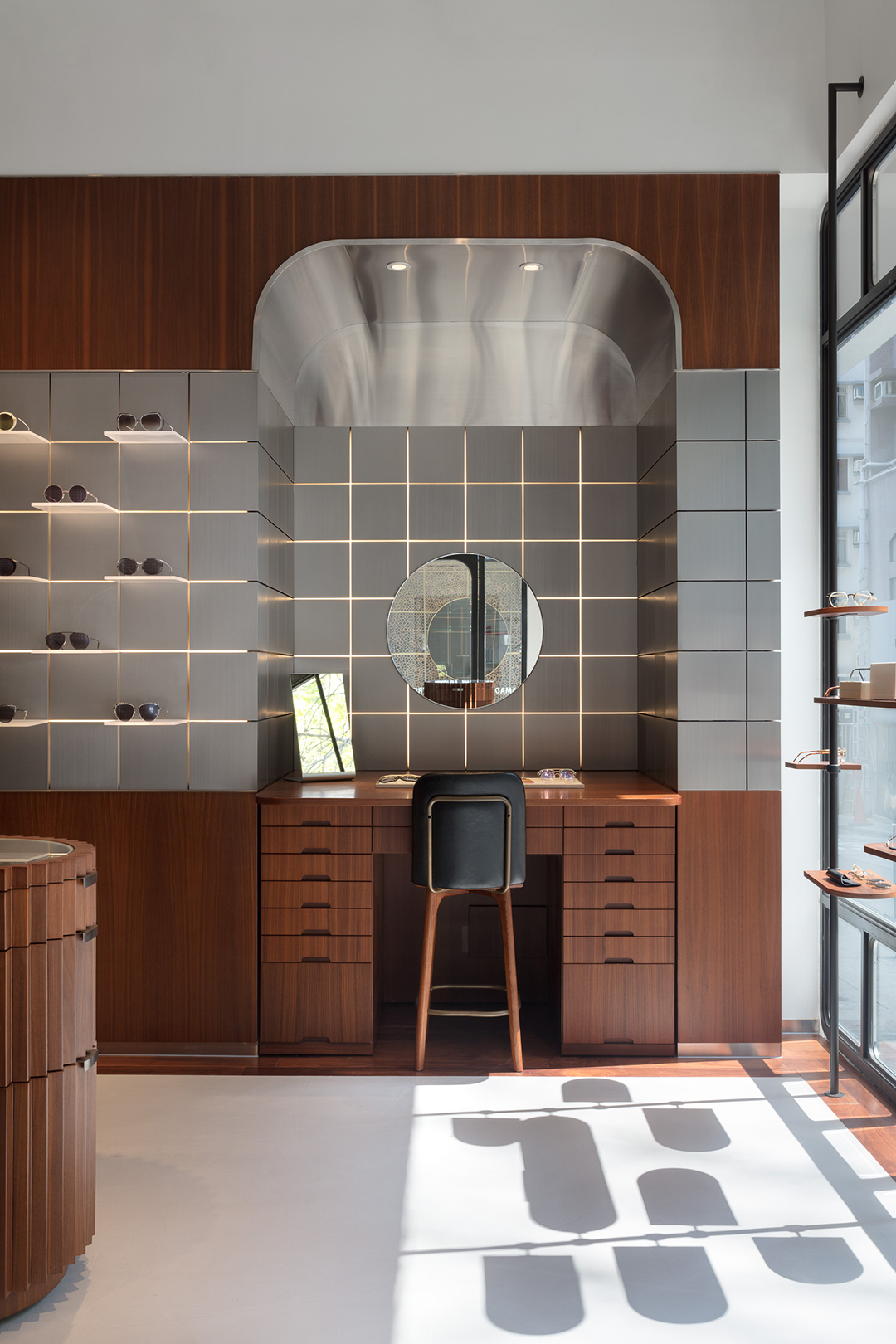
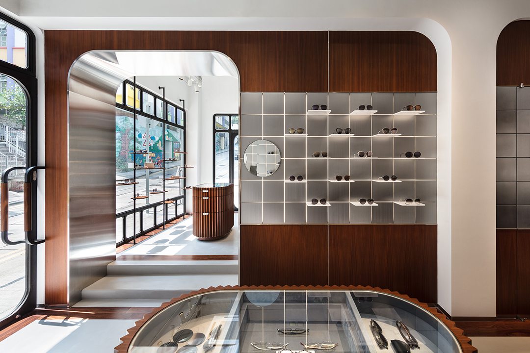
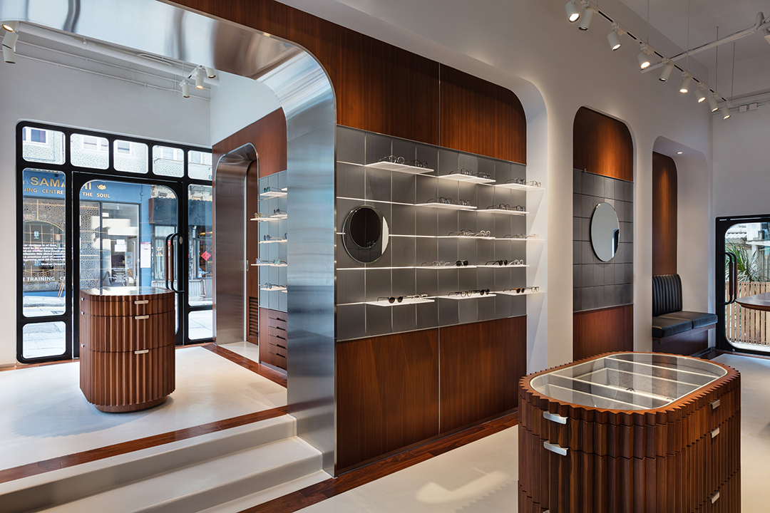
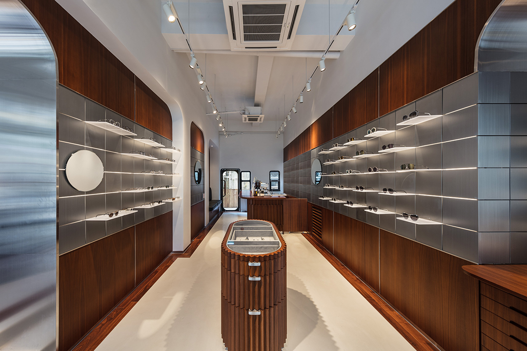
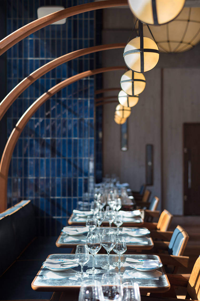
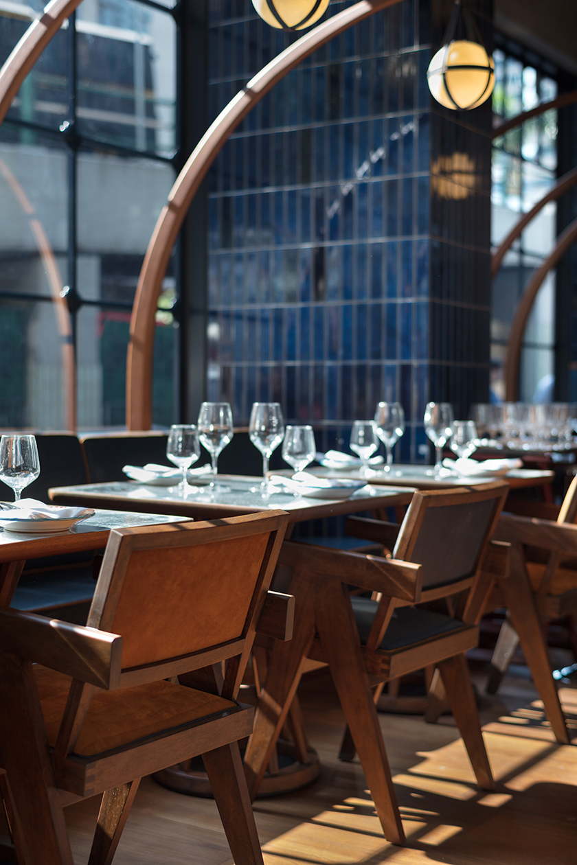
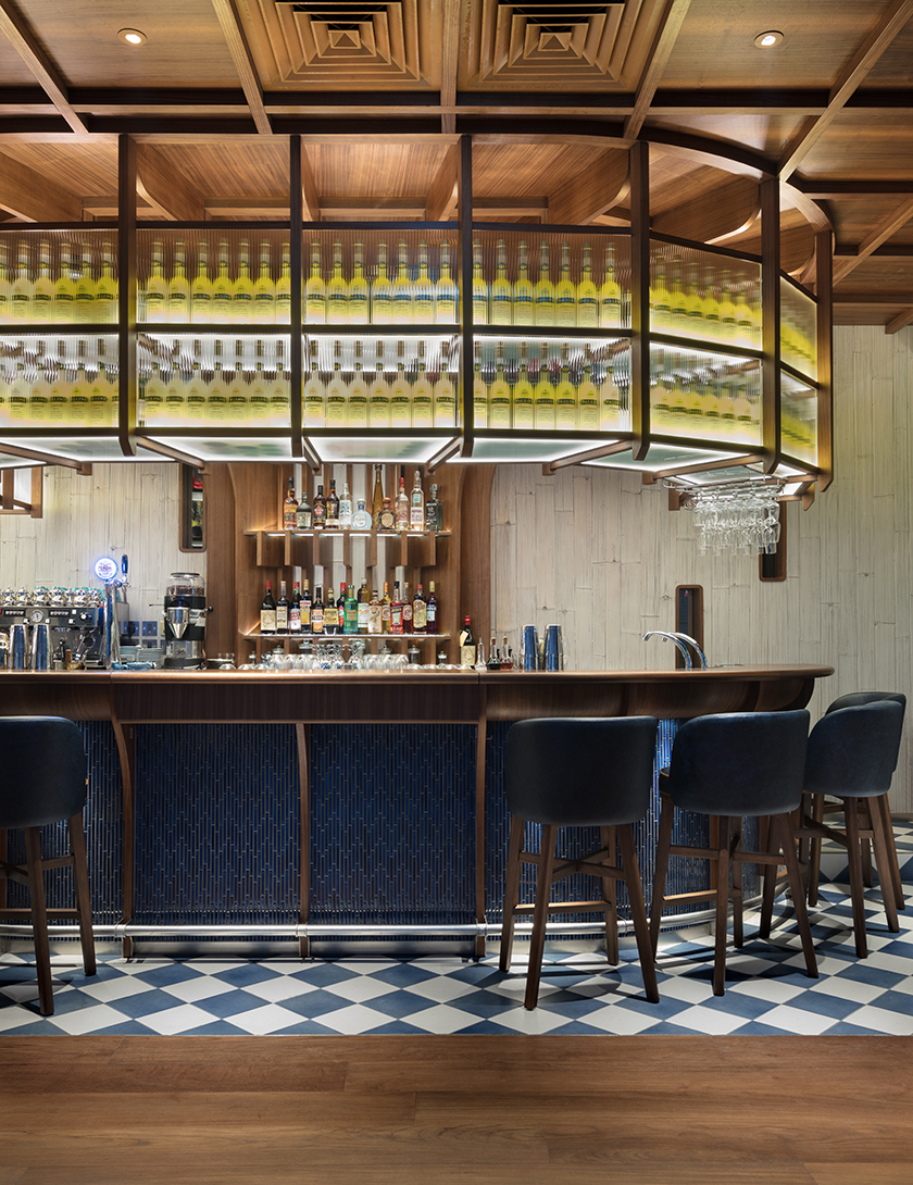
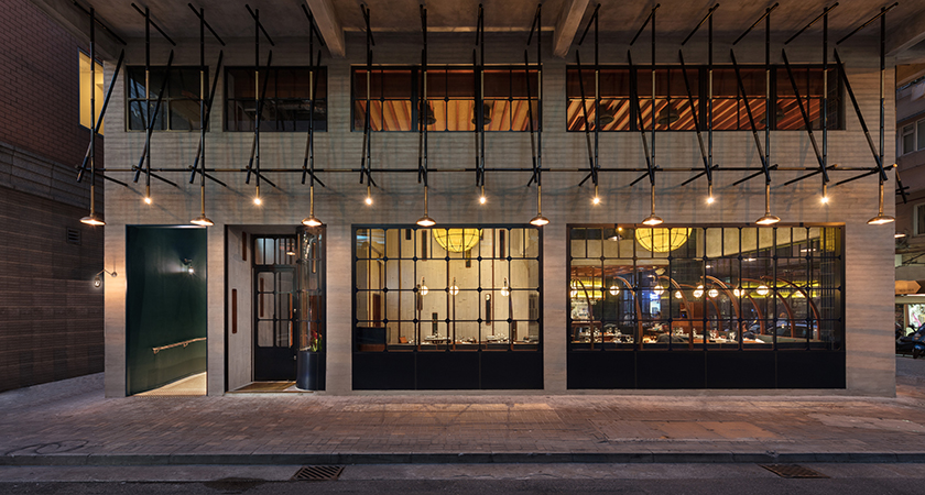
from the cloud of pearl-shaped lights floating above, to the dark olive green facade that opens a portal to a mystical universe, mother pearl expresses dimension through its organic materiality, drawing the consumer deeper into the sweetness of the present.

the rambler

named after goodman interlink’s unique and strategic location in the rambler channel, the rambler is a new take on café design, offering a refreshing space for customers, their workers and their guests to meet, socialise and recharge.

the selection of natural elements is a stark contrast to the industrial building the café resides in. a warm palette of materials interspersed throughout with timber wrapped around to nourish the soul and breathe life into the space – echoing the feel of a haven across day and night. the use of blue hues through a gradient of hand-glazed ceramic tiles reflects the lull of water and washes over with an air of contemplation.

the year of the pig

the year of the pig carries a symbol of “abundance ». this porky zodiac brings you prosperity, fertility and plenty of luck. to send blessings to everyone in the coming year, we designed 8 auspicious red packets that illustrate an array of fortunes treasured in the pig’s full belly: harmony, morality, happiness, longevity, love, peace, success and wealth. gold stamping and spot uv finishing was applied to bring a sense of crafted opulence with each packet individually hand wrapped in ribbed kraft paper, ready to be gifted to friends and family.

origin shangri la

a station is the crossroads of millions of lives that intersect and pass within seconds, a point of convergence harbouring exchanges and ruminations; beginnings and endings. located in the original outlet of shangri-la in singapore, origin epitomises the hotel’s legacy, and honours south east asian produce. the existing arches carved into the space reminisced of station platforms and presented a befitting structure for execution. as diners travel through the bar, main dining, and private dining areas, they are taken on an evocative journey from the ticket counter, grand hall, platform, and finally to the intimate carriage. the curvatures mirrored in the interior and campaign furniture, in combination with the kinetics sculpture at the bar, guide visitors through a rhythm of travel.

fukuro

after a long day of work, wearied salarymen of tokyo trail back to the comforting glow of izakayas, where they take refuge and unwind with food, drinks and uninhibited conversations. echoing these nocturnal waterholes, fukuro embodies a mystical ambience, whilst exuding a warmth that sparks spirited interactions between visitors. as a messenger of the night and a protector from hardship in japanese symbolism, the owl icon manifests the outlet’s identity. the profusion of wood crafted by simple carpentry oozes an intimate and relaxed atmosphere for visitors to indulge in a spin on a quintessential japanese experience.

ebisoba ichigen

ebisoba ichigen has achieved cult status amongst japan’s most discerning ramen aficionados – the secret to its success has been the pairing of ramen with a shrimp based broth for an innovative twist to an old and popular recipe. for its first hong kong location, we designed a space that reveals the power of the flavour by using colors that reflect the ingredient, resulting in the bold and instantly recognisable ebisoba red. reminiscent of the ribbed and curved shell of a shrimp, a sculptural canopy made up of individual pine strips runs from the street to the kitchen, paying tribute to the food while adding a touch of quirkiness to ship street.

the fleming

we were tasked to redesign and rebrand the fleming hotel, originally opened in 2006. a new take on the architecture, interior, products, and identity transformed the fleming into a 66-room boutique hotel that is a true reflection of hong kong. occupying a building from the 70s’, the hotel stands in wan chai close to victoria harbour front. the multilayered design concept draws inspiration from the location and history, leveraging Hong Kong’s maritime heritage and 70s’ industrial era to create a cultural, social and efficient character. one landmark that embodies these three elements is the star ferry — having connected people across the harbour for over a century, it is a piece of hong kong’s collective memory and identity. the star ferry, a unique and elegant icon of Hong Kong’s past and present, became the foundation for every design detail, including the custom designed furniture and lighting. nostalgia is further evoked by colours and scents: Carmine reds and bottle greens — hues seen on the hull of Hong Kong’s ferries, fishing boats, delivery trucks, and temples —and apothecary-inspired toiletries and custom aroma of sandalwood and amber notes, to deliver an authentic sense of place.

Identity

khromis

like a prism dispersing monochromatic light into a spectrum of colours, khomis is a catalyst for transformation. each frame empowers the individual to reveal a whole palette of emotions and personalities. resembling a pair of glasses, the logo is also an expression of refracted light paths. the interior uses mirrors to create reflections and perspective, manoeuvring light to display the product in the best possible way. a touch of wood warms up the interior, along with the coffee bar in the corner, creating a comfortable atmosphere for a multi-sensory experience.

osteria marzia

a place where the sun meets the sea, osteria marzia brings the cuisine and romance of the southern italian coast to the heart of wan chai. through expansive windows, the glorious glow of sunlight breathes life to the luminous aqua blues, yellows and golds inspired by the mediterranean sea and shoreline. boat building techniques guide the interior architecture, and a contemporary maritime spirit find its expression in warm teak wood, white bamboo panels, navy blue banquettes and coral-blue tiles. here, the sea reveals itself in tables with shimmering surfaces and lamps that look like fishing lanterns. herbs from the aeolian islands perfume the air, as friends old and new gather to enjoy la dolce vita over wine and sumptuous italian seafood. a homage to life in cities by the sea, osteria marzia is an encounter with the flavours and sensuality of the mediterranean, in a dazzling oasis near the hong kong harbour.

Identity

plum

like harvesting ripened and succulent fruit while filtering out the rest, plum is a lifestyle curator that thoughtfully selects products based on quality, affordability, and distinctiveness. the result is a refined collection of the best of the best—tested by experts, with insider prices, and customised to each individual’s taste. the identity is the expression of consumer decisions made easier.