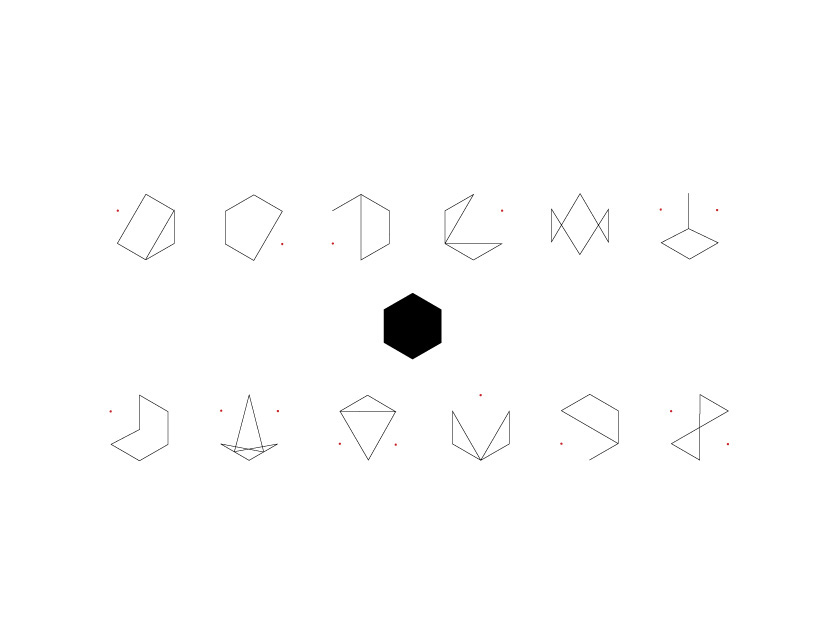
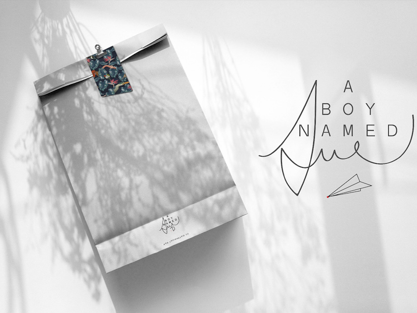
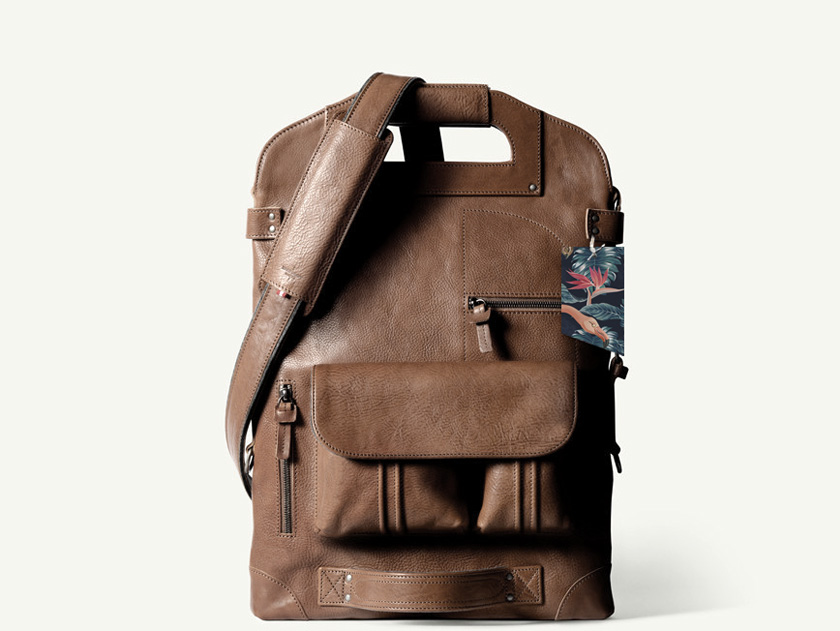
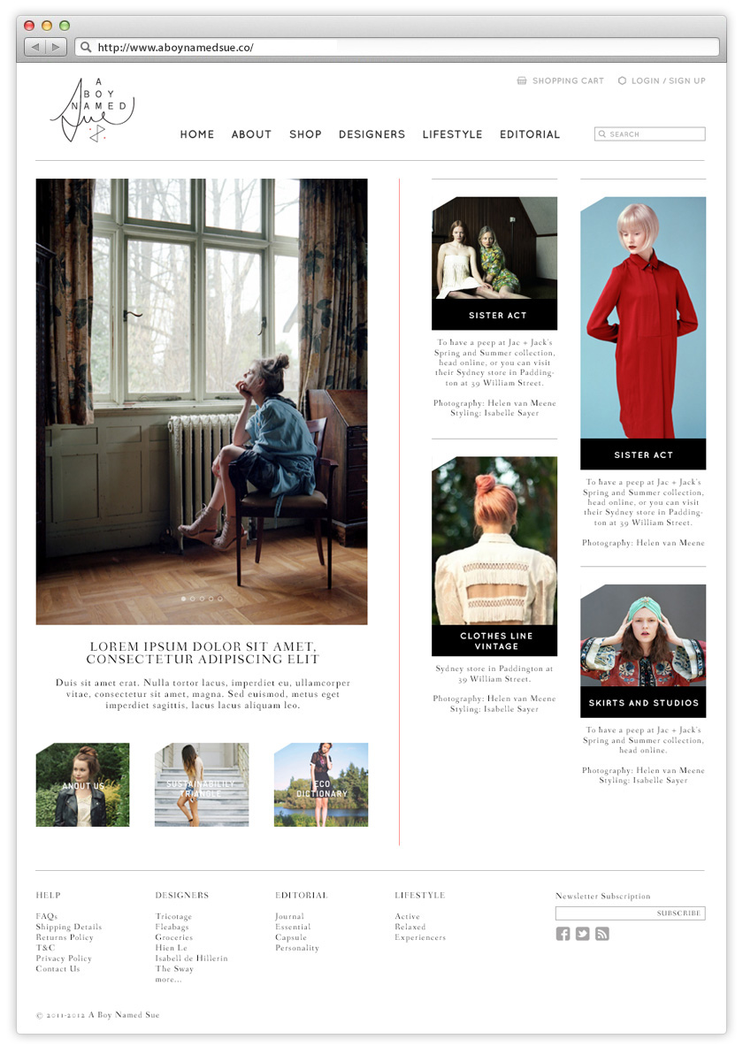
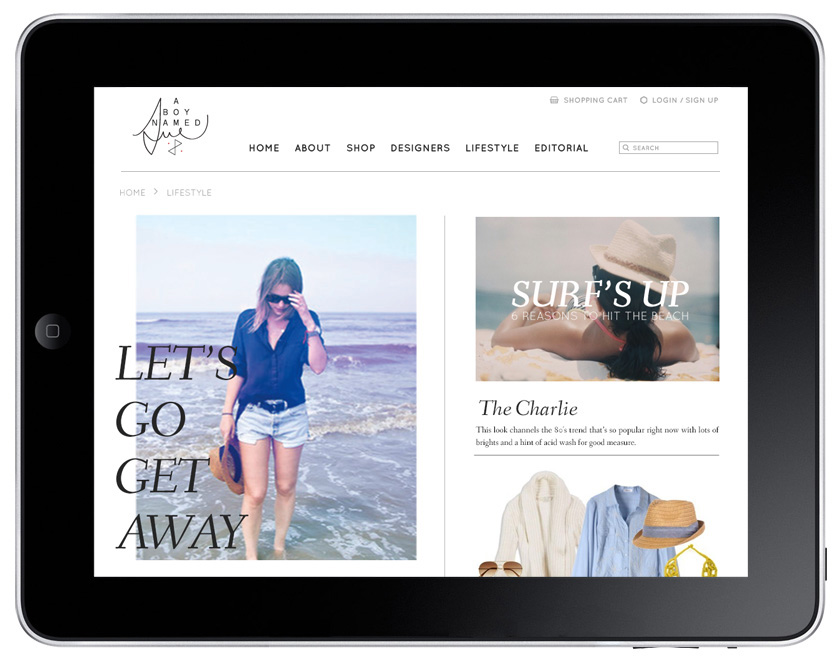
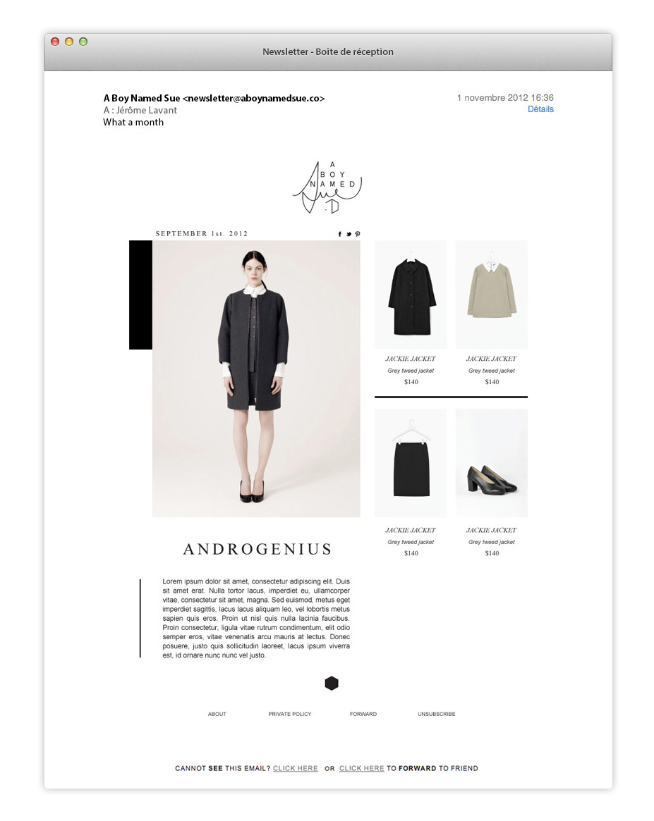
“a boy named sue”, un multi-marques en ligne nommé ainsi en référence à la chanson de johnny cash, propose une collection d’objets socialement et écologiquement équitables. un système de formes nouvelles est adapté et décliné sur tous supports physiques comme numériques. au cœur de ce système visuel, le site internet a été ainsi pensé comme une pièce maîtresse, un espace interactif, de navigation facile pour une expérience intuitive.
Archives
sal curioso
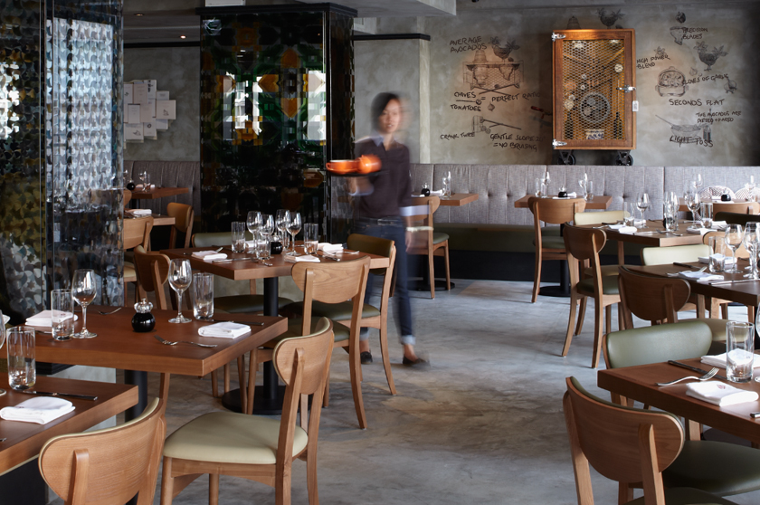
after the success of madam sixty ate, a european restaurant founded by a whimsical chef of great imagination, we were appointed to brand a second restaurant with spanish influences in the hub of hong kong’s vibrant culinary scene.
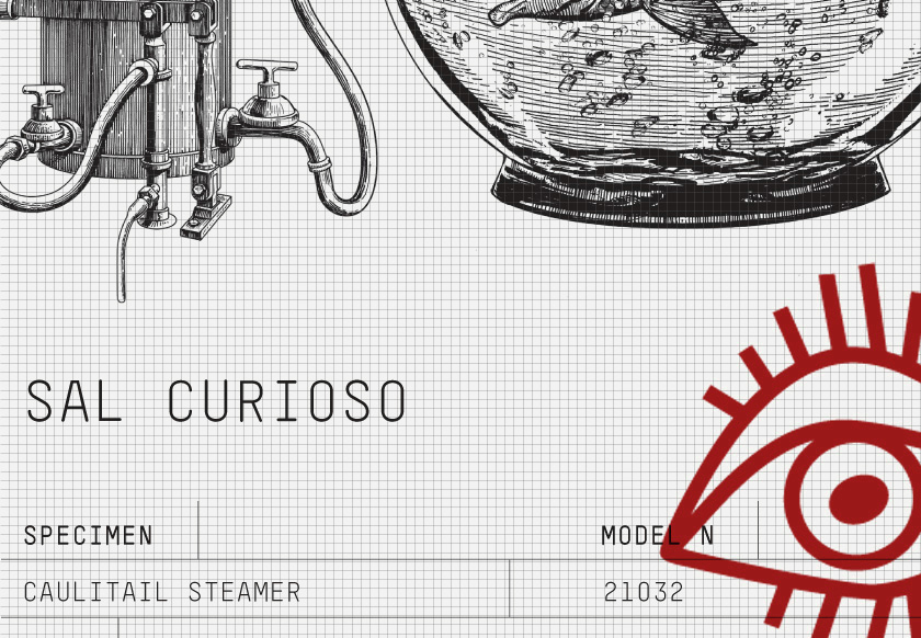
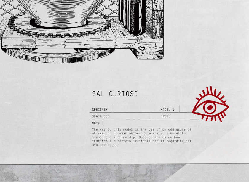
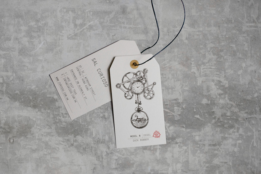
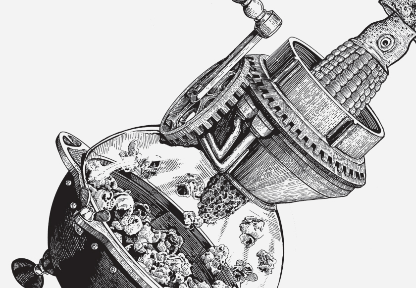
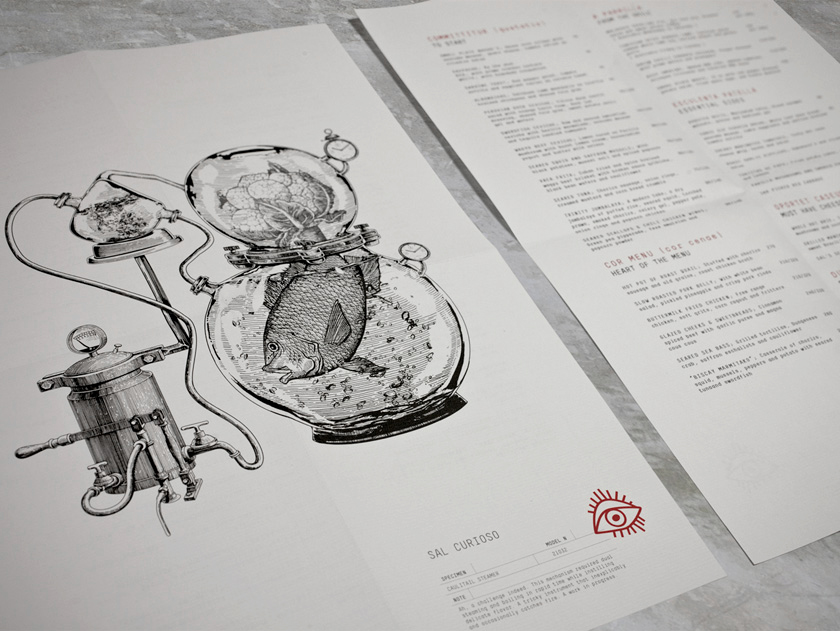
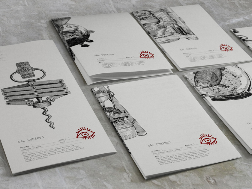
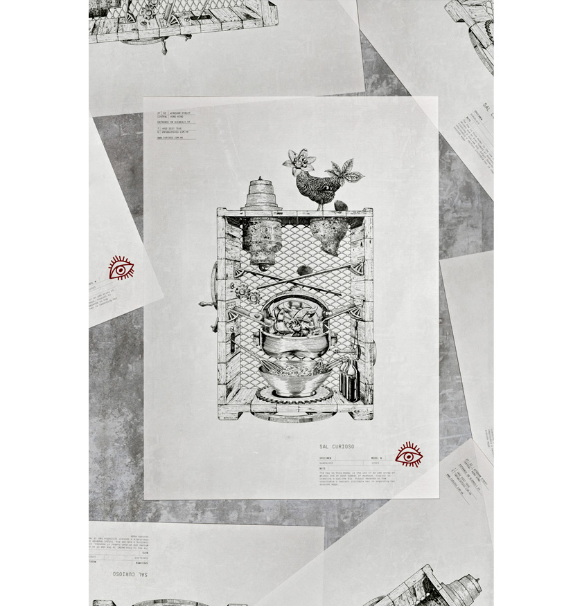
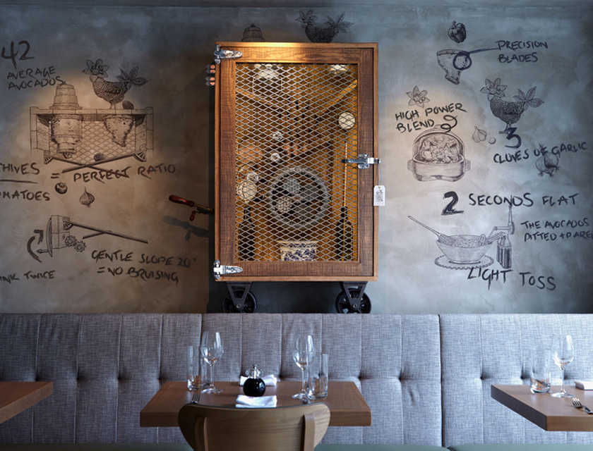
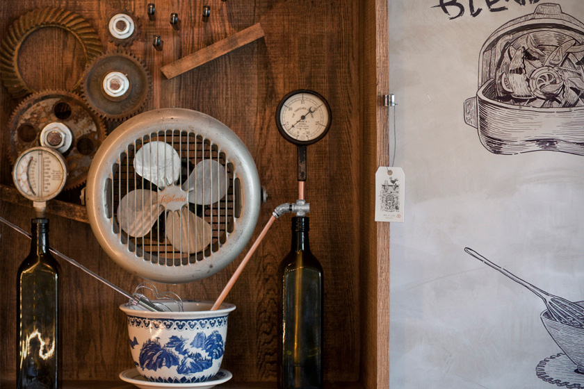
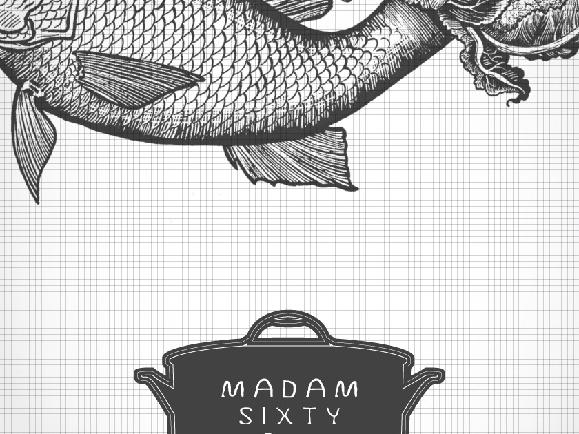
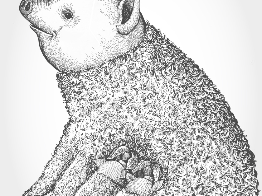
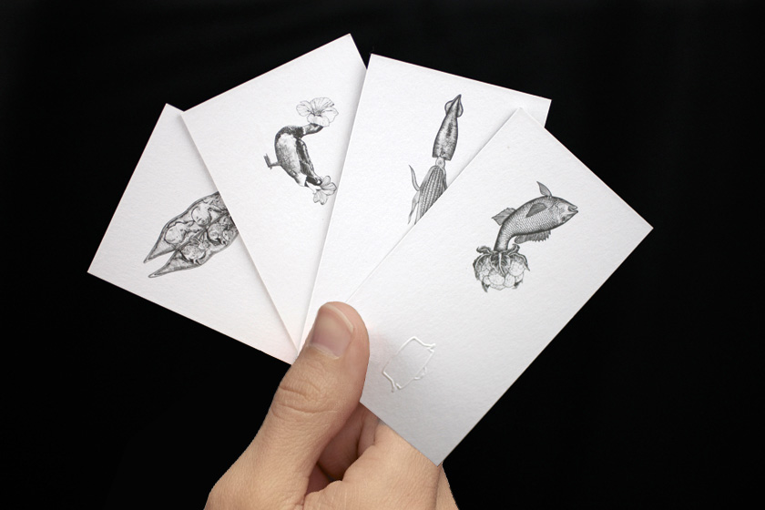
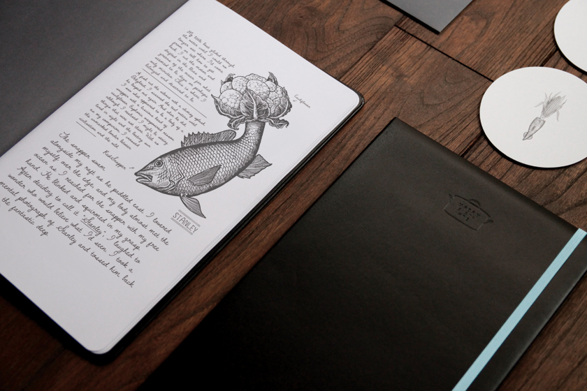
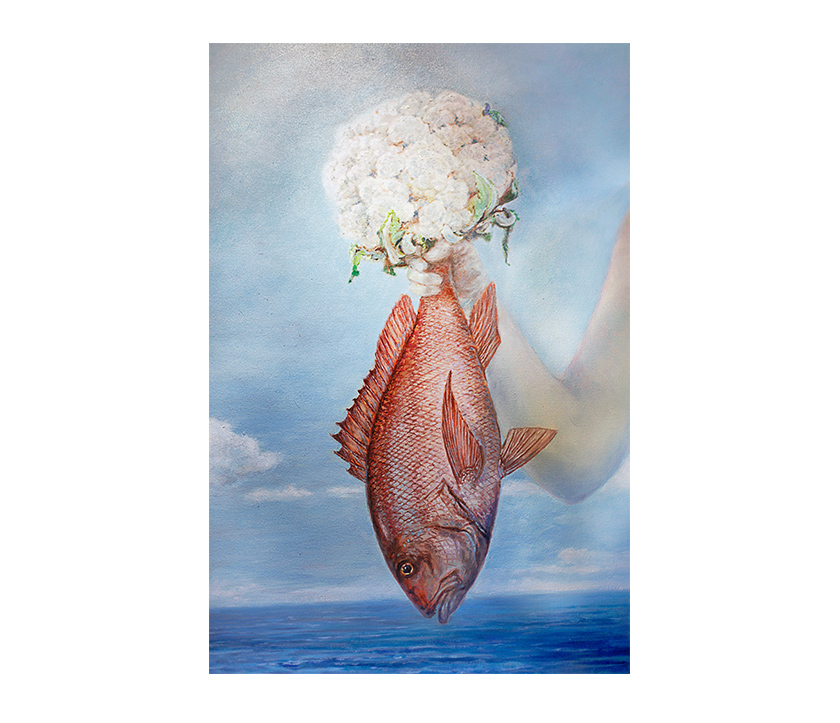
madam’s story centered on her strange journeys and encounters with surreal animals, so it seemed natural to provide her with a quirky companion who could share her discoveries. sal curioso is madam’s spanish ex-lover, an eccentric inventor and an uncommon genius. he meticulously designs and builds contraptions specifically to best broil, steam or pop the strangely shaped animals from madam’s travels into a delicious dish. his inventions include the duck bobber, caulitail steamer, guacaloco and squid pop, all displayed throughout the 2,000 square foot space. it is madam’s dishes, featuring among others, joseph the flower-headed duck and pedro the fish with a cauliflower tail, that inspire each invention.
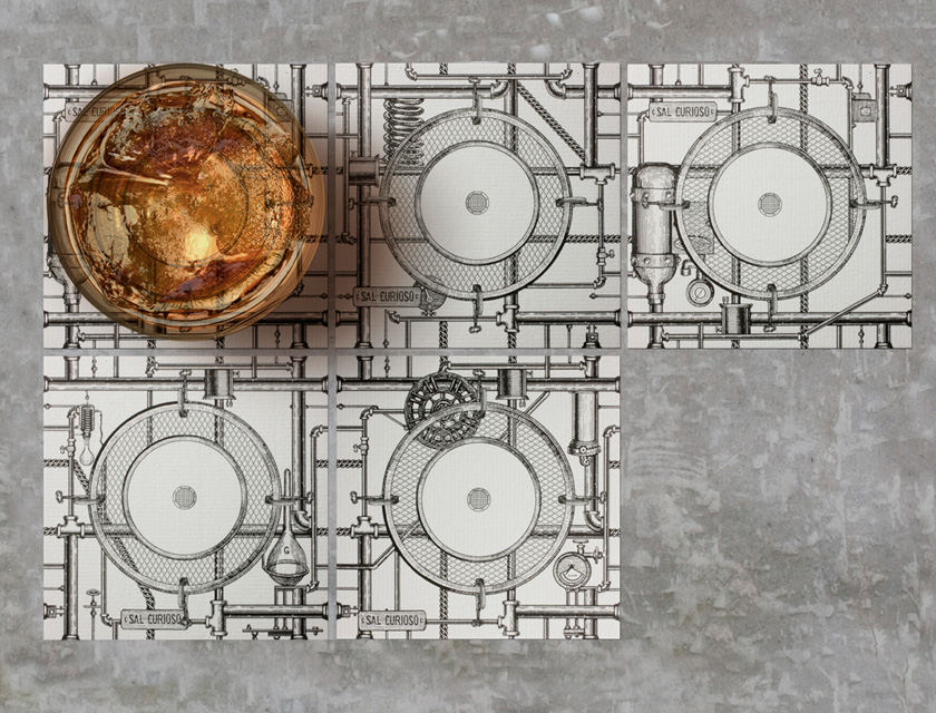
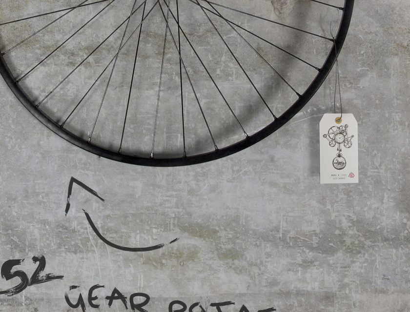
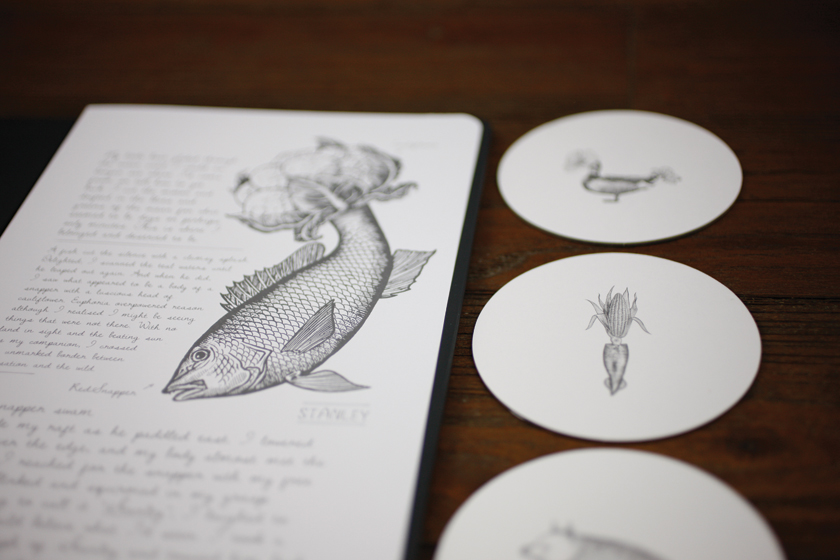
each device is accompanied by sal’s personal annotations of his design, construction process and his creative scrawls of his registered trademarks. the collection of schematic drawings and documents fill the food menus as patents, the interior is his studio occupied by his machines, hung with business card as licensing labels for copyrights. even the coasters on tables are not immune from sal’s touch – they are designed to draw water condensation from cocktails, a piping system that transports the liquid when coasters are placed together to connect the pipes.
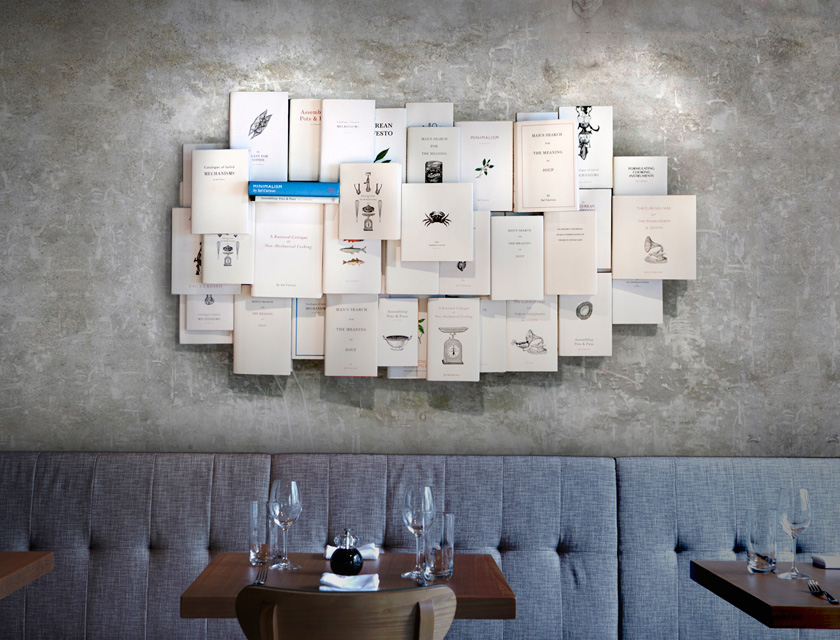
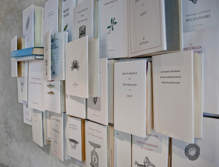
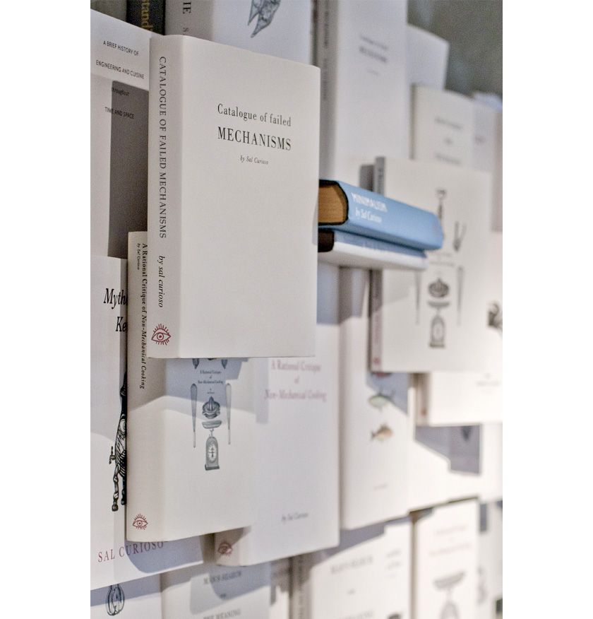
a great thinker, sal is a prolific writer who displays his wall of books written and illustrated himself, displaying a fascination for innovative cooking techniques and antiquated culinary history.
Identity
Interiors
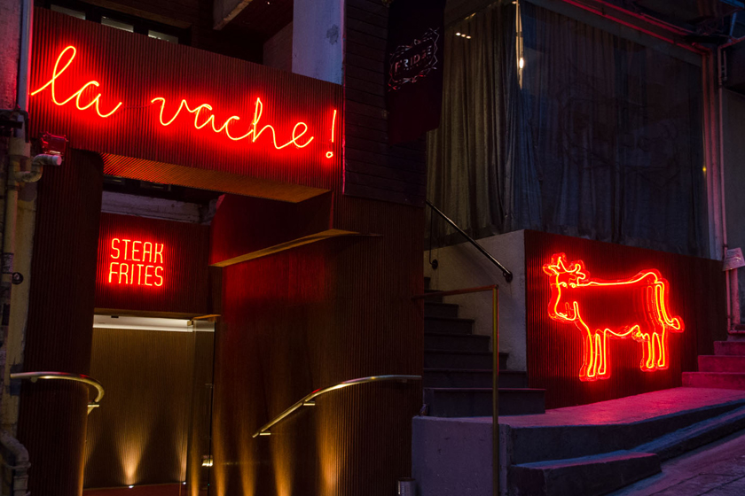
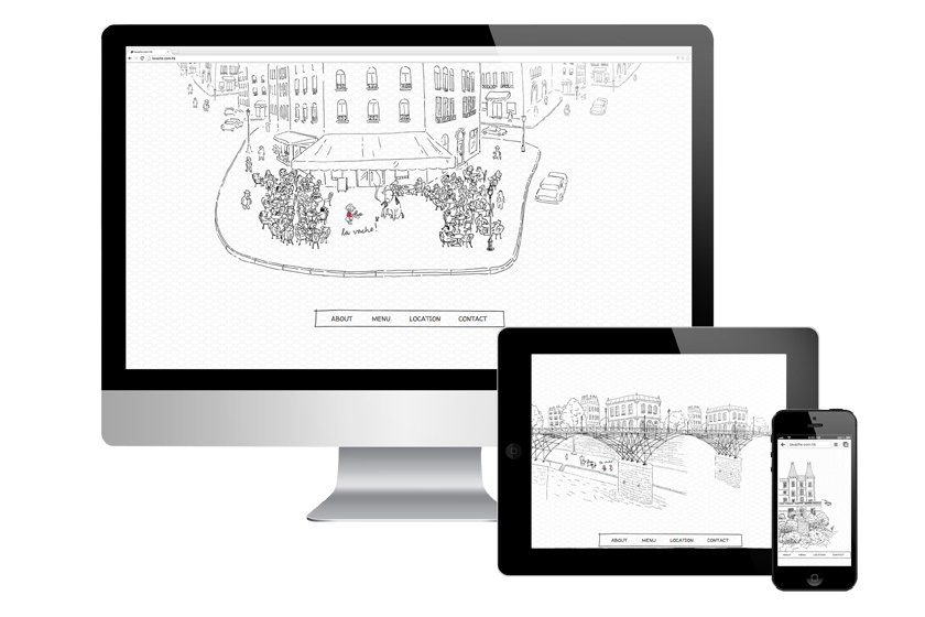
la vache!
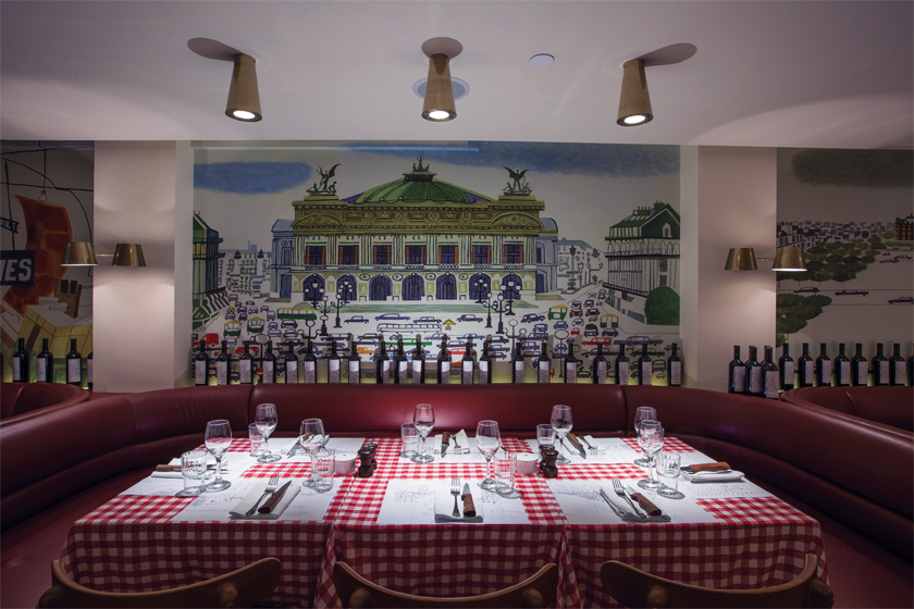
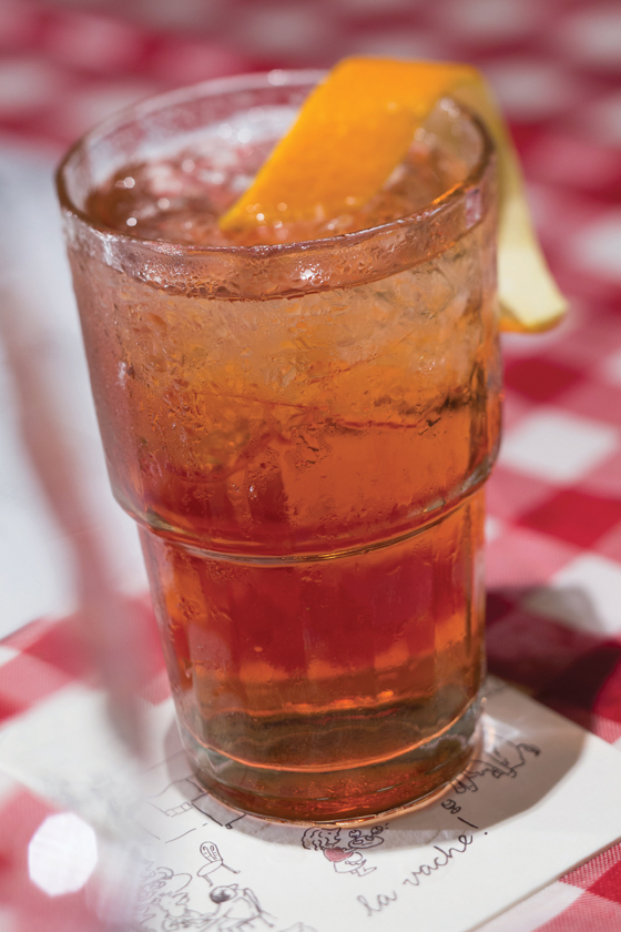
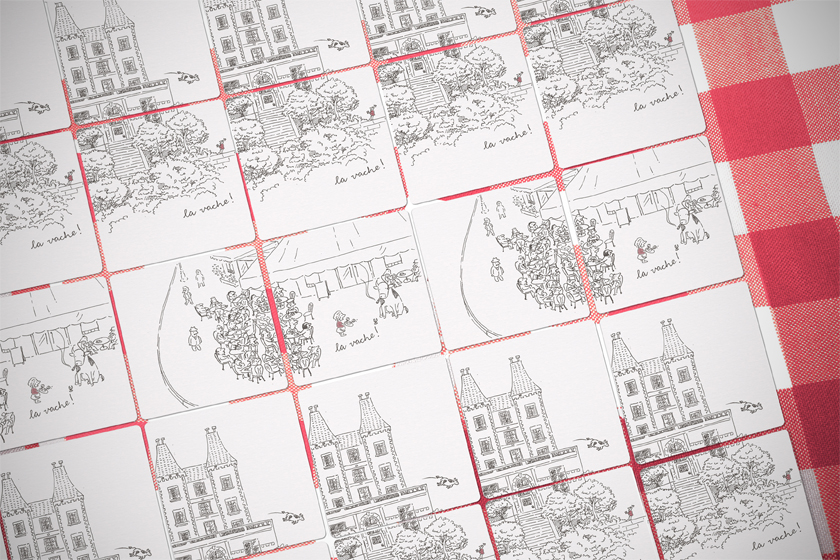
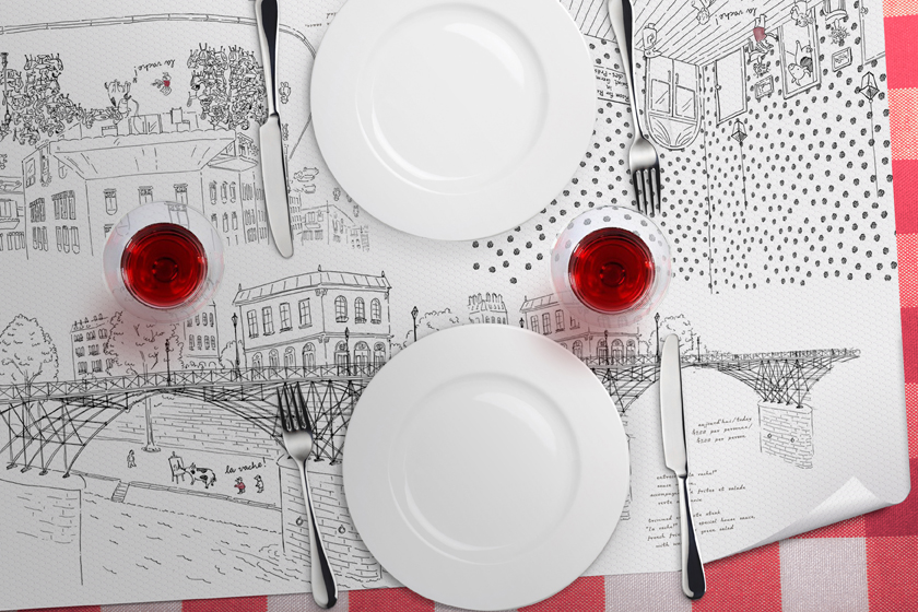
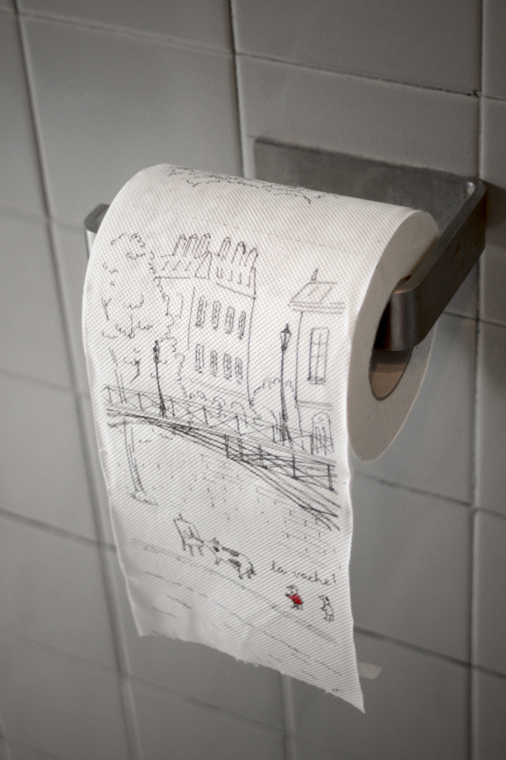
paying homage to the classic parisian steak & frites la vache! brings forth the parisian bistro culinary staple to hong kong’s restaurant scene.
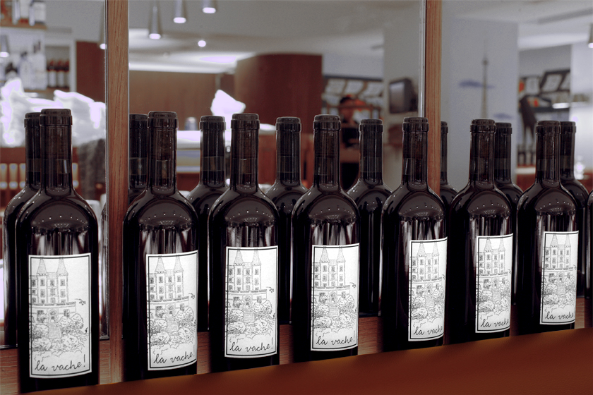
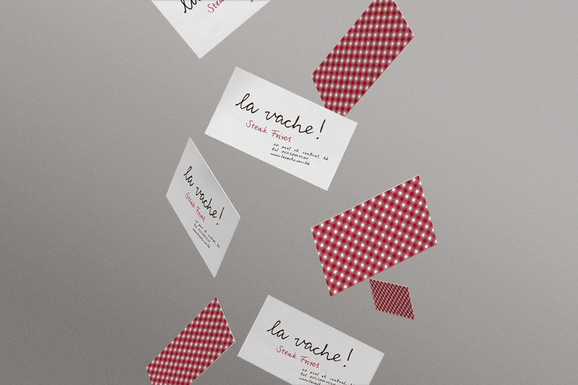
we were inspired by the french cartoonist jean-jacques sempé’s humorous style and created a playground for him to express his witty la vache! moments: tables, walls, coasters, wine labels, toilet paper…
Identity
Digital
madam sixty ate
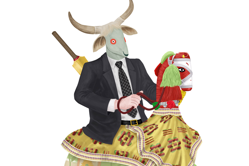
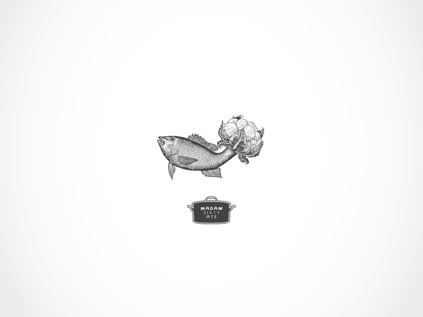
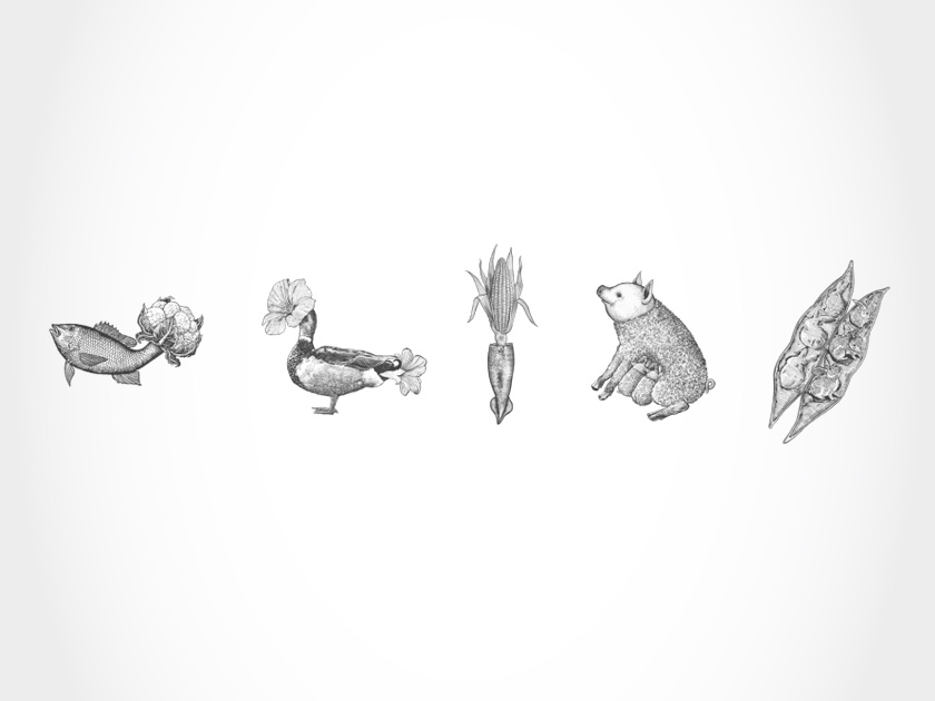
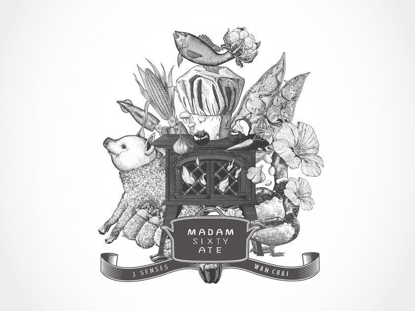
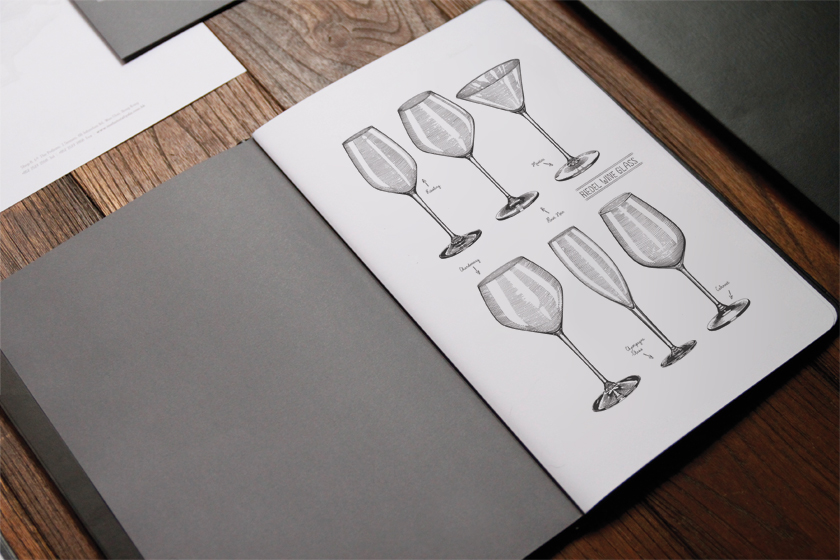
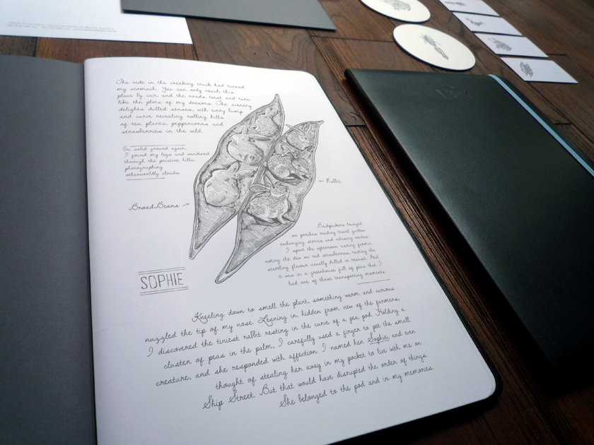
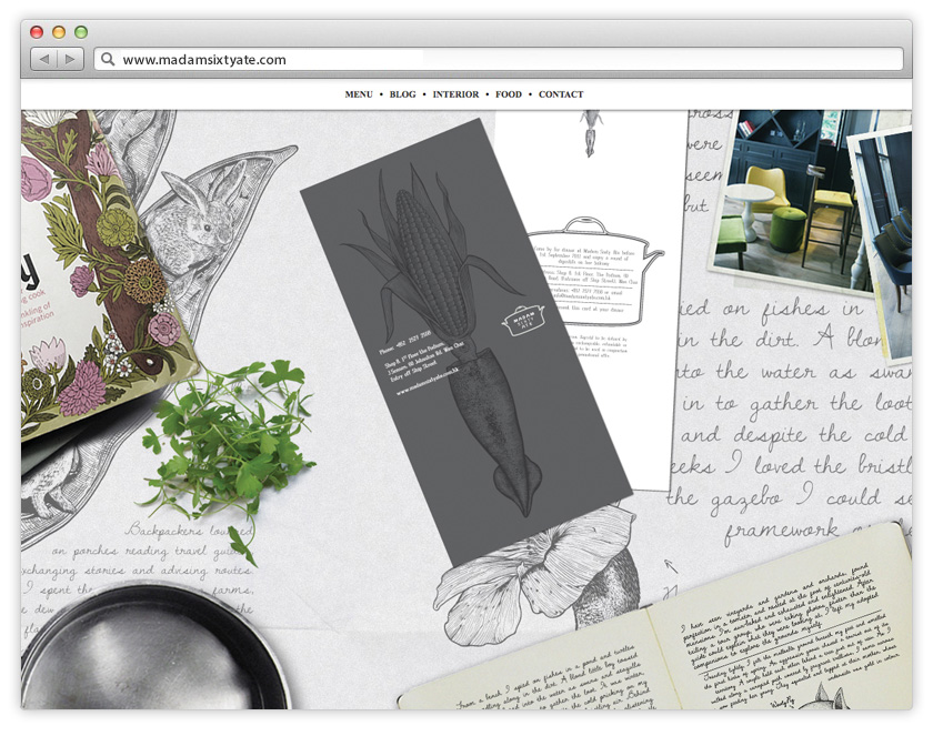
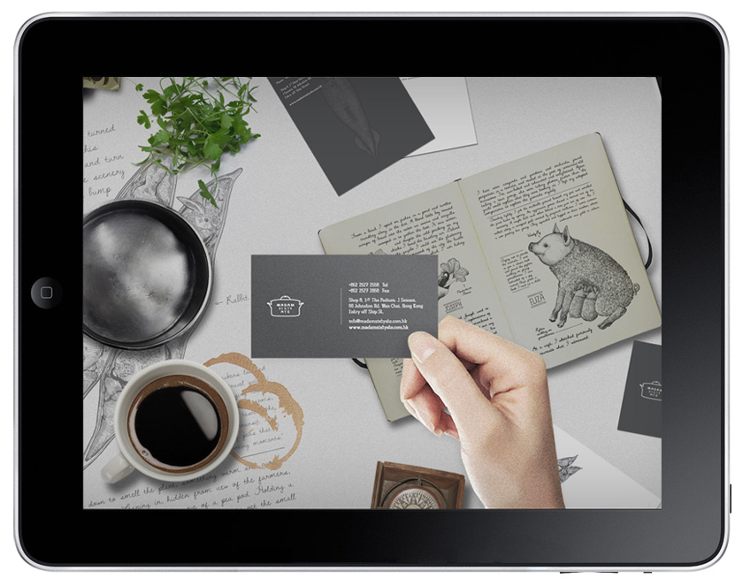
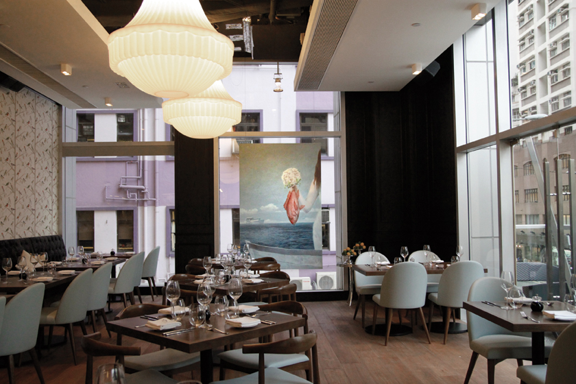
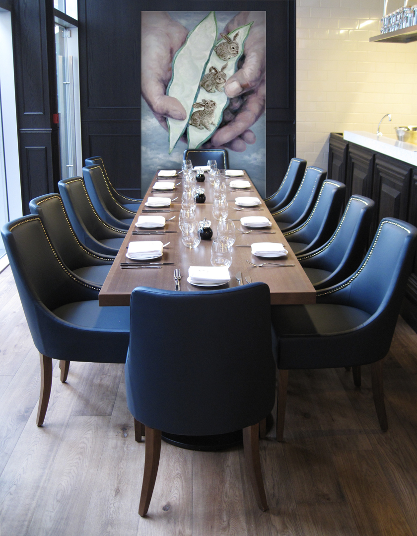
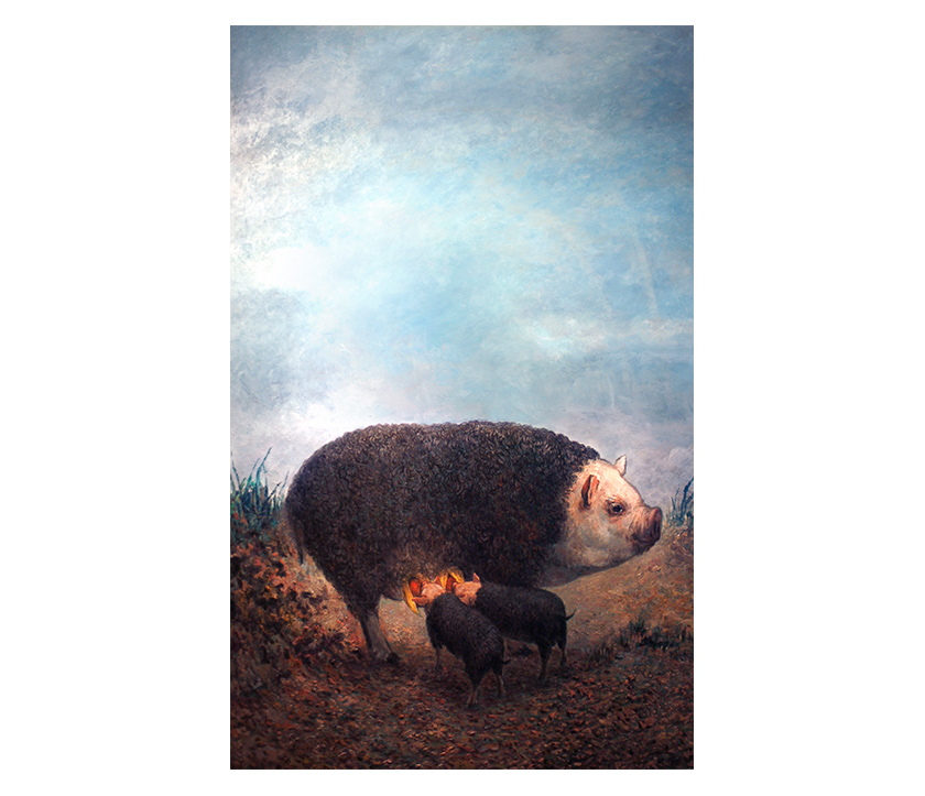
we created the exploits of a mythical person that reflected the chef’s vision and the surprise pairing of ingredients. madam sixty ate is a mysterious adventurer and eclectic writer who delights us with her palate and imagination. her world view is modern with a twist, mirroring the style of food. her surreal experiences and astounding stories are reflected consistently throughout the brand using paintings, journal entries within menus, coasters and ultimately through the cuisine. the journey from discovering a new restaurant to after dinner farewell is a reflection of the journey madam has when she discovers the variable species which capture our imaginations.
![]()
Branding

Digital
Interior
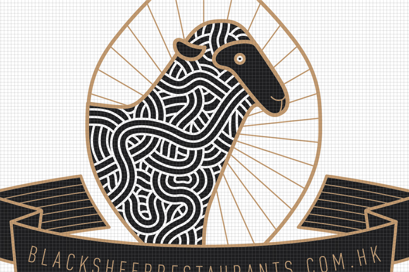
blacksheep
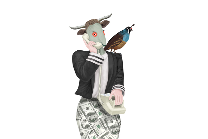
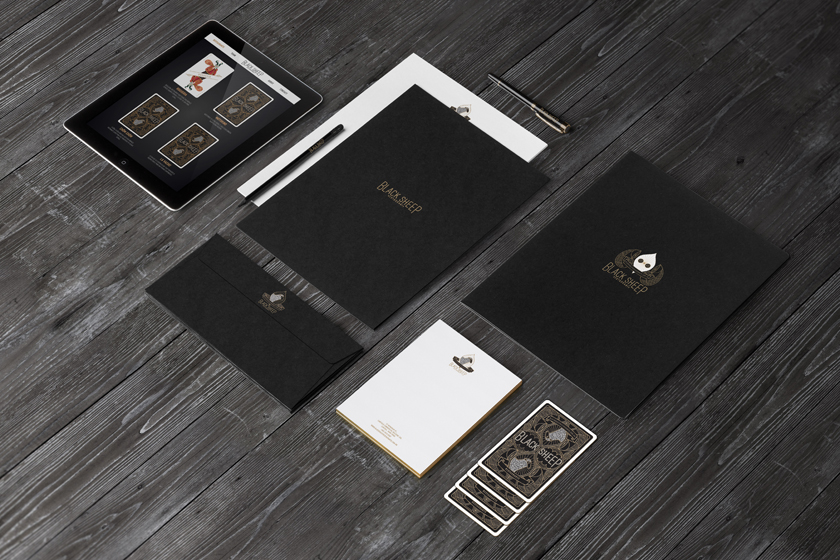
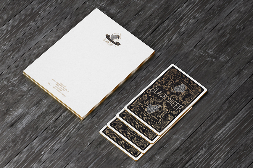
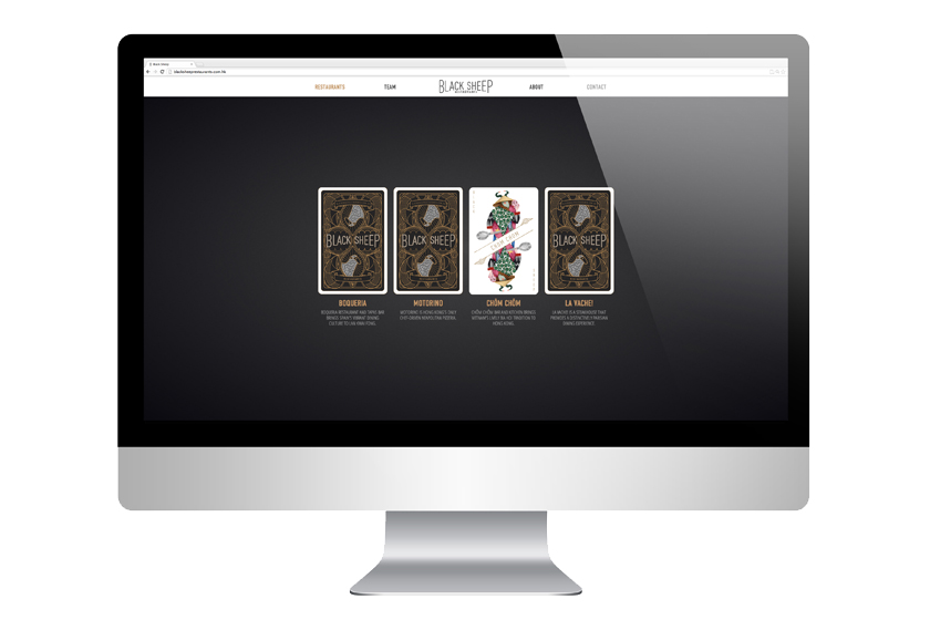
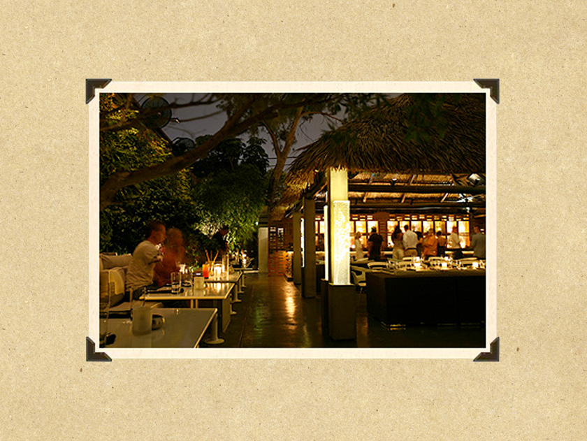
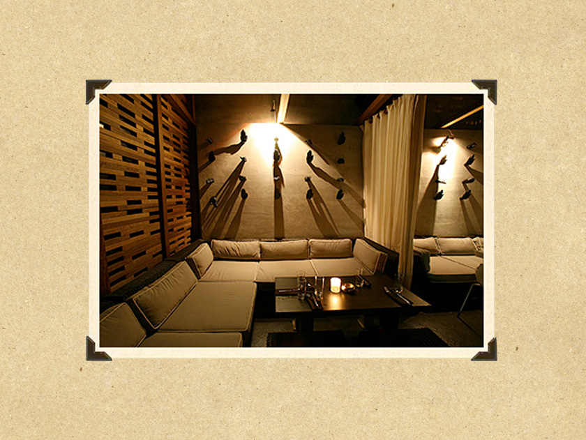
black sheep restaurants is a hong kong-based hospitality group committed to offering a smattering of dining gems in a neighborhood clutter of restaurants. the black sheep team is focused on providing culinary experiences that master the basics.
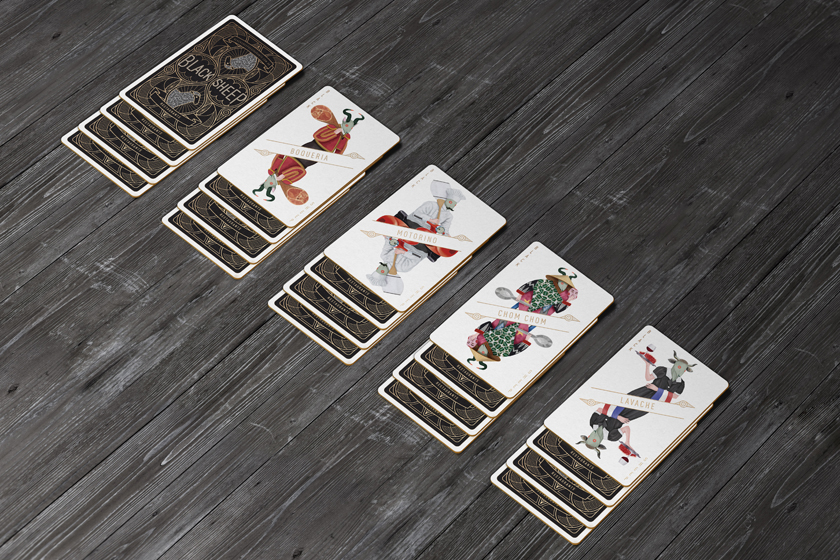
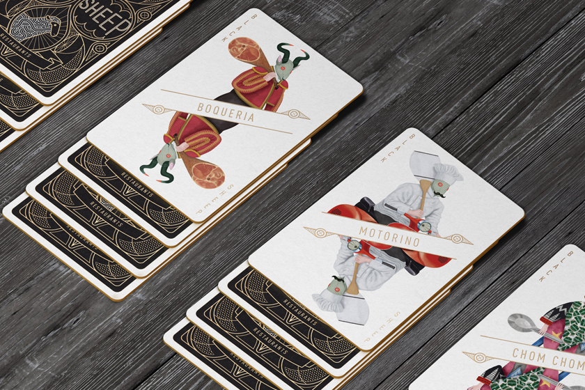
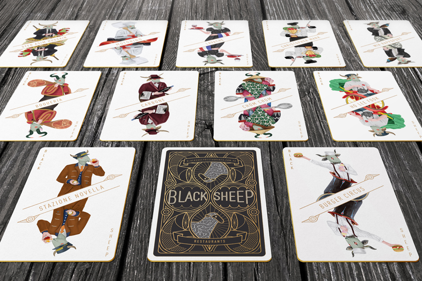
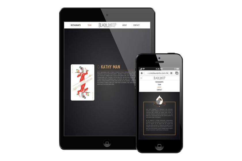
we wanted to express the personality of the brand’s legacy in creating unforgettable mementos by developing a graphic language that holds a harmony of personalities. each detail has a special characteristic and quality that makes the member integral within the family.
Branding
Digital
grass
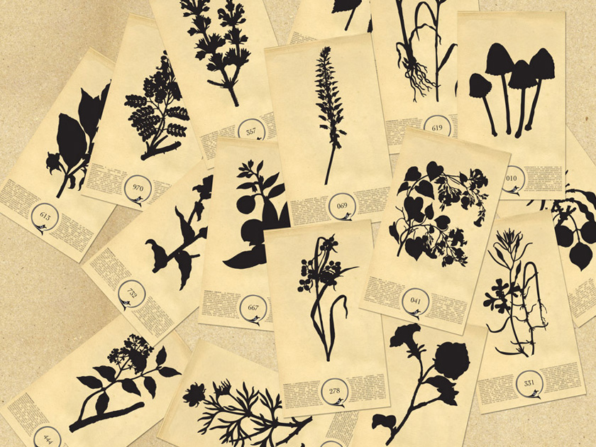
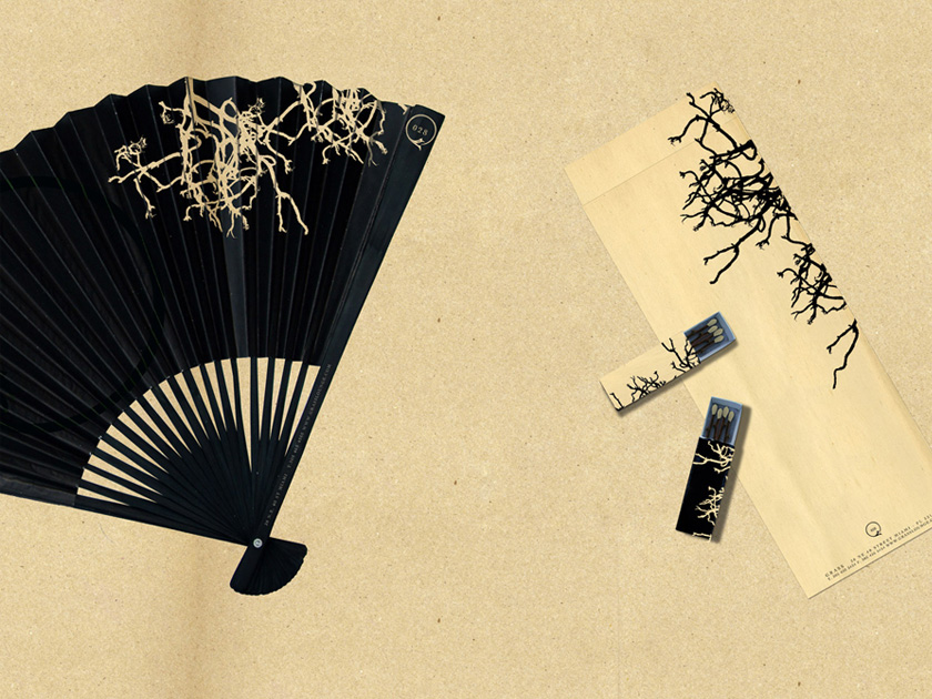
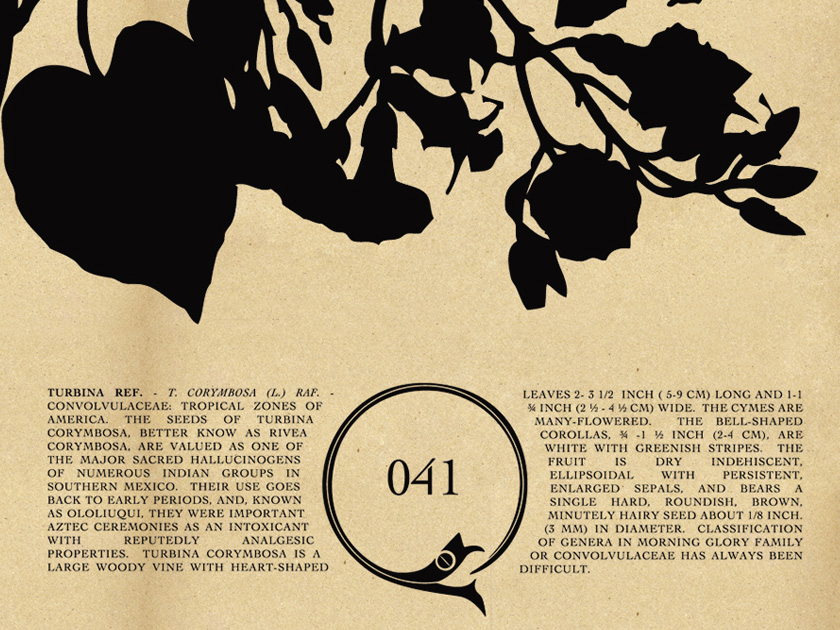
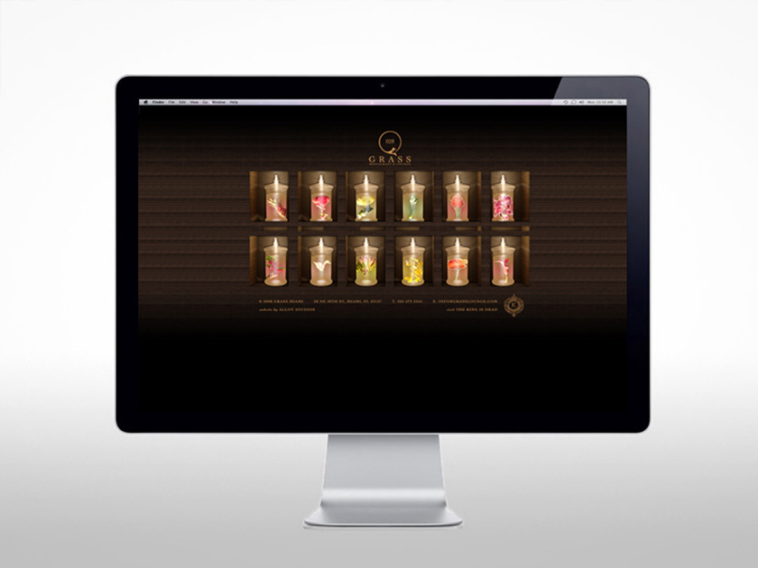
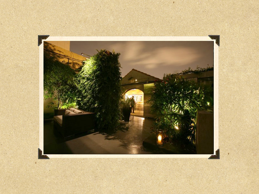
”grass” s’avère être un véritable paradis du botaniste et un restaurant éco-responsable, limitant les émissions de carbone. vous y savourez les délices composés d’ingrédients venus de jardins verticaux. rien ne se perd, tout se transforme, les déchets organiques sont utilisés comme compost et la communication utilise des matériaux recyclés.
Identité
Digital
Interior
hotshot
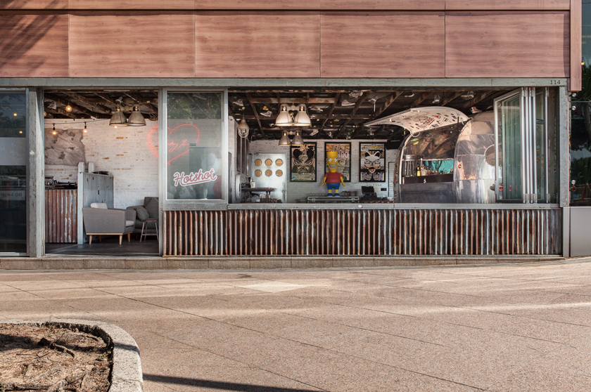
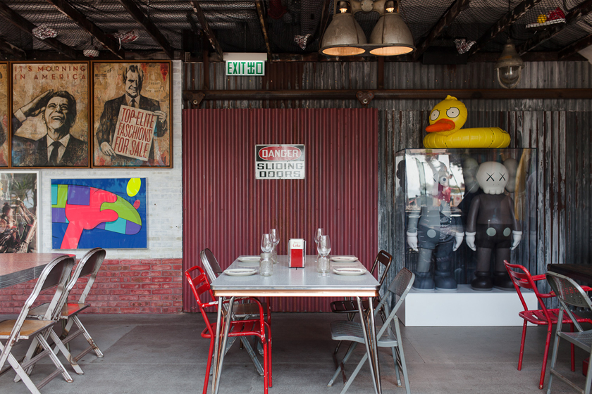
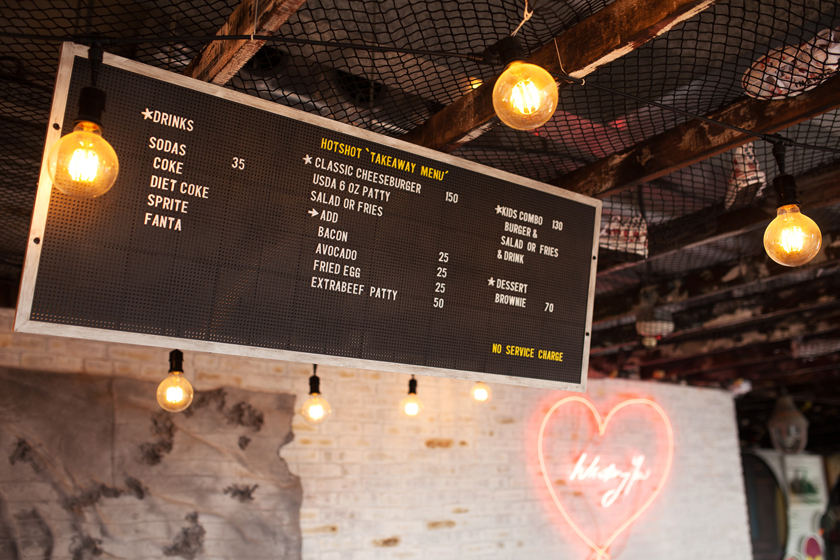
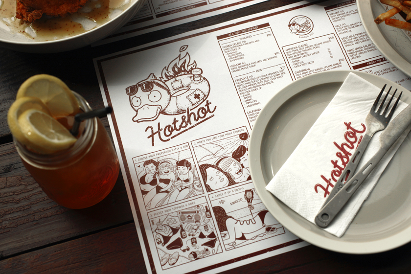
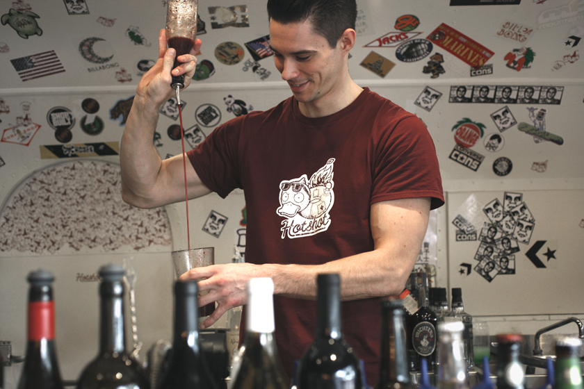
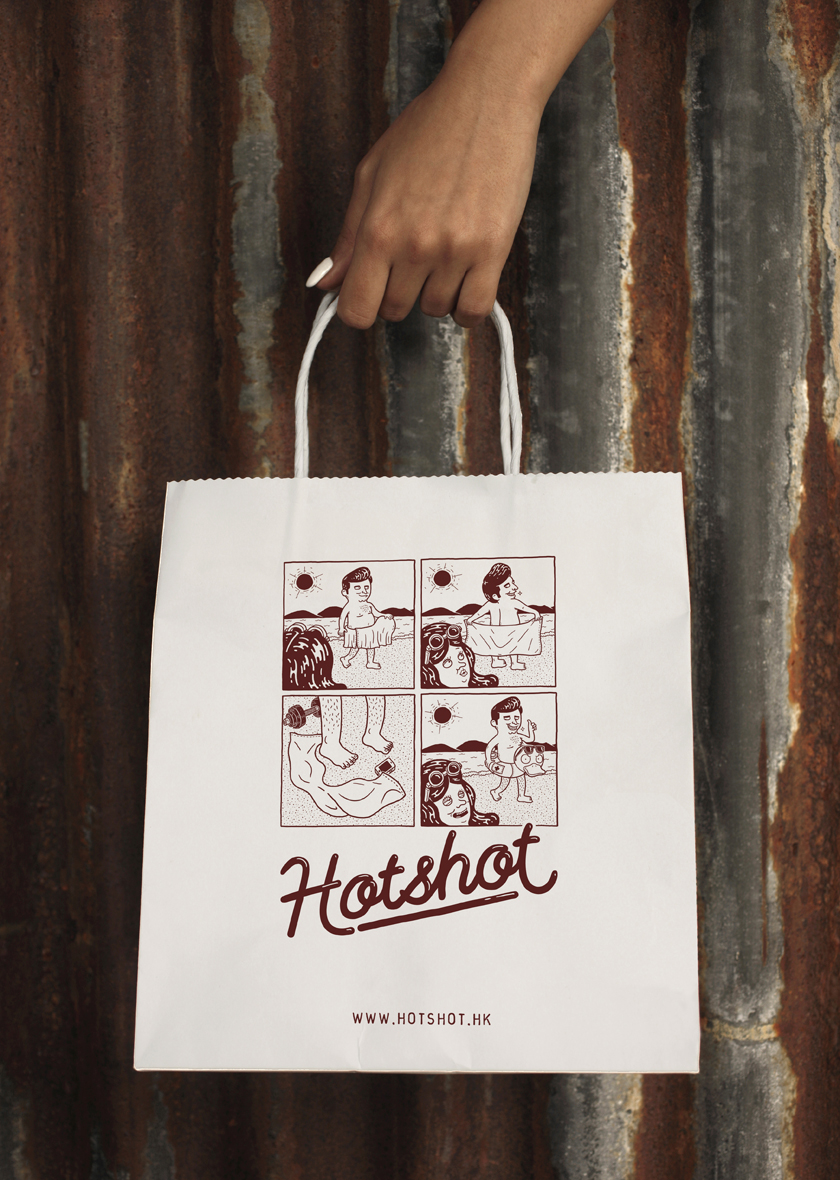
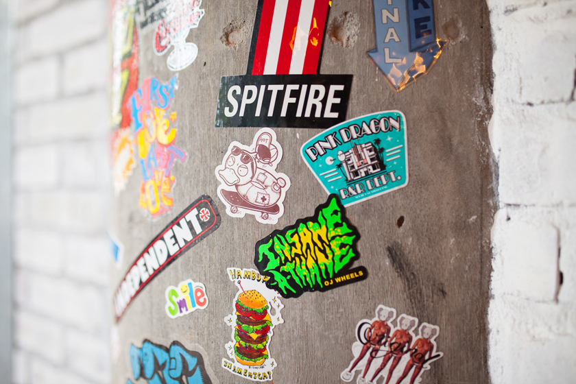
the energy is electric, propelling a youth culture revolution. hotshot, the new all-day diner in Repulse Bay, is inspired by the restless attitude and exploits of surfers and skaters. the brand identity and interior design are direct reflections of fearless low-rider graffiti lifestyle – melding plucky west coast grit and timeless cool.
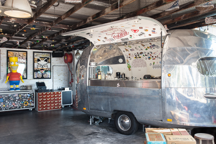
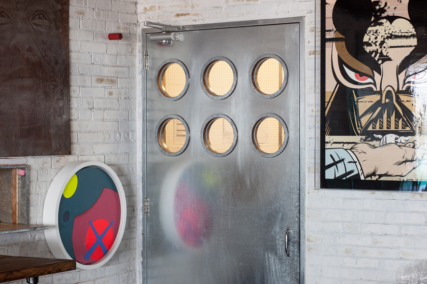
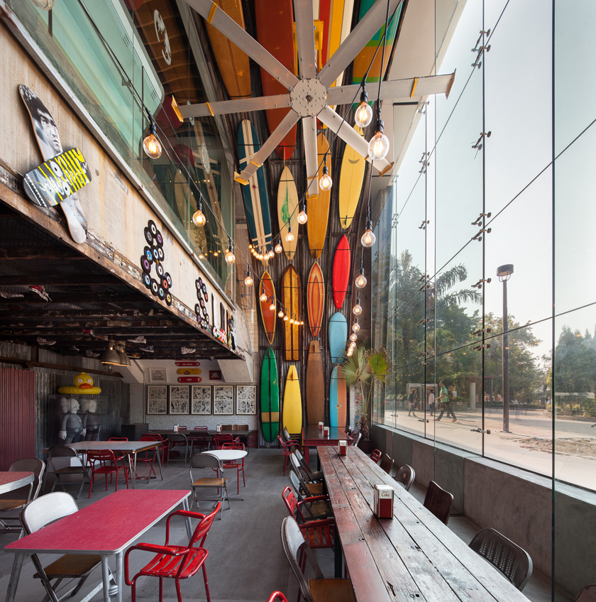
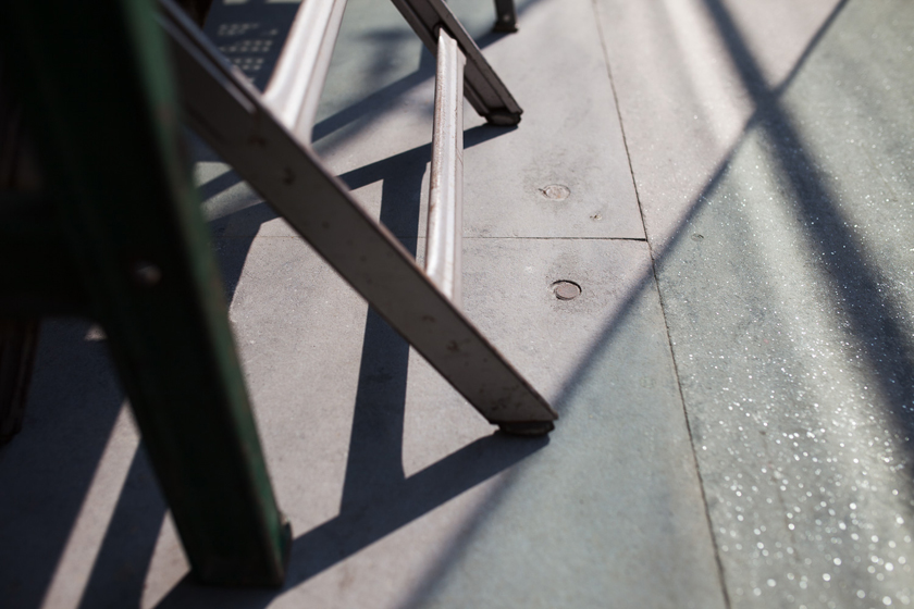
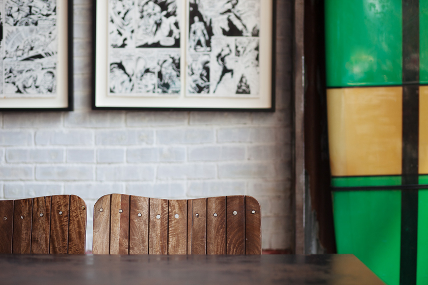
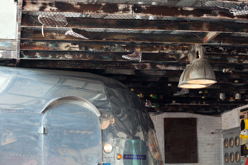
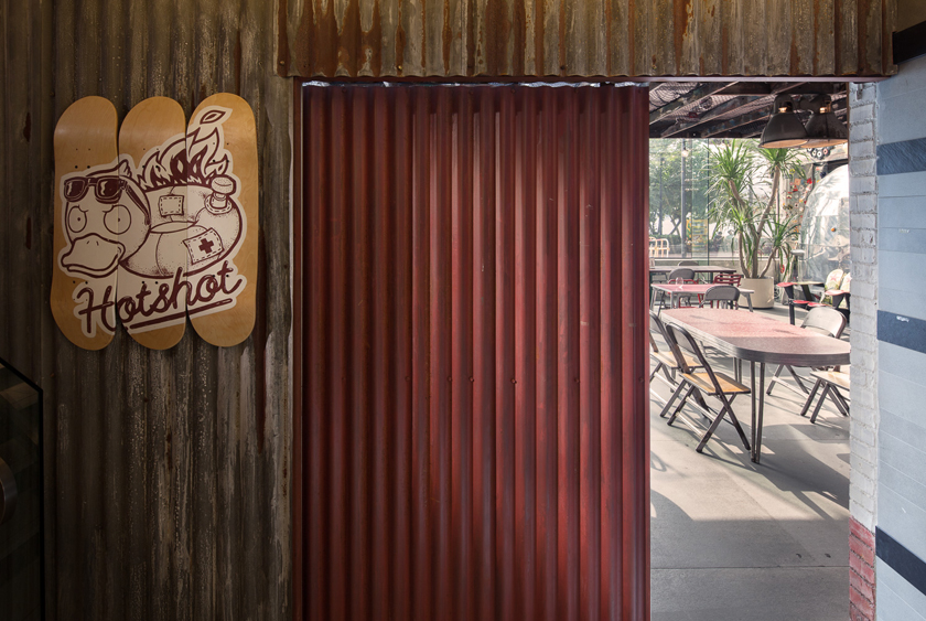
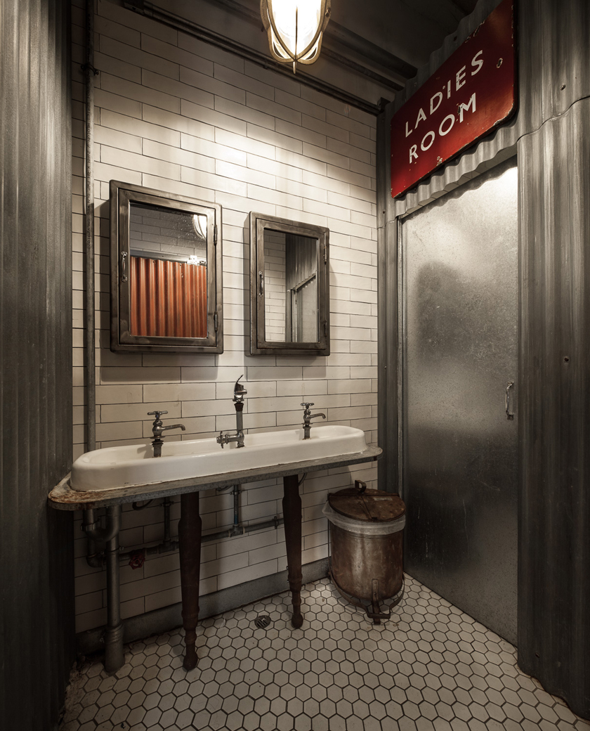
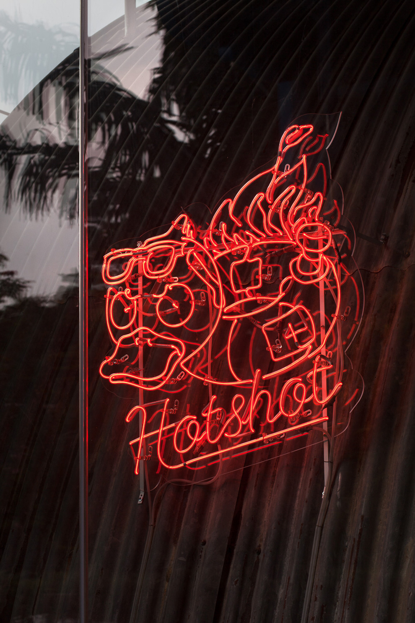
the restaurant’s hangar interior is modeled around a lifeguard station, with iconic surfboards – each a one-of-a-kind masterpiece – adorning the walls (alongside vintage comics and classic beer crates). the materials used were chosen to reflect the era’s easy going aesthetic, incorporating sun-bleached wood, industrial corrugated steel surfaces, a big ass fan and bright neon signage. every last detail, from the custom airstream catering trailer to the comics on the menu, was custom-made and painstakingly crafted to transport customers back to a simpler, groovier time.
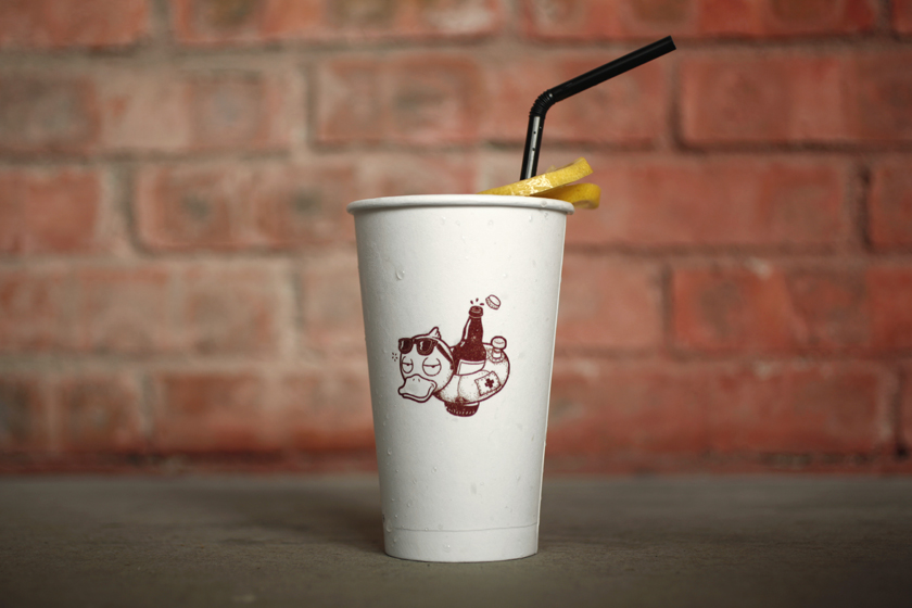
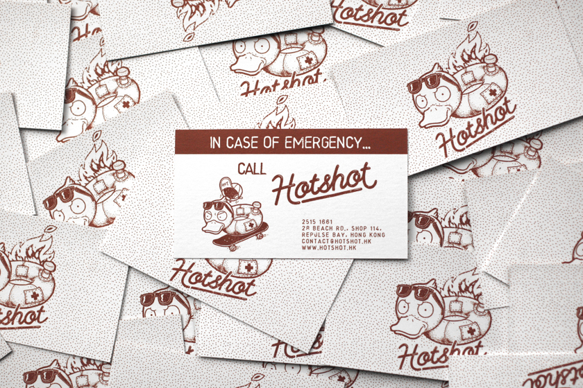
the restaurant mascot, Hotshot, epitomizes the spirit: tough, carefree and more than a little crazy.
Interiors
timothy oulton
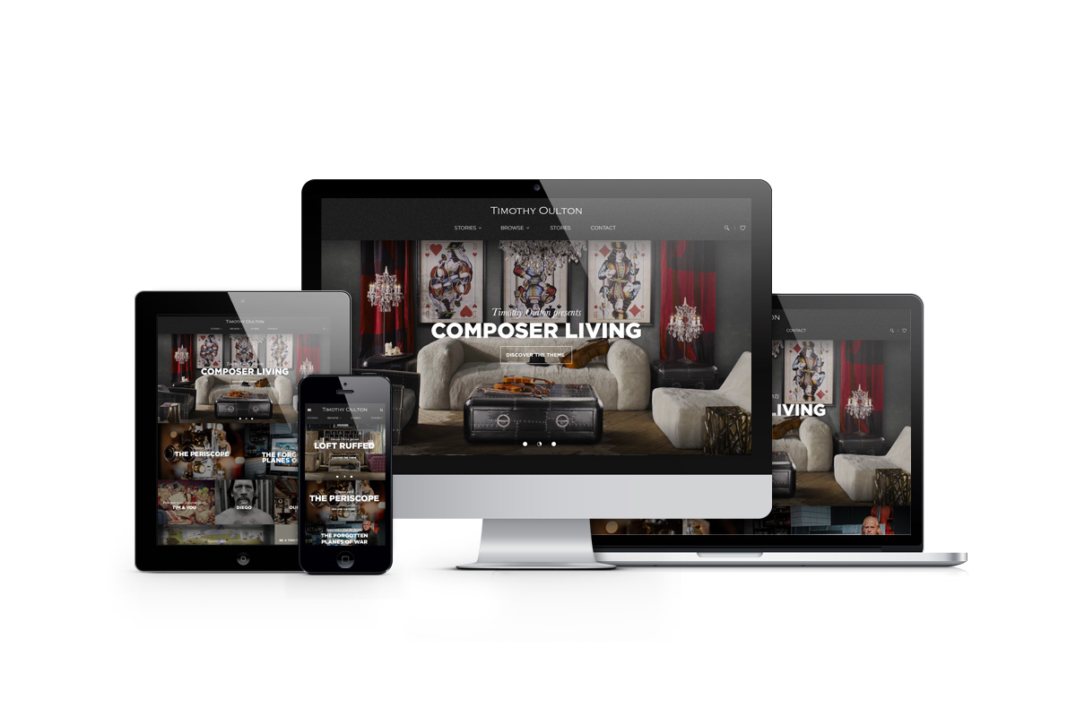
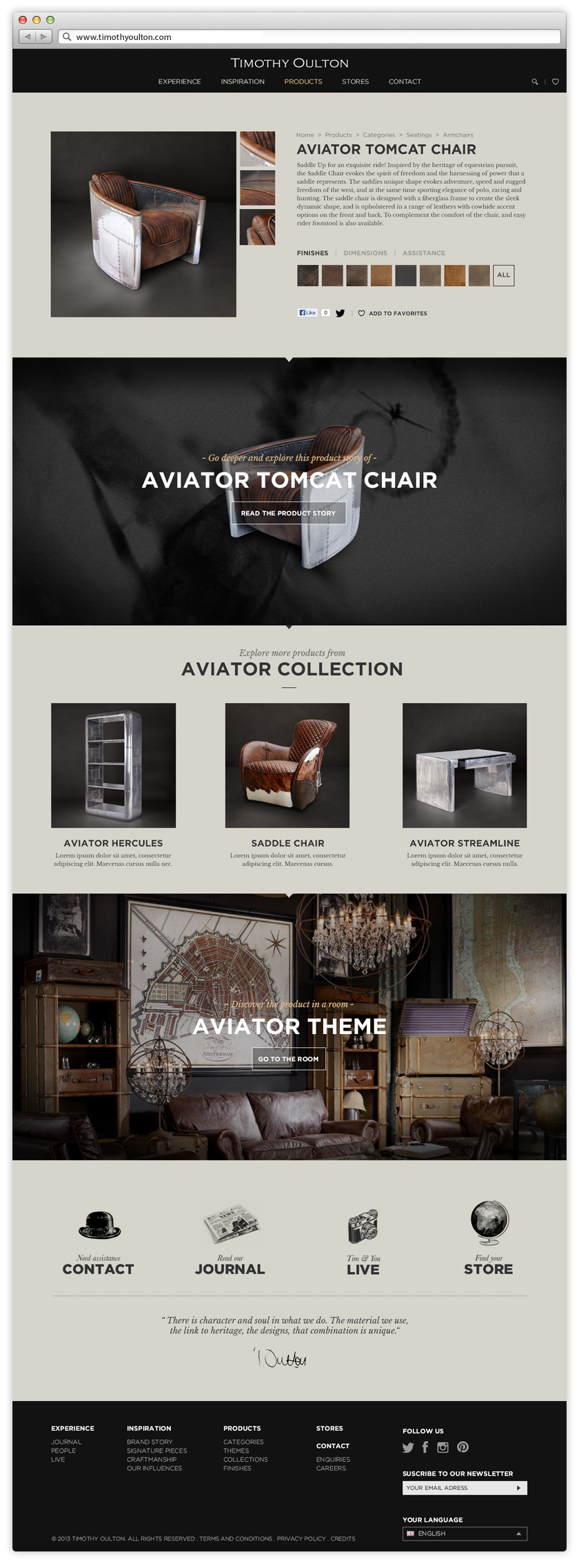
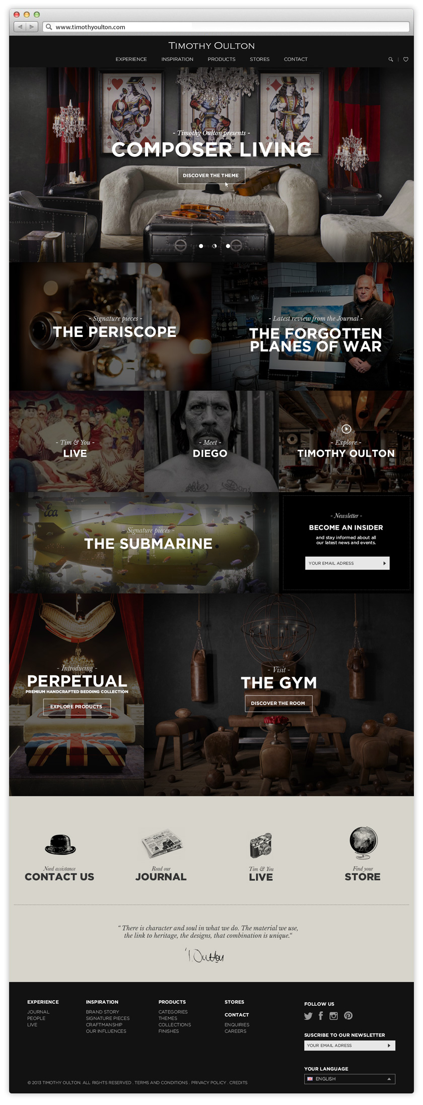
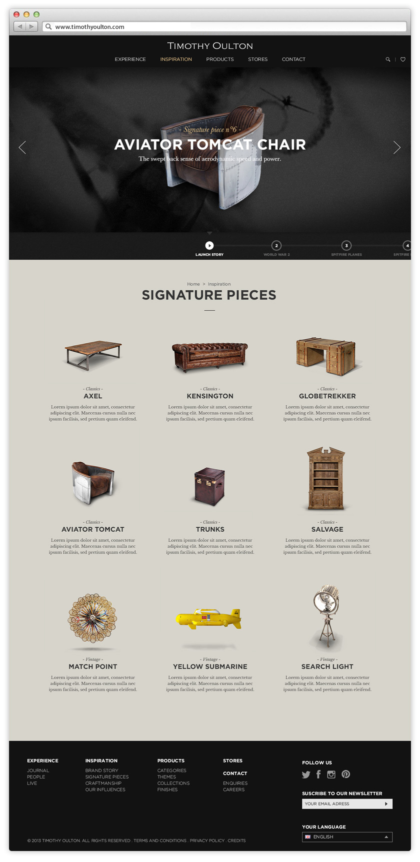
the redesign of timothy oulton’s website captures the british brand furniture aesthetic and meticulous attention to detail. one of the challenges was to reflect their handcrafted product and timeless design. with retail outlets throughout the globe, the main idea was to extend their retail experience into a compelling and engaging digital experience. the website includes a full responsive interface adapted to all devices.
Digital
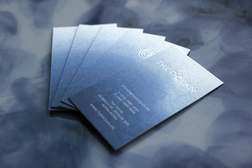
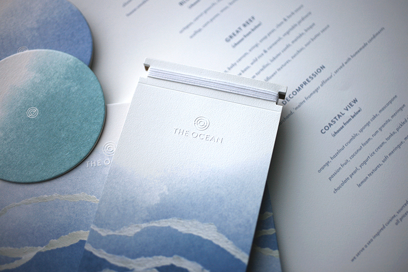
the ocean
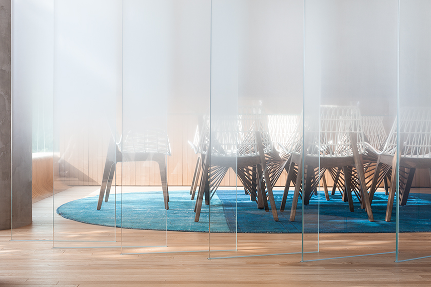
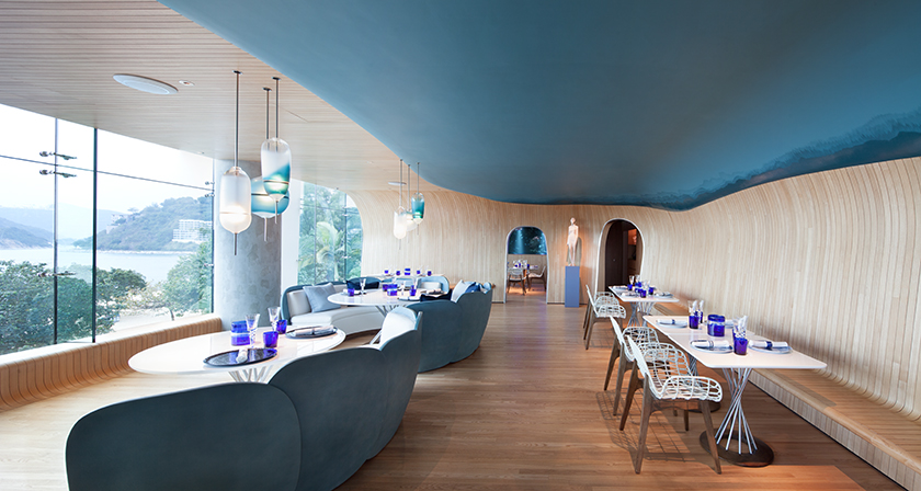
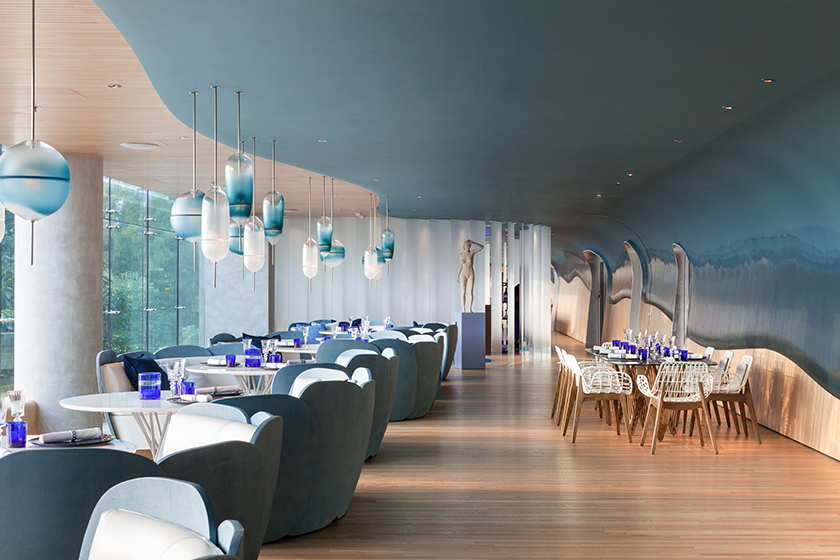
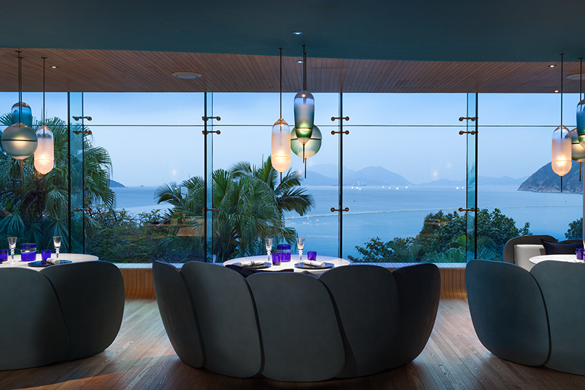
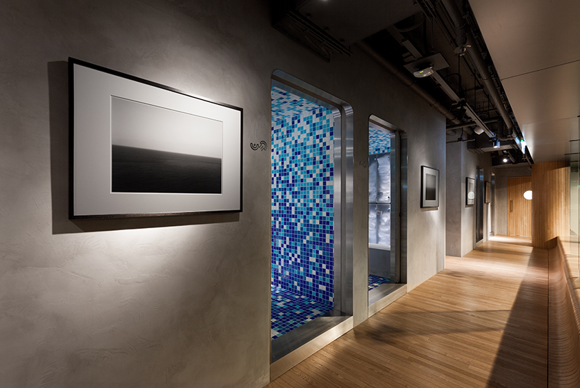
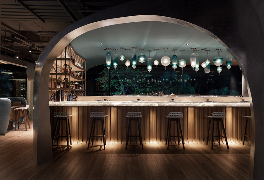
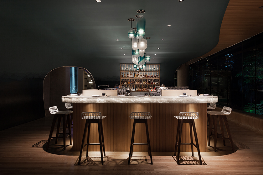
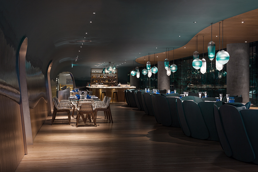
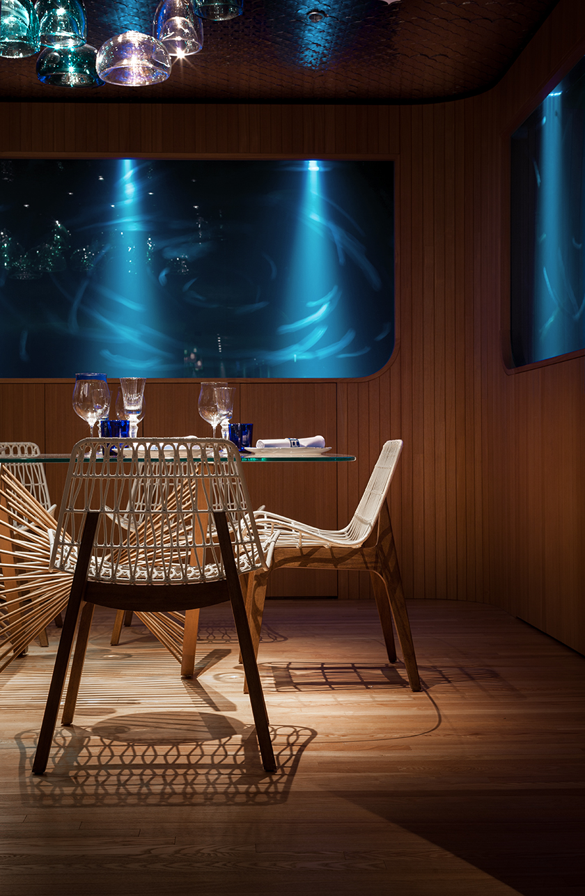
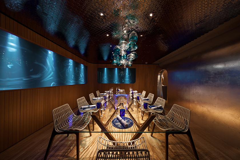
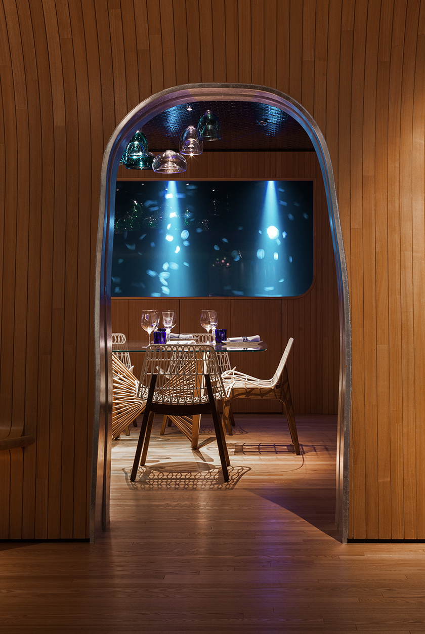
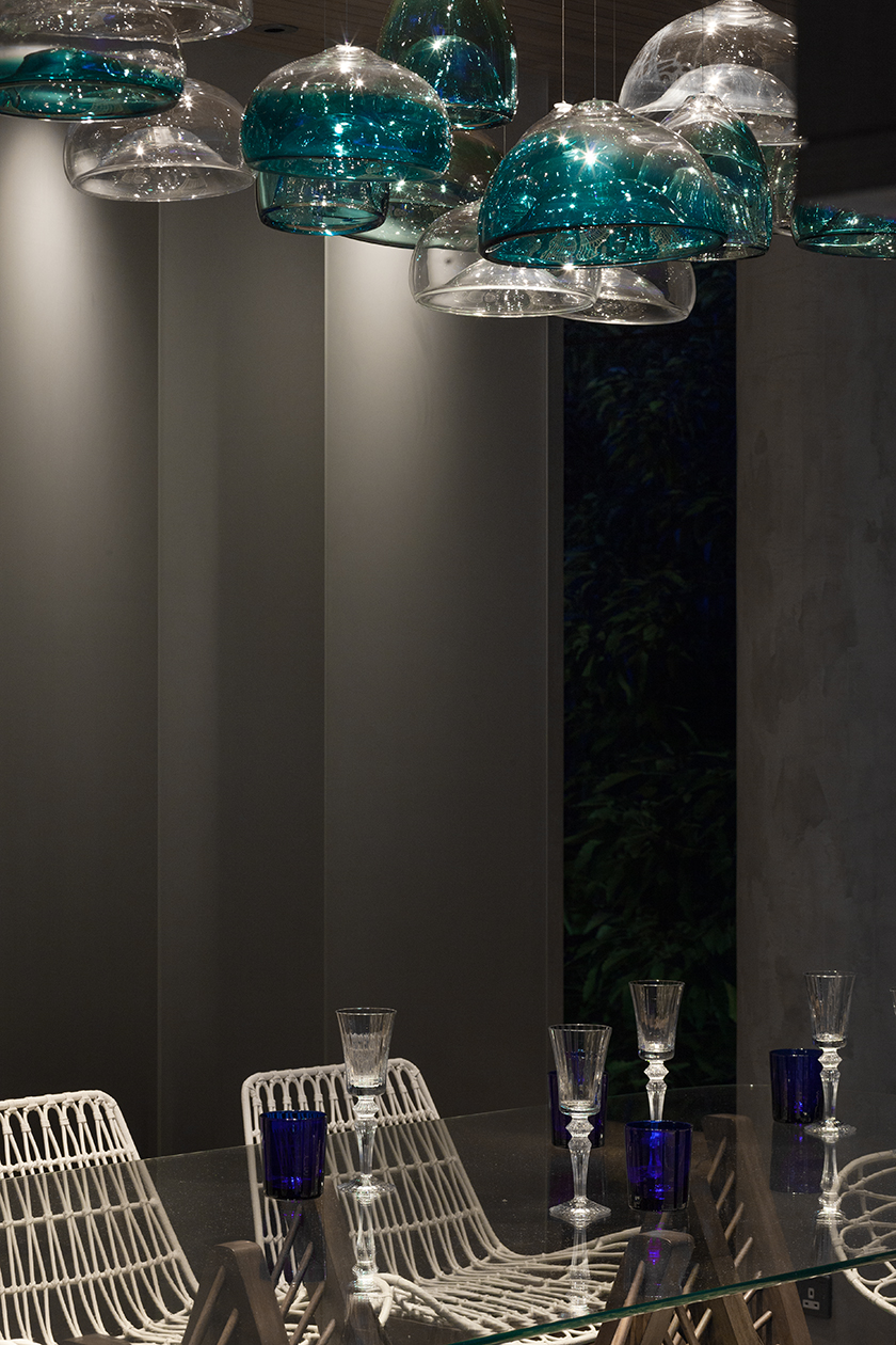
the ocean, protean and primeval, has enchanted many who have come before. along the coast of repulse bay beach, an oceanic sanctum has been imagined as a place of marvels, where one can experience beyond the surface of the sea and into the alluring depths of the unknown.
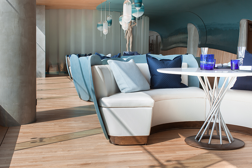
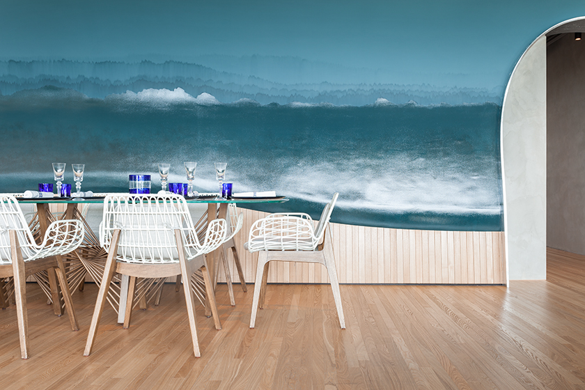
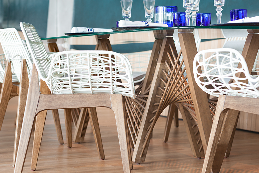
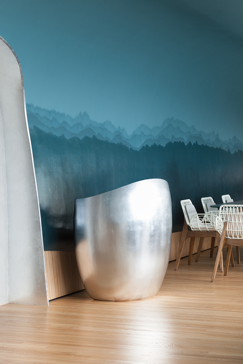
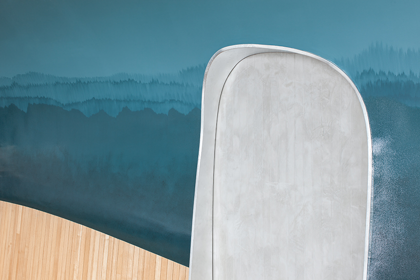
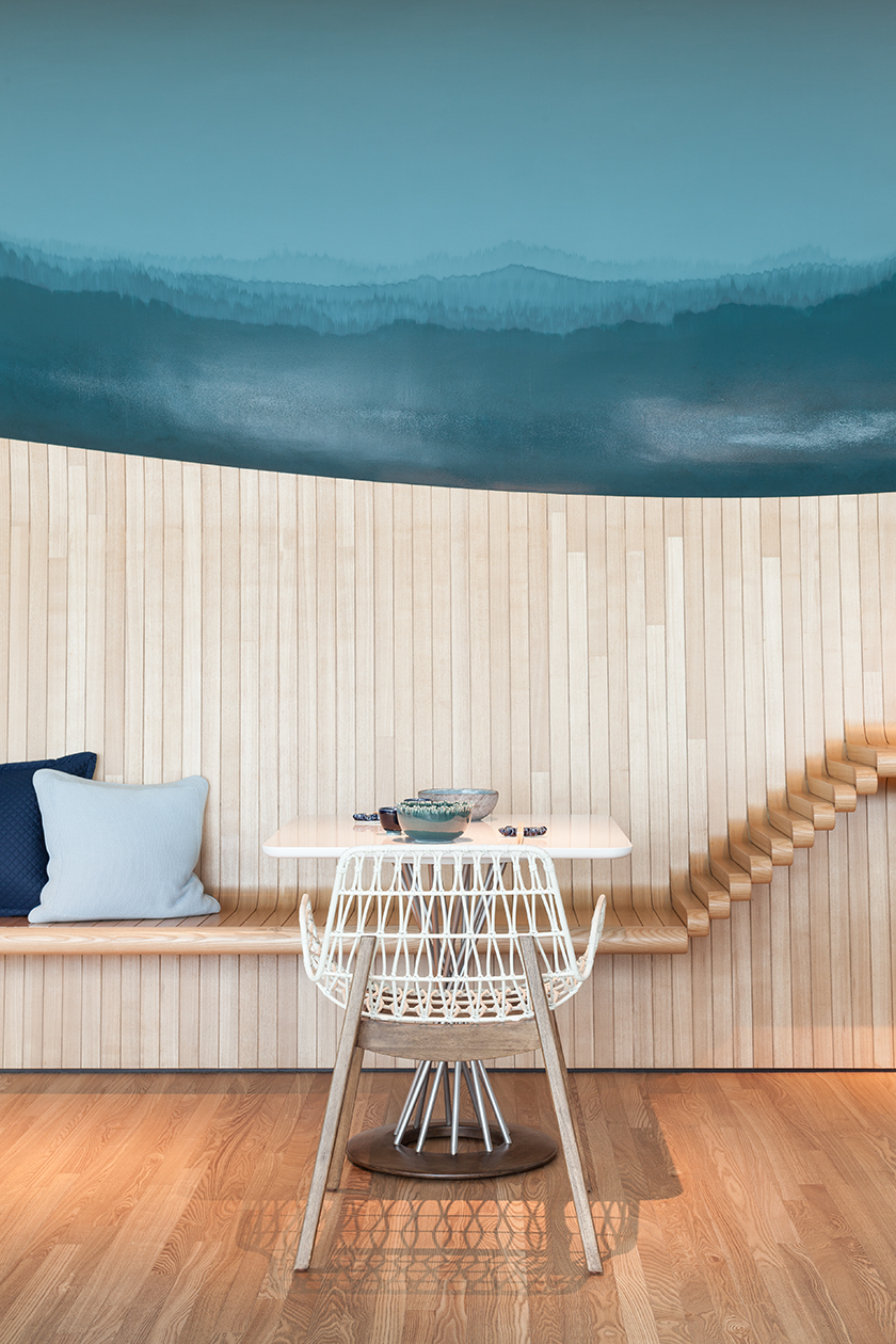
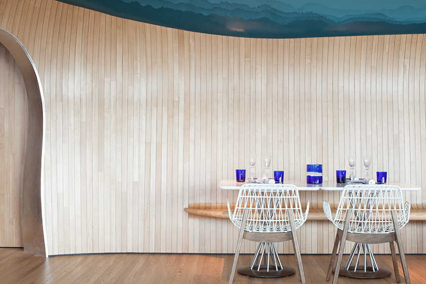
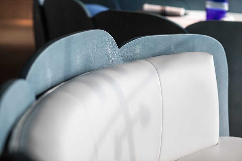
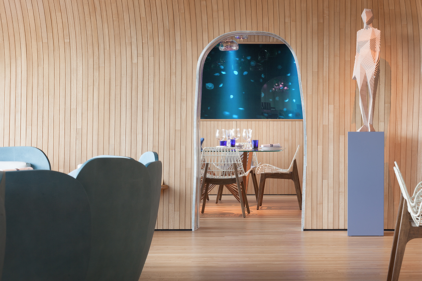
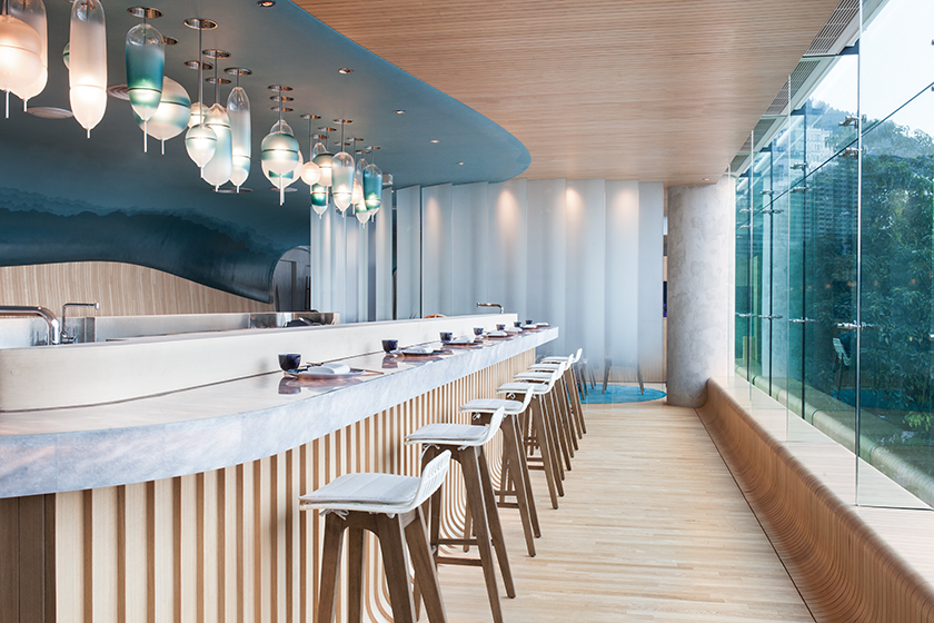
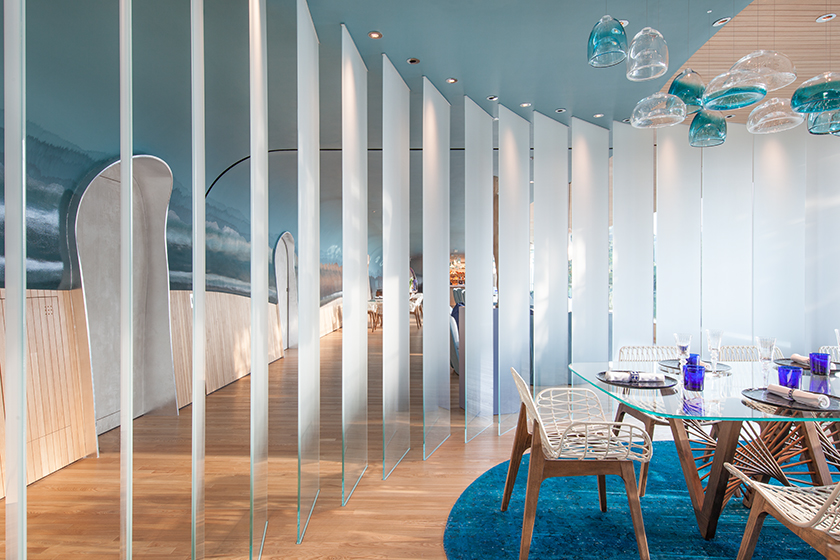
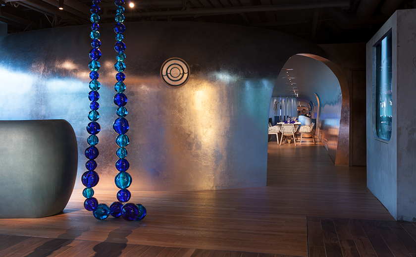
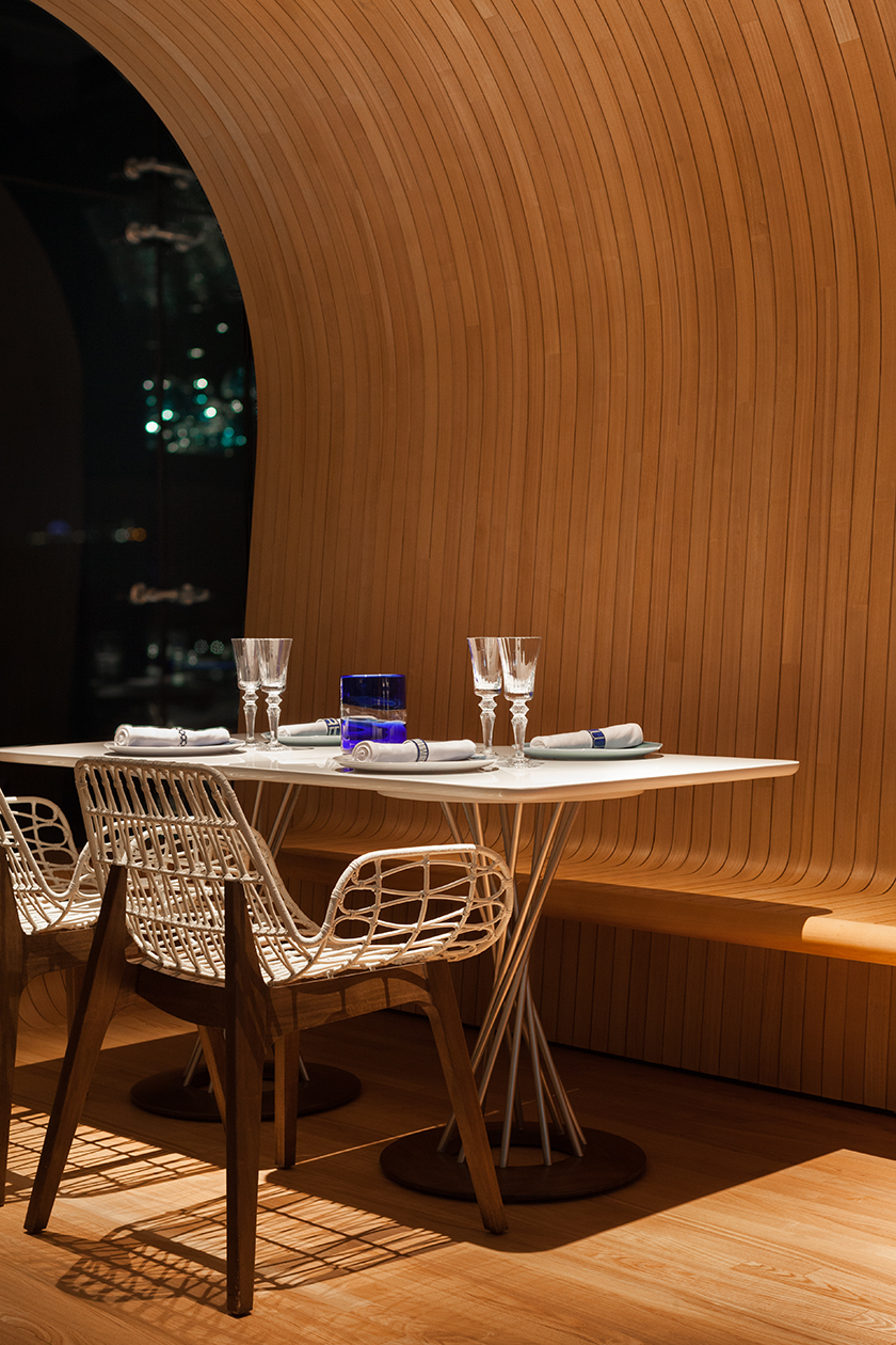
the restaurant’s interior invites you through a pool of dark blues and cyan, balanced with sandy brown finishes throughout. ceiling-to-floor windows offer a clear panoramic view of the sea-side on the horizon, diving into the deep through the portal frames flourished with silver leafs.
there is an emphasis on intimacy, as the ocean houses three private dining rooms for an added lap of luxury. magic is added with a backdrop of the ocean itself, while the walls of a jellyfish aquarium surrounding each private dining room, submerging each visitor into a pool of conversation as they observe the mystique of nature around them.
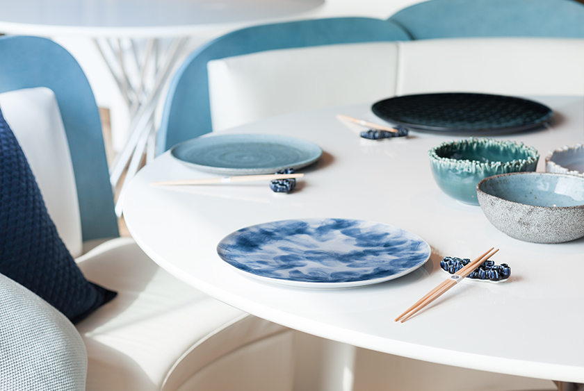
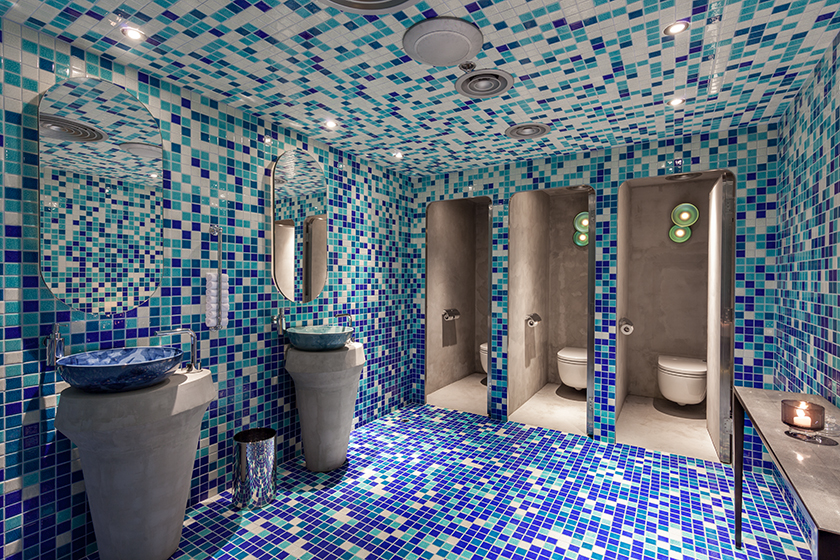
but the devil truly is in the details, with tableware and furnishings taking design cues from coral leafs, anemone spirals and fibonacci suites in shells – each designed to reflect the undersea organic geometry lives.
Interiors
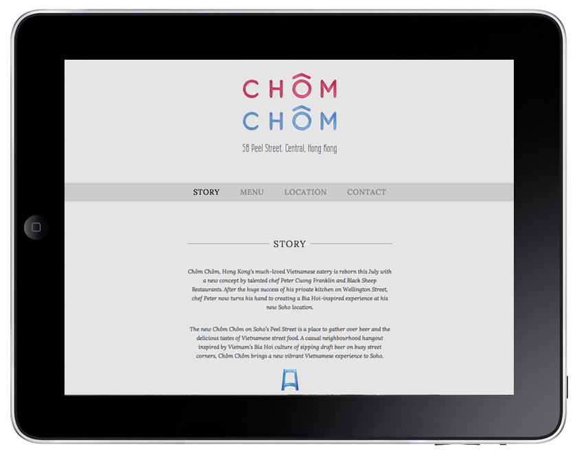
chom chom
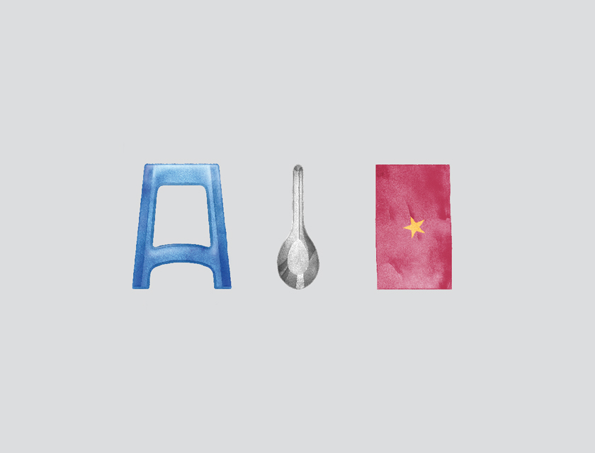
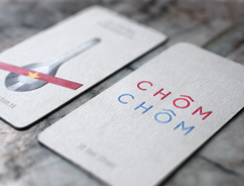
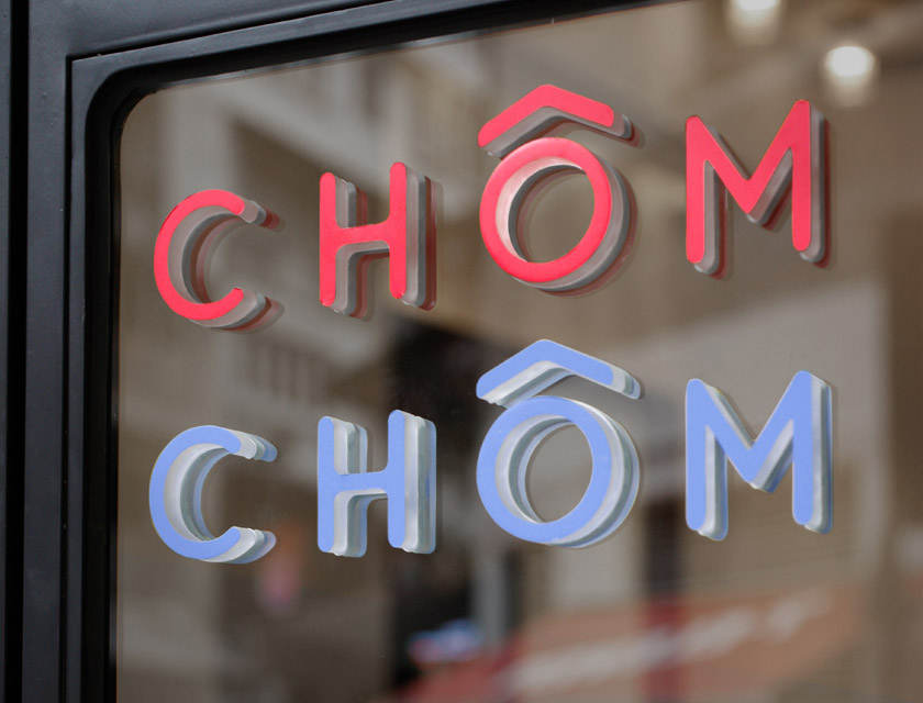
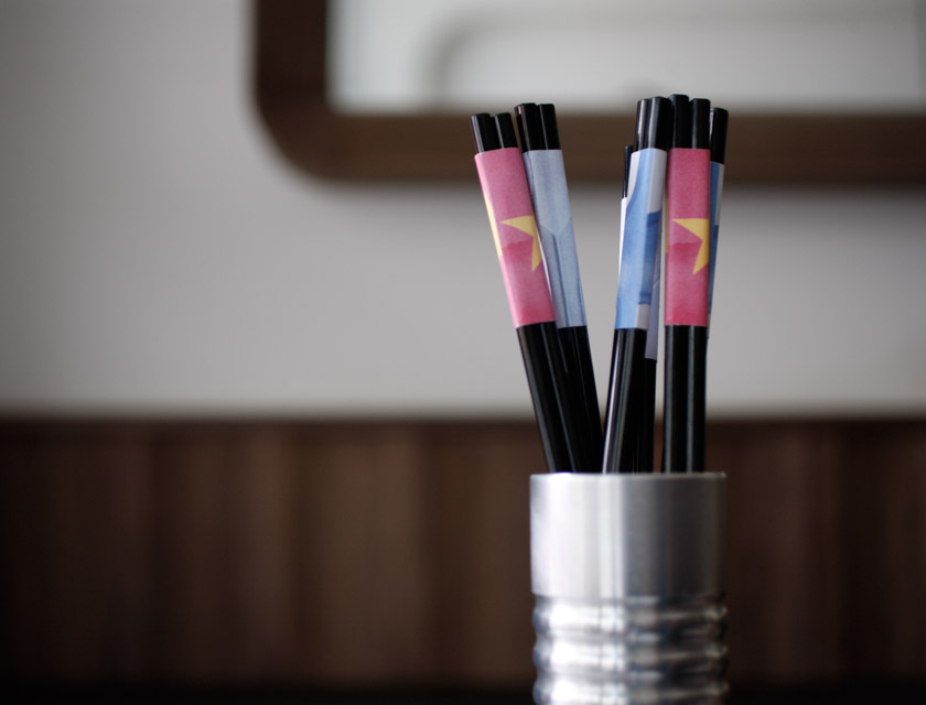
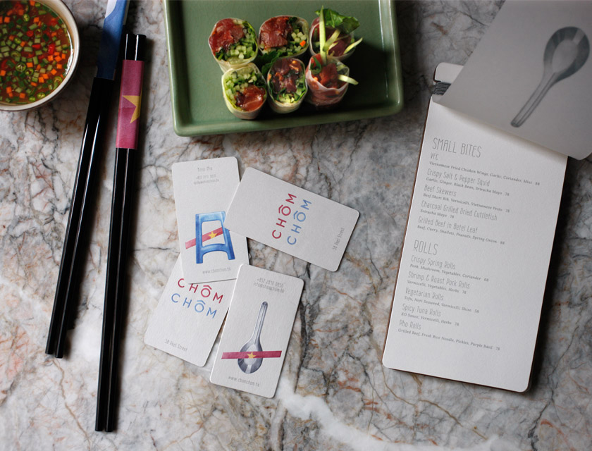
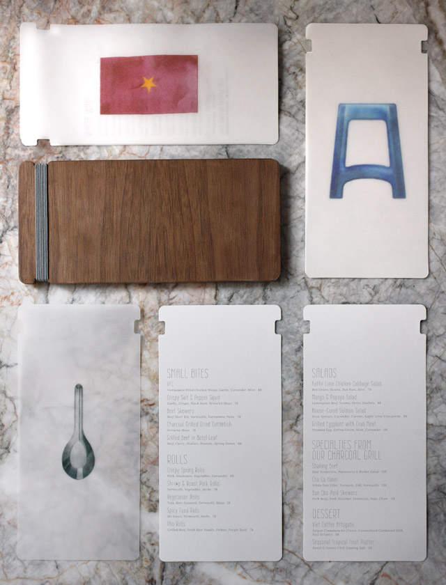
vietnamese street culture was the driving force for chom chom, a vietnamese restaurant nestled in hong kong’s soho district. we zeroed in on the most prevalent objects in hanoi’s street life – metal spoons, plastic stools and the flag – and turned them into recognisable symbols.
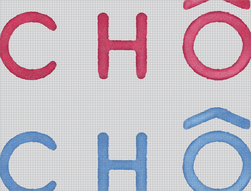
stencilled advertisements hastily painted on concrete walls became inspiration for chom chom’s typography. the layered and soft, absorbable feel of watercolour across all the visuals reflect the way the food drinks up the sauces it is dipped in, as well as how the cuisine is chopped up then layered back together.
guests at chom chom embed themselves with what is quintessentially vietnamese, transformed into stunning icons of the country’s true self.
