sulwhasoo cny campaign

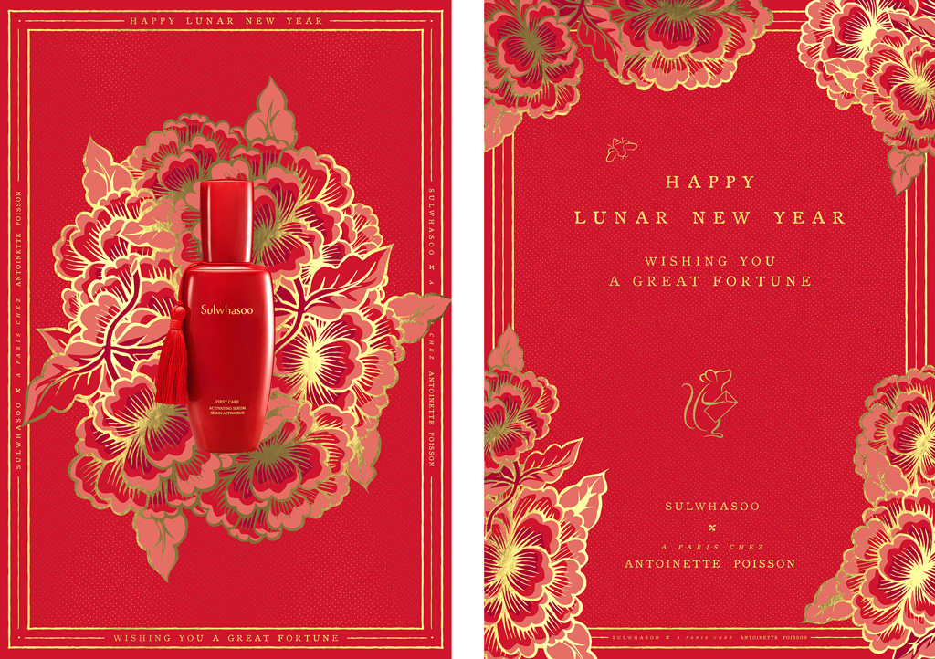
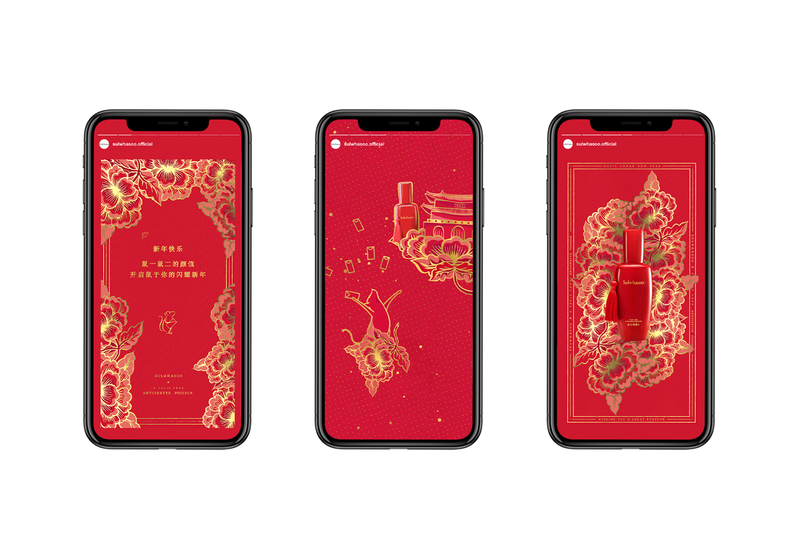
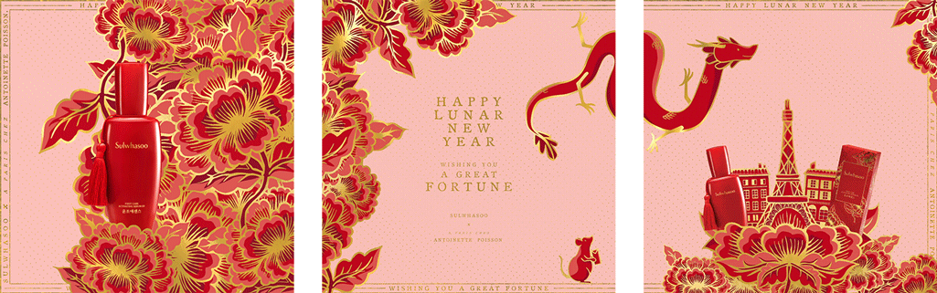
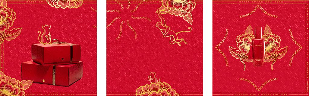
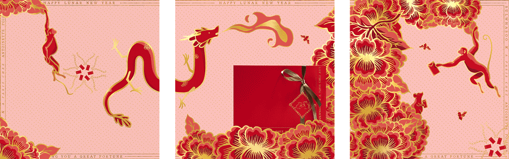
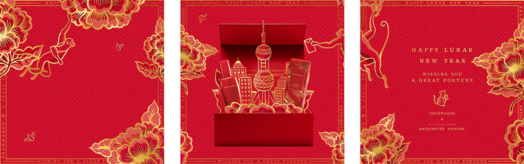
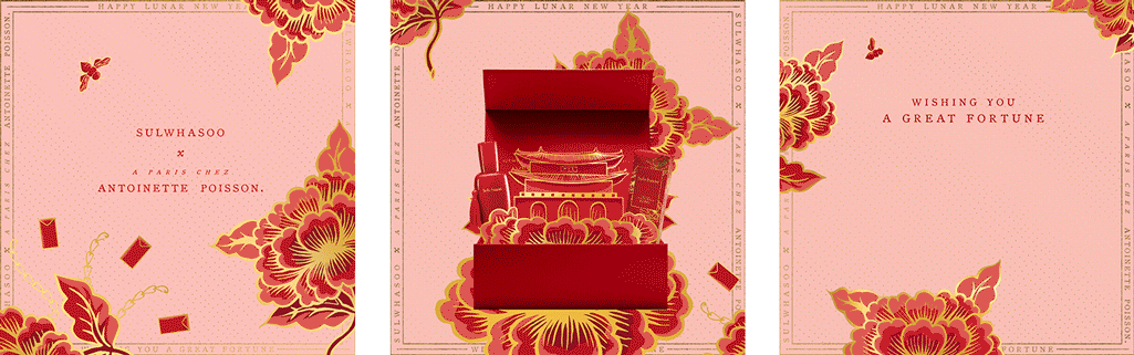
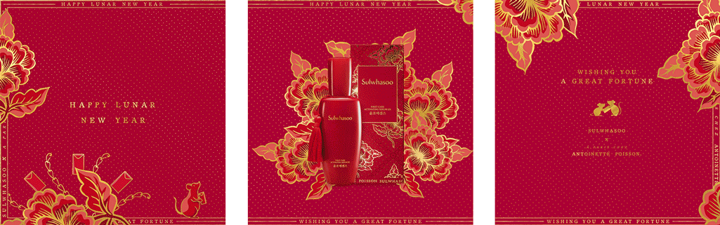
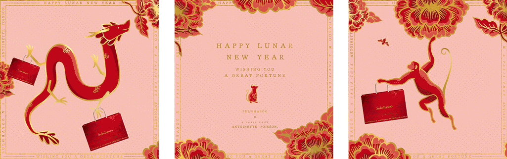
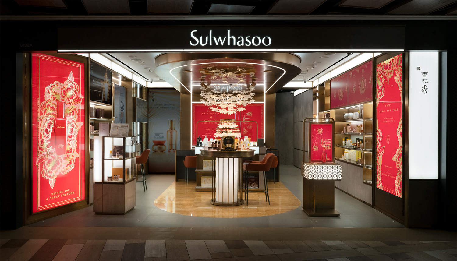
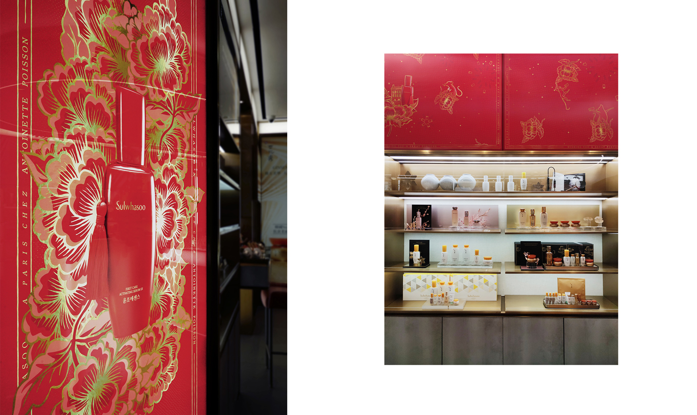
behind the story of this cheeky well-travelled rat, is a collaboration that transcends cultural and creative borders. korea’s leading holistic beauty brand, sulwahsoo, and paris’s 18th century pattern maker, antoinette poisson, came together to develop sulwhasoo’s limited edition chinese new year packaging. we were challenged to create a global campaign out of antoinette poisson’s pattern of peonies, heart-links, and this year’s zodiac protagonist— the rat. staying true to the two dimensional nature of antoinette poisson’s work, we brought the packaging alive by revealing a whole world within the pattern and taking viewers on an enchanting journey past city landmarks and sulwhasoo’s signature product.


paradis

inspired by haitian vodou, paradis takes its cues from the haitian goddess of the moon: mawu. the mesmerising mystique of a lunar eclipse is seen throughout the space, from subtle hints across the restaurant’s branding, to the custom-made lighting fixtures fitted throughout the space itself. it caters specifically to creatures of the night, taking visitors from dinner service through to cocktail hour, and onwards through the wicked hours of the early morning.

rich greens and earthy browns are at the base of the interiors, balanced with a striking gold finishes throughout. on the walls, visitors find a reflection of their own animalistic desires, with hand-painted murals intricately drawn directly to the restaurant walls — each so delicately drawn as if they were created by the priestess herself.

at the centre, the low-slung ceiling encompasses visitors in a warm embrace, while the brass, soft woods and rattan straw details create a sense of discovery that could – until now – only be found in the outdoors.

Interiors

trudon

founded in 1643, maison trudon is the oldest candle manufacturer. maison trudon extends its savoir faire and unveils a line of personal fragrance. substance accompanied the brand with its communication strategy, global branding, packaging, print and digital design. our challenge was to subtly express the rich brand heritage whilst reinterpreting a modern approach.

view the site

Brand Identity


Digital


zoobeetle

in the up and coming district of poho, a charming new château has set down roots. more than just a concept, château zoobeetle encapsulates the very essence of being french and carries it off with just the right touch of parisian insouciance.

we were given a split level store space of 1500 sq. ft. to dream up the effortless elegance of a modern apartment on the left bank, upstairs from a hip new brasserie. the architecture epitomises zoobeetle’s multi sensory brand experience; fixtures throughout the space accentuate the house founders’ hand­picked vintage decor. the effect is one of a contemporary atelier, with a facade inspired by the old world elegance of parisian couturiers.

the origin of zoobeetle is the quintessential parisian experience expressed through a line of culturally crafted leather goods, woven by the founders with strands of the house dna including travel, art and photography.

downstairs, the bar’s lighting and shingled tiles convey you to the rooftops of paris. racks behind the bar echo the atelier’s polished fixtures, harmonising with the gleaming brass countertop. sate your tastebuds with a delectable selection of cheeses and charcuterie, while indulging in a sip of sauvignon.

Interiors

hotshot

the energy is electric, propelling a youth culture revolution. hotshot, the new all-day diner in Repulse Bay, is inspired by the restless attitude and exploits of surfers and skaters. the brand identity and interior design are direct reflections of fearless low-rider graffiti lifestyle – melding plucky west coast grit and timeless cool.

the restaurant’s hangar interior is modeled around a lifeguard station, with iconic surfboards – each a one-of-a-kind masterpiece – adorning the walls (alongside vintage comics and classic beer crates). the materials used were chosen to reflect the era’s easy going aesthetic, incorporating sun-bleached wood, industrial corrugated steel surfaces, a big ass fan and bright neon signage. every last detail, from the custom airstream catering trailer to the comics on the menu, was custom-made and painstakingly crafted to transport customers back to a simpler, groovier time.
the restaurant mascot, Hotshot, epitomizes the spirit: tough, carefree and more than a little crazy.

Interiors

Hotshot-001

Hotshot-002

Hotshot-003

Hotshot-004

Hotshot-008

Hotshot-009

Hotshot-010

Hotshot-011

Hotshot-012

Hotshot-014

Hotshot-015

Hotshot-016

Hotshot-017b

Hotshot-018

Hotshot-019

Hotshot-020

Hotshot-021

Hotshot-022

Hotshot-023

a boy named sue

a boy named sue – a multi-brand ecommerce store, offering a collection of socially and eco conscious for one’s sartorial desires. a boy named sue was inspired by a classic johnny cash song who’s father named him sue and faced ridicule his whole life. sue learns his name is to make him tough and strong-willed reflecting the brand’s promise of strong quality aesthetics and personality.

the identity was designed on a system by which it could be effortlessly redefined to create a series of new shapes. much like there is no one singular solution to eco-fashion, the form needed to be dynamic and transitional. the packaging and stationary also follow the system of the visual identity, with bold folds and bright patterns lining the seams, the visuals embrace a refined eclecticism. the website was the final piece of the puzzle, an interactive space that came together as a curated, easy to navigate and intuitive experience.

Identity

aboynamedsue_identity_00 aboynamedsue_identity_01 aboynamedsue_identity_03 aboynamedsue_packaging_004 aboynamedsue_packaging_05

Digital

aboynamedsue_digital_05 aboynamedsue_digital_06 aboynamedsue_digital_07

la vache!

paying homage to the classic parisian steak & frites la vache! brings forth the parisian bistro culinary staple to hong kong’s restaurant scene.

we were inspired by the french cartoonist jean-jacques sempé’s humorous style and created a playground for him to express his witty la vache! moments: tables, walls, coasters, wine labels, toilet paper…

view the site

Identity

lavache-identity-substance-01 lavache-identity-substance-02 lavache-identity-substance-03 lavache-identity-substance-04 lavache-identity-substance-05 lavache-identity-substance-06 lavache-identity-substance-07 lavache-identity-substance-08 lavache-identity-substance-09

Digital

lavache-identity-substance-10

chom chom

vietnamese street culture was the driving force for chom chom, a vietnamese restaurant nestled in hong kong’s soho district. we zeroed in on the most prevalent objects in hanoi’s street life – metal spoons, plastic stools and the flag – and turned them into recognisable symbols.

stencilled advertisements hastily painted on concrete walls became inspiration for chom chom’s typography. the layered and soft, absorbable feel of watercolour across all the visuals reflect the way the food drinks up the sauces it is dipped in, as well as how the cuisine is chopped up then layered back together.

guests at chom chom embed themselves with what is quintessentially vietnamese, transformed into stunning icons of the country’s true self.

view the site

Identity

chomchom_identity_001 chomchom_identity_002 chomchom_identity_003 chomchom_identity_004 chomchom_identity_005 chomchom_identity_006 chomchom_identity_007 chomchom_identity_008

Digital

chomchom_digital_001

la madeleine de proust

a rich series of french confectionary imported from france, la madeleine de proust’s identity is inspired by the unexpected cues encountered throughout everyday live, reigniting forgotten recollections of the past. from that, le madeleine de proust transports you through a whimsical childhood, drawing on memories of french landscapes, artisans and mouth watering confectionary.

Branding

madeleine_identity_01 madeleine_identity_02

a day with fé

yoga is about awareness and the journey to the final pose, rather than the pose itself. we had to make this tangible and to reflect that each piece was tailored for a specific journey. we arrived at fé: the mindful journey.

the red dot in the collaterals is the point of awareness in both a yogi’s practice and life, representing the distance of the journey, from beginning to end. each collection has a collectable series of city guides, printed in the look-book and on the hangtags. they are accessorized with a bobby pin for a mindful journey. one can also purchase a cardholders, which have the full set of hangtag journeys, covering hong kong, tokyo, new york and more.

view the site

Identity

fe-identity-substance-01 fe-identity-substance-02 fe-identity-substance-03 fe-identity-substance-04 fe-identity-substance-05 fe-identity-substance-06 fe-identity-substance-07 fe-identity-substance-08 fe-identity-substance-09 fe-identity-substance-10 fe-identity-substance-11 fe-identity-substance-12 fe-identity-substance-13 fe-identity-substance-14


Digital

fe-identity-substance-15 fe-identity-substance-16