la vache!

paying homage to the classic parisian steak & frites la vache! brings forth the parisian bistro culinary staple to hong kong’s restaurant scene.

we were inspired by the french cartoonist jean-jacques sempé’s humorous style and created a playground for him to express his witty la vache! moments: tables, walls, coasters, wine labels, toilet paper…

view the site

Identity

lavache-identity-substance-01 lavache-identity-substance-02 lavache-identity-substance-03 lavache-identity-substance-04 lavache-identity-substance-05 lavache-identity-substance-06 lavache-identity-substance-07 lavache-identity-substance-08 lavache-identity-substance-09

Digital

lavache-identity-substance-10

madam sixty ate

we created the exploits of a mythical person that reflected the chef’s vision and the surprise pairing of ingredients. madam sixty ate is a mysterious adventurer and eclectic writer who delights us with her palate and imagination. her world view is modern with a twist, mirroring the style of food. her surreal experiences and astounding stories are reflected consistently throughout the brand using paintings, journal entries within menus, coasters and ultimately through the cuisine. the journey from discovering a new restaurant to after dinner farewell is a reflection of the journey madam has when she discovers the variable species which capture our imaginations.

view the site

msa_awards

Branding

000

001

002

003

004

005

_57X6723

006

_MG_5281_t

IMG_5276_t

P1010358

Digital

msa_digital_01

msa_digital_02

Interior

_MG_5342_t

IMG_3962

msa_deco_03

msa_deco_04

blacksheep

black sheep restaurants is a hong kong-based hospitality group committed to offering a smattering of dining gems in a neighborhood clutter of restaurants. the black sheep team is focused on providing culinary experiences that master the basics.

we wanted to express the personality of the brand’s legacy in creating unforgettable mementos by developing a graphic language that holds a harmony of personalities. each detail has a special characteristic and quality that makes the member integral within the family.

view the site

Branding

blacksheep-identity-substance-01

blacksheep-identity-substance-02

blacksheep-identity-substance-03

blacksheep-identity-substance-04

blacksheep-identity-substance-05

blacksheep-identity-substance-06

blacksheep-identity-substance-07

blacksheep-identity-substance-08

blacksheep-identity-substance-09

blacksheep-identity-substance-10

blacksheep-identity-substance-11


Digital

blacksheep-identity-substance-12

blacksheep-identity-substance-13

grass

a true botanist’s paradise, grass restaurant and lounge is a carbon-zero venture located in the hub of the miami design district. while savoring the “eco-friendly fare,” patrons can rediscover first-hand the leafy delicacies on their plates by strolling through the vivid space, where ingredients are grown everywhere in vertical gardens. all organic waste is discretely used as compost for the plants and all communications collateral uses 100% recycled materials.

Identity

000 001 002 003 004


Digital

005

Interior

006 007 008 009


chom chom

vietnamese street culture was the driving force for chom chom, a vietnamese restaurant nestled in hong kong’s soho district. we zeroed in on the most prevalent objects in hanoi’s street life – metal spoons, plastic stools and the flag – and turned them into recognisable symbols.

stencilled advertisements hastily painted on concrete walls became inspiration for chom chom’s typography. the layered and soft, absorbable feel of watercolour across all the visuals reflect the way the food drinks up the sauces it is dipped in, as well as how the cuisine is chopped up then layered back together.

guests at chom chom embed themselves with what is quintessentially vietnamese, transformed into stunning icons of the country’s true self.

view the site

Identity

chomchom_identity_001 chomchom_identity_002 chomchom_identity_003 chomchom_identity_004 chomchom_identity_005 chomchom_identity_006 chomchom_identity_007 chomchom_identity_008

Digital

chomchom_digital_001

a day with fé

yoga is about awareness and the journey to the final pose, rather than the pose itself. we had to make this tangible and to reflect that each piece was tailored for a specific journey. we arrived at fé: the mindful journey.

the red dot in the collaterals is the point of awareness in both a yogi’s practice and life, representing the distance of the journey, from beginning to end. each collection has a collectable series of city guides, printed in the look-book and on the hangtags. they are accessorized with a bobby pin for a mindful journey. one can also purchase a cardholders, which have the full set of hangtag journeys, covering hong kong, tokyo, new york and more.

view the site

Identity

fe-identity-substance-01 fe-identity-substance-02 fe-identity-substance-03 fe-identity-substance-04 fe-identity-substance-05 fe-identity-substance-06 fe-identity-substance-07 fe-identity-substance-08 fe-identity-substance-09 fe-identity-substance-10 fe-identity-substance-11 fe-identity-substance-12 fe-identity-substance-13 fe-identity-substance-14


Digital

fe-identity-substance-15 fe-identity-substance-16


twangoo

within the notoriously competitive marketplace of e-commerce, substance created twangoo’s identity from the birth of the brand and now recognised as the only mass- affluence group buying experience online, offering “the best deal in town” focused on quality, irresistable prices and first-class service. since substance was appointed as twangoo’s marketing agency, we have generated an amplitude of traffic and sales growth through elaborate marketing campaigns.

Branding

001 002 003 007 008 009

Digital

_00 005 006

yonge piggies

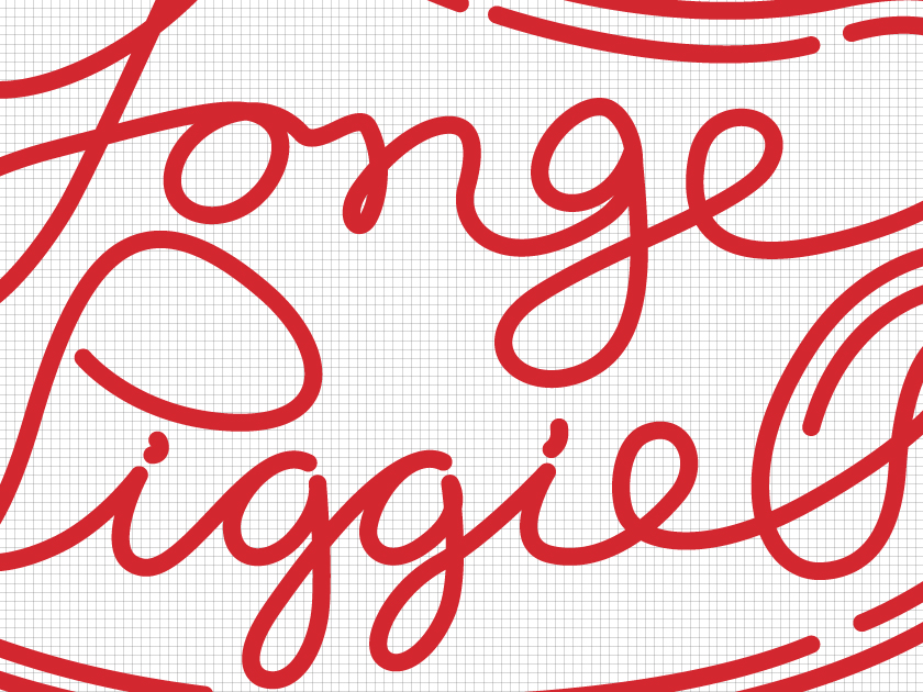
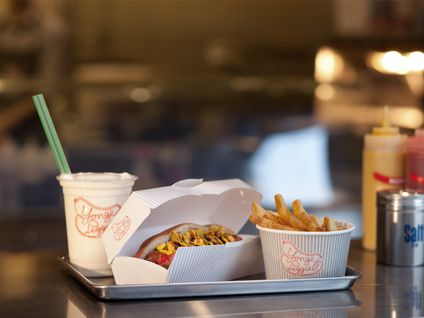
yonge piggies (pronounced “young”, and then “piggies”) brings authentic canadian street meat to hong kong.

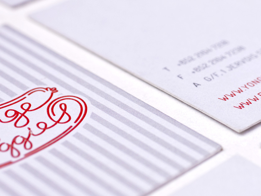
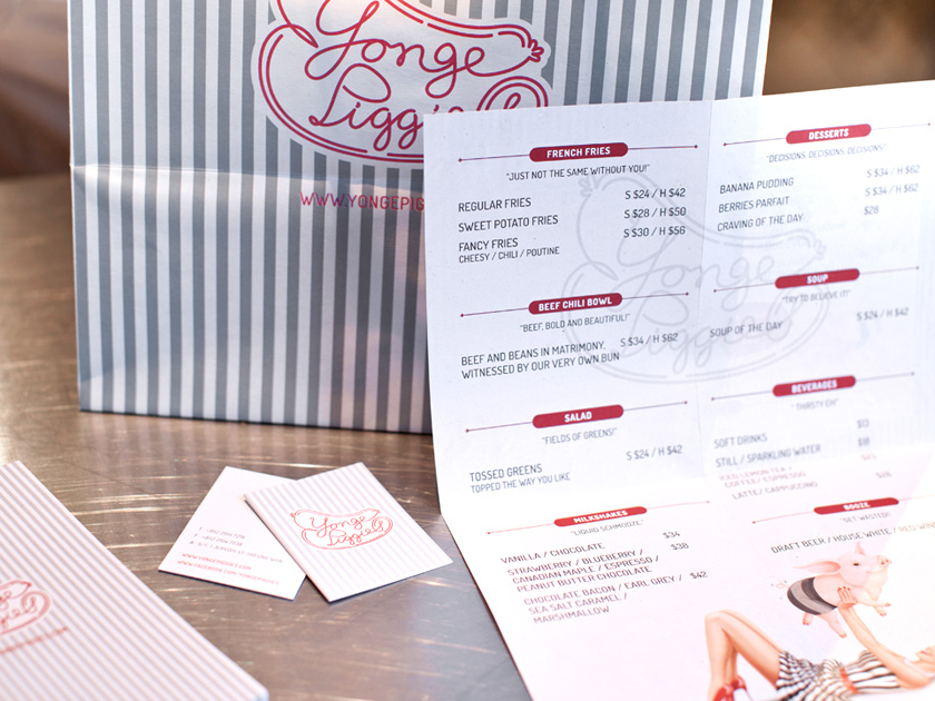
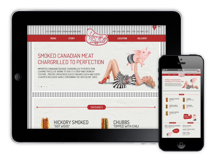
with a quality product and a quirky name, we set out to create a lively brand that would capture a witty spin on the street meat concept. the brand is a nod to the retro-style diners of the 50s and 60s, with a modern spin. each hotdog on the menu became a character in the story of yonge piggies. from jalapeno, the spicy hotdog, to beef, the cowboy, we created charismatic pig characters for each unique flavor.

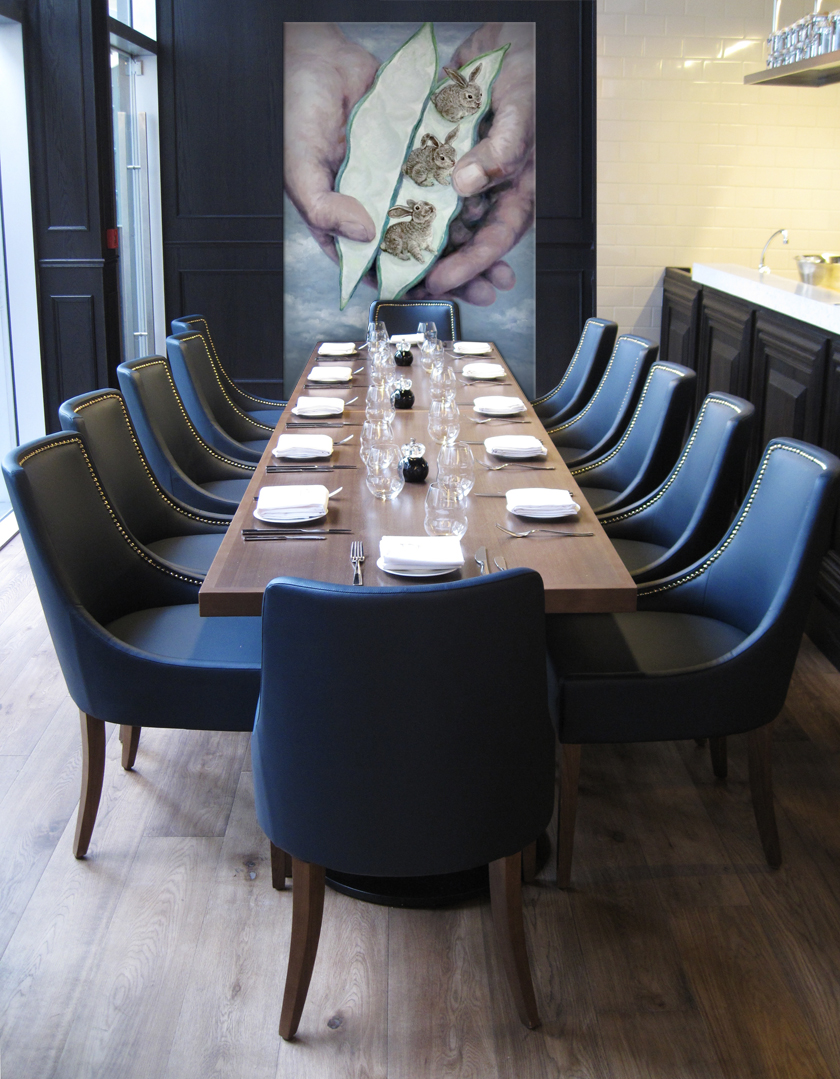
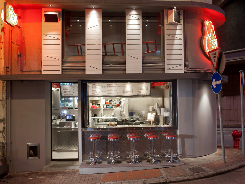
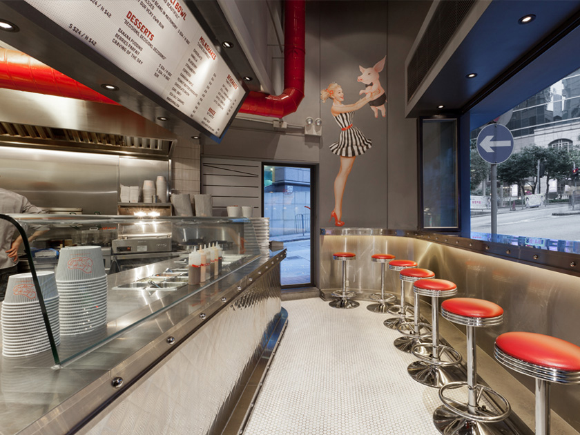
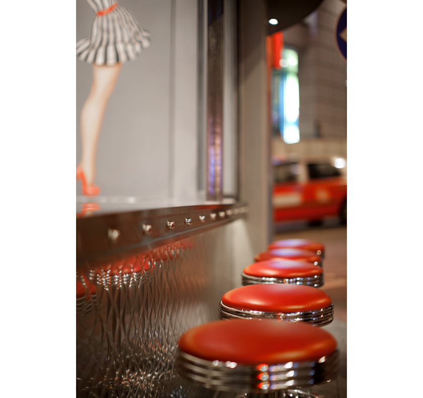
highlighted with trimmings of aluminium, retro red leather details and pinup girls covering the walls, the interior space is designed to combine the friendly atmosphere of an american neighbourhood diner with the in-your-face energy of a contemporary eatery.

branding: substance limited
interior: substance limited in collaboration with nc design & architecture ltd

view the site

Identity

yongepiggies_identity_00 yongepiggies_identity_02 005 007

Packaging

yongepiggies_packaging_02

Interior

yongepiggies_identity_010 yongepiggies_identity_09 011

Digital

digital_yp2

Advertising

yongepiggies_identity_06

gustave

in 1903, gustave eiffel set out to design one of the longest bridges in asia, and with the aid of 3000 workers achieved one of the world’s great civil-engineering masterpieces. cognac gustave was designed to re-define entry-level cognac to a younger generation. the architecture of gustave eiffel was designed to encompass the identity and packaging, working as an independent piece on its own and an architectural structure when placed together.  with it’s success, gustave xo, a superior grade of cognac was created inspired from le grand palais.

Identity

Cognac_advertising_00 Cognac_advertising_01 Cognac_advertising_02 Cognac_advertising_03_b Cognac_advertising_03

Packaging

Cognac_advertising_05 Cognac_advertising_05(1) Cognac_advertising_06