origin shangri la

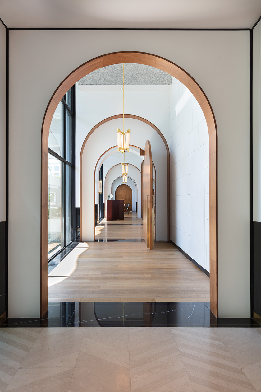
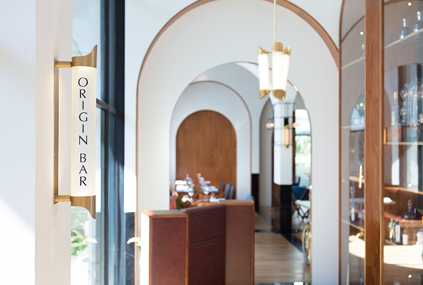
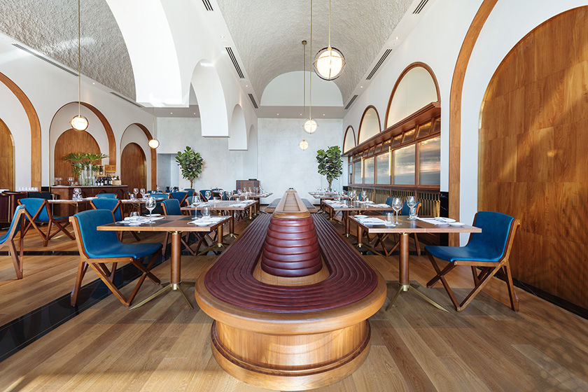
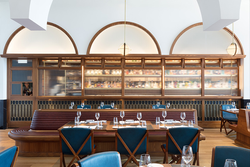
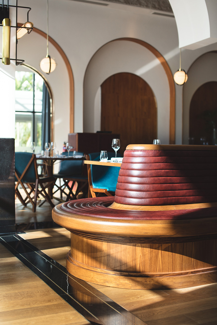
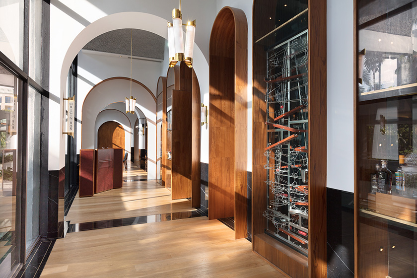
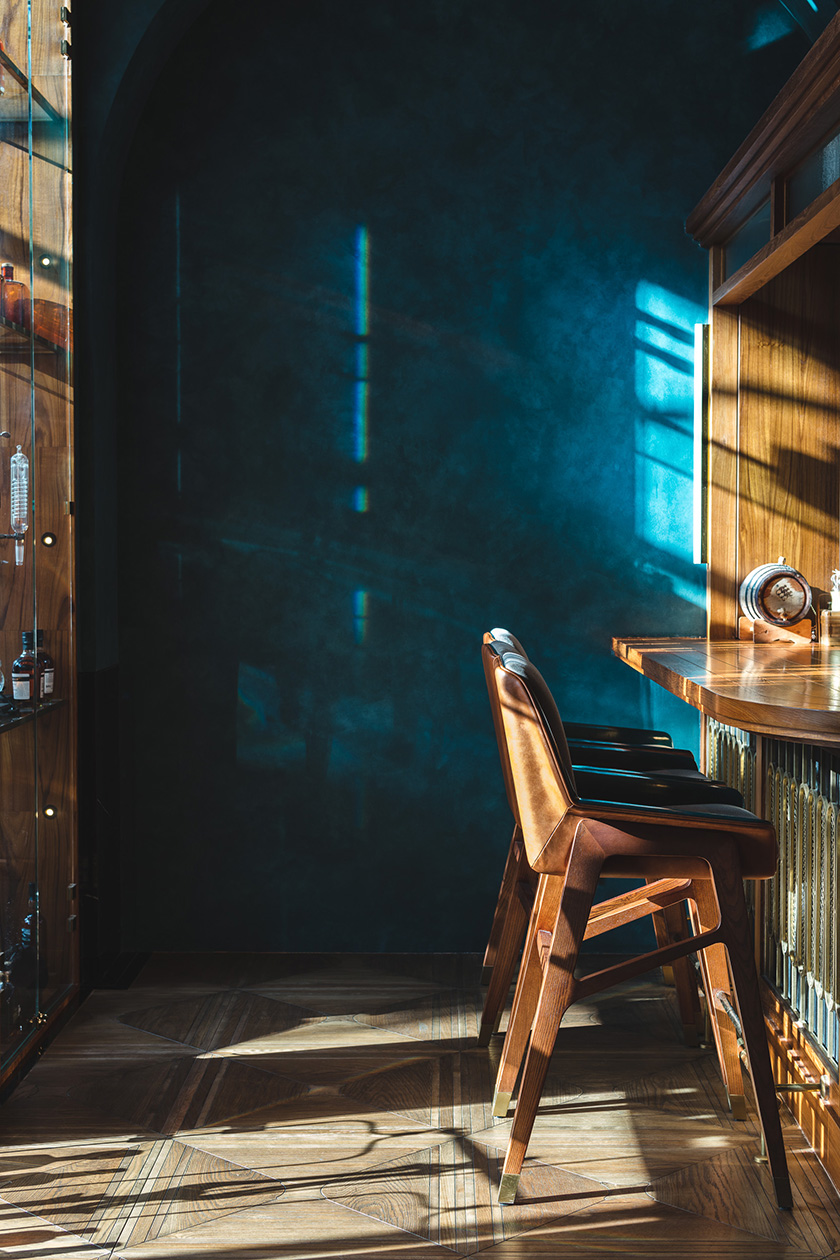
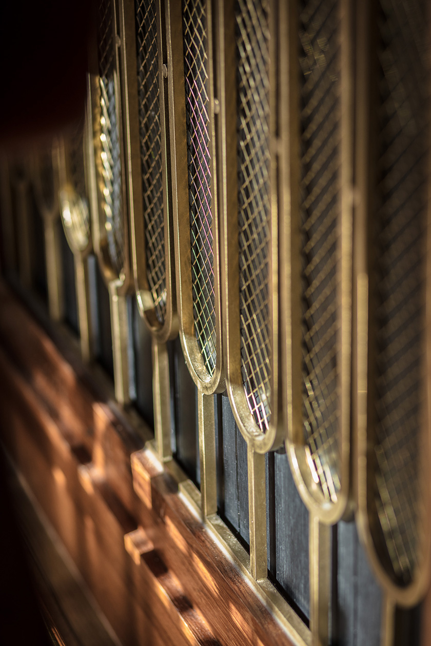
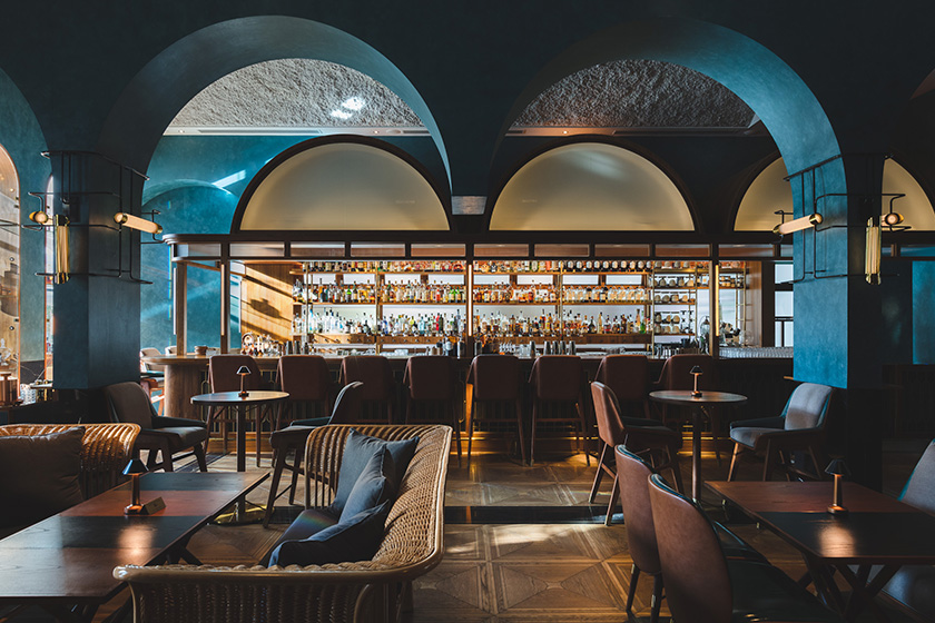
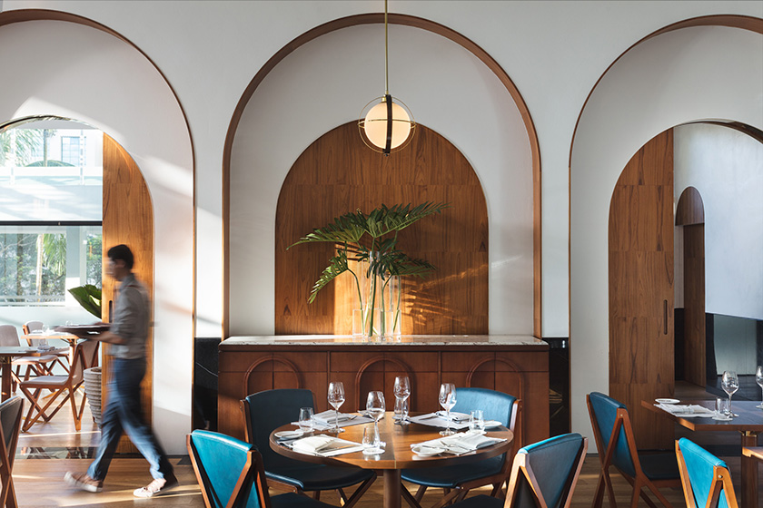
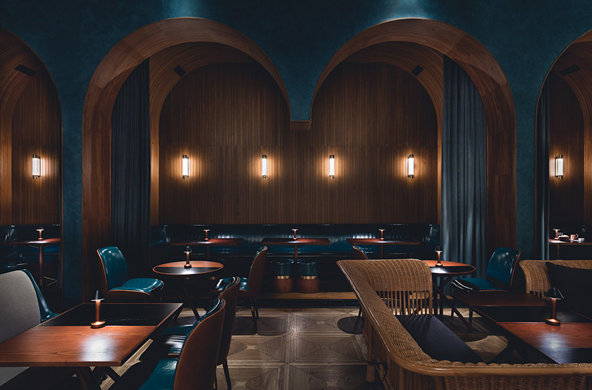
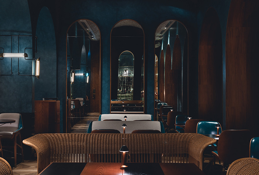
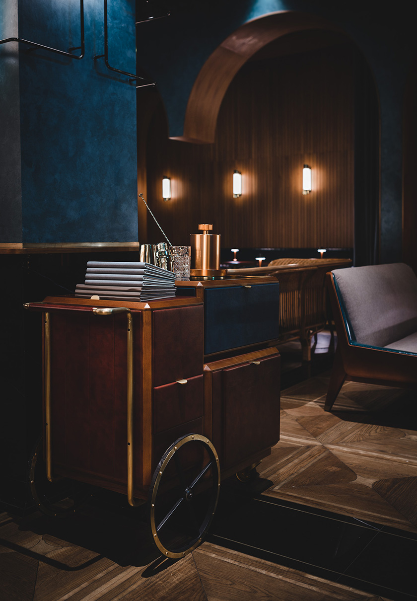
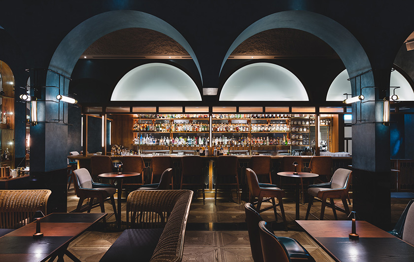
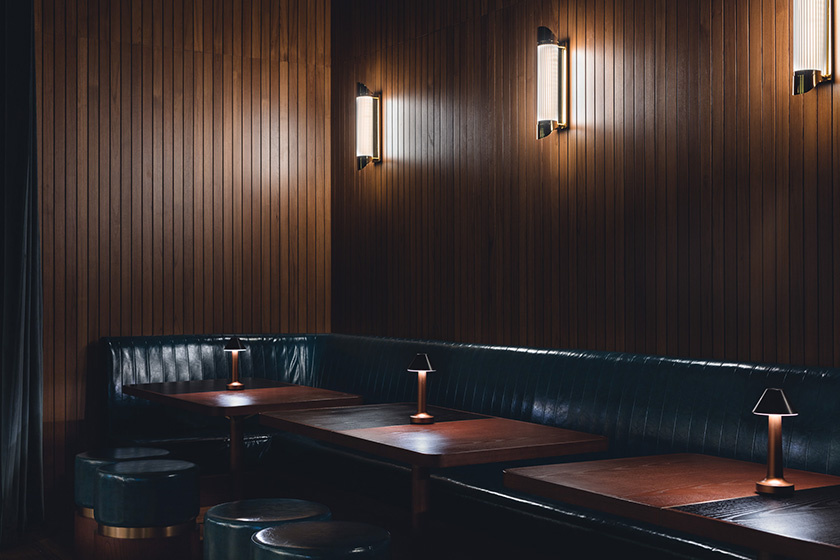
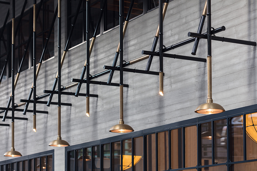
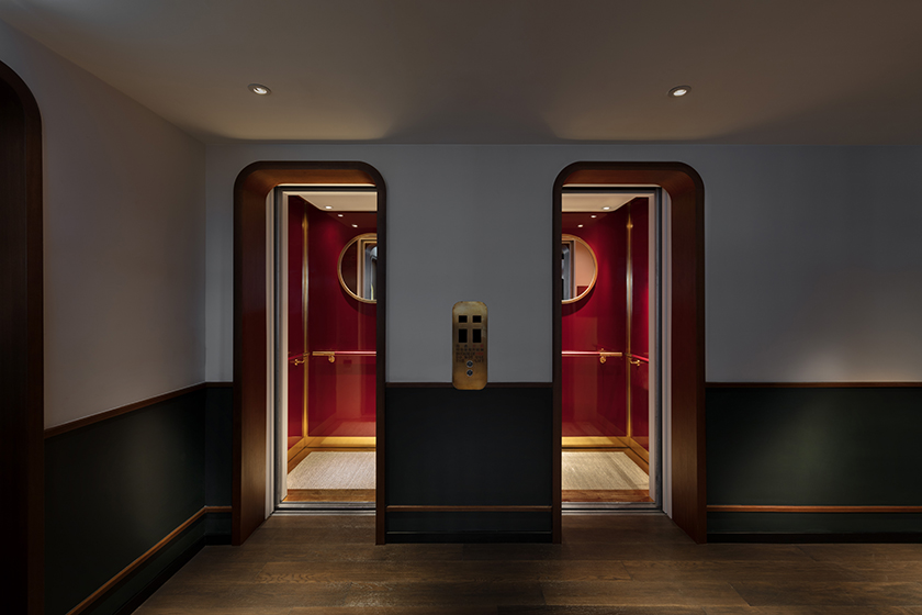
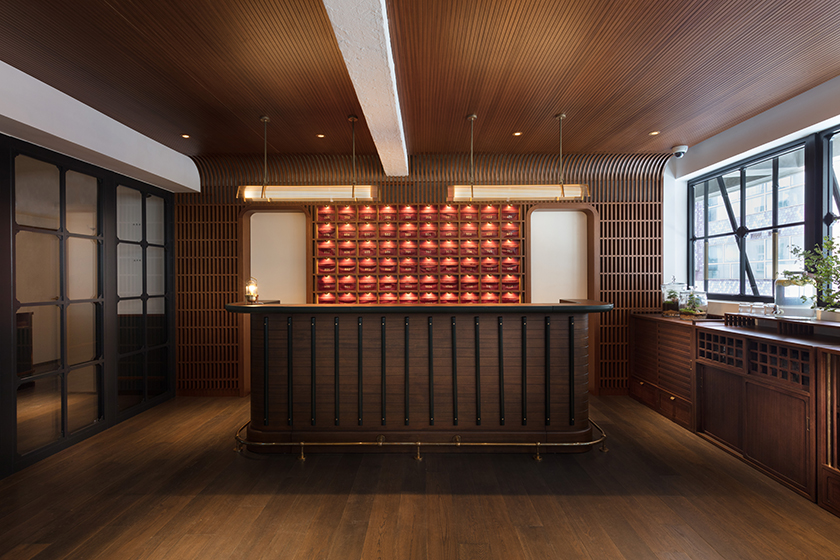
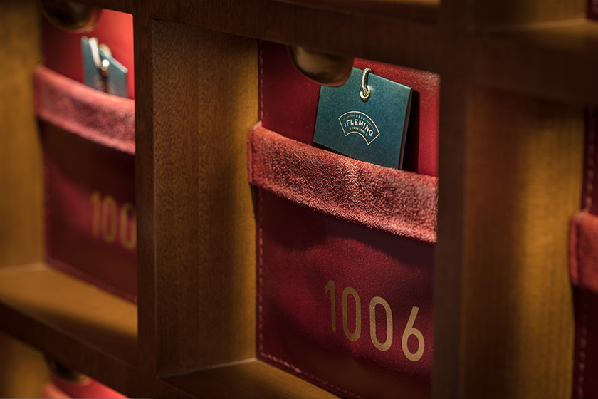
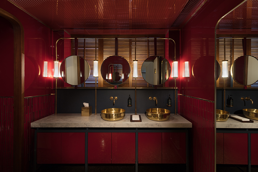
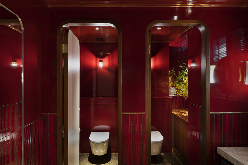
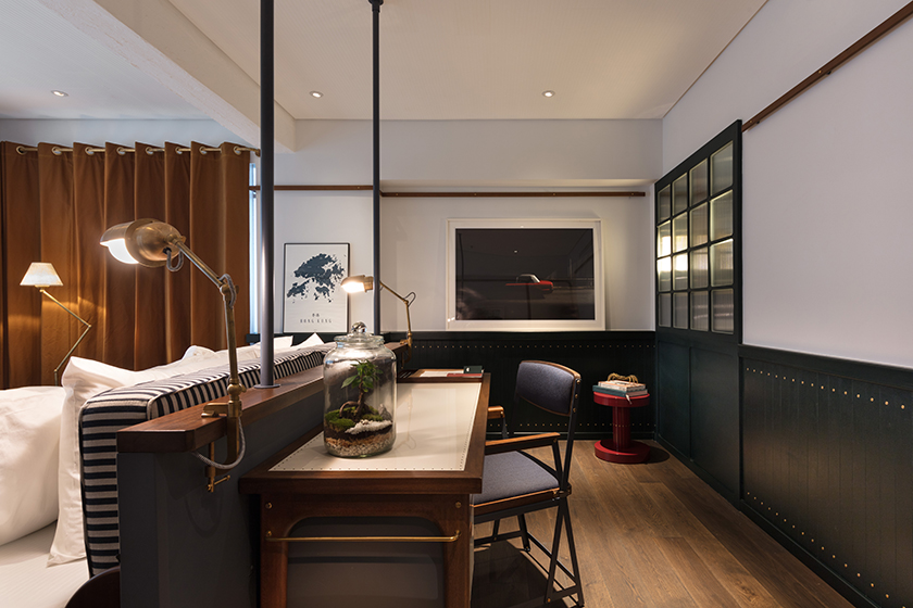
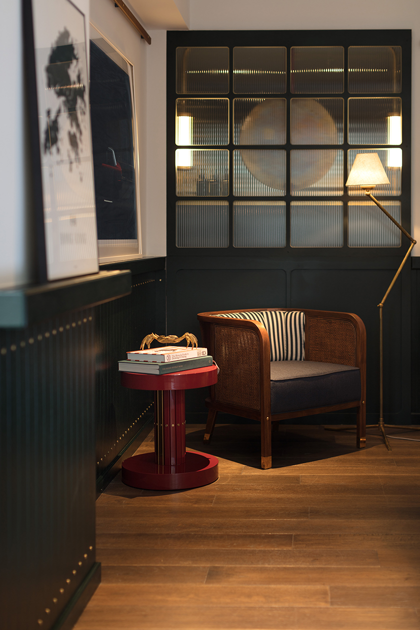
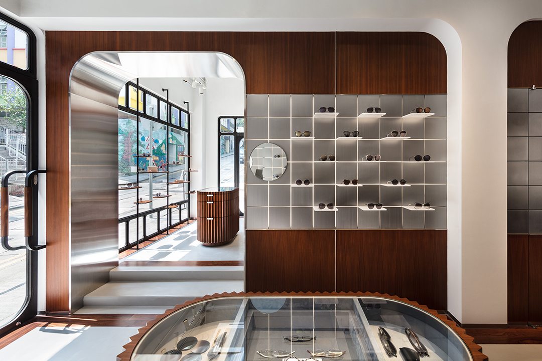
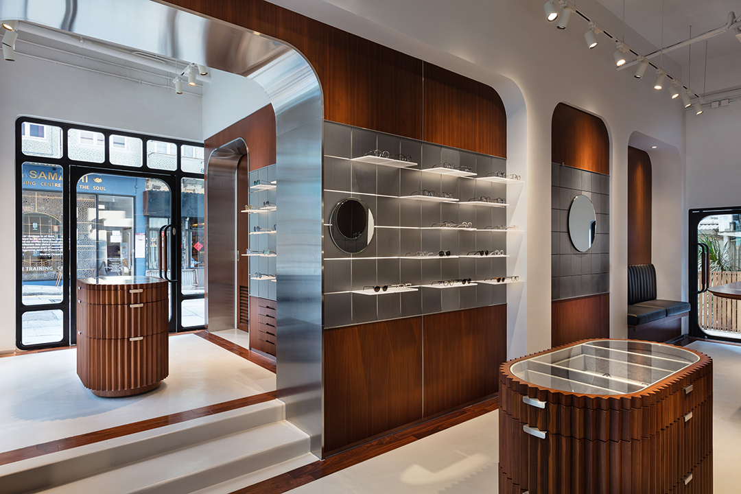
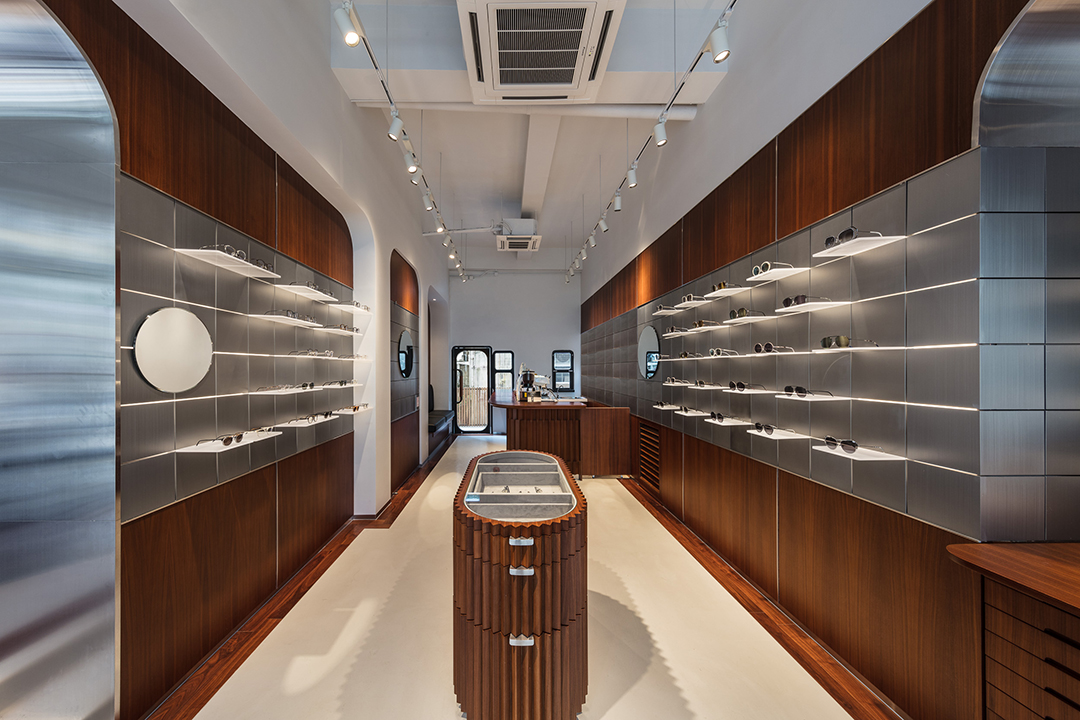
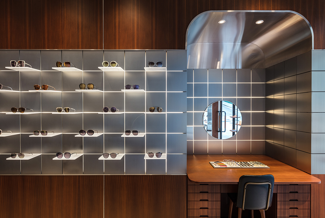
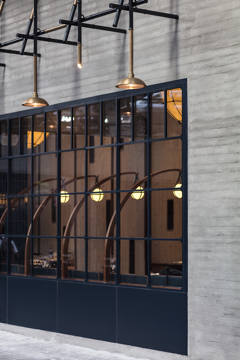
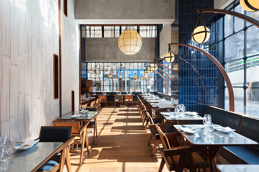
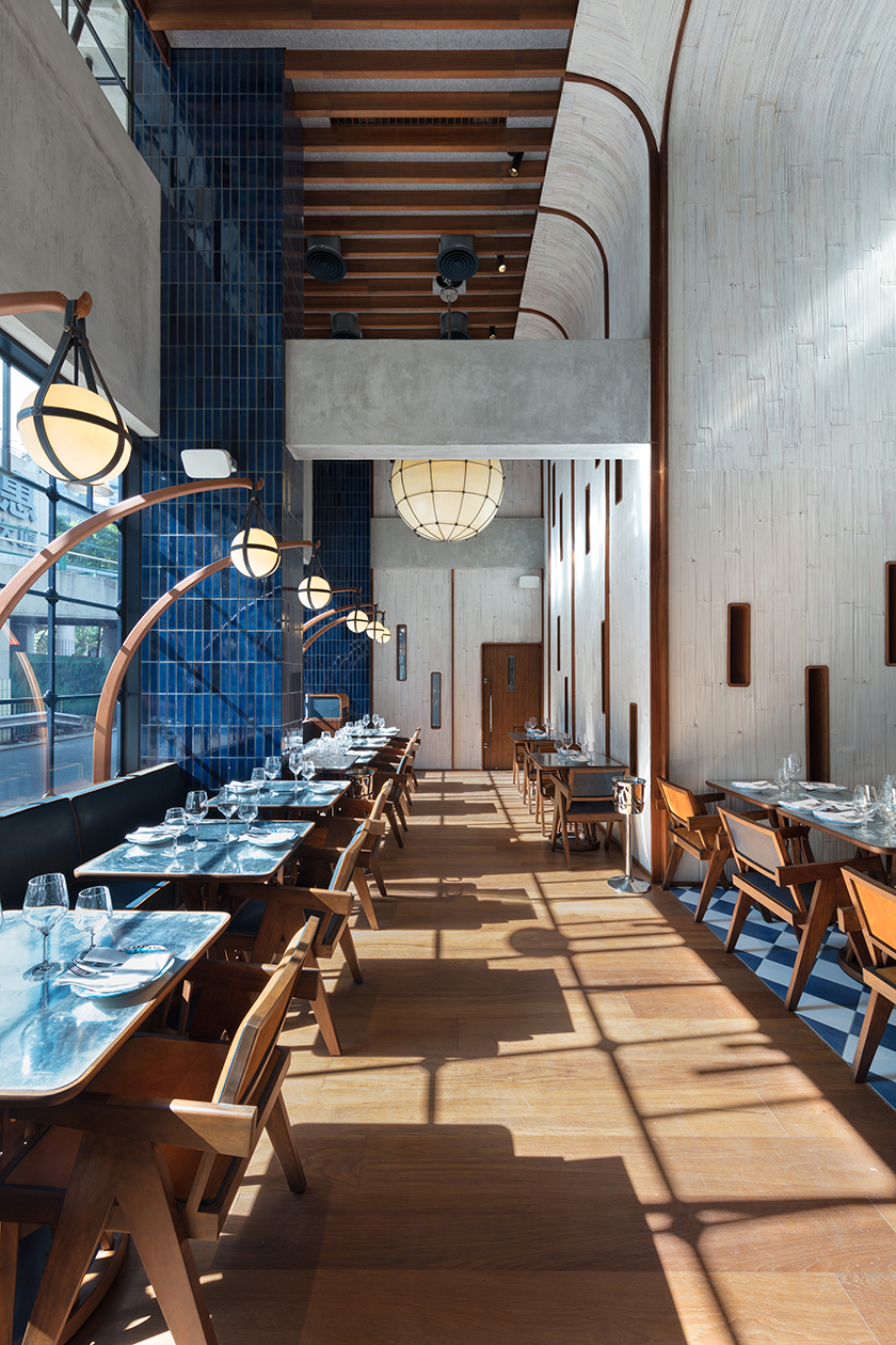
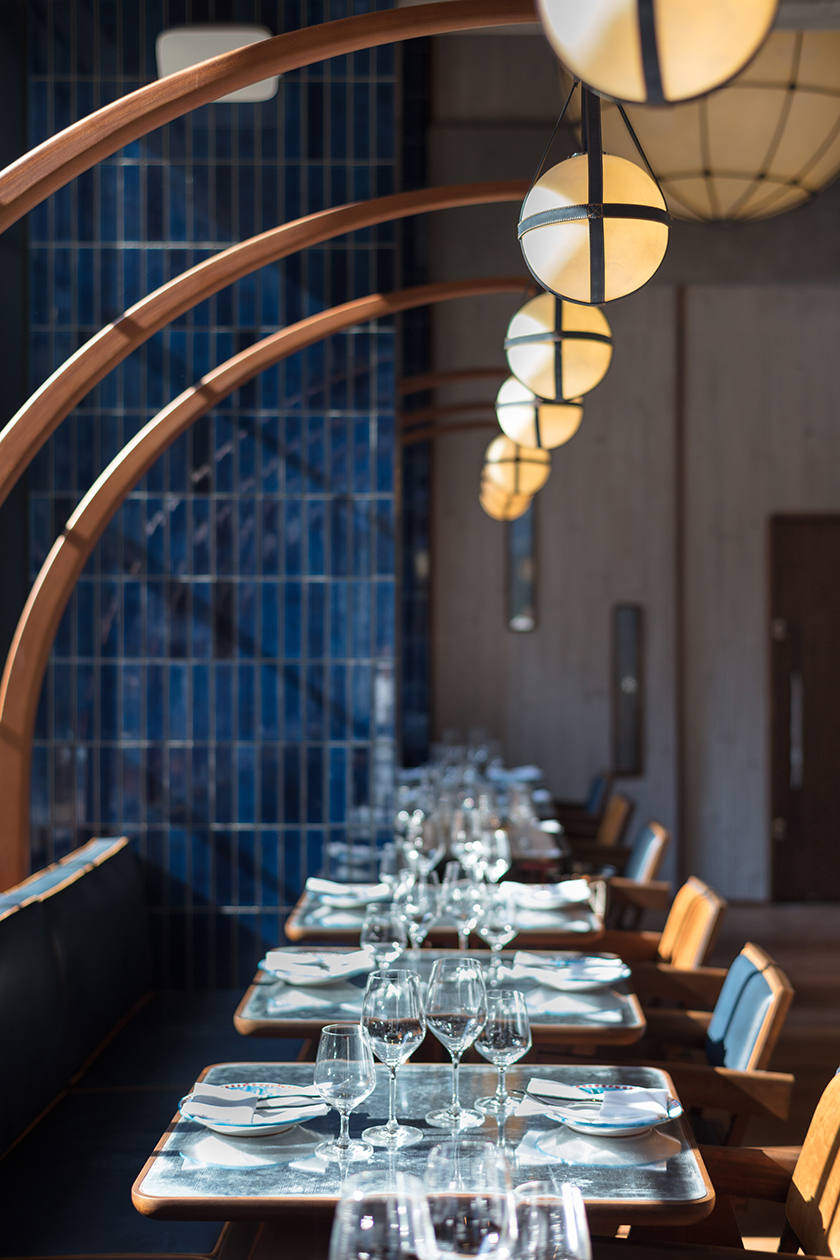
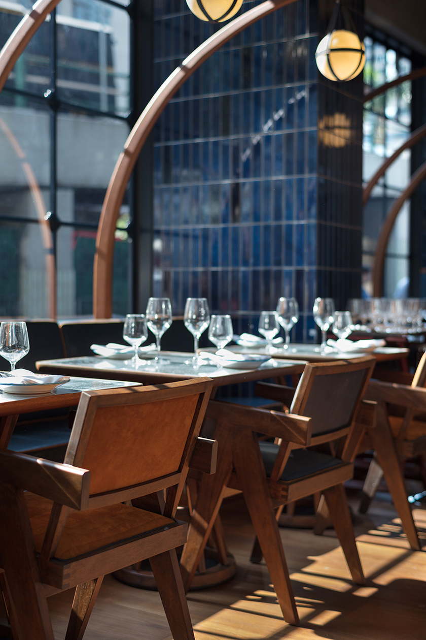
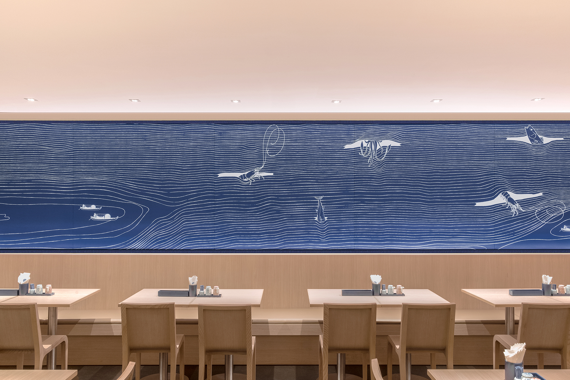
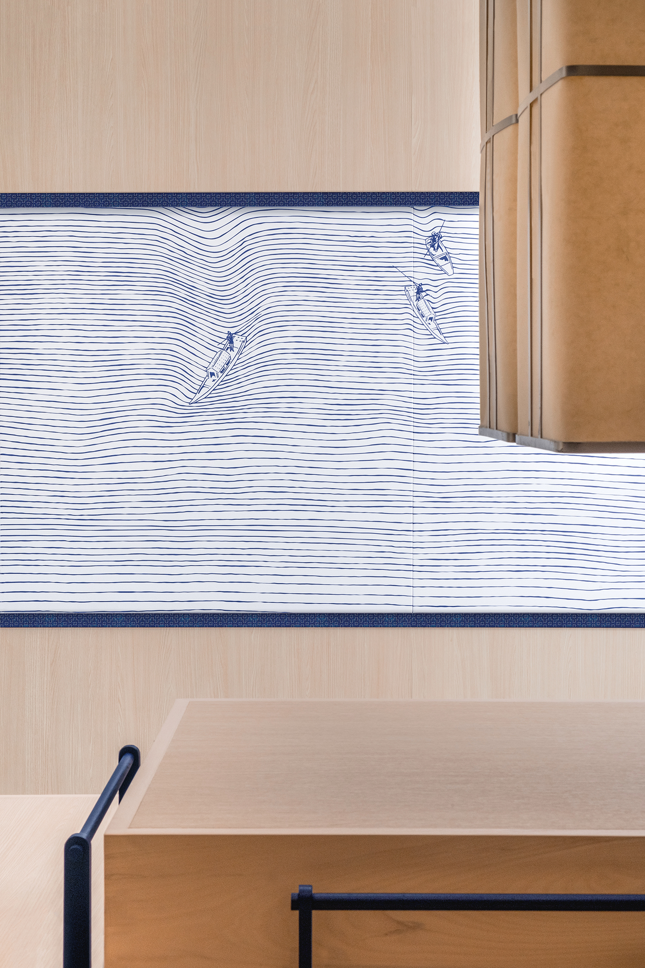
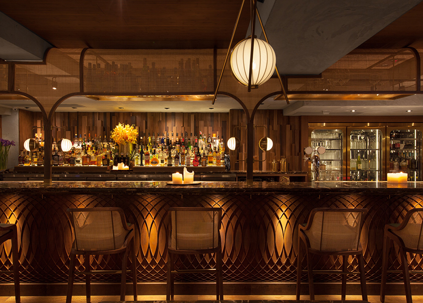
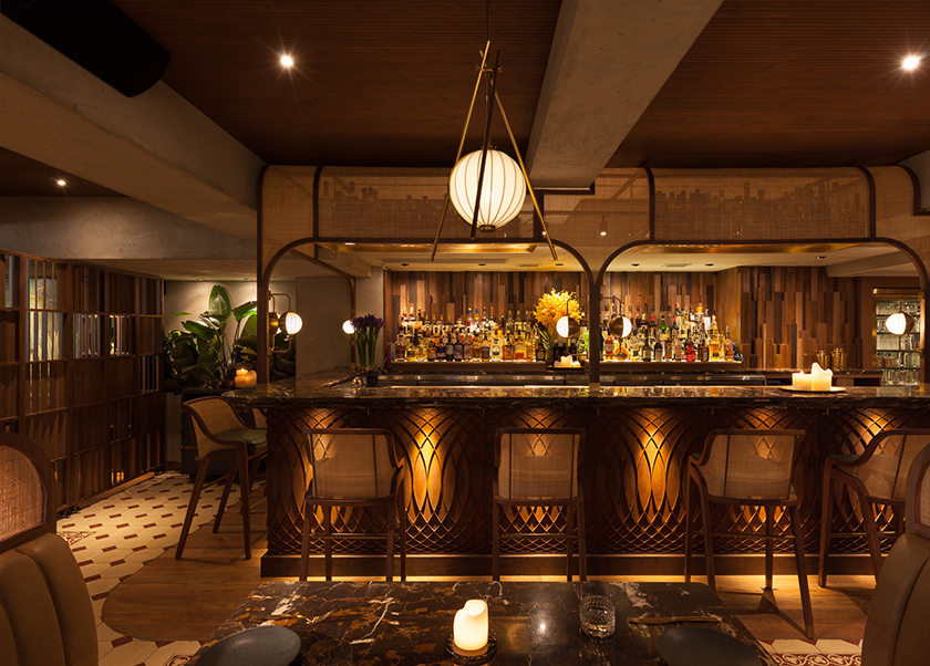
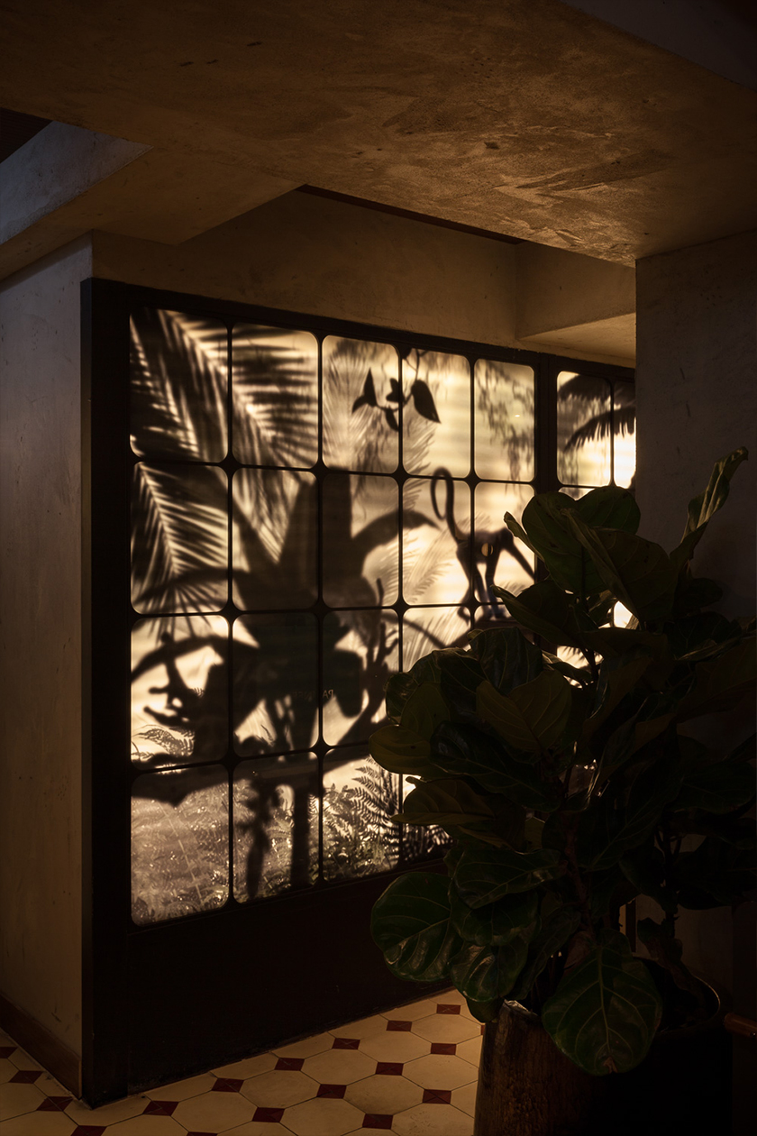
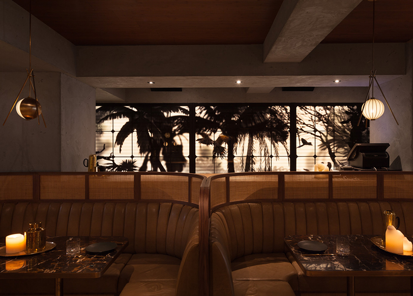
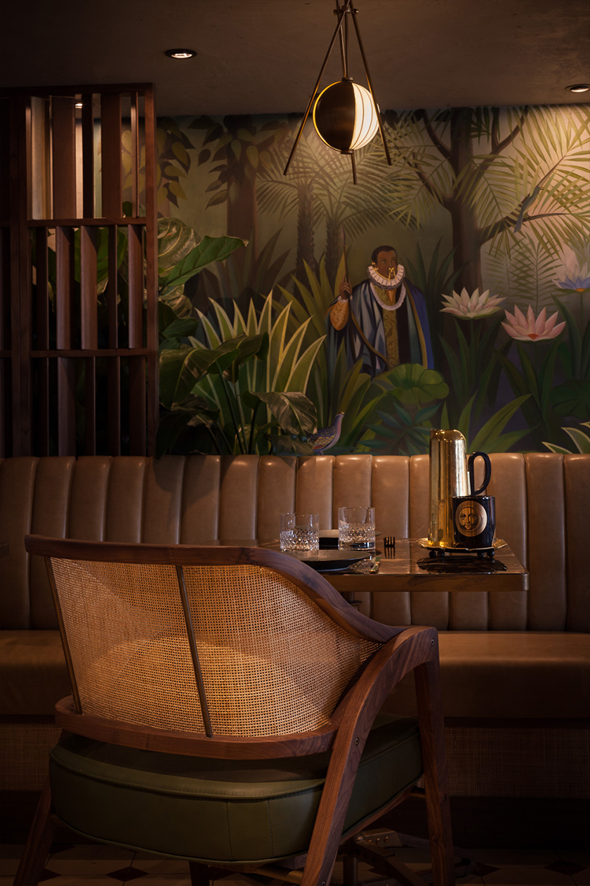
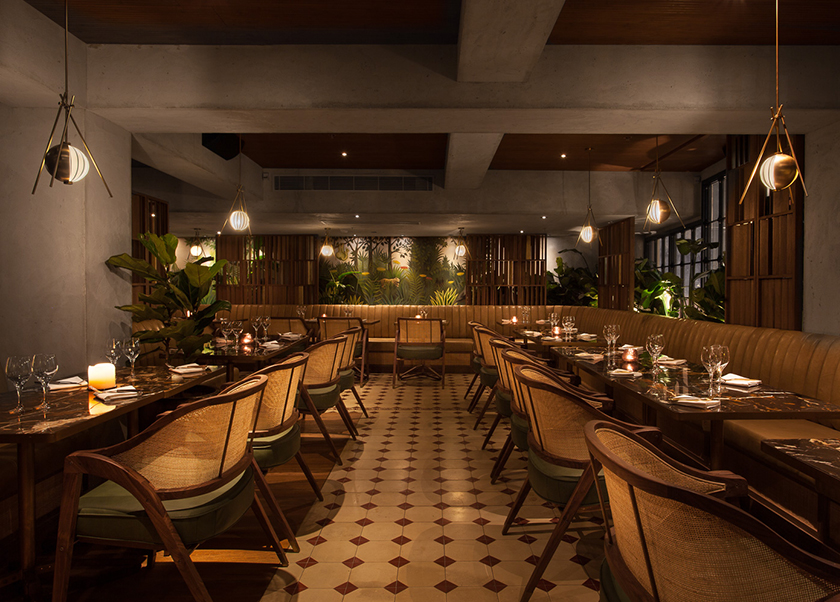
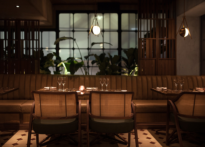
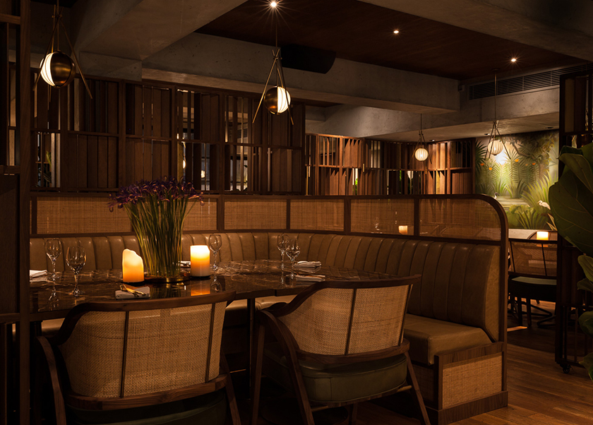
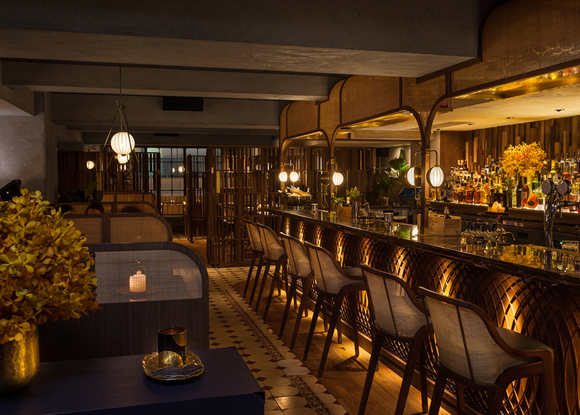
a station is the crossroads of millions of lives that intersect and pass within seconds, a point of convergence harbouring exchanges and ruminations; beginnings and endings. located in the original outlet of shangri-la in singapore, origin epitomises the hotel’s legacy, and honours south east asian produce. the existing arches carved into the space reminisced of station platforms and presented a befitting structure for execution. as diners travel through the bar, main dining, and private dining areas, they are taken on an evocative journey from the ticket counter, grand hall, platform, and finally to the intimate carriage. the curvatures mirrored in the interior and campaign furniture, in combination with the kinetics sculpture at the bar, guide visitors through a rhythm of travel.

the fleming

we were tasked to redesign and rebrand the fleming hotel, originally opened in 2006. a new take on the architecture, interior, products, and identity transformed the fleming into a 66-room boutique hotel that is a true reflection of hong kong. occupying a building from the 70s’, the hotel stands in wan chai close to victoria harbour front. the multilayered design concept draws inspiration from the location and history, leveraging Hong Kong’s maritime heritage and 70s’ industrial era to create a cultural, social and efficient character. one landmark that embodies these three elements is the star ferry — having connected people across the harbour for over a century, it is a piece of hong kong’s collective memory and identity. the star ferry, a unique and elegant icon of Hong Kong’s past and present, became the foundation for every design detail, including the custom designed furniture and lighting. nostalgia is further evoked by colours and scents: Carmine reds and bottle greens — hues seen on the hull of Hong Kong’s ferries, fishing boats, delivery trucks, and temples —and apothecary-inspired toiletries and custom aroma of sandalwood and amber notes, to deliver an authentic sense of place.

photographs by: dennis lo & judy chen


khromis

like a prism dispersing monochromatic light into a spectrum of colours, khromis is a catalyst for transformation. each frame empowers the individual to reveal a whole palette of emotions and personalities. resembling a pair of glasses, the logo is also an expression of refracted light paths. the interior uses mirrors to create reflections and perspective, manoeuvring light to display the product in the best possible way. a touch of wood warms up the interior, along with the coffee bar in the corner, creating a comfortable atmosphere for a multi-sensory experience.

osteria marzia

a place where the sun meets the sea, osteria marzia brings the cuisine and romance of the southern italian coast to the heart of wan chai. through expansive windows, the glorious glow of sunlight breathes life to the luminous aqua blues, yellows and golds inspired by the mediterranean sea and shoreline. boat building techniques guide the interior architecture, and a contemporary maritime spirit find its expression in warm teak wood, white bamboo panels, navy blue banquettes and coral-blue tiles. here, the sea reveals itself in tables with shimmering surfaces and lamps that look like fishing lanterns. herbs from the aeolian islands perfume the air, as friends old and new gather to enjoy la dolce vita over wine and sumptuous italian seafood. a homage to life in cities by the sea, osteria marzia is an encounter with the flavours and sensuality of the mediterranean, in a dazzling oasis near the hong kong harbour.

Identity

plum

like harvesting ripened and succulent fruit while filtering out the rest, plum is a lifestyle curator that thoughtfully selects products based on quality, affordability, and distinctiveness. the result is a refined collection of the best of the best—tested by experts, with insider prices, and customised to each individual’s taste. the identity is the expression of consumer decisions made easier.

hokkaidon

a unique take on a traditional motif, hokkaidon’s graphic expression is a disruption of the tranquil pattern of seigaiha, the instantly recognizable blue rolling waves. energy of the sea-to-table dishes unravels on the murals as an array of eclectic seafood break through the blue and white boundaries of the ocean, adding renewed vigor to this piece of japanese heritage. rice, the foundation of japanese food and culture, is at the core of the logo, creating a pure and distinct brand that reflects the essence of chirashi.


press
yatzer

Identity

mango tree cafe

on the walls of the mango tree cafe, a cultural snapshot of thailand’s street life: one of overloaded humans who magically resemble an enchanted forest, melding a fierce jungle setting with provincial life on a busy thai street. classic thailand with a contemporary twist, creating an innovative vibe with a familiar background that sets the scene for the novel menu – authentic thai meets western cuisine – that invites all to experience its quirky fun.

Identity

sulwhasoo cny campaign

behind the story of this cheeky well-travelled rat, is a collaboration that transcends cultural and creative borders. korea’s leading holistic beauty brand, sulwahsoo, and paris’s 18th century pattern maker, antoinette poisson, came together to develop sulwhasoo’s limited edition chinese new year packaging. we were challenged to create a global campaign out of antoinette poisson’s pattern of peonies, heart-links, and this year’s zodiac protagonist— the rat. staying true to the two dimensional nature of antoinette poisson’s work, we brought the packaging alive by revealing a whole world within the pattern and taking viewers on an enchanting journey past city landmarks and sulwhasoo’s signature product.


paradis

inspired by haitian vodou, paradis takes its cues from the haitian goddess of the moon: mawu. the mesmerising mystique of a lunar eclipse is seen throughout the space, from subtle hints across the restaurant’s branding, to the custom-made lighting fixtures fitted throughout the space itself. it caters specifically to creatures of the night, taking visitors from dinner service through to cocktail hour, and onwards through the wicked hours of the early morning.

rich greens and earthy browns are at the base of the interiors, balanced with a striking gold finishes throughout. on the walls, visitors find a reflection of their own animalistic desires, with hand-painted murals intricately drawn directly to the restaurant walls — each so delicately drawn as if they were created by the priestess herself.

at the centre, the low-slung ceiling encompasses visitors in a warm embrace, while the brass, soft woods and rattan straw details create a sense of discovery that could – until now – only be found in the outdoors.

Interiors

trudon

founded in 1643, maison trudon is the oldest candle manufacturer. maison trudon extends its savoir faire and unveils a line of personal fragrance. substance accompanied the brand with its communication strategy, global branding, packaging, print and digital design. our challenge was to subtly express the rich brand heritage whilst reinterpreting a modern approach.

view the site

Brand Identity


Digital